Conquer Club

[Abandoned] Tokyo

Abandoned and Vacationed maps. The final resting place, unless you recycle.

Moderator: Cartographers

Forum rules
Please read the Community Guidelines before posting.

Re: Tokyo [9 Jul 2011]

Postby natty dread on Sun Jul 10, 2011 1:19 pm

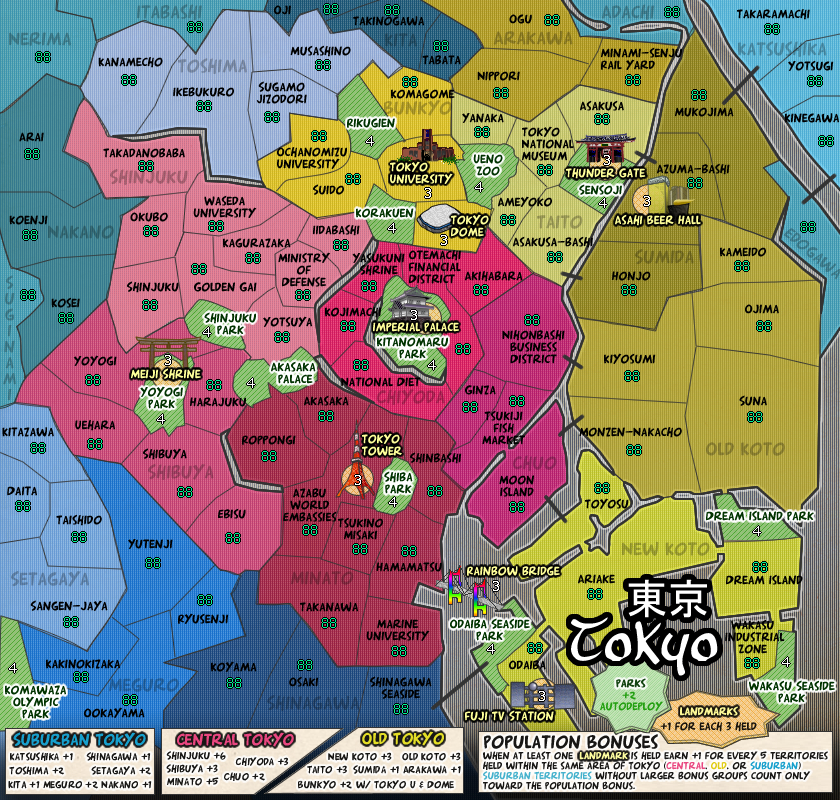
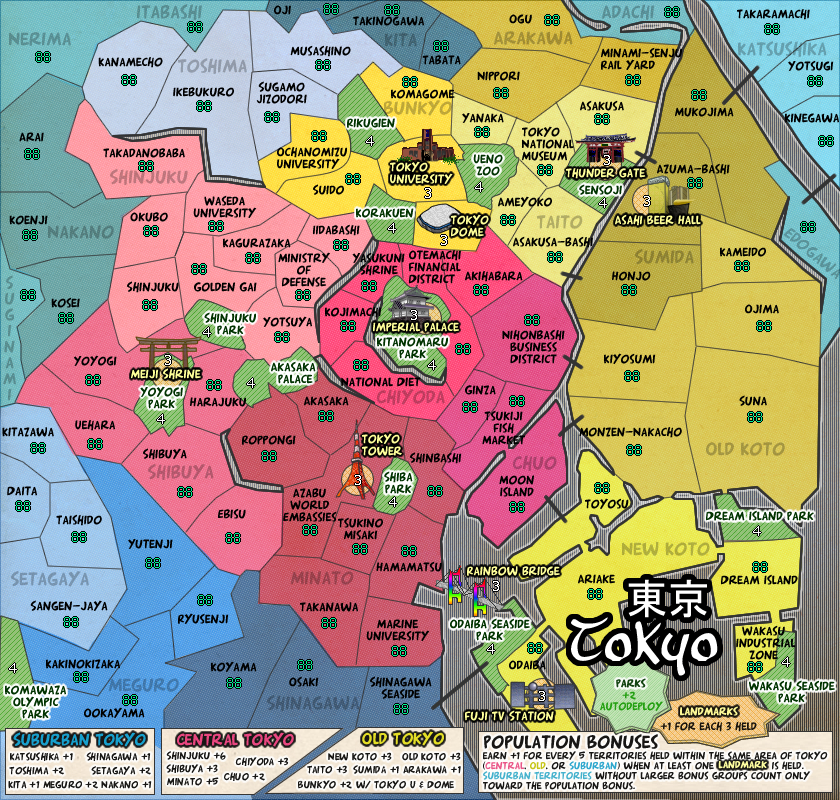
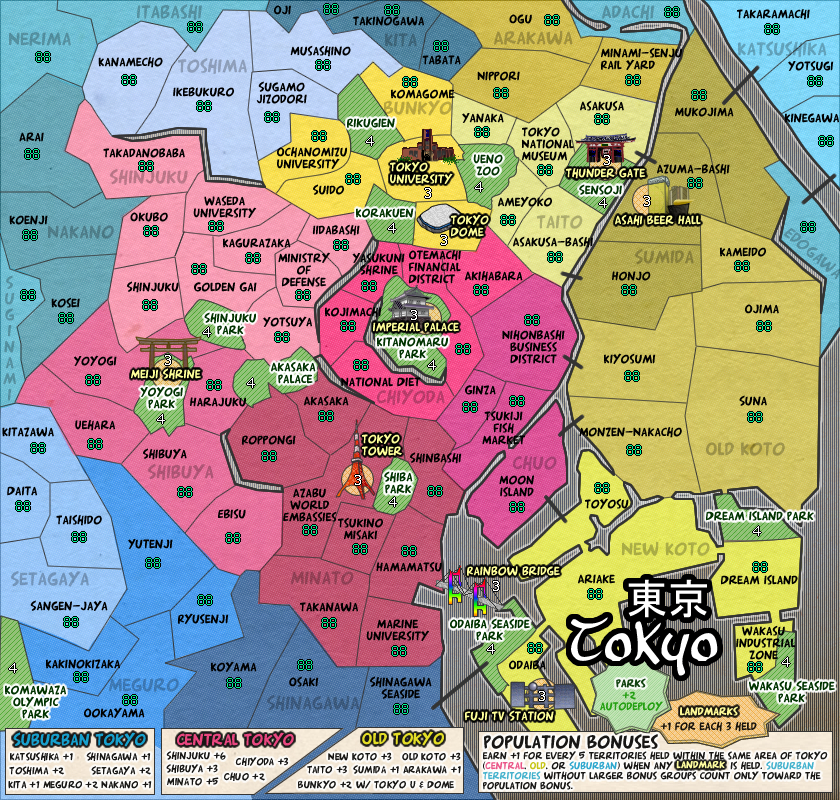
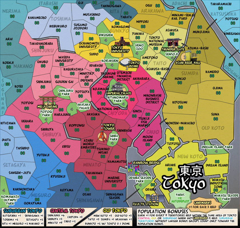
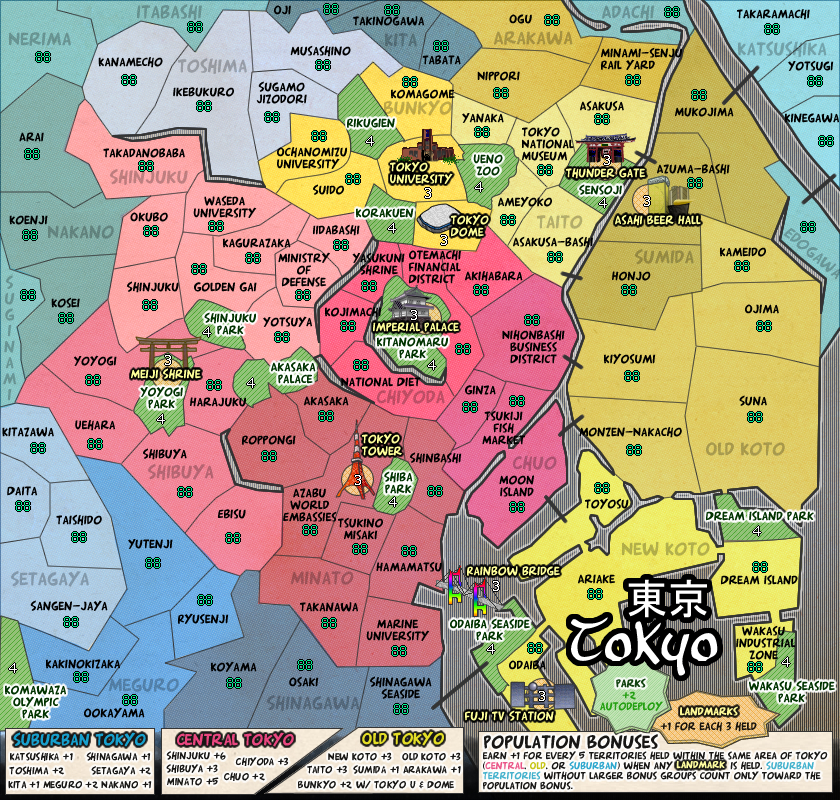
shakeycat wrote:Is it clear that the only 'non playable area' is the water and the legend? I'm thinking now that periphery territories where I have faded names (Nerima, Itabashi, Suginami, etc.) are looking almost unplayable, as if they are outlying states we don't care about .. that needs to change. If you meant something else, please tell me.


The legend is ok, being brighter than everything else, but the water is very similar in tone, lightness, texture and saturation as the playable areas - there's not enough contrast between them. Some kind of contrast would do wonders for the clarity of the map. For example, the water could be darker than all of the playable areas - then there would be a lightness contrast between them. Or the other way around.

Another thing that can help is if you make the borders between land & sea stronger than the other territory borders. A dark inner glow for the water could also help.

Or you could utilize texture - give the land a smooth & shiny texture while making the sea coarse and noisy, or the other way around... although if you want to go for a "comic" look then strong textures probably aren't the best idea.

Another way is making the water a colour that is different from all of the land colours, but you have so many bonus areas that this can be difficult to achieve.

There's various ways of achieving contrast, but the important thing is that the playable areas "stand out" from the non-playable/impassable areas, this makes it easy to visualize and grasp the connections between the territories, which makes for a map that is easy to read.
Image
User avatar
Sergeant 1st Class natty dread
 
Posts: 12877
Joined: Fri Feb 08, 2008 8:58 pm
Location: just plain fucked

Re: Tokyo [10 Jul 2011]

Postby shakeycat on Mon Jul 11, 2011 2:49 am

Would something like this work?

Click image to enlarge.
image


Monochrome water, bold texture instead of more subtle texture on lands. Not sure if I like the texture I added to the land though. But I like the newspaper water compared to the purple water before.
Current Map Project: Tokyo
User avatar
Lieutenant shakeycat
 
Posts: 390
Joined: Sun Mar 11, 2007 5:13 am
Location: Vancouver

Re: Tokyo [10 Jul 2011]

Postby natty dread on Mon Jul 11, 2011 3:36 am

Actually, that looks pretty good. Could you try rotating the land texture a few degrees though? It might look a bit more natural that way.
Image
User avatar
Sergeant 1st Class natty dread
 
Posts: 12877
Joined: Fri Feb 08, 2008 8:58 pm
Location: just plain fucked

Re: Tokyo [11 Jul 2011]

Postby shakeycat on Mon Jul 11, 2011 1:03 pm

Click image to enlarge.
image


Thanks - rotated and looks better to me! Also turned the paper texture back on to block the lines behind (oops!). Yesterday's update looks like sitting too close to the TV screen or something.
Current Map Project: Tokyo
User avatar
Lieutenant shakeycat
 
Posts: 390
Joined: Sun Mar 11, 2007 5:13 am
Location: Vancouver

Re: Tokyo [11 Jul 2011]

Postby MrBenn on Mon Jul 11, 2011 3:06 pm

There's a border missing between Nerima and Itabashi (top left).

There's a nice feel to the map now - it definitely works better than the over-brightness of before. What might be nice is a very slight paper texture to the background - not old parchment, but plain newspapery... perhaps one of these might work (especially the top one):

http://fc08.deviantart.net/fs4/i/2004/256/6/8/Texture_1___sugar_paper_by_LL_stock.jpg

http://www.deviantart.com/download/125574004/Old_Grunger_Paper_Texture_04_by_fudgegraphics.jpg
http://fc08.deviantart.net/fs44/f/2009/162/6/6/Old_Grunger_Paper_Texture_08_by_fudgegraphics.jpg
Image
PB: 2661 | He's blue... If he were green he would die | No mod would be stupid enough to do that
User avatar
Lieutenant MrBenn
 
Posts: 6880
Joined: Wed Nov 21, 2007 9:32 am
Location: Off Duty

Re: Tokyo [11 Jul 2011]

Postby DiM on Mon Jul 11, 2011 3:22 pm

since this is tokyo wouldn't rice paper texture fit better than simple paper? or perhaps a sheet of nori...
ā€œIn the beginning God said, the four-dimensional divergence of an antisymmetric, second rank tensor equals zero, and there was light, and it was good. And on the seventh day he rested.ā€- Michio Kaku
User avatar
Major DiM
 
Posts: 10415
Joined: Wed Feb 14, 2007 6:20 pm
Location: making maps for scooby snacks

Re: Tokyo [11 Jul 2011]

Postby MrBenn on Mon Jul 11, 2011 3:50 pm

DiM wrote:since this is tokyo wouldn't rice paper texture fit better than simple paper? or perhaps a sheet of nori...

Here's one that might work:
http://fc06.deviantart.net/fs71/f/2010/201/8/c/Rice_paper_texture_by_MapleRose_stock.jpg
Image
PB: 2661 | He's blue... If he were green he would die | No mod would be stupid enough to do that
User avatar
Lieutenant MrBenn
 
Posts: 6880
Joined: Wed Nov 21, 2007 9:32 am
Location: Off Duty

Re: Tokyo [11 Jul 2011]

Postby Victor Sullivan on Mon Jul 11, 2011 4:08 pm

I assume the population bonus comes into effect for all regions when a landmark is held? I noticed Suburban Tokyo has no landmark.

-Sully
User avatar
Corporal Victor Sullivan
 
Posts: 6010
Joined: Mon Feb 08, 2010 8:17 pm
Location: Columbus, OH

Re: Tokyo [11 Jul 2011]

Postby AndyDufresne on Mon Jul 11, 2011 5:47 pm

I like the direction the graphics are going with this map, I think you'll end up with unique graphics.


--Andy
User avatar
Corporal 1st Class AndyDufresne
 
Posts: 24919
Joined: Fri Mar 03, 2006 8:22 pm
Location: A Banana Palm in Zihuatanejo

Re: Tokyo [11 Jul 2011]

Postby gimil on Mon Jul 11, 2011 7:35 pm

I disagree with the suggestion to add anymore texture, specially a paper texture. In my opinion the current texture and colouring is perfect and give a sort of manga/comic book feel that you sometimes get with the Japaneses.

I would vote for the texture to remain as is.
What do you know about map making, bitch?

natty_dread wrote:I was wrong


Top Score:2403
User avatar
Corporal 1st Class gimil
 
Posts: 8599
Joined: Sat Mar 03, 2007 12:42 pm
Location: United Kingdom (Scotland)

Re: Tokyo [11 Jul 2011]

Postby Industrial Helix on Mon Jul 11, 2011 8:45 pm

Hmm... I dunno how I like the slanted lines contrasting against the dots.

But anyway... you should include the Tokyo Skytree and preempt its completion next year. I mean, its quite huge and I think maybe a better choice than the Asahi beer hall. Or, you could do both. Your choice. I just see the Tokyo skytree all the time and find it strange its not on the map.
Sketchblog [Update 07/25/11]: http://indyhelixsketch.blogspot.com/
Living in Japan [Update 07/17/11]: http://mirrorcountryih.blogspot.com/
Russian Revolution map for ConquerClub [07/20/11]: viewtopic.php?f=241&t=116575
User avatar
Cook Industrial Helix
 
Posts: 3462
Joined: Mon Jul 14, 2008 6:49 pm
Location: Ohio

Re: Tokyo [11 Jul 2011]

Postby shakeycat on Tue Jul 12, 2011 1:31 am

Industrial Helix - slanted lines against the dots? I thought it was vertical lines against slanted dots ..

And I will switch the Asahi Beer Hall for the Tokyo Skytree. Haven't been to Tokyo since before the Skytree began construction, so had never heard of it! You surely know Tokyo much better than I do (I lived in Osaka), so if anything else seems sorta off, it probably is and you must tell me to fix it :)

Gimil, MrBenn, DiM - believe it or not, there was a paper texture under there! The difference between Jul 10 and 11 was I had the texture turned off when I exported Jul 10. On 11, you'll see the texture most obviously in Old Koto. It seems it's too subtle to hit MrBenn's radar, yet subtle enough that Gimil already thinks it's fine. If I need to just up the contrast on what I'm already using, that can be done. Here's the map with the rice paper texture so you know what it looks like, but I prefer the subtler texture I was using on Jul 11:

Click image to enlarge.
image


Sully - That's correct. I've changed the wording to "when any landmark is held", hopefully it reads more clearly now.

AndyDufresne - thanks :) It feels good to finally find a proper feel and direction. MrBenn helped break my artist's block. (Thanks again, MrBenn!)
Current Map Project: Tokyo
User avatar
Lieutenant shakeycat
 
Posts: 390
Joined: Sun Mar 11, 2007 5:13 am
Location: Vancouver

Re: Tokyo [11 Jul 2011]

Postby gimil on Tue Jul 12, 2011 1:38 am

I prefer the older texture myself. That said thou, their isn't anything wrong with the new one either.
What do you know about map making, bitch?

natty_dread wrote:I was wrong


Top Score:2403
User avatar
Corporal 1st Class gimil
 
Posts: 8599
Joined: Sat Mar 03, 2007 12:42 pm
Location: United Kingdom (Scotland)

Re: Tokyo [11 Jul 2011]

Postby MrBenn on Tue Jul 12, 2011 1:15 pm

gimil wrote:I prefer the older texture myself. That said thou, their isn't anything wrong with the new one either.

The previous texture you had was virtually invisible; the current one is probably too visible... I'd suggest something between the two, but nearer the previous version with the texture barely visible.
Image
PB: 2661 | He's blue... If he were green he would die | No mod would be stupid enough to do that
User avatar
Lieutenant MrBenn
 
Posts: 6880
Joined: Wed Nov 21, 2007 9:32 am
Location: Off Duty

Re: Tokyo [11 Jul 2011]

Postby AndyDufresne on Tue Jul 12, 2011 4:25 pm

MrBenn wrote:
gimil wrote:I prefer the older texture myself. That said thou, their isn't anything wrong with the new one either.

The previous texture you had was virtually invisible; the current one is probably too visible... I'd suggest something between the two, but nearer the previous version with the texture barely visible.

What he is saying, is that your porridge isn't just right yet.

I don't think I have a preference on any of the textures.


--Andy
User avatar
Corporal 1st Class AndyDufresne
 
Posts: 24919
Joined: Fri Mar 03, 2006 8:22 pm
Location: A Banana Palm in Zihuatanejo

Re: Tokyo [11 Jul 2011]

Postby shakeycat on Wed Jul 13, 2011 2:26 am

Here's with MrBenn's Sugar Paper he liked. It's got a bit more fleck to it than the one I was using.

Click image to enlarge.
image


It makes me feel like I need to clean my monitor or something.
Current Map Project: Tokyo
User avatar
Lieutenant shakeycat
 
Posts: 390
Joined: Sun Mar 11, 2007 5:13 am
Location: Vancouver

Re: Tokyo [11 Jul 2011]

Postby MrBenn on Wed Jul 13, 2011 1:05 pm

shakeycat wrote:It makes me feel like I need to clean my monitor or something.

Agreed. I'd either stick with your original version (with my apologies for wasting your time), or switch to a reduced opacity version of the ricepaper one. :?
Image
PB: 2661 | He's blue... If he were green he would die | No mod would be stupid enough to do that
User avatar
Lieutenant MrBenn
 
Posts: 6880
Joined: Wed Nov 21, 2007 9:32 am
Location: Off Duty

Re: Tokyo [11 Jul 2011]

Postby shakeycat on Wed Jul 13, 2011 4:13 pm

We don't know until we try :) So we'll stick with this then:

Click image to enlarge.
image
Current Map Project: Tokyo
User avatar
Lieutenant shakeycat
 
Posts: 390
Joined: Sun Mar 11, 2007 5:13 am
Location: Vancouver

Re: Tokyo [11 Jul 2011]

Postby zimmah on Wed Jul 13, 2011 6:37 pm

Cant really say which one is better from my iPhone so i Will watch On my pc later and give my opinion About which one i think looks best
Click image to enlarge.
image
User avatar
Major zimmah
 
Posts: 1652
Joined: Fri Jun 01, 2007 12:43 pm
Location: VDLL

Re: Tokyo [11 Jul 2011]

Postby shakeycat on Wed Jul 13, 2011 8:41 pm

zimmah wrote:Cant really say which one is better from my iPhone so i Will watch On my pc later and give my opinion About which one i think looks best


You'll know when you start smudging up your screen with fingerprints, trying to get the pesky dust particles off ;) it almost makes me want to use it as a texture!

It's so subtle though.

Maybe if I reduced the opacity of the wards?
flip between:
http://www.atomation.com/~thazzard/fun/tokyo/jul11.jpg
http://www.atomation.com/~thazzard/fun/tokyo/jul13a.jpg
Current Map Project: Tokyo
User avatar
Lieutenant shakeycat
 
Posts: 390
Joined: Sun Mar 11, 2007 5:13 am
Location: Vancouver

Re: Tokyo [11 Jul 2011]

Postby zimmah on Thu Jul 14, 2011 8:19 am

shakeycat wrote:
zimmah wrote:Cant really say which one is better from my iPhone so i Will watch On my pc later and give my opinion About which one i think looks best


You'll know when you start smudging up your screen with fingerprints, trying to get the pesky dust particles off ;) it almost makes me want to use it as a texture!

It's so subtle though.

Maybe if I reduced the opacity of the wards?
flip between:
http://www.atomation.com/~thazzard/fun/tokyo/jul11.jpg
http://www.atomation.com/~thazzard/fun/tokyo/jul13a.jpg


the second one looks good but there's a line at the hight of nakano, that splits the map in half. the upper half looks about right, everythng below that line is too bright.
Click image to enlarge.
image
User avatar
Major zimmah
 
Posts: 1652
Joined: Fri Jun 01, 2007 12:43 pm
Location: VDLL

Re: Tokyo [11 Jul 2011]

Postby Seamus76 on Thu Jul 14, 2011 10:14 am

I definitely like the second one, easy on the eyes. Love the gameplay, and the theme style. Should be a lot of fun. I do faintly see the line zimmah mentions, but it's pretty hard to notice.
User avatar
Sergeant 1st Class Seamus76
 
Posts: 1574
Joined: Fri Feb 25, 2011 5:41 pm
Location: Atlanta, GA

Re: Tokyo [11 Jul 2011]

Postby MrBenn on Thu Jul 14, 2011 10:54 am

Yep, definitely the 2nd version
Image
PB: 2661 | He's blue... If he were green he would die | No mod would be stupid enough to do that
User avatar
Lieutenant MrBenn
 
Posts: 6880
Joined: Wed Nov 21, 2007 9:32 am
Location: Off Duty

Re: Tokyo [17 Jul 2011]

Postby shakeycat on Sun Jul 17, 2011 2:39 pm

Updated first post with this one as our working copy:

Click image to enlarge.
image


What's next? Any gameplay issues need clearing up? Does everything make sense? Are bonuses fair, neutrals high/low enough?

Remember, we were going the no-bonus start route. So players get the region bonus as always, but will need to conquer a landmark before their population bonus kicks in. The initial post outlines starting positions to prevent dropping with small bonuses in 2 and 3 player games as well.

Let's assume the logical first move is to take a landmark and start earning extra (numbers are in the initial post), which would be a minimum of +3 in a 1v1. Will either the first or second player be at an unfair advantage? It will probably take some thought as to which landmark to take first, preferably one the other player is nowhere near. Also, if a landmark inside a park is held, the park will build up by +2 every round and protect it for you and ensure your bonus.


Also, I still have to change the Asahi Beer Hall into the Tokyo Skytree. Will see if I can change the style of landmarks to make any more manga-ish, and will definitely make Tokyo Dome less ugly.
Current Map Project: Tokyo
User avatar
Lieutenant shakeycat
 
Posts: 390
Joined: Sun Mar 11, 2007 5:13 am
Location: Vancouver

Re: Tokyo [17 Jul 2011]

Postby TaCktiX on Wed Jul 20, 2011 11:00 am

I do have to say I like the aesthetic on this map. Lovely color palette that certainly brings the sheer garishness of modern Tokyo to a map. So I've got a few nitpicks to work out the kinks:

- The left leg of the Tokyo Tower looks deformed compared to the other two. I tried altering my perspective, but it was still that way. It's leaning too far left.
- The black lines look silly compared to the Rainbow Bridge landmark. Perhaps consider making them generic bridges instead of lines?

Clarity-wise, just two things:
- The parks/landmarks bit is almost too close to the map proper. Perhaps consider boxing them off or relocating them a smidge? At first I thought they were legitimate territories.
- The bonus values seem all over the place. Excuse my ignorance of the bonus structure in relation to population bonuses, could you get me a table of what adds up to which? Right now I feel like the individual suburbs are undervalued and central Tokyo is slightly overvalued.
User avatar
Corporal 1st Class TaCktiX
 
Posts: 2392
Joined: Mon Dec 17, 2007 8:24 pm
Location: Rapid City, SD

PreviousNext

Return to Recycling Box

Who is online

Users browsing this forum: No registered users