ROME: CIVIL WAR v31
Moderator: Cartographers
Re: ROME [3/8/2011] V 22 pg 13
![]() by Gillipig on Tue Oct 18, 2011 1:00 pm
by Gillipig on Tue Oct 18, 2011 1:00 pm
yes, I like the toga guys more now  !
!
-

 Gillipig
- Posts: 3565
- Joined: Fri Jan 09, 2009 1:24 pm


Re: ROME [3/8/2011] V 22 pg 13
![]() by Teflon Kris on Sun Oct 30, 2011 11:54 am
by Teflon Kris on Sun Oct 30, 2011 11:54 am
Just going back to the bridge at Cornelian Gate - it might be a more obvious connection if the bridge went beyond the wall?
-

Teflon Kris
- Posts: 4236
- Joined: Sun Jul 13, 2008 4:39 pm
- Location: Lancashire, United Kingdom


Re: ROME [3/8/2011] V 22 pg 13
![]() by RedBaron0 on Fri Nov 25, 2011 4:04 am
by RedBaron0 on Fri Nov 25, 2011 4:04 am
There's been some discussion kinda recently on this so I won't bin it outright.... but there hasn't been a true update in forever, where are we at here?


-

RedBaron0
- Posts: 2657
- Joined: Sun Aug 19, 2007 12:59 pm
- Location: Pennsylvania


Re: ROME [3/8/2011] V 22 pg 13
![]() by pamoa on Fri Nov 25, 2011 5:10 am
by pamoa on Fri Nov 25, 2011 5:10 am
hi very nice map here
I know I'm dropping out of nowhere
but wouldn't it be nice if the names on the map were in Latin ?
I know I'm dropping out of nowhere
but wouldn't it be nice if the names on the map were in Latin ?
De gueules à la tour d'argent ouverte, crénelée de trois pièces, sommée d'un donjon ajouré, crénelé de deux pièces
Gules an open tower silver, crenellated three parts, topped by a apertured turret, crenellated two parts
Gules an open tower silver, crenellated three parts, topped by a apertured turret, crenellated two parts
-

pamoa
- Posts: 1242
- Joined: Sat Sep 01, 2007 3:18 am
- Location: Confederatio Helvetica


Re: ROME [3/8/2011] V 22 pg 13
![]() by Minister X on Fri Nov 25, 2011 1:25 pm
by Minister X on Fri Nov 25, 2011 1:25 pm
RedBaron0 wrote:There's been some discussion kinda recently on this so I won't bin it outright.... but there hasn't been a true update in forever, where are we at here?
I'll summarize in detail all matters relating to the status quo...
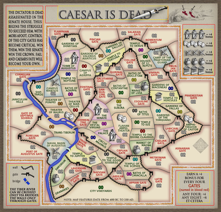
• pamoa earlier today asked if it wouldn't be nice if the names on the map were in Latin. I feel that if I did this the 99.99% of people who couldn't read Latin would be less able to relate to names like "Baths of Caracalla" or "Market of Livia".
• DJ Teflon made a suggestion about one bridge (which I'd not follow - and explain why).
These are the only "outstanding" or "current" issues. Older matters that might be considered unresolved:
• I have struggled to get bridges everyone likes. The most recent bridges (from one version back) were criticized by Flapcake. He says, "the bridges are not an improvement but a decline, it does not look good that they go in the same direction all together, the ones you had before was more authentic and dident look so artificial." But the previous ones were more heavily criticized and those earlier critics have not renewed any complaints, so I assume they're now satisfied.
• on October 7th Gimil posted a diagram showing how he wanted me to expand the legend info to fill rectangles larger than their current boundaries. Victor Sullivan concurred. I feel this is an awful idea and explained why when posting the next version (draft #21) on October 9th. Later on the 9th Gimil restated his objection but I wasn't sure exactly what he was looking for. I worked on the toga guy but didn't respond to Gimil. On the 14th he complained that I'd not addressed his complaint. Later that day AndyDufresne quoted him and asked, "What is your critique about his legend areas exactly? I just want to be clear." I feel this question speaks for me as well. So far Gimil has not responded. On the 18th I posted version #22 with all other issues (beside the one bridge complaint) met. Gimil has still not responded to the request for clarification.
• on October 7th DiM wrote: "i feel like the map has one major flaw. it simply does not do this wonderful city any justice. i've visited rome this year and i've been impressed. it's gorgeous. when i look at your map i honestly can't even tell it's rome. i have to read the terit names to realise it. normally it should scream ancient rome at me. i should be able to recognize it in the first milliseconds." AndyDufresne immediately responded: "you are entitled to your opinion, but I think the overall graphics are fine. I don't feel like every map has to 'scream.'" Later Dim posted: "...the artistic part of a map is largely debatable, for example i think this should scream rome while andy thinks it shouldn't." It seemed he was conceding that it's a matter of taste. On the 8th lostatlimbo seconded DiM's complaint. On the 9th I posted version #21 and in that post replied to the "screaming" issue at length, revieweing and rejecting some possibilities and saying that while I'd love to increase the "Romanness" of the map I need specific suggestions. None have been made.
• Gillipig, just before the most recent version: "Liked it more a couple of updates ago." Lacking more specificity, I can't do much with this suggestion.
In addition to all these, I've learned something technical about army number placement recently that leads me to believe I'll have to change the location of some labels. Hardly anyone will notice the changes if/when made.
I don't know what to do. It seems this map meets the standards of some who've posted here, and they'd like to see it get a graphics stamp and move forward. Others seem to be unhappy with it but I don't know how to make them happy. The forum guidelines say mapmakers should not post simply to bump their threads, so I've refrained from asking twice for specific suggestions or clarifications.
On a personal note, while I appreciate the high standards set for maps, the desire for some sort of consensus, and the good intent of nearly all posters, this process of map refinement is, while rewarding in some ways, quite painful in some others. I believe I take criticism well. I've responded in good faith to every single comment through 22 versions and as a result the map has improved tremendously. That's rewarding. But on the other hand I'm torn between 1) being a drone who simply reacts to each and every comment, 2) being a creative agent with the duty to apply my own standards of taste and common sense, and 3) trying to manage the process (along with the administrators) to move things along. It's a fine line to walk, and the uncertainties make me upset. My patience, which I believe was admirable for a long time, has begun to wear thin. As a result, my motivation has declined. This is my personality; I don't apologize for it but I recognize that it may not be suited for the task at hand. I won't complain if this project is shelved.
That's where things are.
-

Minister X
- Posts: 424
- Joined: Tue Nov 11, 2008 4:45 pm


Re: ROME [3/8/2011] V 22 pg 13
![]() by RedBaron0 on Sat Nov 26, 2011 1:16 am
by RedBaron0 on Sat Nov 26, 2011 1:16 am
While I understand your frustration, there are high standards, and we try to keep them there. It's up to you what you want to do here.
My own personal opinions are that Latin while nifty and cool for this is gonna be confusing in the drop down boxes. Drawing on solutions from the past... (Cirrcus Maximius) all the "U's" are "V's" which gives a 'sense' of Latin, while the names are in English, and readable...
I would agree that the bridges you have are decent, the one at the Carmintine Gate is a little annoying, see if you can't rotate that one just a tad to break the directional complainant.
Gimil does bring up a good point that I agree with, and simply put, your have open space. Space which can be utilized for... Romanness.
You should easily be able to tighten up your texts and gain some space for something.... anything which YOU the artist feel can enhance the Roman flavor of the map which I also agree it seems to be missing.
The Foundry process isn't perfect, I drew the Japan map, got to this very same point with this version:
A lot of people loved it, and it was stickied up for it's last checks. But a few suggestions came through that this version was missing something and should move in an older looking direction. (There was map jizz on the screens of many a Foundry follower when RjBeals posted a quick example. ) But I worked at it and eventually came to this:
This version, of course, was quenched and is tons better, but NOT all that different. Like you said there is a very fine line to walk in the Foundry. It doesn't take much to not be on it... but it can be just as easy to get right back on that line.
My own personal opinions are that Latin while nifty and cool for this is gonna be confusing in the drop down boxes. Drawing on solutions from the past... (Cirrcus Maximius) all the "U's" are "V's" which gives a 'sense' of Latin, while the names are in English, and readable...
I would agree that the bridges you have are decent, the one at the Carmintine Gate is a little annoying, see if you can't rotate that one just a tad to break the directional complainant.
Gimil does bring up a good point that I agree with, and simply put, your have open space. Space which can be utilized for... Romanness.
- Click image to enlarge.
You should easily be able to tighten up your texts and gain some space for something.... anything which YOU the artist feel can enhance the Roman flavor of the map which I also agree it seems to be missing.
The Foundry process isn't perfect, I drew the Japan map, got to this very same point with this version:
- Click image to enlarge.
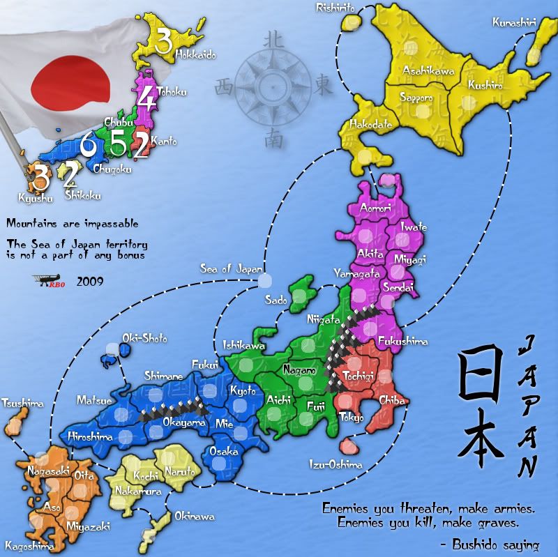
A lot of people loved it, and it was stickied up for it's last checks. But a few suggestions came through that this version was missing something and should move in an older looking direction. (There was map jizz on the screens of many a Foundry follower when RjBeals posted a quick example.
- Click image to enlarge.
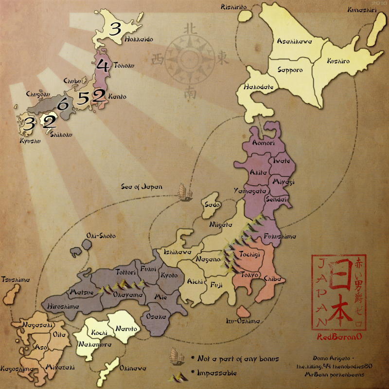
This version, of course, was quenched and is tons better, but NOT all that different. Like you said there is a very fine line to walk in the Foundry. It doesn't take much to not be on it... but it can be just as easy to get right back on that line.
-
RedBaron0
- Posts: 2657
- Joined: Sun Aug 19, 2007 12:59 pm
- Location: Pennsylvania
Re: ROME [3/8/2011] V 22 pg 13
![]() by AndyDufresne on Mon Nov 28, 2011 11:19 am
by AndyDufresne on Mon Nov 28, 2011 11:19 am
Hope to see this map continue. Keep it up, Minister X.
--Andy
--Andy
-

AndyDufresne
- Posts: 24919
- Joined: Fri Mar 03, 2006 8:22 pm
- Location: A Banana Palm in Zihuatanejo


Re: ROME [3/8/2011] V 22 pg 13
![]() by gimil on Mon Nov 28, 2011 5:38 pm
by gimil on Mon Nov 28, 2011 5:38 pm
• on October 7th Gimil posted a diagram showing how he wanted me to expand the legend info to fill rectangles larger than their current boundaries. Victor Sullivan concurred. I feel this is an awful idea and explained why when posting the next version (draft #21) on October 9th. Later on the 9th Gimil restated his objection but I wasn't sure exactly what he was looking for. I worked on the toga guy but didn't respond to Gimil. On the 14th he complained that I'd not addressed his complaint. Later that day AndyDufresne quoted him and asked, "What is your critique about his legend areas exactly? I just want to be clear." I feel this question speaks for me as well. So far Gimil has not responded. On the 18th I posted version #22 with all other issues (beside the one bridge complaint) met. Gimil has still not responded to the request for clarification.
I didn't respond because you were ignoring my follow up comments. I didn't see andys comment and haven't been back in this thread since I felt like I was being ignored. I didn't see the point in coming back into a thread where I was being ignore when I could use my time to comment on other maps where people were going to address my issues...not ignore them.
That said my point still stands. You need to square up that space and centre your content within the space it sits in. Dead space may be desirable is some scenarios but here you have much square space and right angels to have the content sitting off center like you currently do. It is simply unattractive to look at.
What do you know about map making, bitch?
Top Score:2403
natty_dread wrote:I was wrong
Top Score:2403
-

gimil
- Posts: 8599
- Joined: Sat Mar 03, 2007 12:42 pm
- Location: United Kingdom (Scotland)


Re: ROME [3/8/2011] V 22 pg 13
![]() by Minister X on Mon Nov 28, 2011 8:29 pm
by Minister X on Mon Nov 28, 2011 8:29 pm
Draft #23
Two changes:
• bridges all angled just a bit to interrupt unwanted uniformity and assist clarity
• Gimil's criticism hopefully addressed - title plus all four corner texts repositioned - with Gimil's latest post and having re-read the previous ones I think I probably misinterpreted what he wanted. I thought he was calling for the five items to be expanded in size so as to fully occupy edge-to-edge the rectangles he'd drawn; now I think he was simply suggesting that without being enlarged they simply be repositioned so as to be centered within those rectangles. If so, I've accommodated him.


Last edited by Minister X on Sun Dec 04, 2011 11:58 am, edited 1 time in total.
-
Minister X
- Posts: 424
- Joined: Tue Nov 11, 2008 4:45 pm
Re: ROME [3/8/2011] V 23 pg 14
![]() by lostatlimbo on Tue Nov 29, 2011 2:00 am
by lostatlimbo on Tue Nov 29, 2011 2:00 am
I generally like this map, but the toga guy looks poorly photoshop'd. The jaggedy white outline stands out against the drop shadow. Its not as bad on the small, but on the large it is very noticeable.
In addition to cleaning that up, I think you should consider making him grayscale, to match the look of your other bonus icons.
I know the nitpicky stuff can be frustrating, but it really does pay off.
In addition to cleaning that up, I think you should consider making him grayscale, to match the look of your other bonus icons.
I know the nitpicky stuff can be frustrating, but it really does pay off.
-

lostatlimbo
- Posts: 1386
- Joined: Wed Mar 28, 2007 3:56 pm
- Location: Portland, OR


Re: ROME [3/8/2011] V 22 pg 13
![]() by Flapcake on Tue Nov 29, 2011 6:06 am
by Flapcake on Tue Nov 29, 2011 6:06 am
Minister X wrote:
The most recent bridges (from one version back) were criticized by Flapcake. He says, "the bridges are not an improvement but a decline, it does not look good that they go in the same direction all together, the ones you had before was more authentic and dident look so artificial."
Hi Minister, what i ment by decline was, im my personal opinion, that I liked the hand drawn bridges better becourse they looked more natural and not so planted but more well with the connected areas than the current version, I still have that opinion, but after you have rotated some of them in a more natural direction it have helped on the artificial part.
Im still a huge fan of you map

-

Flapcake
- Posts: 756
- Joined: Tue Jan 11, 2011 8:22 am
- Location: beyond the unknown


Re: ROME [3/8/2011] V 23 pg 14
![]() by AndyDufresne on Tue Nov 29, 2011 9:55 am
by AndyDufresne on Tue Nov 29, 2011 9:55 am
lostatlimbo wrote:I generally like this map, but the toga guy looks poorly photoshop'd. The jaggedy white outline stands out against the drop shadow. Its not as bad on the small, but on the large it is very noticeable.
In addition to cleaning that up, I think you should consider making him grayscale, to match the look of your other bonus icons.
I know the nitpicky stuff can be frustrating, but it really does pay off.
I think I preferred the other toga icons from before:
--Andy
-
AndyDufresne
- Posts: 24919
- Joined: Fri Mar 03, 2006 8:22 pm
- Location: A Banana Palm in Zihuatanejo
Re: ROME [3/8/2011] V 23 pg 14
![]() by Minister X on Tue Nov 29, 2011 10:25 am
by Minister X on Tue Nov 29, 2011 10:25 am
lostatlimbo wrote:...the toga guy looks poorly photoshop'd. The jaggedy white outline stands out against the drop shadow. ...consider making him grayscale.
AndyDufresne wrote:I think I preferred the other toga icons from before:
We had a vote to replace the guy Andy prefers because so many folks disliked him. Now let's vote (or at least get an opinion or two) on this choice:

Flapcake wrote:...I liked the hand drawn bridges better becourse they looked more natural and not so planted but more well with the connected areas than the current version, I still have that opinion, but after you have rotated some of them in a more natural direction it have helped on the artificial part.
I'm glad you see the rotations as an improvement. I'm going to take your comment as permission to proceed without further changes - let me know if that's not right.
-
Minister X
- Posts: 424
- Joined: Tue Nov 11, 2008 4:45 pm
Re: ROME [3/8/2011] V 23 pg 14
![]() by RedBaron0 on Tue Nov 29, 2011 12:28 pm
by RedBaron0 on Tue Nov 29, 2011 12:28 pm
grey scale for sure, but I also wouldn't be apposed to coloring the toga while the the rest is still grey scale. Perhaps a nice blood red?
-
RedBaron0
- Posts: 2657
- Joined: Sun Aug 19, 2007 12:59 pm
- Location: Pennsylvania
Re: ROME [3/8/2011] V 23 pg 14
![]() by Flapcake on Tue Nov 29, 2011 12:58 pm
by Flapcake on Tue Nov 29, 2011 12:58 pm
Minister X wrote:I'm glad you see the rotations as an improvement. I'm going to take your comment as permission to proceed without further changes - let me know if that's not right.
Hi Minister, It was only my personal opinion, and I dont realy think im in possition to give any one or anything permission, ther have obvious not been ohters that shared my view, so get on with it, me wanna play your map
Last edited by Flapcake on Wed Nov 30, 2011 3:58 am, edited 1 time in total.
-
Flapcake
- Posts: 756
- Joined: Tue Jan 11, 2011 8:22 am
- Location: beyond the unknown
Re: ROME [3/8/2011] V 23 pg 14
![]() by lostatlimbo on Tue Nov 29, 2011 3:02 pm
by lostatlimbo on Tue Nov 29, 2011 3:02 pm
Minister X wrote:We had a vote to replace the guy Andy prefers because so many folks disliked him. Now let's vote (or at least get an opinion or two) on this choice:
Yeah, grayscale for sure, though I think you could lighten him just a tad so the arms/head aren't so dark.
-
lostatlimbo
- Posts: 1386
- Joined: Wed Mar 28, 2007 3:56 pm
- Location: Portland, OR
Re: ROME [3/8/2011] V 23 pg 14
![]() by Minister X on Fri Dec 02, 2011 12:07 pm
by Minister X on Fri Dec 02, 2011 12:07 pm
I'll replace the senator with a monochrome version (slightly lighter than as shown) but that one change is hardly enough to justify a whole new draft. ANYTHING ELSE?
-
Minister X
- Posts: 424
- Joined: Tue Nov 11, 2008 4:45 pm
Re: ROME [3/8/2011] V 23 pg 14
![]() by RedBaron0 on Sat Dec 03, 2011 1:04 am
by RedBaron0 on Sat Dec 03, 2011 1:04 am
There is still the issue of the extra spaces in and around the legend. And something added artistically for greater Roman flavor.
-
RedBaron0
- Posts: 2657
- Joined: Sun Aug 19, 2007 12:59 pm
- Location: Pennsylvania
Re: ROME [3/8/2011] V 23 pg 14
![]() by Minister X on Sat Dec 03, 2011 11:49 am
by Minister X on Sat Dec 03, 2011 11:49 am
RedBaron0 wrote:There is still the issue of the extra spaces in and around the legend. And something added artistically for greater Roman flavor.
I don't think there are "extra spaces" and I can't think of any way to increase Roman flavor except to change the title to "Rome: Civil War" so the word "Rome" is more prominent. That name change, however, would mean loss of the gladius, loss of the cool dead guy, and a re-write of the upper left blurb. I'm unwilling to do this unless a lot of people express the opinion that it would be an improvement.
-
Minister X
- Posts: 424
- Joined: Tue Nov 11, 2008 4:45 pm
Re: ROME [3/8/2011] V 23 pg 14
![]() by Minister X on Sat Dec 03, 2011 12:02 pm
by Minister X on Sat Dec 03, 2011 12:02 pm
It's not that I'm not trying. I just tried this:

But I don't like it.
But I don't like it.
-
Minister X
- Posts: 424
- Joined: Tue Nov 11, 2008 4:45 pm
Re: ROME [3/8/2011] V 23 pg 14
![]() by Flapcake on Sat Dec 03, 2011 12:43 pm
by Flapcake on Sat Dec 03, 2011 12:43 pm
Minister X wrote:It's not that I'm not trying. I just tried this:
But I don't like it.
I agree, but how ever in ancient Rome the Laurel wreath were symbols of martial victory, crowning a successful commander during his triumph, so it do fits as a theme object, I just cant see where it should be placed

I also support your unwillingness about change the title, I like as it is now
-
Flapcake
- Posts: 756
- Joined: Tue Jan 11, 2011 8:22 am
- Location: beyond the unknown
Re: ROME [3/8/2011] V 23 pg 14
![]() by cairnswk on Sat Dec 03, 2011 2:16 pm
by cairnswk on Sat Dec 03, 2011 2:16 pm
is it possible to have the title as Rome: Civil War (or 44BC) with your current title as a subtitle, that way you don't lose anything.
Also your thread title is simply ROME, and perhaps that needs to change to identify more with the map and leave open the option for others to do a current Rome map as capital of Italy.
I like the laurel effect, but i think it needs a drop shadow similar to your other icons.
Also your thread title is simply ROME, and perhaps that needs to change to identify more with the map and leave open the option for others to do a current Rome map as capital of Italy.
I like the laurel effect, but i think it needs a drop shadow similar to your other icons.

* Pearl Harbour * Waterloo * Forbidden City * Jamaica * Pot Mosbi
-

cairnswk
- Posts: 11510
- Joined: Sat Feb 03, 2007 8:32 pm
- Location: Australia


Re: ROME [3/8/2011] V 23 pg 14
![]() by lostatlimbo on Sat Dec 03, 2011 4:11 pm
by lostatlimbo on Sat Dec 03, 2011 4:11 pm
Minister X wrote:I'll replace the senator with a monochrome version (slightly lighter than as shown) but that one change is hardly enough to justify a whole new draft. ANYTHING ELSE?
I do, but they are mostly nitpicky and you don't seem to like those comments. :)
However, I think your map is close enough where you need to start addressing the little details so people can see the finished product as a whole. Its a frustrating process, but it will get this where it needs to go.
Whether or not you change the title, I think it needs a drop shadow. It looks weird to have it on the gladius, but not the title it goes through.
Why would changing the title result in a loss of the gladius? You could easily flip it around and put it through the O in Rome.
I personally don't mind the title, though I think it would be better in Latin. (Something like Caesaris mortem). I think any title you choose would be better in Latin, as it would give you more of that 'Roman flavor'. (If you can't find the Latin translation online, I might be able to help).
I also didn't mind the laurel in the corner. Its a little strong, but just tone down the opacity on it or add a textured effect and it might fit just fine.
My main nitpick now is that your font looks a little jaggedy on the small version. Make sure you are resizing the font to the nearest whole number when you are sizing down the large version.
Lastly, I still don't understand why you need color coded bonuses when you have the icons, but that's just my opinion. :)
-
lostatlimbo
- Posts: 1386
- Joined: Wed Mar 28, 2007 3:56 pm
- Location: Portland, OR
Re: ROME [3/8/2011] V 23 pg 14
![]() by Minister X on Sun Dec 04, 2011 12:08 pm
by Minister X on Sun Dec 04, 2011 12:08 pm
lostatlimbo wrote:I do, but they are mostly nitpicky and you don't seem to like those comments.
Smilie noted, but to quote myself from page 12:
Minister X wrote:It's time to get REALLY picky about small adjustments like moving an army number one pixel's-worth one way or another. I am honestly looking forward to seeing how detail-oriented y'all can get.
Regarding the jaggies you see on the reduced fonts: I see some degradation of quality moving from the full to the small map, but nothing I'd call jaggies. But I wear glasses and have to squint - so I'll trust your eyes. I've adjusted the fonts on the small map from 8.68 points to an even 9, as you suggested. You'll have to tell me if you see an improvement. I know a little bit about font technology and I don't believe using even point sizes should make any difference at all, but I could well be wrong. In any case, the increase in size is easily managed.
Regarding the drop shadow on the Gladius and title: I see your point. The problem is that the title, using the incised font, is intended to simulate the letters carved in stone, and such things can't have drop shadows. Nevertheless, I applied a drop shadow just to see what it would look like. It's awful. Solution: remove the drop shadow from behind the gladius. In some ways this looks worse than before, in some ways better. I kind of like it; it's stark but the gladius stands out more. We can easily overdo it with drop shadows.
Regarding the color-coded bonuses: you may have forgotten or you may have missed it, but there was a somewhat protracted discussion of how much color should be in the map. Some wanted more; some less. The compromise solution was to have some color in the terts but not under the legend. What you're in essence asking is that we reopen that debate. I'd really rather just live with the result of the previous one, which until your post above seemed to be acceptable as a compromise to everyone.
Regarding using Latin for the title: according to Google Translate, it would be "Caesar Mortuus Est". I'm more concerned by the question of whether the increase in "Roman flavor" would outweigh the fact 1) that only one in forty CC players would know what it means (though more than that could make a good guess), and 2) it would be harder to remember. "Mortuus" is a very awkward word. Because there are more letters than in "Caesar Is Dead" the font must be reduced, which isn't fatal but isn't great. I've placed the gladius where I think it makes the most sense, but it is somewhat distracting there (though still pretty cool). I just don't know. I've made the changes but I consider them temporary and I'd like to hear from as many voices as possible: is this better or worse?
Cairnswk asked, "is it possible to have the title as Rome: Civil War (or 44BC) with your current title as a subtitle, that way you don't lose anything." First for 44BC: the map contains many landmarks built long after 44BC. I couldn't pick one date where Rome actually contained every one of these landmarks. Thus the note at the bottom of the map that says, "Map features date from 400BC to 330AD". Next, as to title plus subtitle: I just think it would be too crowded and confusing; the simpler the better. Let's see what people think of the Latin title.
- Click image to enlarge.

- Click image to enlarge.

-
Minister X
- Posts: 424
- Joined: Tue Nov 11, 2008 4:45 pm
Re: Caesar Mortuus Est [3/8/2011] V 24 pg 15
![]() by RedBaron0 on Mon Dec 05, 2011 1:25 am
by RedBaron0 on Mon Dec 05, 2011 1:25 am
The wreath.... eh was something, but I agree was out of place.
Perhaps a Roman coin?

Or how about a Roman Standard?

Perhaps a Roman coin?
Or how about a Roman Standard?
-
RedBaron0
- Posts: 2657
- Joined: Sun Aug 19, 2007 12:59 pm
- Location: Pennsylvania
Who is online
Users browsing this forum: No registered users
|
|||||||
| Conquer Club is not associated with RISK online in any way. Copyright © 2006-2024 by Big Wham LLC | |||||||