Conquer Club

[Abandoned] - Portugal Gfx Revamp

Abandoned and Vacationed maps. The final resting place, unless you recycle.

Moderator: Cartographers

Forum rules
Please read the Community Guidelines before posting.

Re: Portugal [REVAMP] v3, P.1&3

Postby DiM on Sun Sep 25, 2011 9:14 pm

thehippo8 wrote:Just to throw another idea into the orientation question - why not consider something with perspective and the curvature of the earth like Canada?


because portugal is a tiny little country compared to canada and the earth curvature would be almost undetectable at that scale.
“In the beginning God said, the four-dimensional divergence of an antisymmetric, second rank tensor equals zero, and there was light, and it was good. And on the seventh day he rested.”- Michio Kaku
User avatar
Major DiM
 
Posts: 10415
Joined: Wed Feb 14, 2007 6:20 pm
Location: making maps for scooby snacks

Re: Portugal [REVAMP] v3, P.1&3

Postby thehippo8 on Mon Sep 26, 2011 1:09 am

DiM wrote:
thehippo8 wrote:Just to throw another idea into the orientation question - why not consider something with perspective and the curvature of the earth like Canada?


because portugal is a tiny little country compared to canada and the earth curvature would be almost undetectable at that scale.


Ah, silly me - of course - maybe it already is in perspective ... lol.
User avatar
Corporal 1st Class thehippo8
 
Posts: 1025
Joined: Fri Feb 19, 2010 5:32 pm

Re: Portugal [REVAMP] v3, P.1&3

Postby RedBaron0 on Mon Sep 26, 2011 1:32 am

I like the idea, Portugal is good the way it is, but this is a nice, crisp, replacement.

A few of the territory names placements are bothering me, and I'm not sure the white outline works with the text. Alentro Sul (placement) Mirando do Douro (outline) Setabal (placement) These ones stand out most to me, anything else is very very minor along those lines. Could end up being a bit the font or the background or the color of the outline, etc. so tinkering with what works might cause an across the board change to the text.
ImageImage
User avatar
Sergeant 1st Class RedBaron0
 
Posts: 2657
Joined: Sun Aug 19, 2007 12:59 pm
Location: Pennsylvania

Re: Portugal [REVAMP] v3, P.1&3

Postby gimil on Mon Sep 26, 2011 5:37 pm

Thanks for all the recent input guys. I have put alot of thought into the orientation issue and with such split opinion, my gut is telling me to maintain the map orientation. Since my aim to maintain as much similarity to the old map as possible (while freshening it up).

I think that maps of real places should be correctly or closely oriented to their actual orientation. Part of the fun on CC is learning about places I've never been and to find out that Portugal is not at a large angle has upset me. While the original and revamp look good it would be completely impossible to get a map of the USA or ENGLAND through the foundry at a 45* angle unless that was part of the gameplay twist.


CC maps should never be used as tools to learn geography. The primary concern of it make them work graphical and gameplay wise, many many or out geographic map are inaccurate in order to priorities gameplay/graphics.

n.n. posted a large list of feedback which I greatly appreciate. But I shall get back to that tomorrow. It is to large to fully digest after what I put myself through this (long) weekend ;). A few people have mentioned issues they have with territories names position/aesthetics. I shall give them a general overhaul and take it from there.
What do you know about map making, bitch?

natty_dread wrote:I was wrong


Top Score:2403
User avatar
Corporal 1st Class gimil
 
Posts: 8599
Joined: Sat Mar 03, 2007 12:42 pm
Location: United Kingdom (Scotland)

Re: Portugal [REVAMP] v3, P.1&3

Postby ManBungalow on Sat Oct 01, 2011 4:45 pm

I support you, Gimil.

However, impassables.
Image
Colonel ManBungalow
 
Posts: 3431
Joined: Sun Jan 13, 2008 7:02 am
Location: On a giant rock orbiting a star somewhere

Re: Portugal [REVAMP] v3, P.1&3

Postby gimil on Fri Oct 07, 2011 4:55 pm

Been rather busy as of late. Now I have a little free time I will try and get an update for this done tomorrow. Just a friendly reminder to everyone that I haven't disappeared.


Cheers,
gimil
What do you know about map making, bitch?

natty_dread wrote:I was wrong


Top Score:2403
User avatar
Corporal 1st Class gimil
 
Posts: 8599
Joined: Sat Mar 03, 2007 12:42 pm
Location: United Kingdom (Scotland)

Re: Portugal [REVAMP] v3, P.1&3

Postby gimil on Sat Oct 08, 2011 6:24 am

Made a few little changes just to get an update out. After the latest discussions I have alot to think about for a more major update.

Click image to enlarge.
image


TODO/Areas for discussion:
-Add impassables.
-Add a neutral to one of the Algarve terrs (is this 100% a good idea?).
-Perhaps add a compass to aid in orientation.
-Custom shape around islands continent.
-New island attack routes.
-Rework territory names again. Make them strong with no outline. And fix positioning of all.
-Add 88 coordinates.

Changes:
-Added bevel to the continents, continent names and title.
-Lightened ILHAS to avoid colour blind issue between it and LITORAL.
-Added watermarks to dead land.
-Change the minimap border.
What do you know about map making, bitch?

natty_dread wrote:I was wrong


Top Score:2403
User avatar
Corporal 1st Class gimil
 
Posts: 8599
Joined: Sat Mar 03, 2007 12:42 pm
Location: United Kingdom (Scotland)

Re: Portugal [REVAMP] v4, P.1&5

Postby koontz1973 on Sat Oct 08, 2011 10:27 am

-Add a neutral to one of the Algarve terrs (is this 100% a good idea?).

Please no. Let the drop do it for you.
-Perhaps add a compass to aid in orientation.

Maybe if you find a nice one.

Nice update. You have been working hard. I love the new background, title, mini map. Just about everything you have done so far. =D>
Image
User avatar
Lieutenant koontz1973
 
Posts: 6960
Joined: Thu Jan 01, 2009 10:57 am

Re: Portugal [REVAMP] v3, P.1&3

Postby gimil on Mon Oct 10, 2011 3:39 pm

Click image to enlarge.
image


TODO/Areas for discussion:
-Add impassables.
-Perhaps add a compass to aid in orientation.
-Custom shape around islands continent.
-New island attack routes.

Changes:
-Tweek all territory names
-Added 88 to all terrs
What do you know about map making, bitch?

natty_dread wrote:I was wrong


Top Score:2403
User avatar
Corporal 1st Class gimil
 
Posts: 8599
Joined: Sat Mar 03, 2007 12:42 pm
Location: United Kingdom (Scotland)

Re: Portugal [REVAMP] v5, P.1&5

Postby Victor Sullivan on Tue Oct 11, 2011 5:11 am

Looking better and better! I like the idea of a compass. And make sure the minimap has that same bevel effect and whatnot as the mainland. Still not convinced that title font is a good choice... :-k

-Sully
User avatar
Corporal Victor Sullivan
 
Posts: 6010
Joined: Mon Feb 08, 2010 8:17 pm
Location: Columbus, OH

Re: Portugal [REVAMP] v5, P.1&5

Postby gimil on Tue Oct 11, 2011 8:09 am

Victor Sullivan wrote:Looking better and better! I like the idea of a compass. And make sure the minimap has that same bevel effect and whatnot as the mainland. Still not convinced that title font is a good choice... :-k

-Sully


Thanks Sully,

I forgot to update the mini map so it is consistent with the main land, thank for pointing it out. I plan on adding a compass, just haven't decided how it should look.

What dont you like about the title text, I really like it and will be resistant to changing it unless there was a good reason.
What do you know about map making, bitch?

natty_dread wrote:I was wrong


Top Score:2403
User avatar
Corporal 1st Class gimil
 
Posts: 8599
Joined: Sat Mar 03, 2007 12:42 pm
Location: United Kingdom (Scotland)

Re: Portugal [REVAMP] v5, P.1&5

Postby natty dread on Tue Oct 11, 2011 8:51 am

I also dislike the title font. It looks too comicsans-y.
Image
User avatar
Sergeant 1st Class natty dread
 
Posts: 12877
Joined: Fri Feb 08, 2008 8:58 pm
Location: just plain fucked

Re: Portugal [REVAMP] v5, P.1&5

Postby ManBungalow on Tue Oct 11, 2011 12:28 pm

The watermark emblem is visible through the red bonus region.
Image
Colonel ManBungalow
 
Posts: 3431
Joined: Sun Jan 13, 2008 7:02 am
Location: On a giant rock orbiting a star somewhere

Re: Portugal [REVAMP] v5, P.1&5

Postby gimil on Tue Oct 11, 2011 12:34 pm

natty_dread wrote:I also dislike the title font. It looks too comicsans-y.


Well what would you suggest?
What do you know about map making, bitch?

natty_dread wrote:I was wrong


Top Score:2403
User avatar
Corporal 1st Class gimil
 
Posts: 8599
Joined: Sat Mar 03, 2007 12:42 pm
Location: United Kingdom (Scotland)

Re: Portugal [REVAMP] v5, P.1&5

Postby gimil on Tue Oct 11, 2011 12:34 pm

ManBungalow wrote:The watermark emblem is visible through the red bonus region.


Ah, good catch. Will sort that for the next update.
What do you know about map making, bitch?

natty_dread wrote:I was wrong


Top Score:2403
User avatar
Corporal 1st Class gimil
 
Posts: 8599
Joined: Sat Mar 03, 2007 12:42 pm
Location: United Kingdom (Scotland)

Re: Portugal [REVAMP] v5, P.1&5

Postby The Bison King on Tue Oct 11, 2011 7:17 pm

Maybe I'm missing something... I don't understand how this has a gameplay stamp when there is nothing connecting the island territories...?
Image

Hi, my name is the Bison King, and I am COMPLETELY aware of DaFont!
User avatar
Sergeant The Bison King
 
Posts: 1957
Joined: Thu Aug 27, 2009 5:06 pm
Location: the Mid-Westeros

Re: Portugal [REVAMP] v5, P.1&5

Postby DiM on Tue Oct 11, 2011 7:30 pm

The Bison King wrote:Maybe I'm missing something... I don't understand how this has a gameplay stamp when there is nothing connecting the island territories...?


all revamps start with the draft stamp and the gameplay stamp because only the graphics and the xml will change.
even if the lines aren't present in the last update they were in the previous one and they'll surely be in the final form of the map.

shouldn't you know all this stuff since your a CA deputy or something? :-s


anyway even if the lines of the islands are gone you can still see the islands form a continent because all the terit names are colour coded.

and speaking of that, i don't like it at all. i liked V4 better. the colour coded names look messy and are an overkill.
“In the beginning God said, the four-dimensional divergence of an antisymmetric, second rank tensor equals zero, and there was light, and it was good. And on the seventh day he rested.”- Michio Kaku
User avatar
Major DiM
 
Posts: 10415
Joined: Wed Feb 14, 2007 6:20 pm
Location: making maps for scooby snacks

Re: Portugal [REVAMP] v5, P.1&5

Postby Victor Sullivan on Tue Oct 11, 2011 7:50 pm

gimil wrote:
natty_dread wrote:I also dislike the title font. It looks too comicsans-y.


Well what would you suggest?

Something more formal/professional. The current font is far too informal for a clean, crisp, professional-looking map. And, really, there's nothing that screams "Portugal" by any stretch of the imagination.

-Sully
User avatar
Corporal Victor Sullivan
 
Posts: 6010
Joined: Mon Feb 08, 2010 8:17 pm
Location: Columbus, OH

Re: Portugal [REVAMP] v5, P.1&5

Postby natty dread on Wed Oct 12, 2011 6:10 pm

Image
User avatar
Sergeant 1st Class natty dread
 
Posts: 12877
Joined: Fri Feb 08, 2008 8:58 pm
Location: just plain fucked

Re: Portugal [REVAMP] v5, P.1&5

Postby natty dread on Thu Oct 20, 2011 2:41 am

Image
User avatar
Sergeant 1st Class natty dread
 
Posts: 12877
Joined: Fri Feb 08, 2008 8:58 pm
Location: just plain fucked

Re: Portugal [REVAMP] v5, P.1&5

Postby thehippo8 on Thu Oct 20, 2011 3:17 am


I am impressed! I did HUGE research but you found this!
User avatar
Corporal 1st Class thehippo8
 
Posts: 1025
Joined: Fri Feb 19, 2010 5:32 pm

Re: Portugal [REVAMP] v5, P.1&5

Postby natty dread on Fri Oct 21, 2011 5:03 am

Image
User avatar
Sergeant 1st Class natty dread
 
Posts: 12877
Joined: Fri Feb 08, 2008 8:58 pm
Location: just plain fucked

Re: Portugal [REVAMP] v5, P.1&5

Postby thehippo8 on Fri Oct 21, 2011 5:12 pm

User avatar
Corporal 1st Class thehippo8
 
Posts: 1025
Joined: Fri Feb 19, 2010 5:32 pm

Re: Portugal [REVAMP] v5, P.1&5

Postby Flapcake on Sat Oct 22, 2011 8:01 am

User avatar
Private 1st Class Flapcake
 
Posts: 756
Joined: Tue Jan 11, 2011 8:22 am
Location: beyond the unknown

Re: Portugal [REVAMP] v5, P.1&5

Postby Condestável on Fri Nov 25, 2011 11:47 pm

gimil wrote:ImageImage

Hi foundry goers,

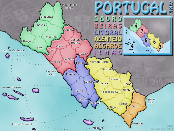
After a rather long map making hiatus. I have finally decided to get back into map making, deciding to REVAMP my very first map PORTUGAL in order to get my photoshopping muscles warmed up again. I decided to maintain the same theme and colouring with the aim of making an overall cleaner and fresher finished product. This is a graphical REVAMP only (with game play remaining unchanged). So without further ado, here is my first draft with a list of possible discussion areas and aspects I am as of yet not satisfied with. Any and all comments, feedback and general whinging is welcome!

Ver. 5
Click image to enlarge.
image


Gimil, are you still going for this revamp?

I could help you. Many names are completely misplaced.

Where you read Viseu, you should read Lamego.
Where you read Ovar, you should read Feira.
Where you read Coimbra, you should read Viseu.
Where you read Figueira da Foz you should read Coimbra.
Covilhã (not Covilha - covilha is a "small grave") is swapped with Castelo Branco.
Where you read Alentejo Norte you should read Portalegre.
Where you read Portalegre you should enlarge a bit a put "Elvas"
It's not EsTERmoz, it's EsTREmoz, but in that place should be "Beja".
Where you have Beja it's precisely Sines.
Where you have Sines is "Ourique"
Where you have Alentejo Sul it's "Mértola"
Where you have Algarve Este, you should have the most important city "Tavira"

The region called Litoral also doesn't exist. We call "Estremadura".

Please, can I help you revamping names and territory shapes?
Lieutenant Condestável
 
Posts: 173
Joined: Thu Feb 03, 2011 12:11 am
Location: Portugal

PreviousNext

Return to Recycling Box

Who is online

Users browsing this forum: No registered users