Re: Alamo map [1/12/13] Pg16
Congrats GH!!
Conquer Club, a free online multiplayer variation of a popular world domination board game.
https://www.conquerclub.com/forum/
https://www.conquerclub.com/forum/viewtopic.php?f=242&t=179700
koontz1973 wrote:Well done GH on your second stamp. Now the hard slog starts with graphics.Lets see an update and we can work from that.

Seamus76 wrote:koontz1973 wrote:Well done GH on your second stamp. Now the hard slog starts with graphics.
Wow.

RedBaron0 wrote:the more you use your gfx program the better, there are plenty of good guides out there too, check youtube out! There is a wide margin for improvement here, but there is potential here!
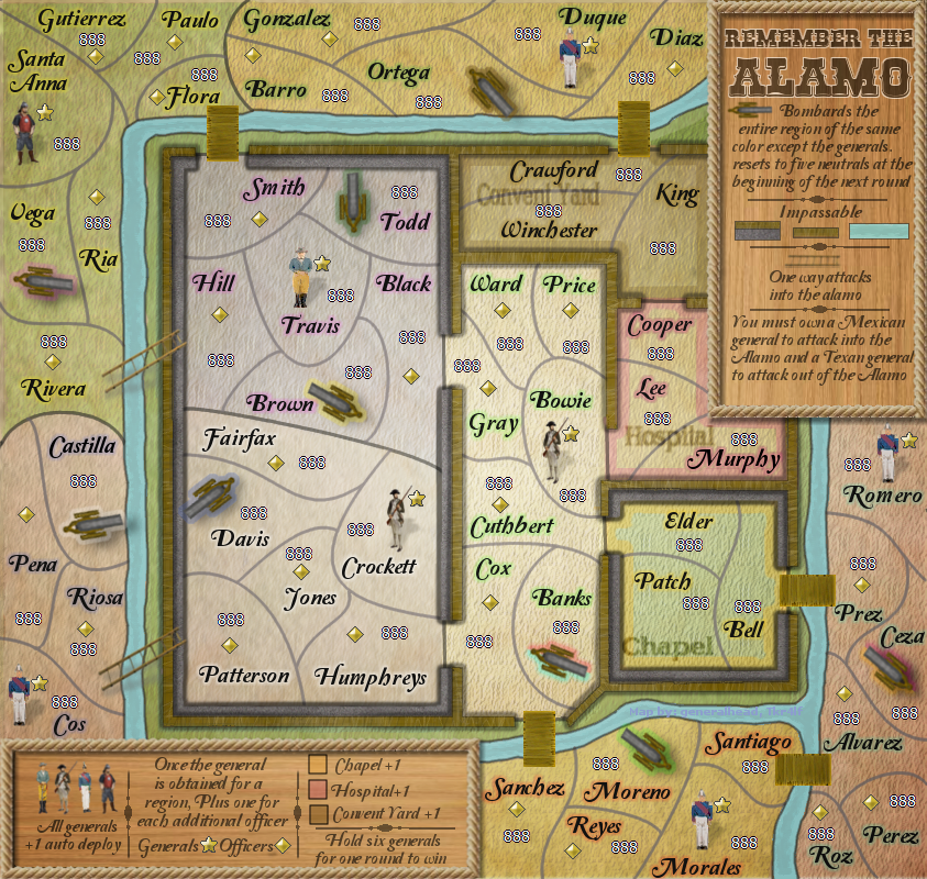
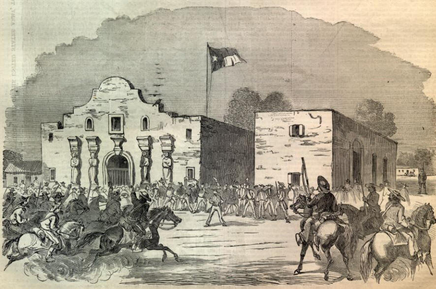
My main gripe for the moment is that this map is really missing any sort of graphical representation of the well known facade of the Alamo:
Zorban wrote:I think the last couple comments on the most recent map were excellent, especially Koontz's. Knowing that it is too big, this might not work, but what about a banner of the image of the Alamo across the top. There is probably a wide, thin one out there that could be across the top. not sure if that would work, but might be worth a try.
Z
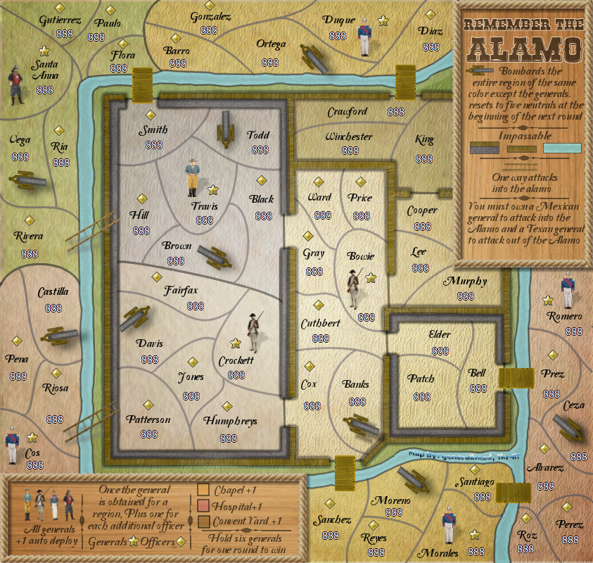
[BigImg][/BigImg]isaiah40 wrote:One minor thing for now, you need to chop off 3px from the width to get the map to 840x800. Right now you are at 843x800. My suggestion is to chop it off the left side. I'll take a closer look at it later.
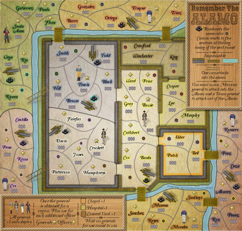
koontz1973 wrote:GH, glows for the regions are OK, but for the names, they are still way to big. Increase selection by 1 and then feather by 5.
I love the cannon balls, you are onto a winner their. Just get the target ones next to the names so players do not have to look for them.