Page 15 of 16
Re: Alamo map 10/30 (pg 24)

Posted:
Fri Nov 01, 2013 5:47 pmby MagnusGreeol
Awesome General, Just throwing this out there, Is it at all possible, and I'd need Your opinion Gen.- If on the bottom of map where the Alamo entrance is, to either side where the instructions are, could be made to look like the wall of the Alamo ,, same whitish color might make the instructions stand out a bit more , So the entire bottom of map would be the wall and Alamo entrance ? I only say this because the instructions get clouded by the darker coloring,, Still like the rope boarder though '') Alot of time spent Gen.- Awesome work and dedication Bro--
Re: Alamo map 10/30 (pg 24)
Posted:
Sat Nov 02, 2013 2:21 amby generalhead
MagnusGreeol wrote:Awesome General, Just throwing this out there, Is it at all possible, and I'd need Your opinion Gen.- If on the bottom of map where the Alamo entrance is, to either side where the instructions are, could be made to look like the wall of the Alamo ,, same whitish color might make the instructions stand out a bit more , So the entire bottom of map would be the wall and Alamo entrance ? I only say this because the instructions get clouded by the darker coloring,, Still like the rope boarder though '') Alot of time spent Gen.- Awesome work and dedication Bro--
Man that is a great idea, you are awesome bro'. I will give it a go to see how it looks.
Re: Alamo map 10/30 (pg 24)
Posted:
Sat Nov 02, 2013 6:17 amby generalhead
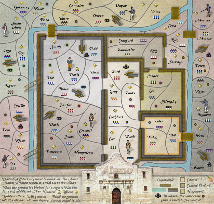
- Click image to enlarge.

Re: Alamo map 10/27 (pg 23)
Posted:
Sat Nov 02, 2013 9:58 amby isaiah40
This still needs to be addressed!
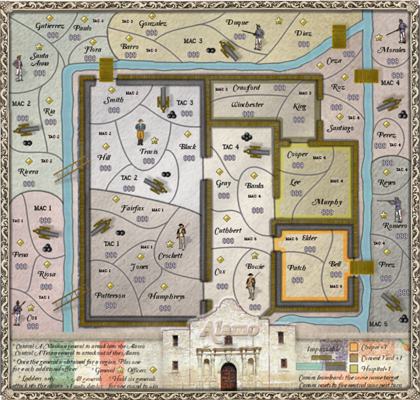
isaiah40 wrote:1. This is more game-play, but Ceza looks like it can also attack Smith. Draw in a border so that it doesn't look like it does.
Re: Alamo map 10/27 (pg 23)
Posted:
Sat Nov 02, 2013 11:21 amby generalhead
isaiah40 wrote:This still needs to be addressed!
isaiah40 wrote:1. This is more game-play, but Ceza looks like it can also attack Smith. Draw in a border so that it doesn't look like it does.
Yes sir, ty
Sorry I dont know how I missed your post the first time. I just went back and read it.
Re: Alamo map 11/2 (pg 24)
Posted:
Sat Nov 02, 2013 6:04 pmby MagnusGreeol
Love it Gen ")
Re: Alamo map 11/2 (pg 24)
Posted:
Wed Nov 06, 2013 12:00 pmby generalhead
fixed the territory border issue.
- Click image to enlarge.
Re: Alamo map 11/2 (pg 24)
Posted:
Thu Nov 07, 2013 12:35 pmby generalhead
Do you think I need to make the characters and/ or the cannons smaller?
Re: Alamo map 11/2 (pg 24)
Posted:
Thu Nov 07, 2013 4:47 pmby isaiah40
generalhead wrote:Do you think I need to make the characters and/ or the cannons smaller?
No they are fine. One thing that is hard to see are the outerglows on the cannonballs, some i can see others I can not. Maybe make the cannonballs colored then it will be easier to see.
The Chapel color in the legend does not match the color on the map, the same with hospital - which is also hard to see on the map itself.
Re: Alamo map 11/2 (pg 24)
Posted:
Thu Nov 07, 2013 5:17 pmby cairnswk
generalhead...can you examine the kerning on the legend instructions font...it seems quite erratic in places i.e. some letters squashed up against others with large spaces in between others.

Re: Alamo map 11/2 (pg 24)
Posted:
Mon Nov 11, 2013 6:15 pmby RedBaron0
isaiah40 wrote:generalhead wrote:Do you think I need to make the characters and/ or the cannons smaller?
No they are fine. One thing that is hard to see are the outerglows on the cannonballs, some i can see others I can not. Maybe make the cannonballs colored then it will be easier to see.
The Chapel color in the legend does not match the color on the map, the same with hospital - which is also hard to see on the map itself.
While I agree about the characters, the canons could be a might bit smaller, they're size makes it look like they could blow a hole in the world let alone a stone wall...
I disagree also with colored canon balls... all puns aside its gonna look pretty bad. I would suggest renaming territories with canons (i.e. Mexican Canon #1; Texan Canon #3, etc.) in them and then placing colored flags with the canon number in it for the targets.
Re: Alamo map 11/2 (pg 24)
Posted:
Mon Nov 11, 2013 7:07 pmby DearCyrus
RedBaron0 wrote:I disagree also with colored canon balls... all puns aside its gonna look pretty bad. I would suggest renaming territories with canons (i.e. Mexican Canon #1; Texan Canon #3, etc.) in them and then placing colored flags with the canon number in it for the targets.
Interesting idea... I like it!
Re: Alamo map 11/2 (pg 24)
Posted:
Tue Nov 12, 2013 9:38 amby generalhead
isaiah40 wrote:The Chapel color in the legend does not match the color on the map, the same with hospital - which is also hard to see on the map itself.
I will look into correcting this.cairnswk wrote:generalhead...can you examine the kerning on the legend instructions font...it seems quite erratic in places i.e. some letters squashed up against others with large spaces in between others.
I will examine the kerning on the font. RedBaron0 wrote:While I agree about the characters, the canons could be a might bit smaller, they're size makes it look like they could blow a hole in the world let alone a stone wall...
I disagree also with colored canon balls... all puns aside its gonna look pretty bad. I would suggest renaming territories with canons (i.e. Mexican Canon #1; Texan Canon #3, etc.) in them and then placing colored flags with the canon number in it for the targets.
If I make the canons smaller though then won't they be not to scale with the character?
It was a good suggestion but I agree with not having the colored canon balls, I don't think that would look good.
I love the idea about renaming the territories with the canons but I don't know how realistic having flags for where the
canons attack at would look. There would also be flags everywhere. Maybe I can number the canon balls?
You can make puns here any time RBO, this is not a pun free zone.
Re: Alamo map 11/2 (pg 24)
Posted:
Tue Nov 12, 2013 10:23 pmby RedBaron0
Well in that case you already have your balls all over the map...


what's the difference between flags and balls? Although it should be ok either way, you just have to figure out if you want a pile of balls, or a single larger ball to fit the numbers on.

Decisions, decisions...
Re: Alamo map 11/2 (pg 24)
Posted:
Sat Nov 16, 2013 4:15 amby generalhead
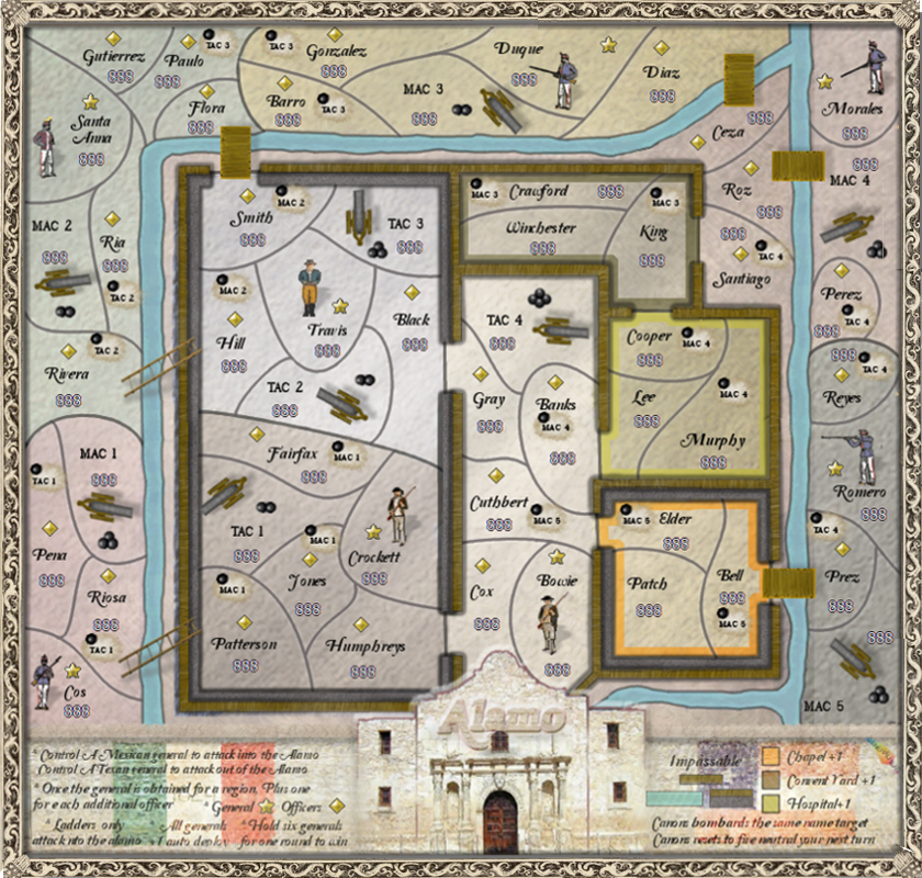
I tried to make the glows for chapel and hospital glows in the legend match better with the map.
I also intensified the opacity of the glows on the map to make them stand out more.
I took the boldness off the letters in the legend. If this doesn't fix the kerning I might have to go with a different font. Let me know
what you think.
I number my balls so I wouldn't lose them.
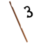
- Click image to enlarge.
The numbers on the balls look a little bland. I think I need to do something different.

Tried muting the numbers a little.
- Click image to enlarge.
Re: Alamo map 11/2 (pg 24)
Posted:
Sun Nov 17, 2013 10:37 amby RedBaron0
You may wanna think about getting your balls off the map entirely... something like a crater, or even a uniform pile of exploding balls for all targets.
Also for clarity I think labeling the canons with their country's owner will go a long way towards preventing confusion. (ie Mexican Canon 1 & Texan Canon 1) Then the corisponding target labels can be "M1 & T1."
Oh and one last asthetic addition that is totally up to you, but I'd say the Lone Star flag oughta be on here somewhere!
Re: Alamo map 11/2 (pg 24)
Posted:
Sun Nov 17, 2013 10:58 amby generalhead
RedBaron0 wrote:You may wanna think about getting your balls off the map entirely... something like a crater, or even a uniform pile of exploding balls for all targets.
Also for clarity I think labeling the canons with their country's owner will go a long way towards preventing confusion. (ie Mexican Canon 1 & Texan Canon 1) Then the corisponding target labels can be "M1 & T1."
Oh and one last asthetic addition that is totally up to you, but I'd say the Lone Star flag oughta be on here somewhere!
Good call RBO
Re: Alamo map 11/2 (pg 24)
Posted:
Sun Nov 17, 2013 9:03 pmby isaiah40
RedBaron0 wrote:Oh and one last asthetic addition that is totally up to you, but I'd say the Lone Star flag oughta be on here somewhere!
If you do this, make sure it is the 1836 flag:

This flag had the Mexican emblem removed and 1824, the year of the Mexican Constitution placed on the flag as a reminder to the Mexican government to adhere to the constitution.
A bit more info.
Re: Alamo map 11/2 (pg 24)
Posted:
Mon Nov 18, 2013 10:04 amby RedBaron0
isaiah40 wrote:RedBaron0 wrote:Oh and one last asthetic addition that is totally up to you, but I'd say the Lone Star flag oughta be on here somewhere!
If you do this, make sure it is the 1836 flag:
This flag had the Mexican emblem removed and 1824, the year of the Mexican Constitution placed on the flag as a reminder to the Mexican government to adhere to the constitution.
A bit more info.
Oh isn't that interesting, but appropriate, they do call this flag, "The Alamo Flag."
Re: Alamo map 11/2 (pg 24)
Posted:
Sun Nov 24, 2013 3:52 pmby generalhead
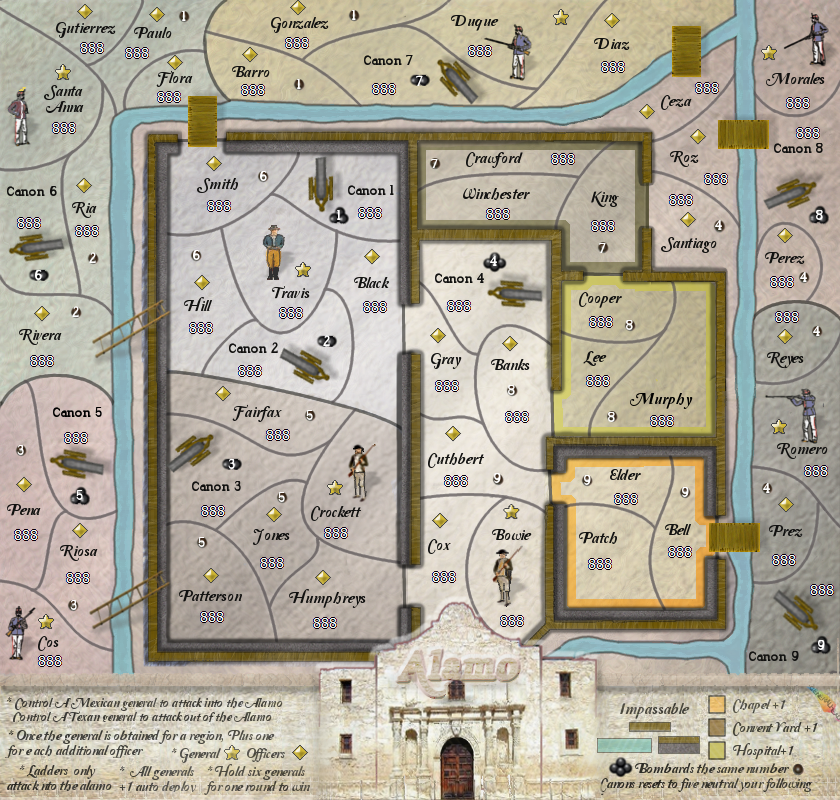
Tried something different with the targets. didn't change too much else. Let me know what you think.
I don't know what happened to my territory border at ceza; I will have to add that back in.
- Click image to enlarge.
I know the border has some hiccups. I will fix if everyone likes it.
Targets are very light and can be fixed if they stay.
Let me know if I should shorten the lettering on the targets.
Re: Alamo map 11/24 (pg 25)
Posted:
Tue Nov 26, 2013 10:51 pmby RedBaron0
I barely noticed the mark you put down for the new targets, I guess your balls still catch my eye first and foremost. :blink: yeah, I said it.

I do honestly think a tinyish explosion is gonna be your best bet here.

Re: Alamo map 11/24 (pg 25)
Posted:
Sat Nov 30, 2013 2:35 amby generalhead
RedBaron0 wrote:I barely noticed the mark you put down for the new targets, I guess your balls still catch my eye first and foremost. :blink: yeah, I said it.
]

I new you would miss the balls on the map.

RedBaron0 wrote:I do honestly think a tinyish explosion is gonna be your best bet here.
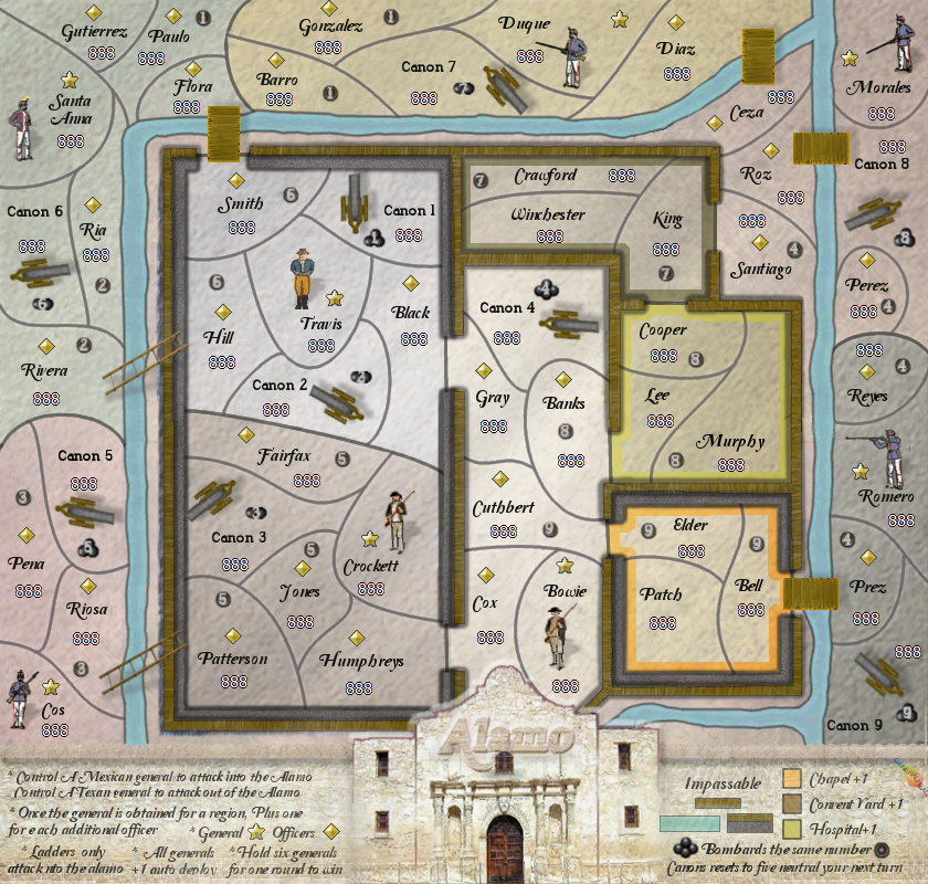
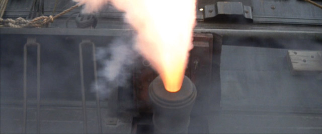
I decided to go with a dirt explosion rather than a fire explosion since a dirt explosion is more realistic.
- Click image to enlarge.
Re: Alamo map 11/30(pg 25)
Posted:
Sat Nov 30, 2013 9:47 amby degaston
A couple of comments:
1. How about adding a blur to the cannon balls to show motion and help direct people's eyes back to the source?
2. The dirt explosions look a little too much like rain clouds.
3. Shouldn't at least some of the cannons be firing?
Re: Alamo map 11/30(pg 25)
Posted:
Sat Nov 30, 2013 12:27 pmby generalhead
degaston wrote:A couple of comments:
1. How about adding a blur to the cannon balls to show motion and help direct people's eyes back to the source?
2. The dirt explosions look a little too much like rain clouds.
3. Shouldn't at least some of the cannons be firing?
Great suggestions, thanks for the input
Re: Alamo map 11/30(pg 25)
Posted:
Sun Dec 01, 2013 1:48 amby koontz1973
GH, this is now looking pretty damn good. A long way from the start and only loks like the final touches need to be done now. So a few from me again.
Your frame is now aligned in a couple of places. It looks like you used a copy and paste job that was too small for the map and needed to improvise.
The Alamo legend, it looks like a layer from the rope is still turned on. It looks like a ghost image on the right.
Alamo title can go smaller (25%) and darker.
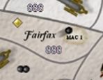
Jones needs to be sorted out. The target does not fit inside the region.
Legend text could be a tad darker.
From Degaston, I like the idea of the smudge giving direction, but the cannon firing, unless this is done really well, would look odd. Leave the clouds as they are though.
Once again, great work GH.