[Abandoned] -The Chako/K'zari War
Moderator: Cartographers
Re: The Chako/K'zari War V.2 Pg.2 Updated 9/7/13
![]() by JamesKer1 on Sat Sep 07, 2013 10:04 pm
by JamesKer1 on Sat Sep 07, 2013 10:04 pm
That looks so much better. I know this isn't needed now since it is only working for draft stamp, but I think red bonus might be overstated? Blue is a whole lot harder to hold than red and it gets less? I understand the Ship affects it... Maybe make over the water beside red, and not count it as part of the bonus? Just my thoughts, might not agree with me. But definitely like the progress!
Join CrossMapAHolics!
A new era of monthly challenges has begun...
Stephan Wayne wrote:Every day is Fool's Day on CC.
A new era of monthly challenges has begun...
-

 JamesKer1
- Posts: 1338
- Joined: Fri Jun 24, 2011 9:47 am
- Location: Good ol' Kentucky


Re: The Chako/K'zari War V.2 Pg.2 Updated 9/7/13
![]() by DearCyrus on Sat Sep 07, 2013 10:28 pm
by DearCyrus on Sat Sep 07, 2013 10:28 pm
Yeah, I was wondering what people would think about the bonus on red. The ship itself can be attacked from 9 different places so they may be about on par as to difficulty to hold, plus more people will likely try to take red for the auto-deploy the ship offers. My thought is that making the bonus higher will force action to funnel towards red. Story wise, who ever starts possessing the ship (which i think I should code player 1?) is representing the K'Zari forces and everyone else are the human tribes. The human players will likely gang up on this starting threat, so a the potential of a high bonus may balance things out. Personally I would like to see this in a beta situation the way it is and see how it plays out! lol
Is there anything else you would like to see changes on?
Is there anything else you would like to see changes on?
-
DearCyrus
- Posts: 183
- Joined: Tue Mar 05, 2013 7:10 pm


Re: The Chako/K'zari War V.2 Pg.2 Updated 9/7/13
![]() by koontz1973 on Sun Sep 08, 2013 5:13 am
by koontz1973 on Sun Sep 08, 2013 5:13 am
Cyrus, moved you to the drafting room for now. A bit of a way to go for the stamp though so will pop back in later today to give you some ideas on how to move this forward.
But one thing you can do though is to put the title onto the map itself.
But one thing you can do though is to put the title onto the map itself.

-

koontz1973
- Posts: 6960
- Joined: Thu Jan 01, 2009 10:57 am


Re: The Chako/K'zari War V.2 Pg.2 Updated 9/7/13
![]() by iAmCaffeine on Mon Sep 09, 2013 9:15 am
by iAmCaffeine on Mon Sep 09, 2013 9:15 am
This looks really good actually. I don't have time to look in depth now, but two things that I noticed straight away:
1. The land looks a lot like a grid-type system with the mountains and whatnot, but underneath Reiden in Chako it looks better. Maybe make it more flexible and not so uniform?
2. Just a little thing.. Using the < > tags in the legend makes me think of html. Can it just be normal?
1. The land looks a lot like a grid-type system with the mountains and whatnot, but underneath Reiden in Chako it looks better. Maybe make it more flexible and not so uniform?
2. Just a little thing.. Using the < > tags in the legend makes me think of html. Can it just be normal?

-

iAmCaffeine
- Posts: 11700
- Joined: Mon Apr 01, 2013 5:38 pm


Re: The Chako/K'zari War V.2 Pg.2 Updated 9/7/13
![]() by DearCyrus on Mon Sep 09, 2013 10:11 am
by DearCyrus on Mon Sep 09, 2013 10:11 am
I actually had it normal and changed it for 2 reasons. 1. It looked REALLY plain... Boring even. 2. The grid type display and text boxes are intended to give the impression of the alien ships console displaying a map of the planet. Having the text bracketed is a way several Comics I read show that what is being read /said is in another language, in this case K'Zari. But I can definitely throw up a version without it and see what everyone thinks.
Thanks for the input!
Thanks for the input!
-
DearCyrus
- Posts: 183
- Joined: Tue Mar 05, 2013 7:10 pm
Re: The Chako/K'zari War V.2 Pg.2 Updated 9/7/13
![]() by iAmCaffeine on Mon Sep 09, 2013 10:19 am
by iAmCaffeine on Mon Sep 09, 2013 10:19 am
I don't see a problem with the grid system, but currently I get the impression it's just bad graphics rather than a scan from a console. Light green lines or similar would make that more apparent. Have a plan around? Maybe even a surrounding border as if the planet is being looked at from some kind of spacecraft. I don't know, just brainstorming.
Ah, I haven't read a comic in a long time but that sounds familiar. You could just make it italic, mix colours up or something? Not a big deal in the end really.
Ah, I haven't read a comic in a long time but that sounds familiar. You could just make it italic, mix colours up or something? Not a big deal in the end really.
-
iAmCaffeine
- Posts: 11700
- Joined: Mon Apr 01, 2013 5:38 pm
Re: The Chako/K'zari War V.2 Pg.2 Updated 9/7/13
![]() by DearCyrus on Mon Sep 09, 2013 12:04 pm
by DearCyrus on Mon Sep 09, 2013 12:04 pm
So a brighter green, then?
-
DearCyrus
- Posts: 183
- Joined: Tue Mar 05, 2013 7:10 pm
Re: The Chako/K'zari War V.2 Pg.2 Updated 9/9/13
![]() by DearCyrus on Mon Sep 09, 2013 10:10 pm
by DearCyrus on Mon Sep 09, 2013 10:10 pm
Here is version 2.1
Changes: Added Map name(top box), brightened the grid lines, added more texture to grid (in ocean and on land), Changed the type of brackets used so as to look less html-y, and changed the blue island text (which I still don't like !)
!)
Personally, I think the grid may need to find some happy medium between the two shades of green... Thoughts?
Changes: Added Map name(top box), brightened the grid lines, added more texture to grid (in ocean and on land), Changed the type of brackets used so as to look less html-y, and changed the blue island text (which I still don't like
Personally, I think the grid may need to find some happy medium between the two shades of green... Thoughts?
-
DearCyrus
- Posts: 183
- Joined: Tue Mar 05, 2013 7:10 pm
Re: The Chako/K'zari War V.2.1 Pg.1/3 Updated 9/9/13
![]() by DearCyrus on Mon Sep 09, 2013 10:33 pm
by DearCyrus on Mon Sep 09, 2013 10:33 pm
-
DearCyrus
- Posts: 183
- Joined: Tue Mar 05, 2013 7:10 pm
Re: The Chako/K'zari War V.2.1 Pg.1/3 Updated 9/9/13
![]() by iAmCaffeine on Tue Sep 10, 2013 8:17 am
by iAmCaffeine on Tue Sep 10, 2013 8:17 am
Hex Grid is definitely better, plus I can still read the map. 
-
iAmCaffeine
- Posts: 11700
- Joined: Mon Apr 01, 2013 5:38 pm
Re: The Chako/K'zari War V.2.1 Pg.1/3 Updated 9/9/13
![]() by Butters1919 on Tue Sep 10, 2013 7:31 pm
by Butters1919 on Tue Sep 10, 2013 7:31 pm
if it's a one or the other, DEFINITELY hex. the square grid almost induced a seizure.
-
Butters1919
- Posts: 974
- Joined: Sun Dec 16, 2007 8:40 am


 2
2 3
3
Re: The Chako/K'zari War V.2.1 Pg.1/3 Updated 9/9/13
![]() by DearCyrus on Tue Sep 10, 2013 8:13 pm
by DearCyrus on Tue Sep 10, 2013 8:13 pm
Lol. How about between hex and version 1?
-
DearCyrus
- Posts: 183
- Joined: Tue Mar 05, 2013 7:10 pm
Re: The Chako/K'zari War V.2.1 Pg.1/3 Updated 9/9/13
![]() by iAmCaffeine on Wed Sep 11, 2013 7:56 am
by iAmCaffeine on Wed Sep 11, 2013 7:56 am
Probably Hex.
-
iAmCaffeine
- Posts: 11700
- Joined: Mon Apr 01, 2013 5:38 pm
Re: The Chako/K'zari War V.3 Pg.1/3 Updated 9/14/13
![]() by DearCyrus on Sun Sep 15, 2013 2:20 pm
by DearCyrus on Sun Sep 15, 2013 2:20 pm
Version 3 is here featuring updated ship graphic and using the hex grid. I think I may want to tone the grid down slightly by decreasing opacity, but I am on the fence about it... I also added some little telepod graphics which I dont know if they add anything to the map, or just make it look cluttered. Thoughts?

-
DearCyrus
- Posts: 183
- Joined: Tue Mar 05, 2013 7:10 pm
Re: The Chako/K'zari War V.3 Pg.1/3 Updated 9/14/13
![]() by koontz1973 on Mon Sep 16, 2013 12:08 pm
by koontz1973 on Mon Sep 16, 2013 12:08 pm
Cyrus, here are some things to think about.
The grid.
Land and sea colours are pretty much OK. It is the ones you have chosen for the hot air balloons, region names and roads. These need to be muted a lot. They are so bright, they give me a headache.
Balloons.
Whilst you have tried to go a different route with the army circles, I would consider removing them completely. They are an over complication that as of now detracts from the rest of the map. These can go back later for refinement.
Sur.
Remove this region as you cannot get the name next to the region.
Name.
Why this name? Why are they at war? All I can see is a crashed ship and it is not in a region of the war. Nothing about the map says war and further more, nothing says chako/karzi war.
That is 5 things. Not much and will pop back later to see the next update.
The grid.
- Neither grid worked as they where. The hex grid is just not going to work for what you want so would be best to just discard this. If you keep the grid system, go back to the square one but change it to something that loks like in the spoiler below.
What you see it the lines of the terrain going round objects and getting closer or further away. This is why neither gird worked. But this is something that needs to be sorted. Personal opinion is that the grid could look fantastic if done right but really bad if done wrong.
Land and sea colours are pretty much OK. It is the ones you have chosen for the hot air balloons, region names and roads. These need to be muted a lot. They are so bright, they give me a headache.
Balloons.
Whilst you have tried to go a different route with the army circles, I would consider removing them completely. They are an over complication that as of now detracts from the rest of the map. These can go back later for refinement.
Sur.
Remove this region as you cannot get the name next to the region.
Name.
Why this name? Why are they at war? All I can see is a crashed ship and it is not in a region of the war. Nothing about the map says war and further more, nothing says chako/karzi war.
That is 5 things. Not much and will pop back later to see the next update.
-
koontz1973
- Posts: 6960
- Joined: Thu Jan 01, 2009 10:57 am
Re: The Chako/K'zari War V.3 Pg.1/3 Updated 9/14/13
![]() by DearCyrus on Wed Sep 18, 2013 7:31 pm
by DearCyrus on Wed Sep 18, 2013 7:31 pm
koontz1973 wrote:Cyrus, here are some things to think about.
The grid.Neither grid worked as they where. The hex grid is just not going to work for what you want so would be best to just discard this. If you keep the grid system, go back to the square one but change it to something that loks like in the spoiler below.
Colours.
What you see it the lines of the terrain going round objects and getting closer or further away. This is why neither gird worked. But this is something that needs to be sorted. Personal opinion is that the grid could look fantastic if done right but really bad if done wrong.
Land and sea colours are pretty much OK. It is the ones you have chosen for the hot air balloons, region names and roads. These need to be muted a lot. They are so bright, they give me a headache.
Balloons.
Whilst you have tried to go a different route with the army circles, I would consider removing them completely. They are an over complication that as of now detracts from the rest of the map. These can go back later for refinement.
Sur.
Remove this region as you cannot get the name next to the region.
Name.
Why this name? Why are they at war? All I can see is a crashed ship and it is not in a region of the war. Nothing about the map says war and further more, nothing says chako/karzi war.That is 5 things. Not much and will pop back later to see the next update.
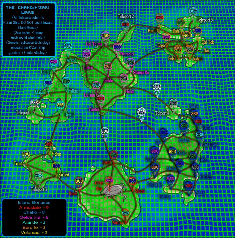
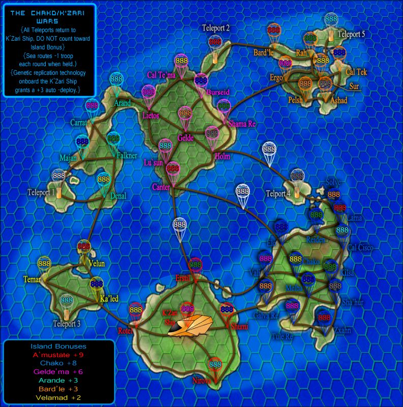
I feel this updated map addresses all of the issues brought up. Grid is no longer an issue and nautical orientation grids can be muted if too distracting. Colors have been muted substantially, changed text to black. The "balloons" have been removed as they are not necessary in this map version. Sur; name fits, it stays.
And the big one.... If I hope to do anything with this map, it is to make something that hasn't existed before, and Man is naming a new thing hard. I have put a lot of thought into the names of my territs and Islands and even my alien race. The back story included in the top post is the birthplace of my map. Indeed, it started with the story. In the original map concept, I meant to show the map how it would appear on a K'Zari warship display, complete with topographic-grids, hologram pop-outs displaying troop info (balloons). All of those features were ultimately space wasting and did not allow for any story elements to be added. I planned use of a GIF to scroll some story in a frame in the corner, but was advised against for speed match's sake. Hopefully changing to the map view of the once peaceful islanders will help show what is going on a bit better.

Version 4
Changes:Major facelift to reflect the Chako view of the map, as posed to the K'Zari's.
added a sea route between Ashad and Solve. I got alot more of the story on to the map, but now need to get Auto deploy and other info back on
-
DearCyrus
- Posts: 183
- Joined: Tue Mar 05, 2013 7:10 pm
Re: The Chako/K'zari War V.4 Pg.1/3 Updated 9/17/13
![]() by koontz1973 on Thu Sep 19, 2013 3:48 am
by koontz1973 on Thu Sep 19, 2013 3:48 am
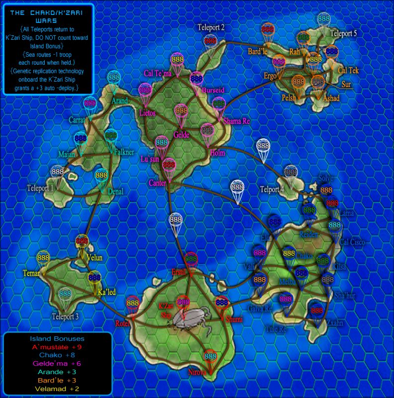
Honestly, much much better. Still along way to go but a huge improvement over the old grid systems. This is a real improvement and could be the basis of a great map.
A few things then extra for now.
Names, give each name a glow of the bonus colour. This will make is easy to see which bonus goes for each region. Then you can lose the island glows. This will improve the borders between green and pink.
List the bonuses from top left to bottom right. Like this.
Something like Invasion Chako, or Operation Chako. But have a think about this before you do it as you will never get eveyone to agree. I spent a week trying to get agreement over the Rorke's Drift maps name. 
Story can go small, bonuses can go larger.
A few things then extra for now.
Names, give each name a glow of the bonus colour. This will make is easy to see which bonus goes for each region. Then you can lose the island glows. This will improve the borders between green and pink.
List the bonuses from top left to bottom right. Like this.
- Arande
Gelde Ma
Bardle
Velamad
Amustrate
Chako
Story can go small, bonuses can go larger.
-
koontz1973
- Posts: 6960
- Joined: Thu Jan 01, 2009 10:57 am
Re: The Chako/K'zari War V.4 Pg.1/3 Updated 9/17/13
![]() by Bruceswar on Thu Sep 19, 2013 5:01 am
by Bruceswar on Thu Sep 19, 2013 5:01 am
looks better... lighten those black lines!
Highest Rank: 26 Highest Score: 3480

-

Bruceswar
- Posts: 9713
- Joined: Sun Dec 23, 2007 12:36 am
- Location: Cow Pastures


Re: The Chako/K'zari War V.4 Pg.1/3 Updated 9/17/13
![]() by iAmCaffeine on Thu Sep 19, 2013 10:06 am
by iAmCaffeine on Thu Sep 19, 2013 10:06 am
This looks a whole lot better.
-
iAmCaffeine
- Posts: 11700
- Joined: Mon Apr 01, 2013 5:38 pm
Re: The Chako/K'zari War V.4 Pg.1/3 Updated 9/17/13
![]() by koontz1973 on Thu Sep 19, 2013 10:40 am
by koontz1973 on Thu Sep 19, 2013 10:40 am
Bruceswar wrote:lighten those black lines!
agreed, but turn the layer of completely for now. They need refining.
-
koontz1973
- Posts: 6960
- Joined: Thu Jan 01, 2009 10:57 am
Re: The Chako/K'zari War V.4 Pg.1/3 Updated 9/17/13
![]() by DearCyrus on Thu Sep 19, 2013 12:13 pm
by DearCyrus on Thu Sep 19, 2013 12:13 pm
Thanks guys!
-
DearCyrus
- Posts: 183
- Joined: Tue Mar 05, 2013 7:10 pm
Re: The Chako/K'zari War V.4 Pg.1/3 Updated 9/17/13
![]() by DearCyrus on Thu Sep 19, 2013 12:17 pm
by DearCyrus on Thu Sep 19, 2013 12:17 pm
koontz1973 wrote:Bruceswar wrote:lighten those black lines!
agreed, but turn the layer of completely for now. They need refining.
Sure, not a problem. However if you can provide an idea of how You feel they should be refined, I can include that in my planned update tonight, rather than duplicating effort...
Thanks!
-
DearCyrus
- Posts: 183
- Joined: Tue Mar 05, 2013 7:10 pm
Re: The Chako/K'zari War V.4 Pg.1/3 Updated 9/17/13
![]() by koontz1973 on Thu Sep 19, 2013 12:38 pm
by koontz1973 on Thu Sep 19, 2013 12:38 pm
You have two choices. Look at Eurasia or Vertex/Austrum. On all three of these maps you will see the lines done slightly different. My two are polar views while natty did his from top to bottom. What all three have are thinner lines that have a far reduced opacity. The line should go over everything and not under land. So thinner lines, reduced opacity, top layer. The best way to do them is to use a 1/2 pixel thickness at max. Copy and paste the line at 90 degree. Then copy and paste the two lines at 45 degrees. Make sure the middle stays as small as possible. If ou feel the need to do more than one, make them at equal spacing around the board. Right now they are just thrown on.
-
koontz1973
- Posts: 6960
- Joined: Thu Jan 01, 2009 10:57 am
Re: The Chako/K'zari War V.4 Pg.1/3 Updated 9/17/13
![]() by DearCyrus on Thu Sep 19, 2013 10:29 pm
by DearCyrus on Thu Sep 19, 2013 10:29 pm
koontz1973 wrote:You have two choices. Look at Eurasia or Vertex/Austrum. On all three of these maps you will see the lines done slightly different. My two are polar views while natty did his from top to bottom. What all three have are thinner lines that have a far reduced opacity. The line should go over everything and not under land.
While I appreciate your thought Koontz, I disagree. All 3 of Your examples have one major difference from the map I am creating, and that is scale. Each example is on a global scale while mine is that of a single island chain. I chose to go with the flat plane model of charting used pre-Mercator.
Examples include this

and this

Often these maps do not have the lines going through the land as they are used for naval charts like what an Island dwelling people would use... Some do however, SO I will include 2 versions in my update for comparison. Use of a sea chart style map comparable to something made in the 1700's also highlights the gap between the Islanders and star-faring aliens.
As far as positioning, I will alter positions to triangulate on each other while intersecting prominent land features.If (Y)ou feel the need to do more than one, make them at equal spacing around the board. Right now they are just thrown on.
Update soon.
-
DearCyrus
- Posts: 183
- Joined: Tue Mar 05, 2013 7:10 pm
Re: The Chako/K'zari War V.4 Pg.1/3 Updated 9/17/13
![]() by koontz1973 on Thu Sep 19, 2013 10:57 pm
by koontz1973 on Thu Sep 19, 2013 10:57 pm
DearCyrus wrote:While I appreciate your thought Koontz, I disagree. All 3 of Your examples have one major difference from the map I am creating, and that is scale. Each example is on a global scale while mine is that of a single island chain. I chose to go with the flat plane model of charting used pre-Mercator.
But nothing about your map suggests this? I thought it was a sci fi map about an lien invasion. The battles all take place on land, so why have you brought in a sea element to the image when
- it is not needed,
- does not fit the theme.
-
koontz1973
- Posts: 6960
- Joined: Thu Jan 01, 2009 10:57 am
Who is online
Users browsing this forum: No registered users
|
|||||||
| Conquer Club is not associated with RISK online in any way. Copyright © 2006-2024 by Big Wham LLC | |||||||