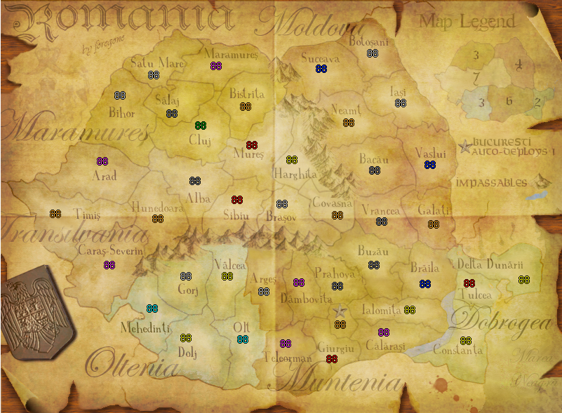
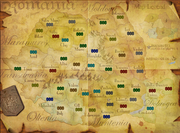
The only detail I can come up with is the "Marea Neagra" text. I don't know cause I haven't read everything, but I guess you wanted it to be kinda faded, even more so because it's close to the worn edge of the map. Right?
It makes it pretty hard to read. If you want it to be of no importance, I'd leave it out. If you want to 'educate' ppl who play the map, I'd make the sea more sea-like and give the text a hint more contrast.


