Hi Isaiah,
I don't have much time to properly respond, but thought I'd give a few first impressions.
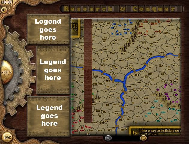
As far as the map area goes, I think it's improved a fair bit. While I liked the theme that TaCKtiX had going and thought it fit a bit better with the steampunk concept, his map area graphics were limited because of it. So great work with that part

For my own preferences, the grey and bronze texture could use some work. I think they appear rather pixelated and while I like the general concept, I think it could use a different texture. The bright purple / pink colour for conscriptions seems really out of place and I think it should be a different colour.
The last major thing I think that needs to be rethought about this design is the size of the map. Even at a pretty decent screen resolution on a wide screen monitor the map runs nearly all the way to the right, making it so that you would need to scroll right just to see the list of players, clock, etc. on the right side of the map. I think the current design of the map doesn't use space very efficiently. It almost looks like you chose the maximum supersize resolution to start and then tried to think of how to fill in the space. I think the previous layout which was used for the labratories which had everything arranged in rows would work better than the dials. The current sections that are arranged like that already could be shrunk down and I think that would clear up some space. It may also be possible to stick one or two of the researches underneath the map, depending on how much space the instructions need. That would help reduce some of the vertical space.
I think that covers it for now. All in all I think it's a really good start to a redesign, it just needs some tweaking and size reduction.
Good job