Page 1 of 3

[Abandoned] - Age of Quests

PostPosted: Wed Oct 01, 2008 11:34 am
by DiM
after calming down and realising i'm too damn addicted to map making i decided to restart this map.

CURRENT VERSION:

V7.
font changed all over the map
changed map name to Age of Quests (temporary until a better alternative is found)

Click image to enlarge.
image


CURRENT DISCUSSION FOCUS
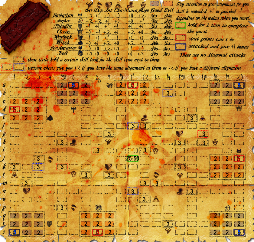
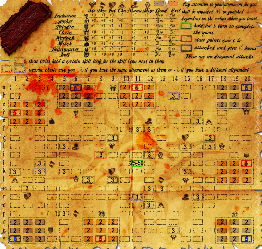
1. placement of skills and treasure chests around the map. as this has a big impact on gameplay i need to make sure all starting locations are balanced and no character has an advantage when it comes to obtaining bonuses. please make sure you check the legend as the skills offer various bonuses depending on character
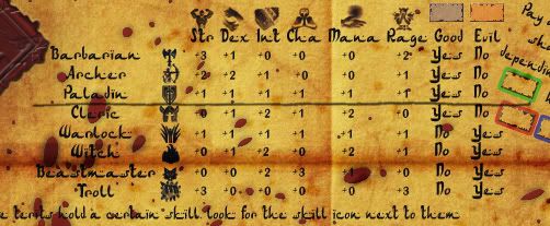
2. visibility. overall the map has perfect visibility of the army numbers. tested it on small and large versions and yes even on the blood splatters the red army numbers are perfectly visible. my main concern on this subject is the font used in the legend. i can read it but i'm not sure others can. so input is needed here. solved?
3. bonuses.
i'm thinking this:
starting location +1 (on hand, this will basically be the terit bonus which is set to a minimum of 1)
each terit of same alignment +1 (on hand)
each terit of different alignment -1 (decay - autodeployed)
treasure chest +/-2 depending on alignment (autodeployed)
skill terits are as seen on the chart in the legend
4. starting neutrals. everything except the starting locations (which will have 5 troops) is neutral and i'm thinking of the following values:
alignment terits (the ones near the starting locations) will have 2 neutrals
skill terits and treasure chests will start with 3 neutrals
all the non important terits will start with 1 to allow smooth movement
the objective will have 25 neutrals as i don't want it to be too high but not too low either
5. name of the map. right now it is Quest of Kylldrotha but i'm open for suggestions
so get talking and give me feedback.


PREVIOUS VERSIONS:

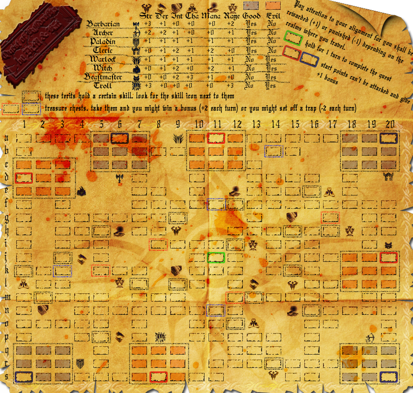
V6.

redid the wax seal
removed the curl in top right corner to make room for text
added explanation that there are no diagonal attacks
changed text on map (except chart numbers)

Click image to enlarge.
image


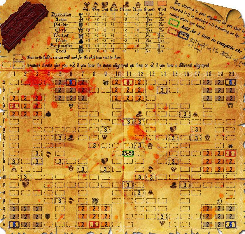
V5.

made the blood stain a tad more red
added various font types please tell me which one you like best.
reworded the treasure chest explanation. hope it's more clear now.
made the map just a bit darker. it should be halfway between V4 and V3
added neutral values and starting locations values. the terits that don't have a number on them have a 1 neutral army. i was too lazy to add so many numbers :P

to do:
fix curl
fix the wax seal (when foregone tells me what's wrong with the broken edges)
decide on font type
decide on a name

http://i178.photobucket.com/albums/w250 ... copy-8.png

V4
made the blood look as a stain to improve visibility and make it more real (used to have the text layer above the blood layer and it wasn't real)
fixed blood coming off the map
added lines in the legend (yes i made them jiggly on purpose)
made the map lighter
made the seal edges broken and added a wax stain where those edges were supposed to be.
changed font all over the place (except for the seal which is waiting for a new name)
fixed letters and stuff going off the map

http://i178.photobucket.com/albums/w250 ... copy-7.png

V3:
completely redid the terits
completely changed the paper background to one that's better for the eye.
removed the ring and replaced it with a wax seal
added a full legend
added icons for skills and characters
placed skills around the map (need thoughts on placement)
added blood
various grunges and stuff
http://i178.photobucket.com/albums/w250 ... copy-6.png


V2:
terit layout
terit naming
starting locations
bla bla
http://i178.photobucket.com/albums/w250 ... copy-2.png

V1:
basic layout
partial legend
various artwork
http://i178.photobucket.com/albums/w250 ... PGcopy.png


ORIGINAL POST:
DiM wrote:i love RPG games. (if you don't know what RPG stands for then google it)
so i was thinking why not combine RPG with CC and get a brand new map with a brand new gameplay?

imagine 8 characters (wizard, barbarian, paladin, archer, warlock, etc) in a fantasy realm going on a quest to find the Holy CC star ( :P )
the beauty part is where the RPG meets Risk.
i have been gone for long and i don't know what is or isn't possible with xml or if any new xml features have been/will be added so bare with me and post your thoughts.

the idea is to get a character and develop it as you would do in any RPG game. to do this you have a HUGE dungeon (have the size limits been increased?) where these characters roam and do quests. i'm thinking somewhere around 400 terits (maybe more) in a grid shape. each charachter will get a beacon (the starting location) and then advance in the maze. the beacons can't be conquered (so you can only win by holding the objective). i need this because each character will have personalized quests. i don't know if it is possible but it's something like this:
quest for warrior: go defeat the Yeti monster and bring it's claws to the Den of Damnation. this actually translates into the xml like this: hold the yeti terit and the Den terit to get the bonus. and to make the quest personalized you also have to hold the warrior beacon. since the beacon can't be taken by other players it means you're the only one that can do that quest. (from what i remember this is possible to be coded in the xml)

now, let's talk about character traits and items. using the beacon holding in the xml other bonuses can also be coded for specific players.
for example a warlock takes a terit in a blessed zone he can get an automatic decay bonus for that terit (because he is an evil character in a good zone) .
or a paladin takes a treasure terit wich gives him a 2 army autodeploy because that terit plus the paladin beacon = "the shield of life"
but if an archer takes that terit it might do nothing because an archer can't equip a shild or even worse an evil character taking that terit gets a negative bonus (alignment incompatibility)
same goes for the traits. let's say you have a terit called dexterity, if an archer takes this terit he gets 2 armies per turn cause he's a dexterity based character. if a paladin takes it he gets just +1 and if a barbarian holds it he gets nothing. that goes for all other traits (intelligence power, etc)

and of course in the middle of the map there's the quest item with lots of neutrals take it hold it and you win.

now most important of all i need to know if what i said is possible to be coded in the xml.
then i need to know your thoughts on the gameplay idea and everything.
i will try to put a graphic mock-up as soon as possible.

i think i must inlcude some info:
number of terits: 261, with 8 starting positions and the rest neutral
gimmicks: objective based map, starting locations, decay, weird bonuses, quests, and other technical mumbo jumbo
Re: RPG Map - second go

PostPosted: Wed Oct 01, 2008 11:51 am
by bryguy
yay! its back!


1) the blood doesnt seem like blood... i dont know why
2) the text on the map is a little hard to read
3) I can read most of the words on the stamp, maybe try lightening it up a little?
4) as far as I can tell it seems like to win you have to capture and hold the green square for 1 turn, but i cant tell, if so, then awesome!
5) i cant read what the fuzzy grey and fuzzy red/blue terits do.
6) its hard to tell what the purpose of the different species and such are for
7) same for good/evil and which are good/evil
8) how do you get the different types of things? (troll, beastmaster, paladin, barbarian, etc.)
9) How do you get the different types of things on top? (str, dex, lut, cha, mana, rage, etc.)


Overall, looks like this will be another great map :D

Re: RPG Map - second go

PostPosted: Wed Oct 01, 2008 11:53 am
by TaCktiX
The stamp in the top left is nigh unreadable, and the lettering at the top is fairly hard to read except on common words.

Is there any tentative neutral setup you could put on the map so that we can comment on gameplay balancing? I'd say a fair portion of this map is gameplay, with the graphics not as much of a worry (aside from the text).

Re: RPG Map - second go

PostPosted: Wed Oct 01, 2008 11:59 am
by Natewolfman
the boxes hurt my eyes lol, I love the idea though, hope this one goes through quickly! my only complaint is that everything is somewhat unreadable

Re: RPG Map - second go

PostPosted: Wed Oct 01, 2008 12:01 pm
by DiM
bryguy wrote:yay! its back!


1) the blood doesnt seem like blood... i dont know why
well i need you to tell me what's wrong with it before i can make any changes

2) the text on the map is a little hard to read
i was affraid of this but the font can be easily changed

3) I can read most of the words on the stamp, maybe try lightening it up a little?
i shall change the stamp to make it better when i find a suitable name

4) as far as I can tell it seems like to win you have to capture and hold the green square for 1 turn, but i cant tell, if so, then awesome!
since starting positions can't be conquered the only way to win is by holding the objective

5) i cant read what the fuzzy grey and fuzzy red/blue terits do.
i shall change the text

6) its hard to tell what the purpose of the different species and such are for
each starting location is a different character and you get different bonuses for each different character

7) same for good/evil and which are good/evil
read 6
8) how do you get the different types of things? (troll, beastmaster, paladin, barbarian, etc.)
read 6
9) How do you get the different types of things on top? (str, dex, lut, cha, mana, rage, etc.)
the skills are terits on the map. conquer that terits and you get the bonus that matches your character.


Overall, looks like this will be another great map :D
i hope so

Re: RPG Map - second go

PostPosted: Wed Oct 01, 2008 12:03 pm
by DiM
TaCktiX wrote:The stamp in the top left is nigh unreadable, and the lettering at the top is fairly hard to read except on common words.

Is there any tentative neutral setup you could put on the map so that we can comment on gameplay balancing? I'd say a fair portion of this map is gameplay, with the graphics not as much of a worry (aside from the text).


stamp will be changed and the font too
indeed the gameplay will be the biggest problem (except for the xml)
i have posted at the top of the page what neutral values i want


Natewolfman wrote:the boxes hurt my eyes lol, I love the idea though, hope this one goes through quickly! my only complaint is that everything is somewhat unreadable


meaning they need to be changed to what? straight lines? make them bolder? make them faded?

Re: RPG Map - second go

PostPosted: Wed Oct 01, 2008 12:13 pm
by InkL0sed
Can you attack diagonally? I don't see anything indicating that, though I could just be missing it.

Re: RPG Map - second go

PostPosted: Wed Oct 01, 2008 12:54 pm
by Neoteny
I think the thing with the blood is that the color is too homogeneous. But I'm no artist, so I don't know how to fix that.

Re: RPG Map - second go

PostPosted: Wed Oct 01, 2008 1:20 pm
by yeti_c
Legibility is gonna be a big problem...

But I know you can work that out.

C.

PS - sorry for not replying properly to PM - been uber busy at work today!

Re: RPG Map - second go

PostPosted: Wed Oct 01, 2008 1:59 pm
by MrBenn
I'm glad to see this one back in the works ;-)

1. Part of me preferred the lighter background of v2, but this one looks heaps better - It might be worth tweaking with the brightness/contrast/saturation/hue a tiny bit... I know it's supposed to be dark and gloomy, but it's just a bit too gloomy for my eyes.

2. You've already acknowledged that the font will probably need to change. Some lines between the rows of the Bonus chart might help make it easier to read... you could use a page-fold, or a pencil-line, or something else... here's my 5-min example (with a slightly tweaked background as per #1 above):Image

3. It took me a while to figure out which territory the Strength bonuses (for example) were connected to... Is there any way of making this clearer at all?

4. I know you explained the values of neutrals, but a visual representation of them would help massively... To get my head round it I'll probably print a copy off and go through it away from the VDU... having the values pre-completed would save me some bother ;-)

5. A few minor graphical glitches - a) there is a rip beneath the letter 'r' on the grid, which makes the 'r' appear to float. b) The same thing happens with some of the borders on the map along the bottom row. c) There is a splatter that looks like it's fallen in the middle of a rip along the bottom edge that looks out of place. d) The wax seal looks good (and I know you'll make it legible), but the edges of the wax clearly go off the edges of the map... surely even ancient admin clerks wouldn't have made an error like that :P

6. Title ideas... I prefer the word 'Quest' on it's own, but can't think of anything catchy... Age of Quests?

That's about all I can manage for now - in any case I need to go and set the video ;-)
As I said already, it's good to see you (and the map) back in action.

Re: RPG Map - second go

PostPosted: Wed Oct 01, 2008 5:07 pm
by bbqpenguin
how cool would it be if we could exclusively get 20 sided dice rollable for this map? sure it'd horribly skew gameplay, but i think that would be overcome by the increaced coolness factor...
honestly, though, i think a d20 belongs near an edge, weighing a corner down or something
also, where's the thief/sneak/rogue?
i think a coffee stain would add a bit of realism and humor, as well as compliment the blood nicely
i can't read what's on the red panel in upper left panel
for that matter, i have a pretty hard time reading the entire thing, especially in the middle where it overlaps the bloodstain
the numbers don't fit the theme, are too modern when compared to letters
on the map, are the icons for the class/races and ability/attribute things territories, or labels?


finally, i don't appreciate you stereotyping trolls as 'evil' i once played a troll that was raised by dryads in the forest from birth and was chaotic good, and stereotypers like you are the reason troll-kind is still stuck in the predicament it's in. stop trying to keep the green man down, whitey! :P

more to come later

Re: RPG Map - second go

PostPosted: Thu Oct 02, 2008 8:31 am
by DiM
InkL0sed wrote:Can you attack diagonally? I don't see anything indicating that, though I could just be missing it.


no you can't. i simply forgot to mention it in the legend. i'll put this in the next update.

Neoteny wrote:I think the thing with the blood is that the color is too homogeneous. But I'm no artist, so I don't know how to fix that.


you're right. i shall try to tweak the colour of the blood and add various shades and tones. it could be tricky as i chose a colour that makes even red armies visible so i have to make sure not to spoil that.

yeti_c wrote:Legibility is gonna be a big problem...

But I know you can work that out.

C.

PS - sorry for not replying properly to PM - been uber busy at work today!


legibility of the whole map or just the legend? as i said armies are perfectly visible right now.

Re: RPG Map - second go

PostPosted: Thu Oct 02, 2008 8:42 am
by DiM
MrBenn wrote:I'm glad to see this one back in the works ;-)

1. Part of me preferred the lighter background of v2, but this one looks heaps better - It might be worth tweaking with the brightness/contrast/saturation/hue a tiny bit... I know it's supposed to be dark and gloomy, but it's just a bit too gloomy for my eyes.

2. You've already acknowledged that the font will probably need to change. Some lines between the rows of the Bonus chart might help make it easier to read... you could use a page-fold, or a pencil-line, or something else... here's my 5-min example (with a slightly tweaked background as per #1 above):Image

3. It took me a while to figure out which territory the Strength bonuses (for example) were connected to... Is there any way of making this clearer at all?

4. I know you explained the values of neutrals, but a visual representation of them would help massively... To get my head round it I'll probably print a copy off and go through it away from the VDU... having the values pre-completed would save me some bother ;-)

5. A few minor graphical glitches - a) there is a rip beneath the letter 'r' on the grid, which makes the 'r' appear to float. b) The same thing happens with some of the borders on the map along the bottom row. c) There is a splatter that looks like it's fallen in the middle of a rip along the bottom edge that looks out of place. d) The wax seal looks good (and I know you'll make it legible), but the edges of the wax clearly go off the edges of the map... surely even ancient admin clerks wouldn't have made an error like that :P

6. Title ideas... I prefer the word 'Quest' on it's own, but can't think of anything catchy... Age of Quests?

That's about all I can manage for now - in any case I need to go and set the video ;-)
As I said already, it's good to see you (and the map) back in action.


1. i really wanted to make the map as dark and gloomy as possible and tweaked the tone several times to push it to the limit of visibility. i guess i can tone it down a bit if that's the general consensus.

2. page folds wouldn't realistically fit there but some pencil lines would. i didn't add anything because i didn't want to clutter the area.

3. well all attacks are done up down left and right. no diagonal attacks. so as soon as i add this to the legend it should be easier to follow attack routes.

4. i'll put a version with neutrals.

5. a, b and c will be fixed in next update. as for the wax seal falling out of the map, i don't know what i could do, because i don't have the place to drag it to the right and make it fit whole and if i reduce it's size then i won't have place for text inside the seal. so perhaps if i simply make the edges that fall outside the parchment to appear broken would be a nice compromise? the seal is all cracked and brittle so broken edges would be realistic.

6. to be honest Age of Quests or Age of Adventure were my initial thoughts on the map name but my name has become too damn similar to the Age of Something names that there were even jokes about Age of Duck Hunt going on inside the AADOM forum :P

Re: RPG Map - second go

PostPosted: Thu Oct 02, 2008 8:51 am
by foregone
Couple of points:

- Part of the problem with the blood is that it goes under the "writing" everywhere, making the writing itself pop out from the map and not seem like its written on the paper/parchment.

-Also, while the explanation on the right is fine now, would it be legible on a small map?

-Very minor point, and it may just be me...I can make out the symbols for everything but intelligence. I can tell where it is everywhere, just not what its supposed to be.

Looking awesome though, glad you came back to it.

Re: RPG Map - second go

PostPosted: Thu Oct 02, 2008 8:56 am
by DiM
bbqpenguin wrote:1. how cool would it be if we could exclusively get 20 sided dice rollable for this map? sure it'd horribly skew gameplay, but i think that would be overcome by the increaced coolness factor...
2. honestly, though, i think a d20 belongs near an edge, weighing a corner down or something
3. also, where's the thief/sneak/rogue?
4. i think a coffee stain would add a bit of realism and humor, as well as compliment the blood nicely
5. i can't read what's on the red panel in upper left panel
6. for that matter, i have a pretty hard time reading the entire thing, especially in the middle where it overlaps the bloodstain
7. the numbers don't fit the theme, are too modern when compared to letters
8. on the map, are the icons for the class/races and ability/attribute things territories, or labels?


9. finally, i don't appreciate you stereotyping trolls as 'evil' i once played a troll that was raised by dryads in the forest from birth and was chaotic good, and stereotypers like you are the reason troll-kind is still stuck in the predicament it's in. stop trying to keep the green man down, whitey! :P

more to come later


1. that would indeed be could and on top of that it would be nice to set different Armour Classes for each terit. or to have a few basic spells and fets for characters. for example the beast master could take control of neutrals for a turn and use them to attack an enemy or reinforce himself :P
2. i really don't have any place where i could put that
3. never been a fan of thief/sneak/rogue
4. coffee stains are easy to do but i won't add them for 2 reasons. a) it's supposed to be an old map and they didn't drink coffee back then. and b) they would clutter the map even more
5&6. font will be changed to something more readable.
7. the numbers are the same font as the legend but i will change them when i change the font.
8. you said you couldn't read the blood stained part of the legend. it says there that some rectangles (with distinct graphic) represent skills and it also says you should look for the closes icon to see what skill it is. for example the rectangle on E16 is exactly like the one in the legend so it means it's a skill terit. when you look around it you notice an icon that represents Cha so logically that terit gives a bonus for Cha.
9. well the trolls on this map weren't raised by dryads. they just some simple minded beasts and are evil :mrgreen:

Re: RPG Map - second go

PostPosted: Thu Oct 02, 2008 9:01 am
by DiM
foregone wrote:Couple of points:

1. Part of the problem with the blood is that it goes under the "writing" everywhere, making the writing itself pop out from the map and not seem like its written on the paper/parchment.

2. Also, while the explanation on the right is fine now, would it be legible on a small map?

3. Very minor point, and it may just be me...I can make out the symbols for everything but intelligence. I can tell where it is everywhere, just not what its supposed to be.

4. Looking awesome though, glad you came back to it.


1. yes i know the writing is on top of the blood and that's not realistic but if i put the blood to be above those layers then people won't be able to read the text or even see some terits and that would suck. probably my best bet regarding the blood is to make it look like an stain. i'll do that in the next update and see what people think

2. for me it is readable even on small but the text is going to be changed anyway

3. it's supposed to be an open book :)

4. thanks


PS: update coming in a few minutes.

Re: RPG Map - second go

PostPosted: Thu Oct 02, 2008 9:38 am
by DiM
V4
made the blood look as a stain to improve visibility and make it more real (used to have the text layer above the blood layer and it wasn't real)
fixed blood coming off the map
added lines in the legend (yes i made them jiggly on purpose)
made the map lighter
made the seal edges broken and added a wax stain where those edges were supposed to be.
changed font all over the place (except for the seal which is waiting for a new name)
fixed letters and stuff going off the map

to-do
add neutral values on the map so people can discuss gameplay. i'll do it later cause i'm leaving to do some shopping right now


Click image to enlarge.
image

Re: RPG Map - V4-page1&2

PostPosted: Thu Oct 02, 2008 9:47 am
by ZeakCytho
I'm not convinced by the page curl in the top right. It looks...fake.

The blood stain looks a million times better now.

The wax seal (I think it's a seal, at least) is still really hard to read.

The treasure chest bonus/penalty - is it that all blues are bonuses, and all reds are penalties, or vice versa, or some random combination where a blue could be either a bonus or a penalty, and same for the reds? If the former, then things are fine. If the latter, this gives a huge advantage to people who have played the map before and know which chests are traps and which are bonuses.

It seems to me that not all start positions are the same distance from the objective. Is this going to be evened out with the addition of neutrals?

Overall, awesome map!

Re: RPG Map - V4-page1&2

PostPosted: Thu Oct 02, 2008 9:56 am
by foregone
Not sure, but I think I prefer the darker background.

So, new round:

1. The pencil lines look great, IMO. Very pencilly.

2. The new font on the top right seems very pixelated and maybe a little too neat. What I did like about the previous one's font was that it looked like a handwritten note on the map, like the first person to use it made notes for the next.

3. I like the broken stamp/seal, but the broken bits seem look artificial at the edges. Also, theres a white edge at the top of the seal that doesn't look quite right. Shouldn't it be the same as the black at the bottom of the seal?

4. It might just be me but the blue starting points on the map are just a shade darker than the one in the legend? My eyesight might be going though.

5. Any chance that another colour could be used for the objective? The lumo green seems slightly out of place for me.

6. The blood is better as a stain, in my opinion. I do think you could make it a tad more red though.

Hopefully this is mildly useful. :)

Re: RPG Map - V4-page1&2

PostPosted: Thu Oct 02, 2008 10:47 am
by yeti_c
1) Good and Evil are mutually exclusive - and thus could be shortened to one column? (Alignment) - which might give you a bit more room for the slanty text to come in a bit from the edge.

2) Top right fold is pixellated.

3) Still can't read the title. (Who's the second person on the map? (Is it me?!))

C.

Re: RPG Map - V4-page1&2

PostPosted: Thu Oct 02, 2008 12:50 pm
by DiM
ZeakCytho wrote:I'm not convinced by the page curl in the top right. It looks...fake.


yeah the curl is too pixely. i don't know why but it will be redone.

ZeakCytho wrote:The blood stain looks a million times better now.


good to hear

ZeakCytho wrote:The wax seal (I think it's a seal, at least) is still really hard to read.


yes i know normally seals are supposed to be round but a rectangular one fits better. and yes it's hard to read cause i haven't bothered to change the font until i find a suitable name for the map.

ZeakCytho wrote:The treasure chest bonus/penalty - is it that all blues are bonuses, and all reds are penalties, or vice versa, or some random combination where a blue could be either a bonus or a penalty, and same for the reds? If the former, then things are fine. If the latter, this gives a huge advantage to people who have played the map before and know which chests are traps and which are bonuses.


well, if you look at the legend you'll see some characters are good (blue) or evil (red). when a blue character takes a blue treasure chest he gets +2. if he gets a red one he gets -2. and vice versa for the other alignment.

ZeakCytho wrote:It seems to me that not all start positions are the same distance from the objective. Is this going to be evened out with the addition of neutrals?


yes they aren't at the same distance but really that should not be a problem since you're supposed to take skill terits and stuff in order to have enough troops to take and hold the objective. plus all non important terits will have 1's and travelling will be easy.

ZeakCytho wrote:Overall, awesome map!


thanks.


foregone wrote:Not sure, but I think I prefer the darker background.


me too but people said it's too gloomy. if i get more opinions on this i shall make it darker/lighter

foregone wrote:So, new round:

1. The pencil lines look great, IMO. Very pencilly.


good to hear

foregone wrote:2. The new font on the top right seems very pixelated and maybe a little too neat. What I did like about the previous one's font was that it looked like a handwritten note on the map, like the first person to use it made notes for the next.


that's why i liked the previous one too but it was kinda hard to read. i could try other fonts if people want me to.

foregone wrote:3. I like the broken stamp/seal, but the broken bits seem look artificial at the edges. Also, theres a white edge at the top of the seal that doesn't look quite right. Shouldn't it be the same as the black at the bottom of the seal?


the white thing is the light falling from top left towards bottom right so naturally the stamp being made of wax and stuff has to drop some sort of shadow hence the whiteness on top and blackness on bottom.
as for the edges what exactly looks artificial? are they too straight? or what?

foregone wrote:4. It might just be me but the blue starting points on the map are just a shade darker than the one in the legend? My eyesight might be going though.


could be. i kinda see your point but i'll check the layers to see what's the problem.

foregone wrote:5. Any chance that another colour could be used for the objective? The lumo green seems slightly out of place for me.


suggest one and i can use it.

foregone wrote:6. The blood is better as a stain, in my opinion. I do think you could make it a tad more red though.

Hopefully this is mildly useful. :)


tad more red. i can do that but i'll have to check for the visibility issues first.


yeti_c wrote:1) Good and Evil are mutually exclusive - and thus could be shortened to one column? (Alignment) - which might give you a bit more room for the slanty text to come in a bit from the edge.


i prefer the way it is now because i can put the good/evil icons on top in line with the other icons. plus if i need more space for the slanted text i can simply move the chart a tad to the left.

yeti_c wrote:2) Top right fold is pixellated.


will be redone

yeti_c wrote:3) Still can't read the title. (Who's the second person on the map? (Is it me?!))

C.


it's not supposed to be readable since i don't have a name for the map. and the name there is Kat. you will be added as soon as the map is deemed worthy of continuing. if people say it's crap and i abandon it then xml will be the least of my worries :P

Re: RPG Map - V4-page1&2

PostPosted: Thu Oct 02, 2008 1:04 pm
by ZeakCytho
DiM wrote:
ZeakCytho wrote:The treasure chest bonus/penalty - is it that all blues are bonuses, and all reds are penalties, or vice versa, or some random combination where a blue could be either a bonus or a penalty, and same for the reds? If the former, then things are fine. If the latter, this gives a huge advantage to people who have played the map before and know which chests are traps and which are bonuses.


well, if you look at the legend you'll see some characters are good (blue) or evil (red). when a blue character takes a blue treasure chest he gets +2. if he gets a red one he gets -2. and vice versa for the other alignment.


That makes sense to me now, but it's really not at all clear from the legend. What if you made the "good" and "evil" columns one column called "alignment" instead of two separate ones. Then, by the chest, say "Chests of the same alignment give you a +2 bonus, those of opposite alignments give you -2" - or something like that.

Re: RPG Map - V4-page1&2

PostPosted: Thu Oct 02, 2008 1:28 pm
by DiM
V5.

made the blood stain a tad more red
added various font types please tell me which one you like best.
reworded the treasure chest explanation. hope it's more clear now.
made the map just a bit darker. it should be halfway between V4 and V3
added neutral values and starting locations values. the terits that don't have a number on them have a 1 neutral army. i was too lazy to add so many numbers :P

to do:
fix curl
fix the wax seal (when foregone tells me what's wrong with the broken edges)
decide on font type
decide on a name

Click image to enlarge.
image

Re: RPG Map - V5-page1&2

PostPosted: Thu Oct 02, 2008 1:42 pm
by foregone
DiM wrote:fix the wax seal (when foregone tells me what's wrong with the broken edges)


I've been busy staring at it continuously trying to work out how to translate it into words. The broken edges just feel too sudden to me and make it look removed from the map. What about trying to add a little ridge with a lightened colour, kinda of like broken coloured candle has a lighter colour on the inside?

Re: RPG Map - V5-page1&2

PostPosted: Thu Oct 02, 2008 1:47 pm
by DiM
foregone wrote:
DiM wrote:fix the wax seal (when foregone tells me what's wrong with the broken edges)


I've been busy staring at it continuously trying to work out how to translate it into words. The broken edges just feel too sudden to me and make it look removed from the map. What about trying to add a little ridge with a lightened colour, kinda of like broken coloured candle has a lighter colour on the inside?


i still have no idea what exactly you want me to do :(
i'll try to rework it on my own and see if i match your wish :mrgreen:


edit//
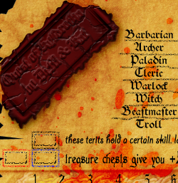
would this be better?
i made it look like it broke in steps and partial pieces still remained at the broken edges. also i reduced the whiteness you mentioned before and made the cracks more visible.
the text is still crappy but as i said before it will be changed when i find a name.

Image