Page 5 of 26
Re: Madagascar -UPDATE- Version6 Pages 1&6 MOUNTAINS UPDATED

Posted:
Tue Apr 29, 2008 3:21 pmby t-o-m
i think they dominate a lil too much, and look outa place a bit, but i can always edit some of the other featrues to suit it

ill wait for more suggs.
Re: Madagascar -UPDATE- Version6 Pages 1&6 MOUNTAINS UPDATED
Posted:
Tue Apr 29, 2008 3:44 pmby ZeakCytho
I like the mountain shape now, but the lighting on them is still off.
Also, I like the thing the title is sitting on, but I don't like those 3 diagonal lines that run through it. Could you get rid of those?
Re: Madagascar -UPDATE- Version6 Pages 1&6 MOUNTAINS UPDATED
Posted:
Tue Apr 29, 2008 3:49 pmby t-o-m
ZeakCytho wrote:I like the mountain shape now, but the lighting on them is still off.
ill look into that - but if i alter the bevel the shape goes - so maybe i will try a low ocpacity darker shade on there?
something like that
ZeakCytho wrote:Also, I like the thing the title is sitting on
i think it needs a lil more colour to it - maybe more of a yellow/tiny bit of orange tint?
ZeakCytho wrote:I don't like those 3 diagonal lines that run through it. Could you get rid of those?
sure - i just used a rubby at a lower ocpacity - i was bored - ill take em out next update
Re: Madagascar -UPDATE- Version6 Pages 1&6 MOUNTAINS UPDATED
Posted:
Tue Apr 29, 2008 6:03 pmby wcaclimbing
t-o-m wrote:- Click image to enlarge.

I spy some liquify.
Did you use the liquify effect on your mountains? like the ones between Betsiboka and Sofia.
either that or the smudge tool.
Its not bad, I'm just curious.
I like the mountains more, but could you kinda have them blend into the surrounding color? Right now the mountains just have an edge where the mountain stops and color starts. Try making that a bit more smooth and it might look better.
Re: Madagascar -UPDATE- Version6 Pages 1&6 MOUNTAINS UPDATED
Posted:
Wed Apr 30, 2008 10:45 amby t-o-m
yea its the smudge tool - - i think that the area you were talking about (sofia way) is too much smudge though
i will try the blends - any pointers on what tool?
also what colours do you guys think i should change the conts to? -- change colours? darker? lighter (no lol)? pattern?
Re: Madagascar -UPDATE- Version6 Pages 1&6 MOUNTAINS UPDATED
Posted:
Wed Apr 30, 2008 3:55 pmby sam_levi_11
i think it should be a mix of african colours, i think all the colours but yellow are good, the yellow just doesnt go with the tohers, maybe make the green darker too
Re: Madagascar -UPDATE- Version6 Pages 1&6 MOUNTAINS UPDATED
Posted:
Wed Apr 30, 2008 4:23 pmby wcaclimbing
t-o-m wrote:yea its the smudge tool - - i think that the area you were talking about (sofia way) is too much smudge though
i will try the blends - any pointers on what tool?
try extending the edges of the mountains out farther, then use a smooth brush on the eraser with a low opacity to gently erase the edges, so they sort of fade away.
Re: Madagascar -UPDATE- Version6 Pages 1&6 MOUNTAINS UPDATED
Posted:
Wed Apr 30, 2008 5:35 pmby t-o-m
wcaclimbing wrote:t-o-m wrote:yea its the smudge tool - - i think that the area you were talking about (sofia way) is too much smudge though
i will try the blends - any pointers on what tool?
try extending the edges of the mountains out farther, then use a smooth brush on the eraser with a low opacity to gently erase the edges, so they sort of fade away.
ok i will try that, along with lowering the ocpacity on the blending effects
Re: Madagascar -UPDATE- Version6.5 Pages 1&8 PATTERN ADDED
Posted:
Fri May 02, 2008 10:07 amby t-o-m
i really cant seem to get the mountains right!
anyone know anyone thats good at that kinda thing??
atm im working on putting a few pictures of their culture and things in at a low ocpacity -
anyway - the main question:
anyone know who is good at making mountians and who would do it?
i bet if you know how it would be a 5-10min job! but i dont know so...
---------
EDIT:
---------
heres a version with some pattern overlay on:
i think this is ok but i think it can be improved a lot
- Click image to enlarge.

--
i dont like this version mcuh:
- Click image to enlarge.

looks too messy and rushed (which it is a lil bit

)
i like the bottom picture on the pink cont though! - that looks good

--
anyway what ya think?
Re: Madagascar -UPDATE- Version6.5 Pages 1&8 PATTERN ADDED
Posted:
Fri May 02, 2008 10:18 amby Ruben Cassar
Tom why don't you put the mini map in the lower right section and put the region names next to the regions in the mini map? I think that would help distinguish the regions especially for colour blind people.
Forget about the second pattern design. It's not good.
I'm also not particularly fond of the font with the stroke or glow you are using for the territory names. Can you give us some other options and maybe run a poll? Don't always use that glow thing because I think it does not help. The map is already very busy as it is.
Good Luck.
Re: Madagascar -UPDATE- Version6.5 Pages 1&8 PATTERN ADDED
Posted:
Fri May 02, 2008 10:26 amby t-o-m
- Click image to enlarge.

that was one of the versions, i think it looks a bit weird
**just showing that to show the mini-map not anything else**
Re: Madagascar -UPDATE- Version6.5 Pages 1&8 PATTERN ADDED
Posted:
Fri May 02, 2008 10:49 amby AndyDufresne
Unless you anchor the minimap in a legend box, it looks oddly out of place, like an additional island in the area. I'd either go with your original idea, or somehow stucture a legend box around it, etc.
--Andy
Re: Madagascar -UPDATE- Version6.5 Pages 1&8 PATTERN ADDED
Posted:
Fri May 02, 2008 5:49 pmby t-o-m
maybe i will try putting it in a box that comes off the title??
the glow ion the terit names, i dont really like - i will play around with them later on,
i need to find a way of making the sea look more like sea,
fix immpassables
and other things when more suggs are in.
--
im juast posting this so people dont get confused with the above images, this is the current version:
- Click image to enlarge.
Re: Madagascar -UPDATE- Version6.5 Pages 1&8 PATTERN ADDED
Posted:
Sun May 04, 2008 8:47 amby t-o-m
hmm what ever i try to do in putting the mini-map in a box just doesnt look good - ill play around with them
the cont names on the mini map looks craped and things, what else could i try to stop that? or change things around?
Re: Madagascar -(ON HOLD)- Version6.5 Pages 1&8 PATTERN ADDED
Posted:
Mon May 12, 2008 3:09 pmby t-o-m
ok finally heres version 6.7!
this has been on hold for a while because ive been so so busy, ive not done v much but ive altered some mild details, nothing major:
Version 6.7:- Click image to enlarge.

i added a slight motion blur to the trees to try a few different things, a motion blur to the mountains to hopefully, wca, that will make it look like the edges are at a lower ocpacity
ive played around with the mini-map and the title a little bit and hopefully that looks better.
i also made the picture in the background a little more ocpacity - because it cheered me up looking at it lol - does it look better for it or is it just a no-no?
Re: Madagascar-FINALLY UPDATED!-Version6.7 Pages 1&8 BOTTOM PGE8
Posted:
Mon May 12, 2008 3:15 pmby Kaplowitz
DiM wrote:never underestimate the power of personalized brushes. create a shape of how you think a tree looks from above. let's say a star shape. now take that brush and set the background and foreground to 2 foliage colours (dark green and yellowy green) then do the following:
shape dynamics>
> size jitter 100%
> minimum diameter 0%
> angle jitter 0%
> roundness jitter 68%
> min roundness 25%
scatter> adjust as you please dependng on what you need
colour dynamics>
>fore/back 100%
> saturation 50%
the rest at 0%
and check smoothing.
then go ahead and paint what you need adjusting the brush size according to the height of the viewpoint.
after you paint put on some drop shadow and even bevel if it suits your need. but keep the bevel at a minimum.
here's a quick example. i didn't bother making a custom shape so i used a flower one. it looks rather bad on large trees but it works for small ones as the details are hard to spot.
Re: Madagascar-FINALLY UPDATED!-Version6.7 Pages 1&8 BOTTOM PGE8
Posted:
Mon May 12, 2008 3:19 pmby ZeakCytho
I like the new box around the minimap, but the attachment of the ropes (for that's what I assume they are) from the title-background to that is not very convincing. It'd look really cool if you could realistically punch two holes in each of the background areas and have the ropes go through them and tie into a knot. Though, this seems like it would be hard to do. Still, it'd look awesome.
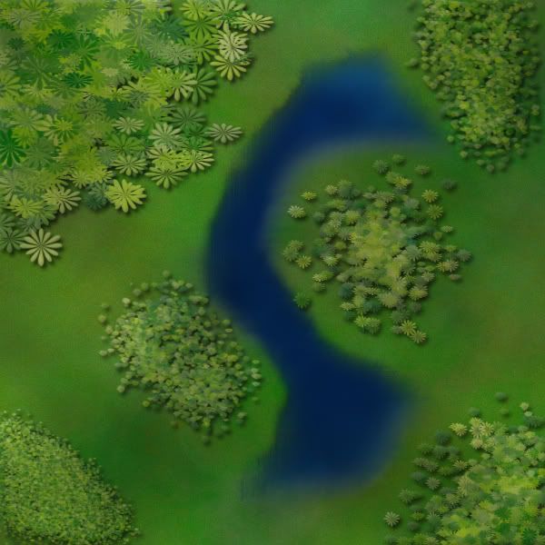
Still don't like the mountains or forest.
I'm not crazy about the background picture either.
Re: Madagascar-FINALLY UPDATED!-Version6.7 Pages 1&8 BOTTOM PGE8
Posted:
Mon May 12, 2008 3:40 pmby t-o-m
i wont quote you kap coz it would take up the whole page lol, but thanks - ill get onto DiM,
ZeakCytho wrote:I like the new box around the minimap, but the attachment of the ropes

they're meant to be ropes
lol im still working on them
ZeakCytho wrote:from the title-background to that is not very convincing. It'd look really cool if you could realistically punch two holes in each of the background areas and have the ropes go through them and tie into a knot. Though, this seems like it would be hard to do. Still, it'd look awesome
i was thinking about making a hole - i was about to do that before i posted this but i forgot. the knot idea does sound good yes, but hard as you said - i might have a go at it.
ZeakCytho wrote:Still don't like the mountains or forest.
i think we all hate the mountains and the forests
ZeakCytho wrote:I'm not crazy about the background picture either.
yea, what do you think i should do in the background then? just normal sea?
Re: Madagascar-FINALLY UPDATED!-Version6.7 Pages 1&8 BOTTOM PGE8
Posted:
Mon May 12, 2008 4:37 pmby t-o-m
should i add some little beaches? or some minor details?
Re: Madagascar-FINALLY UPDATED!-Version6.7 Pages 1&8 BOTTOM PGE8
Posted:
Mon May 12, 2008 5:18 pmby t-o-m
ok i tried some knots, but im tired so idk how they look:
- Click image to enlarge.

Re: Madagascar-FINALLY UPDATED!-Version6.7 Pages 1&8 BOTTOM PGE8
Posted:
Mon May 12, 2008 5:36 pmby Kaplowitz
I think the look pretty good

Re: Madagascar-FINALLY UPDATED!-Version6.7 Pages 1&8 BOTTOM PGE8
Posted:
Mon May 12, 2008 5:40 pmby t-o-m
they look a little more like ropes now, i think they need more shading.
any thoughts on other graphical things/gameplay issues?
(apart from trees/mountains)
?
EDIT:
i might also make the mini-map kinda stand out of the "parchment" that its on, like i did with the land/sea????
Re: Madagascar-FINALLY UPDATED!-Version6.7 Pages 1&8 BOTTOM PGE8
Posted:
Mon May 12, 2008 5:43 pmby ZeakCytho
The ropes look fine, though I think they could still be improved a bit. The knots need work. For the top section, I'd have the rope go under the title-background-plank-thing and come through a hole, having the knot project out toward the viewer like they do in the bottom minimap-background-plank-thing. Then, I'd extend the knots on each to make them more visible - larger, as if they were hand-tied of thick rope. I think the best way to do this would be to lay out the knot as a path and then stroke it, then do your layer effects and whatnot to turn the stroke into a nice looking rope.
Re: Madagascar-FINALLY UPDATED!-Version6.7 Pages 1&8 BOTTOM PGE8
Posted:
Mon May 12, 2008 5:48 pmby t-o-m
ZeakCytho wrote:The ropes look fine, though I think they could still be improved a bit.
i agree
ZeakCytho wrote:For the top section, I'd have the rope go under the title-background-plank-thing and come through a hole, having the knot project out toward the viewer like they do in the bottom minimap-background-plank-thing.
its all about perspective! lol
ZeakCytho wrote:Then, I'd extend the knots on each to make them more visible - larger, as if they were hand-tied of thick rope. I think the best way to do this would be to lay out the knot as a path and then stroke it, then do your layer effects and whatnot to turn the stroke into a nice looking rope.
the thing is, that i will have to learn how to do paths, coz i dont know how. ill learn off a site, here or get someone to do it - but are you sure that'll be a good way (because i dont know anything about them)
ZeakCytho wrote:minimap-background-plank-thing

ZeakCytho wrote:title-background-plank-thing
Re: Madagascar-FINALLY UPDATED!-Version6.7 Pages 1&8 BOTTOM PGE8
Posted:
Mon May 12, 2008 6:14 pmby Unit_2
For holding 5 borders you only get a bonus of 2?? it needs to be ATLEAST 3 4 would be better.