Page 7 of 25

Posted:
Wed Jan 30, 2008 5:49 amby DiM
yeti_c wrote:mibi wrote:now thats thinking outside the proverbial box, well done.
Word.
C.
thanks guys.

then i guess i'll wait for oaktown's visit again.
Posted:
Wed Jan 30, 2008 11:52 amby gimil
Do you have an image with starting neutrals and starting position numbers? This will make oaktowns job easier when he arrives

Posted:
Wed Jan 30, 2008 12:47 pmby DiM
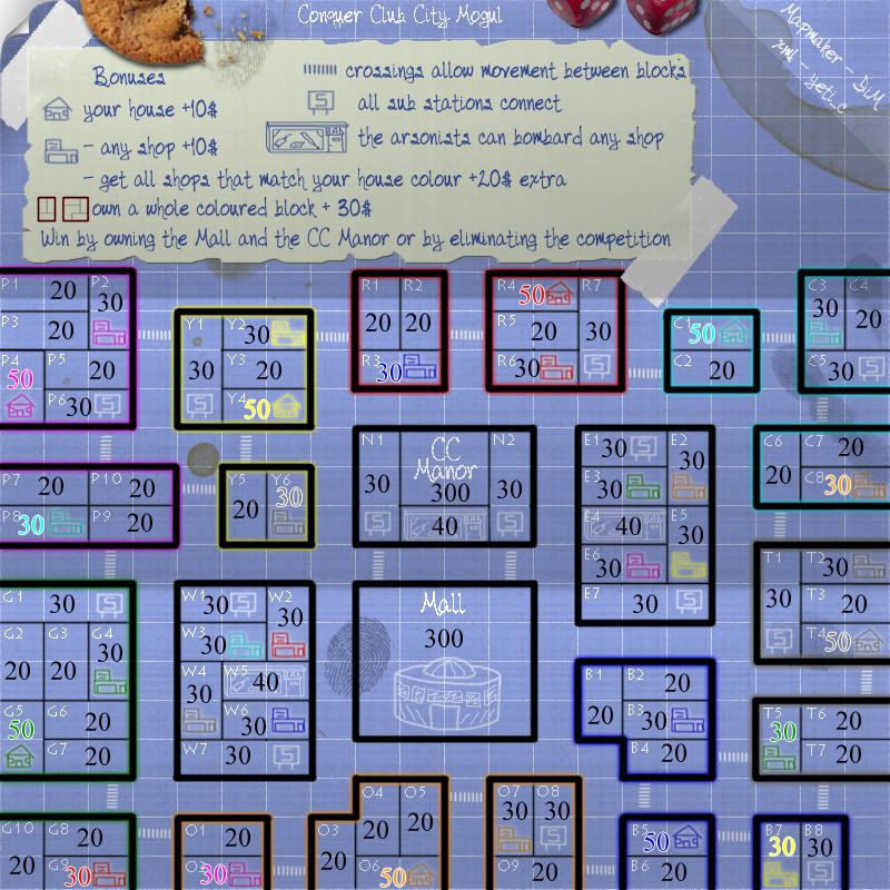
here it is:
all starting armies are marked on the map.
the starting positions for each player are marked with the same colour.
ofcourse the shop and home marked with red army might end up at the cyan player because it's random but the idea is that the shop and house with red army will always belong to 1 player.
Posted:
Wed Jan 30, 2008 2:05 pmby gimil
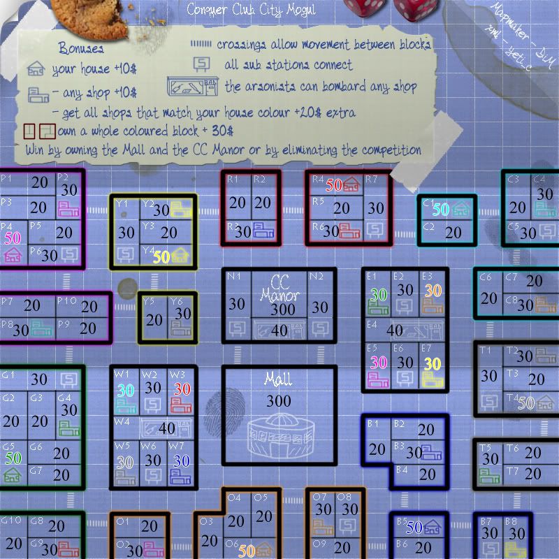
Blue house and yellow factory are way to close and easily make a 1st turn advantage for blue house with decent dice.
Posted:
Wed Jan 30, 2008 2:55 pmby DiM
true. i don't know how i missed that. will rearange.
Posted:
Wed Jan 30, 2008 3:01 pmby gimil
Also cyan/teal colored house and shops are almost invisable to me. If I wasn't looknig for them I wouldnt of known they where there. A nice black stroke or a darker glow may help this but im not really sure.
Another worrying thought is that because your using a strong blue background some colors may appear similar in gameplay e.g. blue and green armie colours could appear similar.
Posted:
Wed Jan 30, 2008 3:01 pmby Herakilla
tsk tsk dim, you need to get on the ball!
Posted:
Wed Jan 30, 2008 3:03 pmby gimil
Herakilla wrote:tsk tsk dim, you need to get on the ball!
He is such a disapointment these days . . .
Posted:
Wed Jan 30, 2008 3:04 pmby Herakilla
gimil wrote:Herakilla wrote:tsk tsk dim, you need to get on the ball!
He is such a disapointment these days . . .

Posted:
Thu Jan 31, 2008 10:44 amby DiM
V10
tweaked the gameplay and changed some borders. now the enemies are right in next to you in a very weird situation.
Posted:
Thu Jan 31, 2008 10:46 amby yeti_c
gimil wrote:Also cyan/teal colored house and shops are almost invisable to me. If I wasn't looknig for them I wouldnt of known they where there. A nice black stroke or a darker glow may help this but im not really sure.
Another worrying thought is that because your using a strong blue background some colors may appear similar in gameplay e.g. blue and green armie colours could appear similar.
CYAN CYAN CYAN - It's not Teal!!!
But yes I agree...
C.
Posted:
Thu Jan 31, 2008 11:00 amby DiM
yeti_c wrote:gimil wrote:Also cyan/teal colored house and shops are almost invisable to me. If I wasn't looknig for them I wouldnt of known they where there. A nice black stroke or a darker glow may help this but im not really sure.
Another worrying thought is that because your using a strong blue background some colors may appear similar in gameplay e.g. blue and green armie colours could appear similar.
CYAN CYAN CYAN - It's not Teal!!!
But yes I agree...
C.
will see. problem is that if i add a stroke to those. i have to add to the others. i'll see about it. i'll also toy with the background to see if i can do something.
Posted:
Thu Jan 31, 2008 11:39 amby DiM
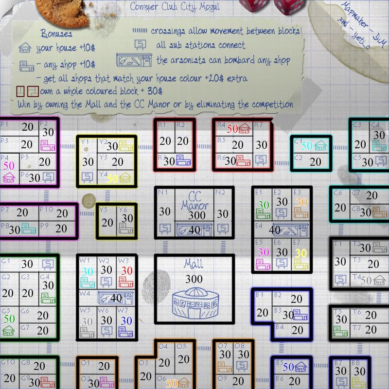
v11
after trying glows and strokes and stuff like that on icons i found nothing that looked good. so i started tweaking the background but by making it lighter and lighter i totally strayed from the blueprint feeling so now i give you the whiteprint (cairns and yeti please shut up)
if anybody still has issues seeing icons or text then i'll officially tell you you're blind as a bat.
edit// i forgot the sig opacity at 100% i will tone it down in the next update.
Posted:
Thu Jan 31, 2008 1:45 pmby I GOT SERVED
You have a 4-way border between p7, p8, p9 and p10. Not sure if this was intended or not.
If it was, then ignore the above message.
Also, I like this map, and I love the progress it's made. Keep up the excellent work!
Posted:
Thu Jan 31, 2008 2:58 pmby DiM
I GOT SERVED wrote:You have a 4-way border between p7, p8, p9 and p10. Not sure if this was intended or not.
If it was, then ignore the above message.
Also, I like this map, and I love the progress it's made. Keep up the excellent work!
i guess i'll have to add somewhere that there are no diagonal attacks
Posted:
Thu Jan 31, 2008 4:28 pmby FreeMan10
DiM wrote:i guess i'll have to add somewhere that there are no diagonal attacks
There's a 4-way at G2 G3 G5 G6, also. Just in case you were going to specify the one junction in the message.
Posted:
Thu Jan 31, 2008 4:33 pmby DiM
FreeMan10 wrote:DiM wrote:i guess i'll have to add somewhere that there are no diagonal attacks
There's a 4-way at G2 G3 G5 G6, also. Just in case you were going to specify the one junction in the message.
yep i know thanks. i will probably insert a general message.
Posted:
Sat Feb 02, 2008 7:18 amby DiM
so, any other comments? other than the diagonal attacks which will be solved in the next update?
Posted:
Sat Feb 02, 2008 11:34 amby fireedud
I don't like the shadows of the paper in the whiteprint.
Posted:
Sat Feb 02, 2008 11:43 amby DiM
fireedud wrote:I don't like the shadows of the paper in the whiteprint.
what shadows? i have a lot of different shadows on the map. tell me which ones and what exactly you don't like about them and i'll see what i can do.
btw those are the same shadows as the blueprint. so normally there shouldn't be anything wrong with them

Posted:
Sat Feb 02, 2008 11:45 amby fireedud
DiM wrote:fireedud wrote:I don't like the shadows of the paper in the whiteprint.
what shadows? i have a lot of different shadows on the map. tell me which ones and what exactly you don't like about them and i'll see what i can do.
btw those are the same shadows as the blueprint. so normally there shouldn't be anything wrong with them
the shadows of the paper itself, where the creases are. It just sticks out on the white paper, but not the blue paper.
Posted:
Sat Feb 02, 2008 12:05 pmby Herakilla
fireedud wrote:DiM wrote:fireedud wrote:I don't like the shadows of the paper in the whiteprint.
what shadows? i have a lot of different shadows on the map. tell me which ones and what exactly you don't like about them and i'll see what i can do.
btw those are the same shadows as the blueprint. so normally there shouldn't be anything wrong with them
the shadows of the paper itself, where the creases are. It just sticks out on the white paper, but not the blue paper.
i think it sticks out more on the blue because there it looks more like a random line
Posted:
Sat Feb 02, 2008 4:20 pmby DiM
fireedud says they stick out on white herakilla says they stick out on blue. i say they stick out the same. as they should.
Posted:
Sat Feb 02, 2008 4:34 pmby whitestazn88
i dont like the white print. go back to the blueprint
Posted:
Sat Feb 02, 2008 5:40 pmby volfan
This might also be used as a game setting. You can choose at the start a game menu wether or not to multiply the armies.