Page 7 of 10

Re: Route 66: diner, pg 10

PostPosted: Thu Jul 16, 2009 1:56 am
by oaktown
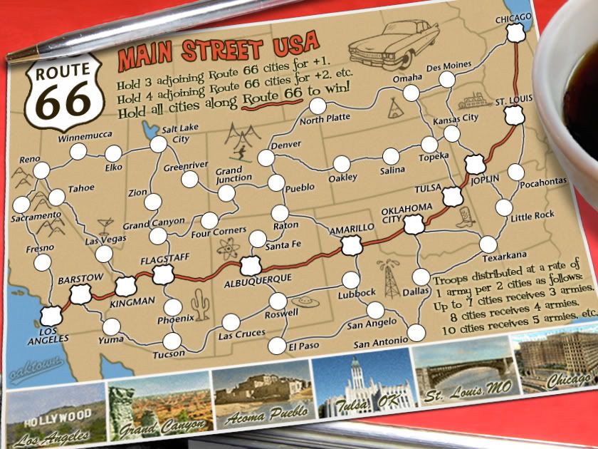
Click image to enlarge.
image


RjBeals wrote:i say bring back the ashtray, and have a look at the "66" reflection in a.sub's image - it looks good. What a fine piece of art you've created here oak - i could care less about gameplay. The map has evolved into something that is so unique and has so much style - that it could be my fav on cc. Well done.

Thanks Rj. I applied a bit of reflection to the pen - a.sub had the right idea but I don't think the reflection should creep up the side of the pen so much.

As for the ashtray, I liked it better as well since it went nicely with the steel pen and the table's side, but it's worth trying something new to see how folks react. Not that anybody seems to be paying attention to Foundry threads much these days!

Re: Route 66: diner, pg 10

PostPosted: Thu Jul 16, 2009 9:35 am
by yeti_c
Oak - I believe the phrase is "Quench"

C.

Re: Route 66: diner, pg 10

PostPosted: Thu Jul 16, 2009 10:14 am
by oaktown
yeti_c wrote:Oak - I believe the phrase is "Quench"

Wow, I don't have any stamps (beyond drafts) yet the quench it crew is on board already! ;)

Re: Route 66: diner, pg 10

PostPosted: Thu Jul 16, 2009 12:15 pm
by Danyael
i only got 2 graphic nitpicks
it looks a little pixelated on the bottom right edge of the route 66 logo
and super nitpicky the border behind the car to the right fades in different then the other borders that are around it
other then that i think you need some stampin'

Re: Route 66: diner, pg 10

PostPosted: Fri Jul 17, 2009 11:09 am
by oaktown
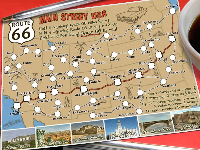
Click image to enlarge.
image


Danyael wrote:it looks a little pixelated on the bottom right edge of the route 66 logo
and super nitpicky the border behind the car to the right fades in different then the other borders that are around it

Done and done. I guess I'll write some code, since I have nothing else to do here really.

Re: Route 66: pg 11

PostPosted: Fri Jul 17, 2009 11:50 am
by the.killing.44
I believe the phrase is, "epic win."

.44

Re: Route 66: pg 11

PostPosted: Fri Jul 17, 2009 1:50 pm
by MrBenn
There's something about the perspective that makes me feel a little dizzy - possibly because the right-edge of the postcard looks almost parallel to the edge of the canvas? Will it mess everything else up if you pull the bottom-right-corner slightly over to the left, to make it look slightly more rectangular than parallelogram-esque?

The reflection in the pen looks like it could be increased a fraction... The coffee cup looks more like a bowl than a mug - probably because you can;t see the base of it??

Anyway, these are really minor graphical nitpicks - are we still waiting for the gameplay brigade to pass this one? As far as I'm concerned, the gameplay was more-or-less sorted out while the map was still a draft :lol: Shall I poke somebody to get this one stamped?

Re: Route 66: pg 11

PostPosted: Fri Jul 17, 2009 7:48 pm
by Suzy1
I really like this map. Great concept. I think you would get alot of play on it. It has my vote. good luck with it!

Re: Route 66: pg 11

PostPosted: Sun Jul 19, 2009 4:06 pm
by Teflon Kris
I am happy to announce that this map satisfies gameplay standards:

Image

I can see other maps following suit with this unique style of gameplay.

Nice work oak :)

Re: Route 66: pg 11

PostPosted: Mon Jul 20, 2009 12:23 am
by a.sub
well deserved =D>

Re: Route 66: pg 11 (GP)

PostPosted: Thu Aug 06, 2009 11:48 am
by oaktown
I'm back in town and interested in wrapping up the last maps I have in production so I can get on with my life. I'll get to work on Benn's suggestions from above, and any others that would push this toward a graphics stamp would be appreciated.

Re: Route 66: pg 11 (GP)

PostPosted: Sat Aug 08, 2009 11:57 am
by the.killing.44
Hmm, it's a bit blurry; changing the anti-aliasing mode of the text usually sorts that out. But other than that stamp pl0xez.

.44

Re: Route 66: large & small pg 11 (GP)

PostPosted: Sun Aug 09, 2009 11:44 am
by oaktown
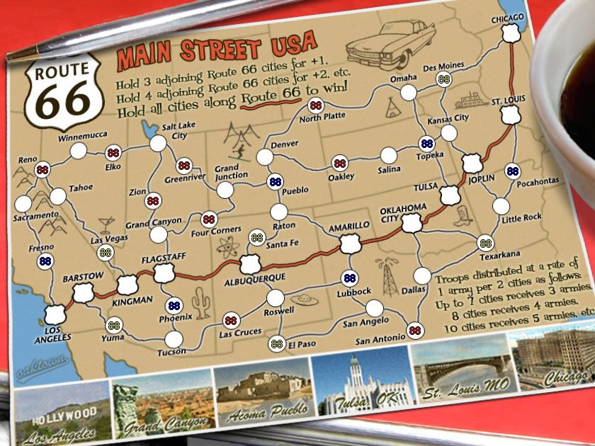
Click image to enlarge.
image


Changes: increased text size for all territory titles, worked on making them a bit less blurry.

Pulled the lower left corner of the postcard out a bit as per Benn's suggestion... whether or not it's better is probably a matter of personal preference.

Increased the reflection on the pen.

Moved a few army circles and terit titles for improved user friendliness (eg. Green River).

I'm inclined to leave the coffee cup as is. Old diner coffee cups are often rounded at the bottom, and to show a straight-sided mug would severely cut into the postcard itself (or I'd have to show much less of the cup). Ideally I'd put a saucer under the cup, but I just don't have the space.

Image

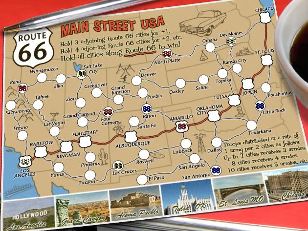
And because I had a few more minutes, I've started working on a small map... it requires larger army circles, and note that since the postcard is set back at and distorted the circles are no longer perfect circles. While these army counts fit in the circles, they will never line up perfectly unless I replace the current army circles with perfect circles, which will throw off the sense of perspective.

The colors of the counts below have no gameplay relevance - they're just there to show size.

Click image to enlarge.
image

Re: Route 66: tweaks on pg 11 (GP)

PostPosted: Sun Aug 09, 2009 1:00 pm
by sully800
I like the cup of coffee, and the circles aren't so skewed that they detract from anything. As you said, if they were perfectly straight they wouldn't seem to fit onto the postcard.

Kansas seems a little empty, which perhaps is appropriate, because there are no icons in the state. I think Topeka would be deserving of a sketch. Perhaps a wagon wheel to commemorate the Oregon Trail which used to run through Topeka?

I think the bonus text could use some differentiation between the first 2 lines and the last 3 lines. Maybe you could make the first 2 lines bold, or put bullets in front of the last three lines since it is a list of army distributions.

Looks good!

Re: Route 66: tweaks on pg 11 (GP)

PostPosted: Sun Aug 09, 2009 4:35 pm
by ender516
There's only two things that come from Kansas, steers and queers.... :D ;) Just kidding, though something agricultural does seem to be missing from the map. What would be more appropriate to Kansas, a steer, a steer's head (longhorn?), or perhaps a cob of corn or sheaf of wheat? Anybody from that area with an opinion?

Re: Route 66: tweaks on pg 11 (GP)

PostPosted: Sun Aug 09, 2009 4:49 pm
by MrBenn
Looking good - I think the perspective is just a matter of personal preference, as you say ;-)

Sully made a good suggestion about the bonus-instruction text, but I can't really find fault with anything...

The only thing I'd mention, is whether you've given any thought to having the small version without the pen/cup/perspective, or whether that would confuse people too much when switching between maps??

Re: Route 66: tweaks on pg 11 (GP)

PostPosted: Sun Aug 09, 2009 5:14 pm
by sully800
MrBenn wrote:Looking good - I think the perspective is just a matter of personal preference, as you say ;-)

Sully made a good suggestion about the bonus-instruction text, but I can't really find fault with anything...

The only thing I'd mention, is whether you've given any thought to having the small version without the pen/cup/perspective, or whether that would confuse people too much when switching between maps??


You could cut off the pen and the cup a bit more in the small map perhaps, but the small one doesn't feel too crowded right now so that might not be necessary. Eliminating the perspective could be confusing, I'm not sure how many people switch between small and large regularly. I probably wouldn't notice because I very rarely switch!

Re: Route 66: tweaks on pg 11 (GP)

PostPosted: Sun Aug 09, 2009 5:18 pm
by oaktown
Click image to enlarge.
image


MrBenn wrote:Sully made a good suggestion about the bonus-instruction text, but I can't really find fault with anything...

I think this version has much improves=d lower text.

MrBenn wrote:The only thing I'd mention, is whether you've given any thought to having the small version without the pen/cup/perspective, or whether that would confuse people too much when switching between maps??

I have no problem with making the two maps different, but simply presenting the postcard without the outer elements really won't save much space. If you lose the perspective and turn the card upright on the small map it comes out the same size as the current image. If it would mean a significant increase in the size of the gameplay elements I'd do it, but since it doesn't i don't think it justifies losing the fun graphics.

Kansas... I tried to come up with something for kansas earlier and failed. Having driven across Kansas all I remember seeing is corn, followed by miles and miles of more corn. Then you pass through a small town and see more corn. I'm pretty content with leaving it flat, because...
geographers compared the flatness of Kansas to the flatness of a pancake. They used topographic data from a digital scale model prepared by the US Geological Survey, and they purchased a pancake from the International House of Pancakes. If perfect flatness were a value of 1.00, they reported, the calculated flatness of a pancake would be 0.957 "which is pretty flat, but far from perfectly flat". Kansas's flatness however turned out to be 0.997, which they said might be described, mathematically, as "damn flat".

Re: Route 66: tweaks on pg 11 (GP)

PostPosted: Sun Aug 09, 2009 5:33 pm
by ender516
oaktown wrote:
geographers compared the flatness of Kansas to the flatness of a pancake. They used topographic data from a digital scale model prepared by the US Geological Survey, and they purchased a pancake from the International House of Pancakes. If perfect flatness were a value of 1.00, they reported, the calculated flatness of a pancake would be 0.957 "which is pretty flat, but far from perfectly flat". Kansas's flatness however turned out to be 0.997, which they said might be described, mathematically, as "damn flat".

:lol: I love it when people use technical terms. :lol:
Too bad there isn't an icon that conveys flatness!

Re: Route 66: tweaks on pg 11 (GP)

PostPosted: Mon Aug 10, 2009 1:34 am
by RedBaron0
The army circles still seem to be slightly oddly shaped, not quite circular(mostly just the circles towards the edges of the map). It's not big thing though, get it to the FF and test it out with the "88's" and worry about it then if necessary.

Re: Route 66: tweaks on pg 11 (GP)

PostPosted: Mon Aug 10, 2009 4:20 am
by oaktown
RedBaron0 wrote:The army circles still seem to be slightly oddly shaped, not quite circular(mostly just the circles towards the edges of the map). It's not big thing though, get it to the FF and test it out with the "88's" and worry about it then if necessary.

As I explained about five posts ago, the perspective of the postcard makes everything- including the circles - look slightly flattened. This is intentional.

Re: Route 66: tweaks on pg 11 (GP)

PostPosted: Thu Aug 13, 2009 6:34 am
by iancanton
oaktown wrote:Kansas... I tried to come up with something for kansas earlier and failed.

for a moment, i thought that we could have the emerald city from the wizard of oz... then i remembered that kansas city isn't in kansas!

oaktown wrote:
MrBenn wrote:The only thing I'd mention, is whether you've given any thought to having the small version without the pen/cup/perspective, or whether that would confuse people too much when switching between maps??

I have no problem with making the two maps different, but simply presenting the postcard without the outer elements really won't save much space. If you lose the perspective and turn the card upright on the small map it comes out the same size as the current image. If it would mean a significant increase in the size of the gameplay elements I'd do it, but since it doesn't i don't think it justifies losing the fun graphics.

concur. by far the majority play on the small map. the ambience of the whole setting would be missing without those extra retro touches.

ian. :)

Re: Route 66: tweaks on pg 11 (GP)

PostPosted: Thu Aug 13, 2009 6:40 am
by perchorin
Kansas, being "The Sunflower State" could have a sunflower in it. It would be pretty! Also, I'm really looking forward to playing this map.

Re: Route 66: tweaks on pg 11 (GP)

PostPosted: Fri Aug 14, 2009 1:44 am
by RedBaron0
For Kansas you could use a buffalo, or a cattle skull, for Utah you could put a beehive down or a steam locomotive, the cattle skull might actually be better in California since Rt. 66 passes just the south of Death Valley. ;)

Re: Route 66: tweaks on pg 11 (GP)

PostPosted: Wed Aug 19, 2009 4:54 pm
by MrBenn
This has been here too long now, and is very worthy of this:
Image

Onwards and Upwards =D>