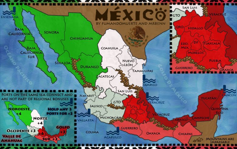
MrBenn wrote:Well, given that I've only adjusted the glow extending from the shoreline for about 10-15 pixels, I don;t really know why you suddenly think that bit of shading looks so bad (compare it to the large image at the top, and you'll see no real difference to that area.
I think... at the previous version, the glow is thin enough to look like an outline instead of a glow, so it didn't bother me much. However now that you have made it wider it seems somehow disturbing... it doesn't quite fit with the graphics of the rest of the map... I can't quite put my finger on it. Perhaps indeed it reminds me of the oil spill too much, and thinking about the oil spill just makes me sad...
Perhaps if you were to blur the edges of the glow, smooth it out a bit, it wouldn't bother so much, it would still serve it's purpose but it would be less noticeable.
Also, a very small nitpick: could it be possible to move the "Mountains are impassable" text down 1-2 pixels, so the letter U doesn't overlap with the land border?