Page 19 of 25

Re: Philadelphia - [29 March 2012] pg 30 -army circles

PostPosted: Thu Mar 29, 2012 2:30 pm
by natty dread
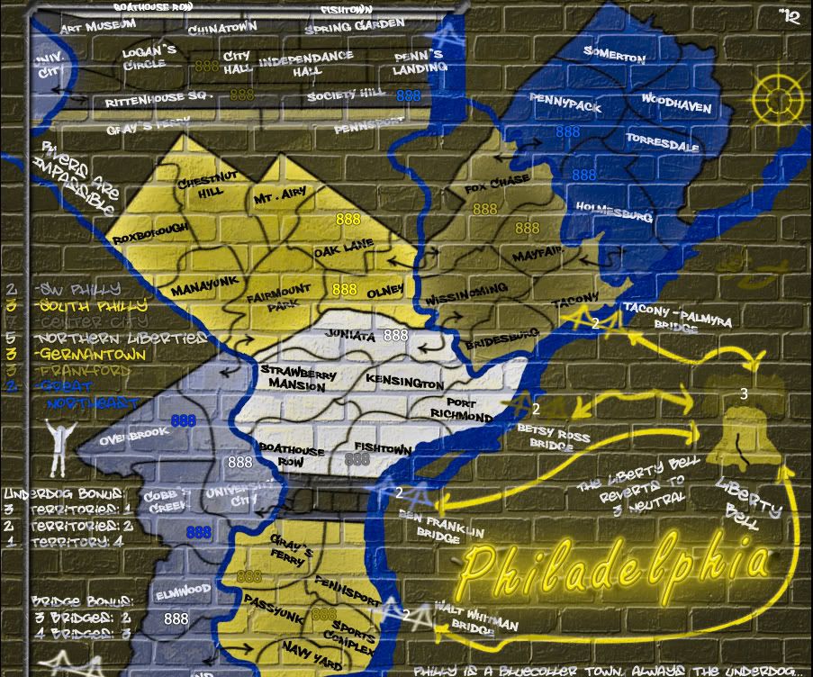
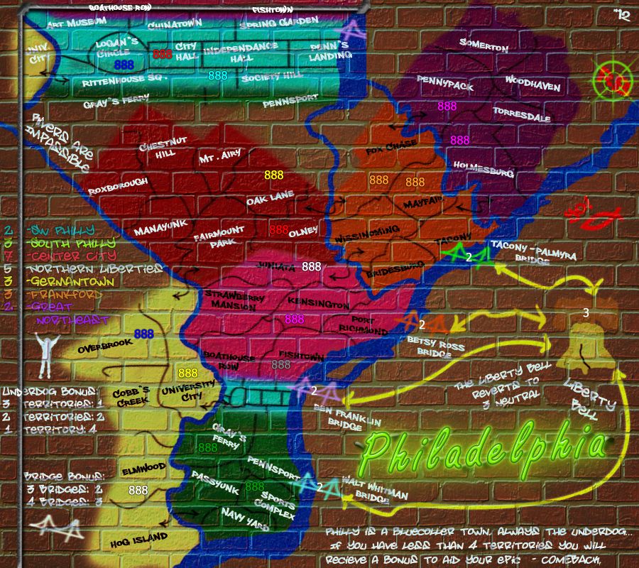
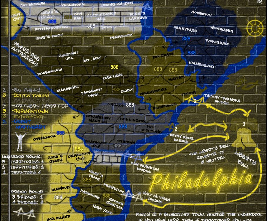
RedBaron0 wrote:Black is the most common spray paint graffiti color, and honestly I like the look. Sigh... I will try all white.

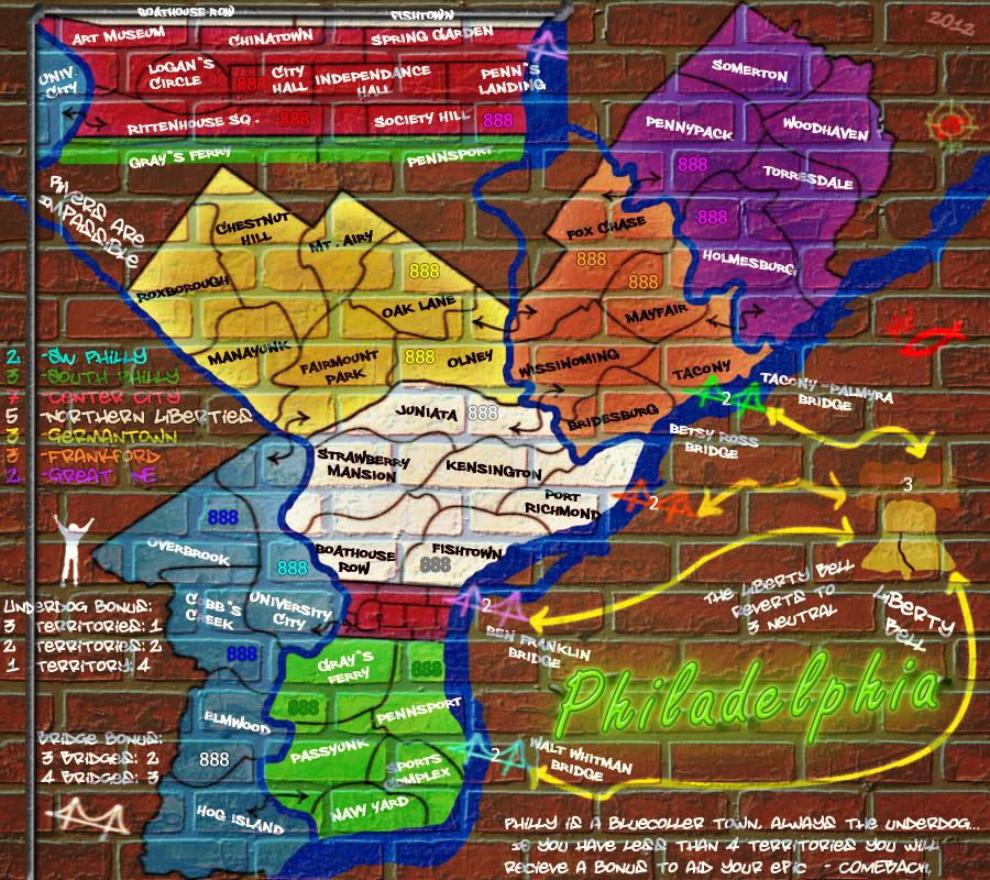
I can add more drips, I figured out how to make them look good with the army circles and I can apply it to everything else. Still a work in progress afterall. I may end up redrawing all the borders, bridges, and connectors using this technique.


But before you said that you didn't want to add drips because good graffiti artists don't make paint drips... and I agree with it. I think you can make the circles look like a part of the painting by just making them a bit irregular in shape, and with the airbrush edges...
Re: Philadelphia - [29 March 2012] pg 30 -army circles

PostPosted: Fri Mar 30, 2012 12:43 am
by RedBaron0
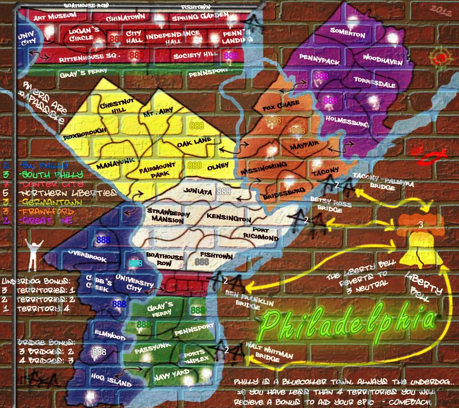
Current Draft:
Click image to enlarge.
image

Image size: 900x800

It makes sense on the circles though, and at least the bridges, since they have that look of being added on top of the good mural/graffiti by a 12 year old who found a can or two of spray paint in the garage.

A irregular dot wouldn't fit with the original art which should look good and not drippy.

all white circles, none on N Liberties and Germantown and drippy bridges.

ok borders and connectors might be too much and unnecessarily cluttery.

Re: Philadelphia - [30 March 2012] pg 30 -army circles

PostPosted: Fri Mar 30, 2012 10:14 pm
by chapcrap
I don't think the color of the army circles matters as much. In fact, I'd go with the black ones because the background is already dark. With the stark contrast from the darker background to the white circles it makes it harder to see, I think.

However, I don't think the army circles are the real issue. It's the background itself. The numbers are quite hard to see on the background. Either the background colors need to change or the army circles need to be much larger.

Re: Philadelphia - [30 March 2012] pg 30 -army circles

PostPosted: Sat Mar 31, 2012 1:20 am
by natty dread
chapcrap wrote:I don't think the color of the army circles matters as much.


Try being the blue player on Ancient Greece.

Re: Philadelphia - [30 March 2012] pg 30 -army circles

PostPosted: Sun Apr 01, 2012 11:53 pm
by RedBaron0
Is there a middle ground color we can think of? Or is the the best solution, no circles?

Re: Philadelphia - [30 March 2012] pg 30 -army circles

PostPosted: Mon Apr 02, 2012 2:38 am
by natty dread
RedBaron0 wrote:Is there a middle ground color we can think of? Or is the the best solution, no circles?


Sure, but then you have to tweak the colours... which might be the better choice anyway.

Re: Philadelphia - [30 March 2012] pg 30 -army circles

PostPosted: Mon Apr 02, 2012 5:44 pm
by chapcrap
natty dread wrote:
chapcrap wrote:I don't think the color of the army circles matters as much.


Try being the blue player on Ancient Greece.

I know that is your most natty dreaded scenario, but I don't think that is that bad of map.

And that doesn't really even address what I thought the problem was.

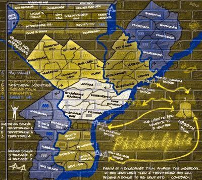
Re: Philadelphia - [3 May 2012] pg 31 -no army circles

PostPosted: Thu May 03, 2012 3:32 am
by RedBaron0
Click image to enlarge.
image

Image size: 900x800

Fiddled with the colors so that army circles aren't necessary.
Colored the main bridges
Darkened the rivers
blended the Liberty Bell into the background a bit more
No drips.

Re: Philadelphia - [3 May 2012] pg 31 -no army circles

PostPosted: Thu May 03, 2012 5:45 pm
by chapcrap
Some of those colors are pretty difficult to see still, especially green. What would the colorblind version look like?

Re: Philadelphia - [3 May 2012] pg 31 -no army circles

PostPosted: Fri May 04, 2012 9:30 am
by AndyDufresne
chapcrap wrote:Some of those colors are pretty difficult to see still, especially green. What would the colorblind version look like?

Maybe a color like one of these older version colors would be better?

Image
Image


--Andy

Re: Philadelphia - [3 May 2012] pg 31 -no army circles

PostPosted: Fri May 04, 2012 11:46 pm
by RedBaron0
Image

I'll fiddle with the green some more. Thanks guys.

Re: Philadelphia - [8 May 2012] pg 31 -no army circles

PostPosted: Tue May 08, 2012 12:58 am
by RedBaron0
Click image to enlarge.
image


Click image to enlarge.
image


New green in South Philly

Suddenly its very not crowded in here... :?

Re: Philadelphia - [8 May 2012] pg 31 -no army circles

PostPosted: Tue May 08, 2012 10:40 am
by AndyDufresne
Green looks good. Is there a reason why the Betsy Ross bridge name is closer to the Tacony bridge?


--Andy

Re: Philadelphia - [8 May 2012] pg 31 -no army circles

PostPosted: Tue May 08, 2012 10:15 pm
by RedBaron0
I think I moved the bridge a bit to the south and forgot to move the name along with it. Any other concerns, comments, and/or opinions?? I'm ready to move onto the small map otherwise.

Re: Philadelphia - [8 May 2012] pg 31 -no army circles

PostPosted: Wed May 09, 2012 6:10 pm
by chapcrap
I'm still not enamored with the colors compared to the numbers, but the green is a little better. I think the spray paint look just doesn't work very well with the colors of the troop numbers.

Re: Philadelphia - [8 May 2012] pg 31 -no army circles

PostPosted: Wed May 09, 2012 10:43 pm
by koontz1973
chapcrap wrote:I think the spray paint look just doesn't work very well with the colors of the troop numbers.

Not our fault that you lot take our pretty art and bung these little numbers all over it. :P

Re: Philadelphia - [8 May 2012] pg 31 -no army circles

PostPosted: Thu May 10, 2012 1:43 am
by chapcrap
koontz1973 wrote:
chapcrap wrote:I think the spray paint look just doesn't work very well with the colors of the troop numbers.

Not our fault that you lot take our pretty art and bung these little numbers all over it. :P

:lol: Yeah, I don't mind the way the map looks in general. It's those stupid numbers!!

Re: Philadelphia - [8 May 2012] pg 31 -no army circles

PostPosted: Thu May 10, 2012 9:08 pm
by RedBaron0
It might be cool to get optional fonts to use for the numbers, BUT that won't likely happen for obvious reasons. I'll see if I can't tweek the hue on the green a little more and isaiah40 wants me to squeeze the bricks down some to give the illusion that the map is on a much larger wall.

Re: Philadelphia - [8 May 2012] pg 31 -no army circles

PostPosted: Sat May 12, 2012 3:41 am
by Jippd
I also find the colors and numbers situation hard to read here. Unfortunately I have no solution or idea of how to fix it but I'll think about it

Re: Philadelphia - [8 May 2012] pg 31 -no army circles

PostPosted: Sat May 19, 2012 6:49 pm
by army of nobunaga
oooooo I like this one.

you are seriously going to take maps up another step with this one.

that underdog bonus? friggin ingenious

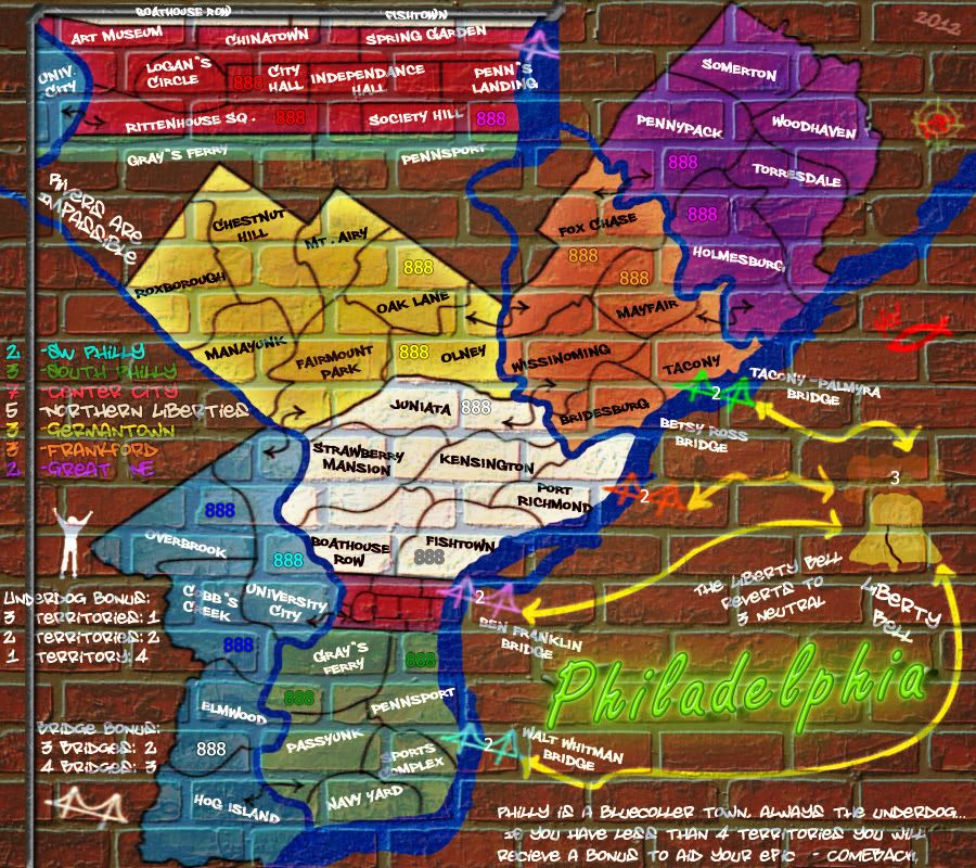
Re: Philadelphia - [11 June 2012] pg 31 -'bigger' wall

PostPosted: Mon Jun 11, 2012 3:33 am
by RedBaron0
Click image to enlarge.
image

Image size: 900x800

Back with a lil time for Philly here.

Alterations:
Bricks scaled back to give the perception of being a mural on a much larger wall.
Green in South Philly further altered to better jive with army color green
signature cleanup
South Philly text color changed to black to read easier on the lighter green bonus color
minor details cleaned up(mostly with the inset)
some tinkering with the overall look of the brick background

Some territory names likely need a tiny bit of repositioning due to the scaled back bricks, for clarity, easy positional fix.

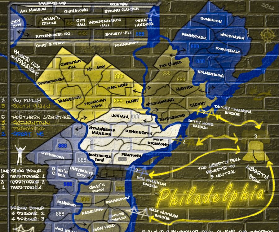
Color Blind test should be clear:
Click image to enlarge.
image


Further issues/problems/requests???

Re: Philadelphia - [11 June 2012] pg 31 -'bigger' wall

PostPosted: Mon Jun 11, 2012 2:21 pm
by AndyDufresne
Some territory names likely need a tiny bit of repositioning due to the scaled back bricks, for clarity, easy positional fix.

Is the only thing I was going to comment on really, but I see that you've got that in your mind already.

I'll see if anything else comes to mind.


--Andy

Re: Philadelphia - [11 June 2012] pg 31 -'bigger' wall

PostPosted: Thu Jun 14, 2012 8:46 am
by isaiah40
Bricks are a little better, though IMHO they could be a little bit smaller.

Re: Philadelphia - [11 June 2012] pg 31 -'bigger' wall

PostPosted: Thu Jun 14, 2012 10:04 pm
by RedBaron0
Further shrinking the wall will make the grout outlines affect more territory names. This something I want to avoid, for readability and clarity reasons.

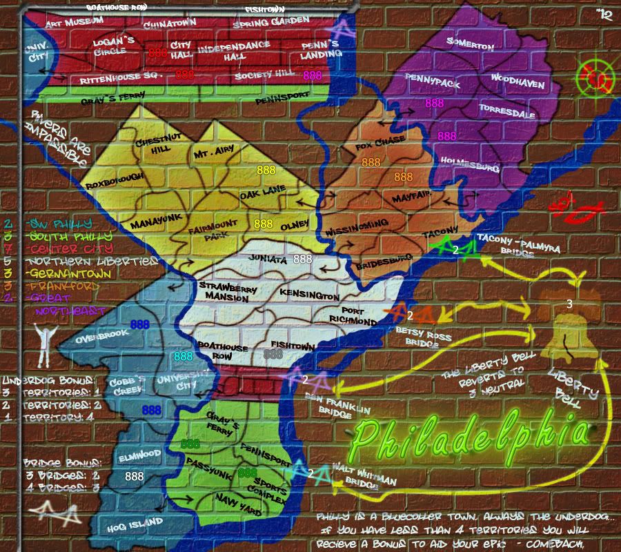
Re: Philadelphia - [29 July 2012] pg 32 -spray paintier

PostPosted: Sun Jul 29, 2012 11:32 am
by RedBaron0
Click image to enlarge.
image

Image size: 900x800

Click image to enlarge.
image

color blindness test

There is still some general cleaning up to do, territory name positions, couple of border extensions, (although I may end up redrawing them entirely.) and maybe a minor change or two, but I wanted to get this up and clear the black box out... ;)