Page 28 of 35
Re: Japan - 日本 (D, Gp) V12.9 (Upd 1-18)pg45 Sushi anyone?

Posted:
Mon Jan 18, 2010 5:02 pmby jefjef
I Like the subtle sun.
Re: Japan - 日本 (D, Gp) V12.9 (Upd 1-18)pg45 Sushi anyone?

Posted:
Mon Jan 18, 2010 5:25 pmby porkenbeans
The canvas texture is great. It is actually starting to make the Islands fit with the background. I would like to see what it looks like with a little more opacity, so that it is more visible over the Islands.

The compass rose looks good where it is at, just maybe shift it to the right about 1/4 inch, and up 1/2 inch.
Also, I just took notice of how cool that junk is. Why not enlarge it ? There sure is plenty of room.
Have you tried putting your sig in the upper left corner ? Might look better, I would need to see it first.
Re: Japan - 日本 (D, Gp) V12.9 (Upd 1-18)pg45 Sushi anyone?

Posted:
Mon Jan 18, 2010 5:27 pmby jefjef
The title ink stamp is neon again. Go back to the dark red.
Re: Japan - 日本 (D, Gp) V13.0 (Upd 1-18)pg46 Lucky 13...

Posted:
Mon Jan 18, 2010 6:24 pmby RedBaron0
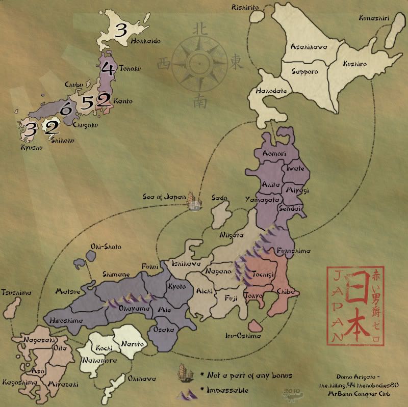
Version 13.0
Large:
- Click image to enlarge.
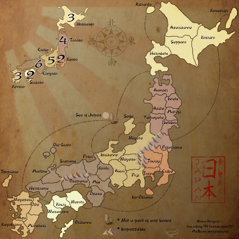
Small:
- Click image to enlarge.
Changed the blue some, I don't think you can see it now. But the effect used on it gives me something very likable.
It fixed the color of the stamp in the process.
Still didn't move the compass... now I think they works where they are, but again a move is very simple to do.
Re: Japan - 日本 (D, Gp) V13.0 (Upd 1-18)pg46 Lucky 13...

Posted:
Mon Jan 18, 2010 6:29 pmby natty dread
Now this version I like. Looks great! Only, now the land area kinda jumps at you... there's a huge contrast with the background having all that texture and the land area being so plain and bright. Perhaps the brightness of the land could be toned down just a tiny bit?
Actually, only hokkaido and Shikoku look weird, the rest of the land looks great. Shikoku more so than Hokkaido. So if you could just adjust those two areas.
Re: Japan - 日本 (D, Gp) V13.0 (Upd 1-18)pg46 Lucky 13...

Posted:
Mon Jan 18, 2010 6:42 pmby AndyDufresne
natty_dread wrote:Now this version I like. Looks great! Only, now the land area kinda jumps at you... there's a huge contrast with the background having all that texture and the land area being so plain and bright. Perhaps the brightness of the land could be toned down just a tiny bit?
Actually, only hokkaido and Shikoku look weird, the rest of the land looks great. Shikoku more so than Hokkaido. So if you could just adjust those two areas.
I had the same immediate response to Hokkaido and Shikoku. Everything else does look great, as mentioned.
--Andy
Re: Japan - 日本 (D, Gp) V13.0 (Upd 1-18)pg46 Lucky 13...

Posted:
Mon Jan 18, 2010 7:56 pmby the.killing.44
Horridly dark.
Re: Japan - 日本 (D, Gp) V13.1 (Upd 1-18)pg46 Lucky 13...

Posted:
Mon Jan 18, 2010 9:31 pmby RedBaron0
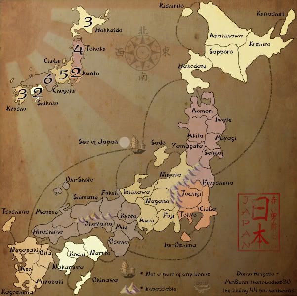
Version 13.1
Large:
- Click image to enlarge.

Small:
- Click image to enlarge.
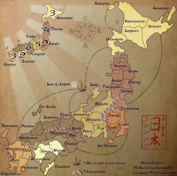
Alright, how's Hokkaido and Shikoku now?
Amazingly helpful 44, but lightened up the background at any rate.
Re: Japan - 日本 (D, Gp) V13.1 (Upd 1-18)pg46 Lucky 13...

Posted:
Mon Jan 18, 2010 9:36 pmby the.killing.44
Err, sorry RB0. That looks very good now. Maybe you want to add some sort of coastal line, in place of a non-parchmenty drop shadow or outer glow.
a la Beals. Something to separate the land from the sea; they blend together a lot atm.
Another thing is that some separation from the mountains would be nice. They're very different from the rest of the map, but are integrated a bit oddly, so instead of being an impassable border, they seem to cover up the border and don't draw enough attention…though they do draw attention. If that makes sense. Point is, maybe a slight black outer glow would look nice. It's really mainly in the yellow-orange-pink area.
Junk ship is a nice touch.
Re: Japan - 日本 (D, Gp) V13.2 (Upd 1-18)pg46 Lucky 13...

Posted:
Mon Jan 18, 2010 10:44 pmby RedBaron0
Version 13.2
Large:
- Click image to enlarge.

Small:
- Click image to enlarge.
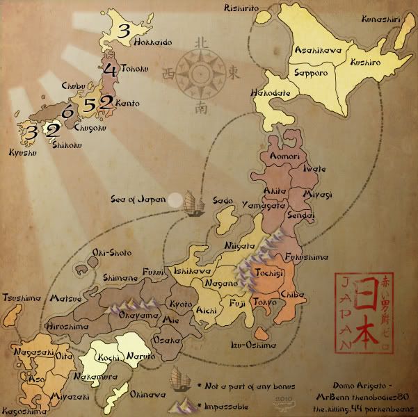
Alrighty then... I'm not sure about these little changes, but let me hear what you all think.
Mountains added a light black outer glow.
Ripple outline around the outer edge of the land.
Re: Japan - 日本 (D, Gp) V13.2 (Upd 1-18)pg46 Lucky 13...

Posted:
Mon Jan 18, 2010 10:48 pmby isaiah40
I hate to say this, IMO the mountains now look like they are pasted on instead of drawn on.
Re: Japan - 日本 (D, Gp) V13.2 (Upd 1-18)pg46 Lucky 13...

Posted:
Mon Jan 18, 2010 10:49 pmby natty dread
Perhaps you could try black outlines instead. But don't make it so that the outline is all around the mountain, but so that it's kinda "cut out" in random segments... If you get what I'm going for...
Re: Japan - 日本 (D, Gp) V13.3 (Upd 1-18)pg46 Lucky 13...

Posted:
Mon Jan 18, 2010 11:22 pmby RedBaron0
Version 13.3
Large:
- Click image to enlarge.
Small:
- Click image to enlarge.
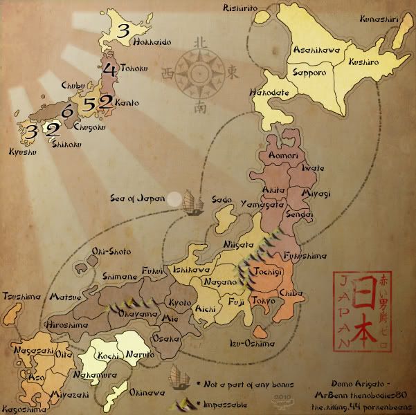
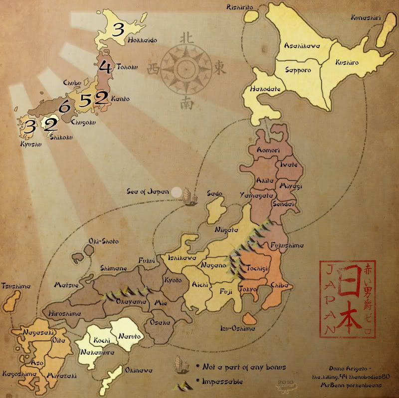
I figured as much.... it looked like a sort of negative image or the mountains to me. Outlines likely aren't going to work here, at least not in a simple sense, where I change/fiddle with sliders or check marks... I may have to draw an outline on, but before that I've got this, a darker greenish color added hearkening back to the original mountains I drafted with the green on the lit side of the mountains. The mountains are more pronounced now as an impassable.
What about the outline around the outside of the islands?
Re: Japan - 日本 (D, Gp) V13.3 (Upd 1-18)pg46 Lucky 13...

Posted:
Mon Jan 18, 2010 11:26 pmby isaiah40
RedBaron0 wrote:I figured as much.... it looked like a sort of negative image or the mountains to me. Outlines likely aren't going to work here, at least not in a simple sense, where I change/fiddle with sliders or check marks... I may have to draw an outline on, but before that I've got this, a darker greenish color added hearkening back to the original mountains I drafted with the green on the lit side of the mountains. The mountains are more pronounced now as an impassable.
What about the outline around the outside of the islands?
They look better to me now. The outline is good, I see it but it is not distracting which is good!
Re: Japan - 日本 (D, Gp) V13.3 (Upd 1-18)pg46 Lucky 13...

Posted:
Mon Jan 18, 2010 11:29 pmby natty dread
I like the outline around the islands, but that green colour on the mountains... it works on the left side mountains, but the right side mountains seem ...wrong, somehow. Can't really explain why, sorry. They just seem wrong.
Then again I should probably get some sleep and take a look with fresh eyes...
Re: Japan - 日本 (D, Gp) V13.3 (Upd 1-18)pg46 Lucky 13...

Posted:
Mon Jan 18, 2010 11:37 pmby The Neon Peon
While you're busy messing around with colors, might I ask that we have the old texture back:

The random splotches on the new one aren't adding much to the map, and the old one works better with the one on the land.
Re: Japan - 日本 (D, Gp) V13.3 (Upd 1-18)pg46 Lucky 13...

Posted:
Tue Jan 19, 2010 12:37 amby RedBaron0
[facepalm]
Anyone else prefer the other background? Right now I'm really liking where the map is currently. To go back to the old background puts the map exactly where it was this morning after updating various aspects all day today.
Re: Japan - 日本 (D, Gp) V13.3 (Upd 1-18)pg46 Lucky 13...

Posted:
Tue Jan 19, 2010 1:07 amby isaiah40
RedBaron0 wrote:[facepalm]
Anyone else prefer the other background? Right now I'm really liking where the map is currently. To go back to the old background puts the map exactly where it was this morning after updating various aspects all day today.
I vote for the new background!
Re: Japan - 日本 (D, Gp) V13.3 (Upd 1-18)pg46 Lucky 13...

Posted:
Tue Jan 19, 2010 1:25 amby jefjef
Don't much care for the trace around the map on the new one.
Like both backgrounds.
Pick one and get r out the door.
Re: Japan - 日本 (D, Gp) V13.3 (Upd 1-18)pg46 Lucky 13...

Posted:
Tue Jan 19, 2010 1:39 amby Peter Gibbons
Of the last 10 versions or so, I feel pretty strongly that 13.0 and 12.8 are the best. I could live with any incarnation you choose, but I think those two stand out above all others. I don't like the outlines in the most recent version and I also think the last few have lost a little too much color in the territories (13.1, 13.2 and 13.3 all feel, to an extent, as though the map is one color with various shades; I realize that's an exaggeration but I also believe you lose a lot when you tone down the blues/purples). I'd personally urge you to go back to at least 13.0 and would hope that you consider 12.8 as your final choice (aside from the fixing of the smudges).
This is an inexact science, obviously. It's hard to put into words why one person might like one version over another. I really like the two I've mentioned above. Others are going to have different choices. But you're at the point where gameplay, graphics, texts, minimap, background, etc. are all agreed upon. So none of this should cause any facepalms and we DEFINITELY shouldn't be seeing versions 15.1 or 16.2, etc. I say you pick which one YOU like best and push it for Final Forge. Make that version 14.0 and move towards Beta!
Re: Japan - 日本 (D, Gp) V13.3 (Upd 1-18)pg46 Lucky 13...

Posted:
Tue Jan 19, 2010 1:47 amby RedBaron0
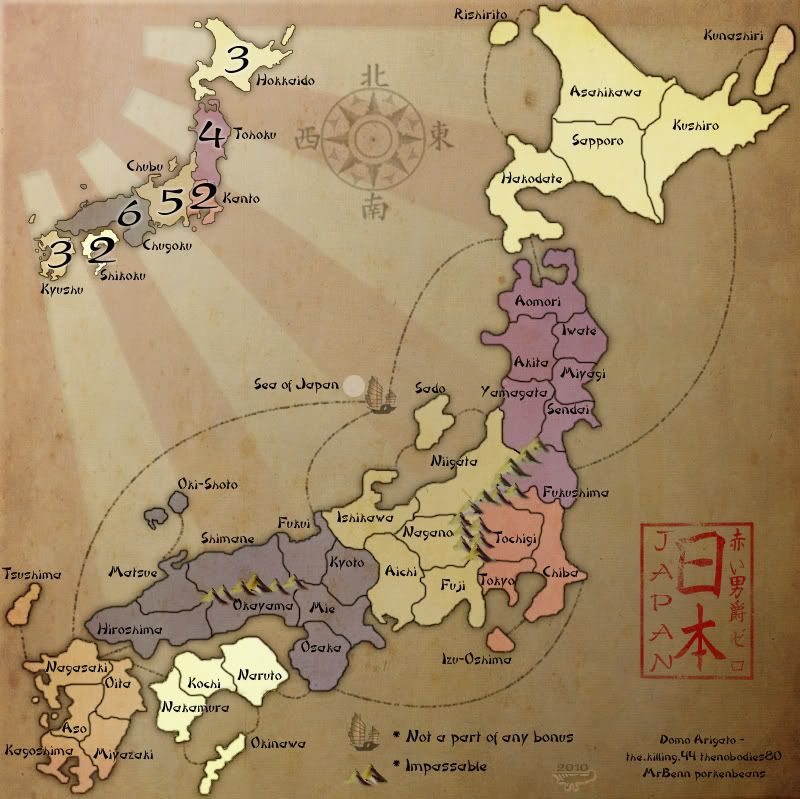
We'll see where we are after some sleep, I think the outline is off and a bit of outer glow to add to around the country will work best. My choice is the background as it is; the results of today's work, and maybe see if I can get the color on the land to come through a bit more.
Re: Japan - 日本 (D, Gp) V13.5 (Upd 1-19)pg46 Lucky 13...

Posted:
Tue Jan 19, 2010 1:57 amby RedBaron0
Ah.... what the hell.
Version 13.5
Large:
- Click image to enlarge.
Small:
- Click image to enlarge.
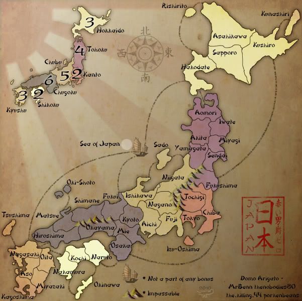
Now I am definitely going to sleep.

Re: Japan - 日本 (D, Gp) V13.5 (Upd 1-19)pg46 Lucky 13...

Posted:
Tue Jan 19, 2010 2:23 amby jefjef
Re: Japan - 日本 (D, Gp) V13.5 (Upd 1-19)pg46 Lucky 13...

Posted:
Tue Jan 19, 2010 12:54 pmby Industrial Helix
Yeah, that's a lot better. Nice work, let's play!
Re: Japan - 日本 (D, Gp) V13.5 (Upd 1-19)pg46 Lucky 13...

Posted:
Tue Jan 19, 2010 12:59 pmby jefjef
Oops. The coloring on Kunashiri should be a little more pure.
