Re: Lunar War <v5> p1, 5
I've been watching this map with unease. I want a moon map, but man I hate dots and connector lines. Fortunately, I think it has the potential to work on a map based on craters...
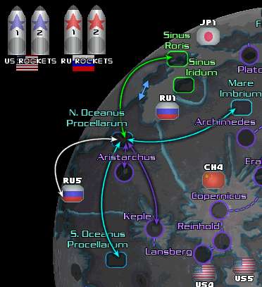
My first crit is that the Sinus seem unnecessary. You've got Mare already.
You've got 6 landing sites per country... cut each in half and add countries. part of the fun of a what if future mission is all the possibilities. The Indian Chandrayaan-I lunar mission found the first evidence of water on the moon just before the US mission confirmed this years big discovery. In fact, the Indian Space Agency is more capable of lunar landing and operations, at this point, than China or Japan.
The European Union could use some representation as well as it is capable of all forms of space exploration as the US, short of landing on the moon. They also spend the most on space exploration besides the US.
Brazil is also a very capable space nation as they run all sorts of rockets, have astronauts and operate satellites. Perhaps the most capable outside of the great powers.
Now if you want to delve deep into science fiction... the South African gov't this year signed a bill which marks their entrance into space exploration. Canada, S. Korea, Indonesia, Israel and Ukraine are all running strong space agencies which include operating rockets and satellites and having astronauts. So the choice is yours but I would love to see more countries involved in this map.
I say you should run with just one style of connection, either the dotted lines or the arrows. Using two is unnecessary and confusing.
The outline of the moon is pixelated.
Throw some stars into that black background.
Can you make the craters look like craters rather than purple circles? I didn't realize they were craters looking at the map until I resigned myself to looking at the lengthy legend. I think it should be obvious what a territory is when you look at it. The mares look great though, very distinctive but the blue line ruins it for me....
Have you guys considered running with a different color scheme? Or at least desaturating them some so that theyre not so bright and neon?
What about the two craters in the south west?
Anyway, good luck.
 ->
->