Page 13 of 19

Re: RAIL ASIA [16.2.12] V27-P21 Sml/Lge 88s

PostPosted: Wed Feb 15, 2012 11:50 am
by natty dread
Well, since the coordinates look fine to me now, and no one else is complaining... I see no reason to hold back the stamp, so I'm giving it with the caveat that if the CA:s or foreman find some coordinates that I've missed, you'll be expected to fix them...

Image

Enjoy!

Re: RAIL ASIA [16.2.12] V27-P21 Sml/Lge 88s

PostPosted: Wed Feb 15, 2012 11:54 am
by cairnswk
natty dread wrote:...
Image

Enjoy!


Thank you !

Re: RAIL ASIA [16.2.12] V27-P22 Finals

PostPosted: Wed Feb 15, 2012 11:55 am
by cairnswk

Re: Re: RAIL ASIA [16.2.12] V27-P22 XML stamped

PostPosted: Sat Feb 18, 2012 1:36 pm
by DiM
i'd say this has decent graphics ... if we were in 2007
look at rail usa. you went downhill from there and i have no idea why.

Re: Re: RAIL ASIA [16.2.12] V27-P22 XML stamped

PostPosted: Sat Feb 18, 2012 1:45 pm
by cairnswk
DiM wrote:i'd say this has decent graphics ... if we were in 2007
look at rail usa. you went downhill from there and i have no idea why.

To start, i didn't do the graphics on Rail USA. widowmakers did. you yet make another fool of yourself.

Re: Re: RAIL ASIA [16.2.12] V27-P22 XML stamped

PostPosted: Sat Feb 18, 2012 1:51 pm
by DiM
cairnswk wrote:
DiM wrote:i'd say this has decent graphics ... if we were in 2007
look at rail usa. you went downhill from there and i have no idea why.

To start, i didn't do the graphics on Rail USA. widowmakers did. you yet make another fool of yourself.


hmm then it's clear why it all went downhill.
good job managing to come close to widowmakers' graphics from 2007... even if you're 5 years later. maybe by next year you'll finally manage to make something better. though it's doubtful since you've already admitted to going for quantity over quality.

but don't worry your pretty little head if you can't manage to improve your graphics, or even the gameplay. the standards are different for you so you'll be cut a slack once again. :roll:

Re: Re: RAIL ASIA [16.2.12] V27-P22 XML stamped

PostPosted: Sat Feb 18, 2012 11:51 pm
by koontz1973
DiM wrote:good job managing to come close to widowmakers' graphics from 2007...

Not even close to widowmakers graphics from 2007. This is by far a better map graphics wise.


Great job cairnswk, even though I never really liked the rail series. ;)

Re: Re: RAIL ASIA [16.2.12] V27-P22 XML stamped

PostPosted: Sun Feb 19, 2012 3:52 am
by Gillipig
DiM wrote:
cairnswk wrote:
DiM wrote:i'd say this has decent graphics ... if we were in 2007
look at rail usa. you went downhill from there and i have no idea why.

To start, i didn't do the graphics on Rail USA. widowmakers did. you yet make another fool of yourself.


hmm then it's clear why it all went downhill.
good job managing to come close to widowmakers' graphics from 2007... even if you're 5 years later. maybe by next year you'll finally manage to make something better. though it's doubtful since you've already admitted to going for quantity over quality.

but don't worry your pretty little head if you can't manage to improve your graphics, or even the gameplay. the standards are different for you so you'll be cut a slack once again. :roll:

Wow DiM you're starting to sound like natty! (not a good thing ;))
I don't understand your criticism, cairnswk is obviously great at map making. If his graphics were doomed not good enough, then you'd have to shoot down at least 90% of all the maps that are being made today! Rail USA doesn't look very good I have to say that, but to compare this map to rail USA graphic wise is very far off!

Re: Re: RAIL ASIA [16.2.12] V27-P22 XML stamped

PostPosted: Sun Feb 19, 2012 7:17 am
by thenobodies80
About the current standard diatribe...please never forget to understand what software people use to develop a map...I'm of the opinion that cairnswk has his own style, we can recognize his maps easily, many of them have a simple graphics, that most of time is mixed with a great great gameplay (i think i don't have to name some maps in this case) that some mapmakers can only hope to develope. I can't understand how it can be said that cairnswk is someone who looks at quantity....he is a creative person who produces lot of maps, but I can count no more than 4 or 5 maps that I wouldn't to have in the current roster (although I don't play all his maps). Yes, his style is not for everyone and i think he is well aware of this, but i think it works for the type of maps that he produces.
DiM on what basis (objective) you can judge this map not par to the standards if ultimately these standards are not written somewhere and the only judges of them are the CAs as written in the guidelines? Not trying to push the discussion in this direction, just pointing out. O:)

Personally, the only thing i personally "dislike" is the title...if I look at the map it pops out too much and I'm forced to look at it every 5 seconds. Don't know if this is a good thing while people is playing the map. But maybe it's just me. ;)

Nobodies

Re: Re: RAIL ASIA [16.2.12] V27-P22 XML stamped

PostPosted: Sun Feb 19, 2012 9:04 am
by DiM
thenobodies80 wrote:About the current standard diatribe...please never forget to understand what software people use to develop a map...


this is the second or third time i heard this excuse. i've never taken it seriously but now that you mention it i'm starting to wonder.
wtf is this? since when did the software used become an excuse for poor graphics? if i have only mspaint should my crappy maps be accepted just because my software can't do miracles?

ok, not everybody should be forced to buy photoshop but gimp is free and it can produce really great graphics. look at natty's eurasia which looks awesome and is done in gimp.

excuses like "my software is not good" or "my skill sucks" are lame. great free software is available and the skills are there to be continuously improved. if you really can't evolve and it comes a time when you're left behind compared to the standards then it's time to give up and go to landgrab.

thenobodies80 wrote:I'm of the opinion that cairnswk has his own style, we can recognize his maps easily, many of them have a simple graphics,


having a style is not that good especially when that style is simple and spread over 30+ maps. it's ok to make a few maps share the same style especially when they're in the same series. but other than that it's actually kinda annoying to have dozens of maps that look virtually identical.

i designed my piglandia map in such a way that it's sort of like a template. i can easily go and in 2 moves switch it from a pig to a sheep a horse or a dragon. same style different map. assuming the map wasn't about a pig but rather about something accepted as good and interesting, would it be ok to produce 30 maps using that template?
it's as easy as finding 30 different islands and adjusting them for my template. i wouldn't spend more than 30-40 minutes per map including drawing the borders and adding the names.

should i do this? apparently it's ok and if somebody says the gfx is not nice i can simply say my software can't do better ;)

thenobodies80 wrote:he is a creative person who produces lot of maps,


i agree with the bolded part but his creativity has dwindled a lot in the past years. there used to be a time when he was challenged to do better and better maps with better and better graphics but at some point nobody bothered to say anything and his style and technique stopped improving. and after a while when some people dared to step in and comment he had become so accustomed to being left alone he started bullying those that dared to comment negatively. and if bullying did not work he either ignored those that commented or he vacationed his maps for months until the protestors would give up and he was free to have his own way.

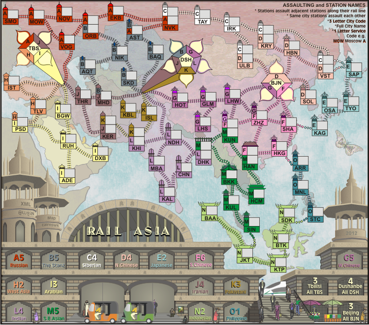
anyway, if you all consider that this map is truly showing 5 years worth of improvement over the rail usa map then it's clear there's nothing i can do about it.
sadly in the long run this map will prove to be another fiasco played for a couple of thousand games and then abandoned.
but hey according to cairns the number of games is not important. so the fact that most of his maps are the least played maps of this site is not relevant.
i'd say constantly being at the bottom of the rankings for close to 5 years with almost 30 maps actually says that something is wrong.
but who am i to judge? maybe it's for the better like this. i mean somebody has to be at the bottom, right?

Re: Re: RAIL ASIA [16.2.12] V27-P22 XML stamped

PostPosted: Sun Feb 19, 2012 9:51 am
by thenobodies80
Don't get me wrong, but there's a big difference between saying that if cairnswk decides to use another software instead of illustrator (that is perfect for vectorial art) he can improve/increase his graphics skill and saying that his current maps are shit. About what people consider a fiasco or not, I stopped to trust into people judgement about graphics after seeing the "your favourite map polls" in which a map like North America (that is probably one of the most awful map we have right now on the site) took more votes than other nice and popular maps, like Germany....in few words you'll never know what people can think.....that's why we have a cow and you're drawing a pig (and you shouldn't).

As said this map is a cairnswk map and I really don't think it's not par to the current foundry standard, then if you're saying that all his maps looks similar I agree with you and he knows i think in this way.

btw, cairnswk could you please make more visible the connections between BTK-KTP and the one between OSA-TYO?

Re: RAIL ASIA [16.2.12] V27-P22 XML stamped

PostPosted: Sun Feb 19, 2012 10:02 am
by natty dread
Well Dim, you know I think you make a lot of good points, but to be fair to cairnswk, some of his work is good and some of his maps are actually quite popular. Stalingrad and Waterloo are one of the most popular maps, at least for those who like complex, strategical maps.

Also I think some of cairnswk's maps look really nice. It's not that he's not capable of creating good graphics. It's more that no one is really pushing mapmakers to do their best and explore new things anymore... and I do believe this should be remedied, somehow.

However, this probably isn't a suitable topic for a map thread, so maybe we should take this to foundry discussions? This seems like the kind of thing that should be talked about in the "declining standards" thread...

Re: Re: RAIL ASIA [16.2.12] V27-P22 XML stamped

PostPosted: Sun Feb 19, 2012 10:36 am
by DiM
thenobodies80 wrote:Don't get me wrong, but there's a big difference between saying that if cairnswk decides to use another software instead of illustrator (that is perfect for vectorial art) he can improve/increase his graphics skill and saying that his current maps are shit.


i did not say his maps are shit i just said they are poorer and poorer compared to the foundry standards. basically his skill and technique have only slightly improved from 4-5 years ago and in my opinion they did not keep up with how the foundry should be. if his graphics were considered good in 2007 decent in 2009 i clearly think they are sub-par in 2012.
if a new map maker made salem's or rail asia i'm willing to bet anything he would not get a graphics stamp. but since cairns made them he gets an automatic pass since apparently bland and simple is his style and that's somehow ok.
if he can't do any better with illustrator then he must either do more tutorials or switch to another software.

thenobodies80 wrote: About what people consider a fiasco or not, I stopped to trust into people judgement about graphics after seeing the "your favourite map polls" in which a map like North America (that is probably one of the most awful map we have right now on the site) took more votes than other nice and popular maps, like Germany....in few words you'll never know what people can think.....that's why we have a cow and you're drawing a pig (and you shouldn't).


a few opinions in the foundry or some votes in a poll will never hold the absolute truth. the only think that comes close to assesing the popularity of a map is the number of games played. if you split maps into categoriez based on size and complexity and then compare them with other maps from the same time frame you can clearly see which map is more popular.
almost all of cairns's map are at the bottom of the pool when put up against similar maps from that same time frame. out of 28 maps he barely has 5-6 that are somewhere at average level or a bit above average. and guess what, those 5-6 maps are mainly some of his earlier maps.

thenobodies80 wrote: As said this map is a cairnswk map and I really don't think it's not par to the current foundry standard, then if you're saying that all his maps looks similar I agree with you and he knows i think in this way.


i think that you (and others) are blinded by the fact that the map is done by cairns.

Re: RAIL ASIA [16.2.12] V27-P22 XML stamped

PostPosted: Sun Feb 19, 2012 10:45 am
by DiM
natty dread wrote:Well Dim, you know I think you make a lot of good points, but to be fair to cairnswk, some of his work is good and some of his maps are actually quite popular. Stalingrad and Waterloo are one of the most popular maps, at least for those who like complex, strategical maps.


actually waterloo while being one of the most succesfull cairns maps, it's not really such a big performer on the overall scheme of things.
it does ok. but not more.
stalingrad on the other hand is not nearly as popular.

waterloo is one of the last few maps where he really did nice. it was all well in 2007 but after 2008 it was ... meh.

natty dread wrote:Also I think some of cairnswk's maps look really nice. It's not that he's not capable of creating good graphics. It's more that no one is really pushing mapmakers to do their best and explore new things anymore... and I do believe this should be remedied, somehow.


exactly what i said. "there used to be a time when he was challenged to do better and better maps with better and better graphics but at some point nobody bothered to say anything and his style and technique stopped improving."

i used to be a fan of his maps. and he knows i've told him before. but after a while one would expect improvement not a plateau or even a decline.

Re: Re: RAIL ASIA [16.2.12] V27-P22 XML stamped

PostPosted: Sun Feb 19, 2012 11:09 am
by Gillipig
DiM wrote:i did not say his maps are shit i just said they are poorer and poorer compared to the foundry standards. basically his skill and technique have only slightly improved from 4-5 years ago and in my opinion they did not keep up with how the foundry should be. if his graphics were considered good in 2007 decent in 2009 i clearly think they are sub-par in 2012.

Are you saying that maps like Pot Mosbi and New Zealand aren't up to par for 2012? I think they're two of the best looking maps in the foundry, and they're obviously not sub par maps regardless of how you slice it! Spanish Armada is a fugly map, if all his maps were like that I'd agree with you but that just isn't the case.

Re: Re: RAIL ASIA [16.2.12] V27-P22 XML stamped

PostPosted: Sun Feb 19, 2012 12:25 pm
by DiM
Gillipig wrote:
DiM wrote:i did not say his maps are shit i just said they are poorer and poorer compared to the foundry standards. basically his skill and technique have only slightly improved from 4-5 years ago and in my opinion they did not keep up with how the foundry should be. if his graphics were considered good in 2007 decent in 2009 i clearly think they are sub-par in 2012.

Are you saying that maps like Pot Mosbi and New Zealand aren't up to par for 2012? I think they're two of the best looking maps in the foundry, and they're obviously not sub par maps regardless of how you slice it! Spanish Armada is a fugly map, if all his maps were like that I'd agree with you but that just isn't the case.


i have not posted in pot mosbi or newzeeland i posted in the rail map for a reason ;)
also i never said all maps i just said most maps.


edit// just checked those 2 maps. while pot mosbi does look ok it still has some pretty nasty aspects that will hopefully be solved in the graphics stage.
however new zeeland is completely sub-par. nothing is textured, the outer border is made of a horrible brush/clipart pasted again and again, the mountains are made of the same image copy pasted dozens of times, these are things that could have passed as decent years ago. at this time i actually expect the map makers to bother making different mountains not copy pasting one all over the place.
yeah sure, at a first glance it looks like an ok image, but once you really start to look at it you see tons of things that are wrong. things that most people will realize they're wrong only when they're replaced with a better alternative. for example his mountains look functional, they are clear as impassables and they do their job. a non-foundry regular or even one with not so high standards will say the map is fine. but take out those mountains insert properly drawn ones and you'll never want to go back to the current ones.
it's like a peanut butter and jelly sandwich. you can eat a simple peanut butter sandwich just fine but once you taste it with jelly you'll never go back ever again.

Re: Re: RAIL ASIA [16.2.12] V27-P22 XML stamped

PostPosted: Sun Feb 19, 2012 12:59 pm
by thenobodies80
OK, now we're going off topic, back on track

thenobodies80 wrote:Personally, the only thing i personally "dislike" is the title...if I look at the map it pops out too much and I'm forced to look at it every 5 seconds. Don't know if this is a good thing while people is playing the map. But maybe it's just me.


thenobodies80 wrote:btw, cairnswk could you please make more visible the connections between BTK-KTP and the one between OSA-TYO?

Re: Re: RAIL ASIA [16.2.12] V27-P22 XML stamped

PostPosted: Sun Feb 19, 2012 2:09 pm
by DiM
thenobodies80 wrote:OK, now we're going off topic, back on track


yeah sure, back on track. i assume properly designing the map is out of the question at this point so let's look into improving what you got right now:

1. white spot that does not belong:
Image
2. black lines/dots in the title (look at the L or R)
Image
3. inconsistent lines in almost all of the train stations (army boxes). the line above MBA is clean and crisp while the line above CHN is blurry and thick. a lot of the stations have the blurry line problem (khi, thr, mhd, dhk etc.)
Image
4. for some reason the outline is lighter than the middle.
Image
5. pixelization in some places but most annoying in the big stations (dsh and tbs)
6. the legend text is inconsistent. some names have a glow while others don't and those that do have a glow have different hues. find a neutral colour that fits all the names and apply it consistently.
7. move further apart the following stations so that the connection is easier to see: thr-mhd, kbl-isl (plus those that tnb80 mentioned)
8. all the letters in the title seem to be centered on a pole/column, except for the L which is a bit to the left.
9. the facade of the train station has a nice brick texture, the dome and the horizontal beams have a sort of cement texture, but the towers don't have anything.

Re: RAIL ASIA [16.2.12] V27-P22 XML stamped

PostPosted: Sun Feb 19, 2012 2:35 pm
by natty dread
DiM wrote:3. inconsistent lines in almost all of the train stations (army boxes).


I noted this before, it's because the vectors are not properly hinted. I haven't really used vector-graphics softwares much, but I would assume that any worthwhile vector software would have some function for hinting, ie. aligning them to the pixel grid?

To explain what I mean:

show: exposition

Re: RAIL ASIA [16.2.12] V27-P22 XML stamped

PostPosted: Mon Feb 20, 2012 6:11 am
by cairnswk
Updated images will be posted later this week.

Re: RAIL ASIA [21.2.12] V28 Final adjustments

PostPosted: Mon Feb 20, 2012 3:00 pm
by cairnswk
Do your best with this fellas!..before i post the large.
All issues raised above have been addressed.

Image

Re: RAIL ASIA [21.2.12] V28-P23 Final adjustments

PostPosted: Mon Feb 20, 2012 8:07 pm
by isaiah40
The little black dots are still visible on the title, and I didn't zoom in to see them. ;)

Re: RAIL ASIA [21.2.12] V28-P23 Final adjustments

PostPosted: Mon Feb 20, 2012 11:50 pm
by cairnswk
isaiah40 wrote:The little black dots are still visible on the title, and I didn't zoom in to see them. ;)

Please refresh isaiah40, those black dots are gone because i have changed the treatment of the backdrop of the title.
The problem aparently was arising because of the font being extruded & image translation to .png on my computer.
Rather than change the font which i have already battled over, i changed the brackdrop treatment.
Problem should now be solved.

Re: RAIL ASIA [21.2.12] V28-P23 Final adjustments

PostPosted: Tue Feb 21, 2012 12:04 am
by isaiah40
Okay, title looks good.

Some of the stations still have that blurry line; DHK, CHN, HKG, HAN, BKK, KAL, HCM, KAG, SHA, ZHZ (the "F" needs to come down a couple pixels as well), LHW, SAP, IRK, TAY and AST.

On MHD, the "J" can come down a pixel or two.

Looking at the station bonuses, I'm thinking you might not need the outer glow.

Re: RAIL ASIA [21.2.12] V28-P23 Final adjustments

PostPosted: Tue Feb 21, 2012 1:03 am
by cairnswk
isaiah40 wrote:Okay, title looks good.

Some of the stations still have that blurry line; DHK, CHN, HKG, HAN, BKK, KAL, HCM, KAG, SHA, ZHZ (the "F" needs to come down a couple pixels as well), LHW, SAP, IRK, TAY and AST.

On MHD, the "J" can come down a pixel or two.

Looking at the station bonuses, I'm thinking you might not need the outer glow.


isaiash40. the things that are out of alignment i am happy to fix.

for the blurry lines, i have to question this, because if i zoom in at 240-300%, they are all bloody blurry. so is a player going to even notice this anyway. i mean can you notice this at normal 100% vision, because i can't.
i have been through and fixed all the stations as per natty's request above and grided the bounding boxes. that took over 6 hours to redo all the stations.

i disagree with the outer glow comment, if it wasn't needed in the first place i wouldn't have put it there and gone to the trouble of finding a solution for the flatness. Some of those colours are not very visible on that karchi-gray background, which is why it is there to lift them.

i would also ask, that if this map still has graphics issues, then the graphics and xml stamps needs to be withdrawn as it seems it was handed out prematurely. :)