gimil wrote:[Stickied]
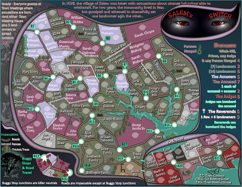
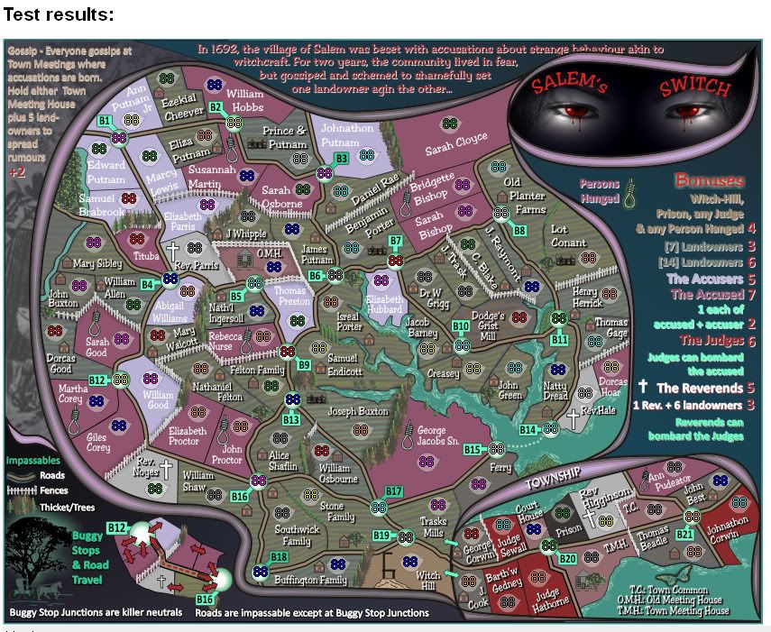
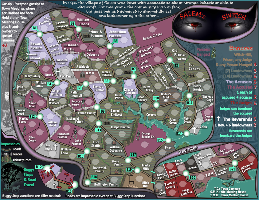
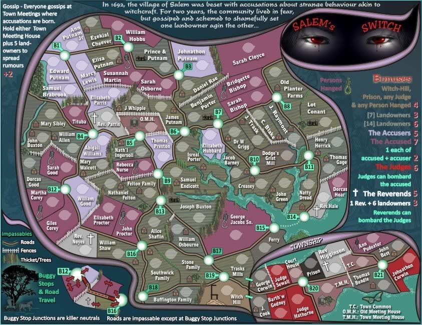
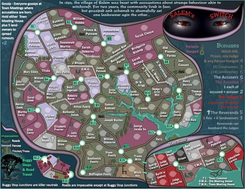
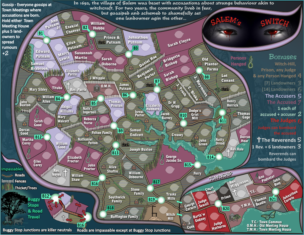
The only issue I see now cairns is that the legends text on the right needs t stand out a little more. It looks to flat on that watermark underneath and some colours are swallowed up. I think a glow on those legends that match the terr names should solve this problem.
Gimil, firstly let me remind you that "to flat" should be "too flat"...which has now been done to death but i see it still appears.
I've already been through this one and tried to make it stand out more, and i have tried to put a glow around the text unsuccessfully, because what happens is that you lose the watermark image in the background and i don't want that. Besides a white glow that matches the terr names look hideous.
To boot, it is an odd combination of colours but that is the design of the map.
I think 90% of it stands out reasonably well, more so particularly on the big map.

Overall, i'm pretty happy with it.