Page 1 of 20
Senate Map [Quenched]

Posted:
Tue Dec 26, 2006 12:10 pmby Fitz69
Maps:
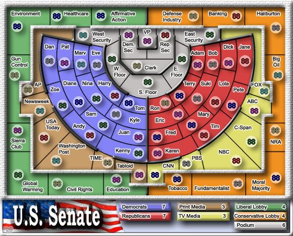
http://i128.photobucket.com/albums/p192 ... ate600.jpg
http://i128.photobucket.com/albums/p192 ... ate800.jpg
XML:
http://upload2.net/page/download/hoVJsV ... L.txt.html
65 countries
7 continents
Names for the areas are hard to come up with so I took the liberty of being a bit creative. In theory any "
Tom, Dick or Harry" can become senator so I used such names for the seats.
Media and lobbyists are other influences in politics so theyre present as well.
Posted:
Tue Dec 26, 2006 12:24 pmby everywhere116
In the Senate they have assigned seats. Why dont you name the seats after who actually occupies them.
Posted:
Tue Dec 26, 2006 12:42 pmby reverend_kyle
everywhere116 wrote:In the Senate they have assigned seats. Why dont you name the seats after who actually occupies them.
I agree, overall I like it though, it has that nice simple ccu feel to it.
Posted:
Tue Dec 26, 2006 12:54 pmby Fitz69
everywhere116 wrote:In the Senate they have assigned seats. Why dont you name the seats after who actually occupies them.
It originally had all the seats but it was way too cluttered.
You can see it under the topic "new ideas"
Posted:
Tue Dec 26, 2006 1:01 pmby reverend_kyle
you can get rid of some of the senators as that is only like 1/3 of the seats, just get rid of the ones you dont hear about for playability reasons.
Posted:
Tue Dec 26, 2006 1:57 pmby P Gizzle
i like it, even with the names.
Posted:
Tue Dec 26, 2006 2:03 pmby onbekende
Nice, now I know where to put my bomb
Posted:
Tue Dec 26, 2006 2:05 pmby s.xkitten
onbekende wrote:Nice, now I know where to put my bomb

don't let homeland security hear you....and nice map, i like it...its like CCU...
Posted:
Tue Dec 26, 2006 2:06 pmby onbekende
s.xkitten wrote:onbekende wrote:Nice, now I know where to put my bomb
don't let homeland security hear you.
They couldn't even find Bin Laden when he passes them with a sign "I AM BIN LADEN"
but certainly a mpa discussed before, nice to finally see a map of it
Posted:
Tue Dec 26, 2006 4:43 pmby Fitz69
Ok nice input everyone..
Let get to some specifics, as to what needs to be done. On topic that is.
1. lettering. All text in the map needs to be redone. Mainly a question about font size in my opinion.
2. Size. Get the size right. 2 versions as specified in the "how to make a map"
3. Cosmetics. A better backgrond than the white one. Maybe a flag under the bonuses.
4. XML file thingamajigg. Gotta look into how that is done.
Any input from everyone else? Fell free to add to the list.
Posted:
Tue Dec 26, 2006 5:02 pmby AndyDufresne
Definitely look into seeing if users are interested in playing this idea of a map, before going head long into it. Intriguing idea!
--Andy
Posted:
Tue Dec 26, 2006 5:13 pmby Qwert
to many teritory to many borders.
Posted:
Tue Dec 26, 2006 5:22 pmby DublinDoogey
I like it, it's a fun, creative idea. I'm assuming that the thick black lines are an uncrossable boundary? Is that correct? Also, you might want to look into moving the legend above/below the map (similar to Hong Kong map) so that you can make it a bit bigger, increasing legibility.
Anyway, it looks good and I like the idea, keep up the work

Posted:
Wed Dec 27, 2006 1:51 amby Sargentgeneral
I think you need to close some of the boarders to make it a more playable map.
Posted:
Wed Jan 03, 2007 6:01 pmby Fitz69
deleted
Posted:
Wed Jan 03, 2007 6:06 pmby Fitz69
Fitz69 wrote:Ok nice input everyone..
Let get to some specifics, as to what needs to be done. On topic that is.
1. lettering. All text in the map needs to be redone. Mainly a question about font size in my opinion.
2. Size. Get the size right. 2 versions as specified in the "how to make a map"
3. Cosmetics. A better backgrond than the white one. Maybe a flag under the bonuses.
4. XML file thingamajigg. Gotta look into how that is done.
Any input from everyone else? Fell free to add to the list.
Latest changes
1. DONE
2. DONE
3. DONE
Posted:
Wed Jan 03, 2007 6:53 pmby DublinDoogey
I like this map a lot! If you were to move the legend to be all across the bottom/top of the map, like Hong Kong, you may be able to actually increase the size of the map itself, making it easier to read the names on the small version.
Posted:
Wed Jan 03, 2007 7:12 pmby AndyDufresne
Hm, well lets see...the map is coming along...
- You'll have to rework the black lines, they seem slopped on. Perhaps using a brown, and making it look more like a wood grain, might give the effect of barriers and impassable borders.
- Regarding the colors, I like them overall, but can you experiment with perhaps making them a little darker? I like the brightness, but it might be a touch to much.
- Regarding a few of the country names...I suggest moving 'Newsweek' to the 'Tabloid' spot, and flip flopping them. I think that will fit better.
- Also, I'd get rid of one of the two 'oils'. Keep Big Oil, replace bigger oil with something else.
- Notice how you put fox's name on the top? Either do the same with AP (or perhaps put tabloid there), to keep things symmetrical.
- You might have to boost the size of names on the small map, though it looks rather impossible.
- One thing to consider, stretch the map a little bit vertically, not very much, but that might give you more room for the names and the army shadows.
--Andy
Posted:
Thu Jan 04, 2007 12:15 amby Marvaddin
What a boring and usa-centric idea! Map of US senate... bah! At least make a map of CC senate (even why CC is much more important than US
). Start changing those seat names... although not all need to be changed, once you have Kyle, Ron, Dan, Pete...

Wheres my seat, man?

You also could use some clans names, or, as lobby, how about dice changing, no more maps, noobs segregation, kill hendy, etc?
Would that be possible? Because it would surely have much more appeal to me.
Posted:
Thu Jan 04, 2007 12:36 amby Sargentgeneral
I disagree with Marvaddin, i think this will eventually become a very good map.
Now regarding the points that andy made:
1. I believe you do need to darken the countries because after playing it for a long time it would hurt your eyes.
2. I really like the idea of perhaps and acutal wood design for the boarders. That way it would seem like an actual building.
3. The placement of Fox should match AP.
4. One of the oils must be changed.
These ideas will help the map move along much quicker. (these are andy's points and i agree with them)
Posted:
Thu Jan 04, 2007 1:07 amby Marvaddin
And Im against this one? Im just suggesting a little "theme change"
(Didnt I seem serious in my previous post? I was totally serious: do a CC senate map instead!)
Posted:
Thu Jan 04, 2007 2:41 amby reverend_kyle
Marvaddin wrote:And Im against this one? Im just suggesting a little "theme change"
(Didnt I seem serious in my previous post? I was totally serious: do a CC senate map instead!)
If he moves that kyle into a blue seat he's already got a good start.
Posted:
Fri Jan 05, 2007 2:24 amby Coleman
I think this looks brilliant as is personally, can't wait to play on this one if it gets added.
Posted:
Sun Jan 07, 2007 6:07 pmby Fitz69
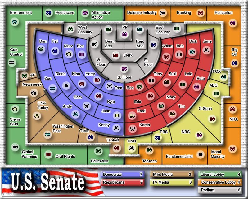
1. Black lines: gone. Went for a brick and handrail feel.
2. Colors: Darkened and changed.
3. Names: Flipflopped Newsweek and Tabloid.
4. Names: Bigger Oil now called Banking. (thought Big and bigger oil was kinda fun though).
5. Media names: Fox and AP symetrical.
6. Map size: Followed DublinDoogeys suggestion; put the legend below and got more room.
7. Kyle: Well, he's in a blue seat now.
Let me know what you think. (of course you will
)
Posted:
Sun Jan 07, 2007 6:27 pmby johloh
should there maybe be a left right connection somewhere at the bottom of the map?
if you leave it how it is i think the podium should have a larger bonus due to its central location...