Page 1 of 5
Tamriel map of the Elder scrolls [Done]

Posted:
Tue Apr 25, 2006 6:01 pmby Banana Stomper

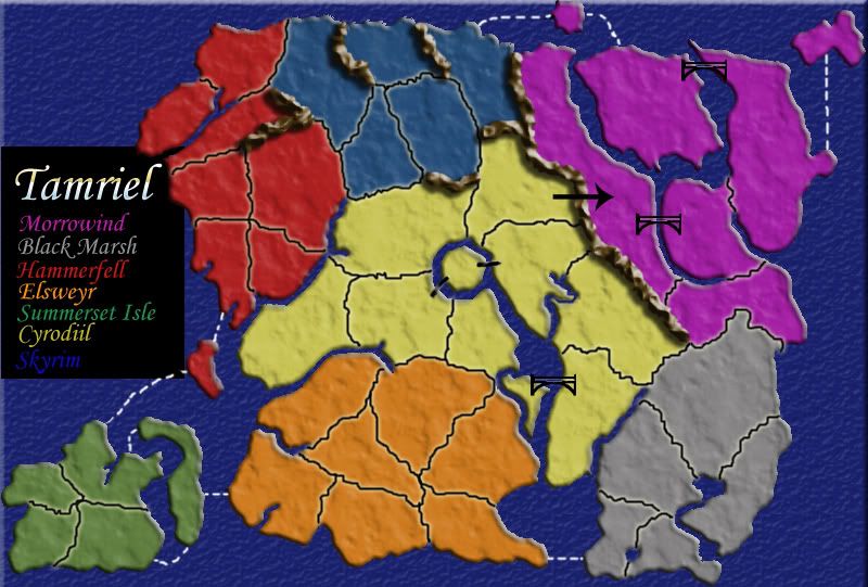
Hey there, i just had the idea to do the map of Tamriel from the Elderscrolls. I think it makes for a pretty dynamic map, it'd be a fun play. Just some little notes about it, the thick ugly gray lines will be mountains, and are up for being changed, but where they are now are sorta true for Tamriel. Also, the island continent in the south west is in fact a different continent from the yellower one, the colors ended up looking similar after i started fiddling. One other nice thing, 48 countries, so there won't be any neutral territories save a 5 person game... This is a pretty rough draft. Let me know what you guys think.

Posted:
Tue Apr 25, 2006 6:03 pmby johnnyrotten
Looks pretty good to me... Marv'll be gay like normal and say it's shite lol... only joking Marv


Posted:
Tue Apr 25, 2006 6:16 pmby thegrimsleeper
I've never heard a joke that had as much truth in it as that one...

I'm just kidding too Marv.

Not a bad first draft at all, actually. I'd recommend taking the height of the 3D countries down lower a bit, so it doesn't look so much like bubble wrap. Obviously the mountains will be changed, and there are certainly quite a few mappers on here that can help you with that if you need.
It actually looks like a very fun map. Those names are a little ridiculous, but hey, it is fantasy, right? Anyway, nobody should have any problem remembering where ac ountry is with such a memorable name as Fang's Lair.

Posted:
Tue Apr 25, 2006 6:23 pmby Hoff
looks like a good start. Try adding some texture to the countries and the sea maybe. And werent there mounts all over tamriel? Maybe you coudl use some mountains as natural borders. And the names of the countries are really hard to see. Different bolder font and all the same color might be better. but its a nice start. Morrowind is the most addicting game ever....

Posted:
Tue Apr 25, 2006 6:40 pmby coolestguy98
yea, definitly looks like a good start on a very rough draft, i know you Stomper, and i'm sure this will be quality...

Posted:
Tue Apr 25, 2006 7:10 pmby Hoff
you also need to find room for some sort of legend where it says what the territory bonuses are. And also, i'm not a huge fan of the different shades within the same territotory. I like a territory to be all the same shade of whatever color. By territory I mean the ones that you get the bonuses for.

Posted:
Tue Apr 25, 2006 7:15 pmby Shadow Dragon
Yeah that looks really good. Here is an actual map just in case you might need it or something that shows all of Tamriel and the differant regions and such.
http://img205.imageshack.us/img205/2076 ... 1rj5zb.gif

Posted:
Tue Apr 25, 2006 7:17 pmby kingwaffles
It would be better to keep consistent colours within a continent as well as making some of the colour differences clearer just to make it a little easier on the eyes.

Posted:
Tue Apr 25, 2006 7:35 pmby Jota
I agree with kingwaffles. You don't need to make a continent all exactly the same, but it'd help if the different shades were closer to each other (especially at the lighter end of the spectrum, where they all appear to be approaching "gray" from different directions).
Also, it might actually be beneficial for a couple of these continents if you increased the number of borders they had. I'm thinking in particular of the islands in the southwest, the green continent in the southeast, or the purple continent in the northeast.
Looks decent. I'd like to see how this one progresses.

Posted:
Tue Apr 25, 2006 7:57 pmby Banana Stomper
Also, it might actually be beneficial for a couple of these continents if you increased the number of borders they had. I'm thinking in particular of the islands in the southwest, the green continent in the southeast, or the purple continent in the northeast.
I'm open to adding more paths into continents, but it was sort of one thing i was trying to avoid with such a compact map. A lot of the new maps are very cramped. I was trying to revert back to something more along the lines of the original world map, in which austrailia has one entrance, south america has two, north america three, for example. I feel like the limitations may lead to more interesting, dynamic gameplay. I'd be interested to hear what more people have to say about the issue.

Posted:
Tue Apr 25, 2006 9:55 pmby Shadow Dragon
I almost forgot my suggestion. It looks like a good start and all but if it is possible you should try to add in some of the other large regions like Valenwood, Elsweyr, and High Rock as right now they seem to just have been absorbed by the other countries/regions.

Posted:
Wed Apr 26, 2006 6:47 pmby Marvaddin
Take it easy, guys, Im not so harsh.

And my suggestions are here to help, not to flame

About the map, its really a good start. A continent-by-continent analysis should be made for detect some problems, like the yellow continent very difficult to hold and the purple very easy to hold...
About the visualization, some good suggestions already. Change the colour of the names of the yellow countries, too... difficult to read.
This map has potential and can be a good one... keep working.

Posted:
Fri Apr 28, 2006 11:51 amby Banana Stomper

This is another draft of the Tamriel Map. I tried making the central region a little more true to the real map of the region. I also added some texture and whatnot. Those goofy little things crossing some rivers are supposed to be bridges, they need some work, but thats the idea. Some other big changes. I felt like the red region was kinda large, so i cut out some, which also conveniently left room for a legend. The number of countries has changed, so any suggestions on where to add or delete countries to make a nice number would be grand. Suggestions for adding to playability would be nice. And comment on whether you like the original region setup as opposed to the new one. Thanks!

Posted:
Fri Apr 28, 2006 11:58 amby Hoff
i think the textures are looking good and the map is coming along nicely. The bridges and the dotted lines need work. we need to see territory names and bonus values adn stuff like that. Its looking good tho.

Posted:
Fri Apr 28, 2006 4:26 pmby Mr. K
Looks like its coming along pretty nicely. Keep up the good work.

Posted:
Sat Apr 29, 2006 6:38 pmby Banana Stomper

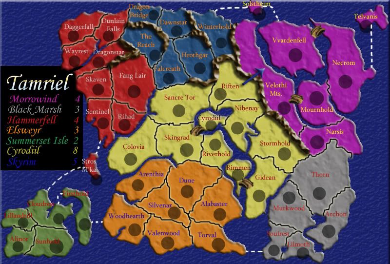
I'm thinking she's looking about done. To note some changes.
-the mountains in Skyrim were altered to give skyrim some internal regions.
-country added to red to give 48 countries (i think)
-new bridges!
-Bonus values.
What do you think

Posted:
Sat Apr 29, 2006 6:44 pmby Hoff
I like the way it looks. I'm not very good at evaluting bonuses so i'll leave that up to someone else. One thing that i would suggest would be to fix the fonts of the territory names. They arnt the easiest to read, especially in summerset Isle. Maybe making the text bold, and changing the color to something easier to read. Changing the actuall font type might be good too. but besides that i think it looks good.

Posted:
Sat Apr 29, 2006 7:37 pmby Jota
This is looking very good. I do think that Cyrodiil's bonus looks a bit high, though. I'd recommend adding a sea route between Gidean and Murkwood or one between Colovia and Sentinel/Rihad. Possibly even both. I think that would still fit with the Black Marsh's bonus of 3, although it might arguably raise Hammerfell to 5.
Also, what order is the legend in? It might make it a bit easier to use if it was ordered by how the countries were laid out on the map: Hf, S, Mw, C, SI, E, BM.

Posted:
Sat Apr 29, 2006 7:55 pmby Hoff
yea and bout the visual look of the legeng....i like the black background. But maybe make it smaller so that its not under that countinent. and add some texture or inner or outer glow to give it some depth. And work on lining up the territory names in the legend

Posted:
Sun Apr 30, 2006 5:19 pmby Hoff
in the map that you posted in the embassy thread the grey countries but the red writing was hard for me to read. but it looks fine here.

Posted:
Sun Apr 30, 2006 7:30 pmby haha
the map looks good but shount black marsh and symmerset isle be worth the same

Posted:
Sun Apr 30, 2006 7:45 pmby Banana Stomper
Possibly, I guess the only thing that really puts it above summerset isle is that it can be attacked from 3 regions as opposed to summerset isle, which can be attacked from only two. I'm not sure if thats enough of a reason, but thats it, heh.

Posted:
Sun Apr 30, 2006 7:52 pmby haha
o i only see two

Posted:
Sun Apr 30, 2006 7:53 pmby haha
it can be atacket but u olnly need to defend 2

Posted:
Sun Apr 30, 2006 7:56 pmby Hoff
yea its a tough call. I can see it going either way. It depends how important you think number of attacking borders are. It will be fine either way.


