Wow! That looks fantastic, RedBaron!
-Sully
Philadelphia [Quenched]
Moderator: Cartographers
Re: Philadelphia - [17 Jan 2012] pg 27 -Revamped
![]() by Victor Sullivan on Tue Jan 17, 2012 10:44 pm
by Victor Sullivan on Tue Jan 17, 2012 10:44 pm
Beckytheblondie: "Don't give us the dispatch, give us a mustache ride."
Scaling back on my CC involvement...
Scaling back on my CC involvement...
-

 Victor Sullivan
- Posts: 6010
- Joined: Mon Feb 08, 2010 8:17 pm
- Location: Columbus, OH


Re: Philadelphia - [17 Jan 2012] pg 27 -Revamped
![]() by natty dread on Wed Jan 18, 2012 1:12 am
by natty dread on Wed Jan 18, 2012 1:12 am
I... have to disagree.
That wall looks way too uniform and clean, it looks what it is: a photoshop filter, not a real brick wall...
I liked the previous wall much better.
That wall looks way too uniform and clean, it looks what it is: a photoshop filter, not a real brick wall...
I liked the previous wall much better.

-

natty dread
- Posts: 12877
- Joined: Fri Feb 08, 2008 8:58 pm
- Location: just plain fucked


Re: Philadelphia - [17 Jan 2012] pg 27 -Revamped
![]() by perchorin on Wed Jan 18, 2012 1:24 am
by perchorin on Wed Jan 18, 2012 1:24 am
natty_dread wrote:I... have to disagree.
That wall looks way too uniform and clean, it looks what it is: a photoshop filter, not a real brick wall...
I liked the previous wall much better.
I liked the previous brick wall much better too. This one hurts my eyes, and makes me think of those special floor tiles they have at preschools so the toddlers don't hurt themselves falling over. Game play is looking pretty sweet though--underdog bonus is a cool idea.

Silvanus wrote:perch is a North Korean agent to infiltrate south Korean girls
-

perchorin
- Posts: 1859
- Joined: Mon Sep 04, 2006 8:19 am
- Location: Busan, South Korea


Re: Philadelphia - [17 Jan 2012] pg 27 -Revamped
![]() by RedBaron0 on Wed Jan 18, 2012 1:57 am
by RedBaron0 on Wed Jan 18, 2012 1:57 am
ugh....
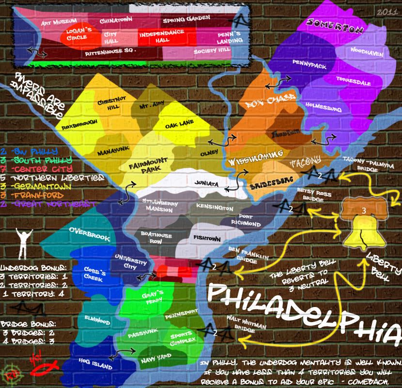
So this is better?
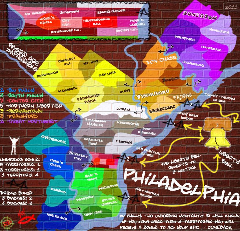
Or this?
So this is better?
- Click image to enlarge.
Or this?
- Click image to enlarge.


-

RedBaron0
- Posts: 2657
- Joined: Sun Aug 19, 2007 12:59 pm
- Location: Pennsylvania


Re: Philadelphia - [18 Dec 2011] pg 25 -Painted on or not?
![]() by lostatlimbo on Wed Jan 18, 2012 3:48 am
by lostatlimbo on Wed Jan 18, 2012 3:48 am
I agree with Sully. This looks much more realistic than the previous version. Its a tad on the dark side, but big improvement.
The other two you posted after this still look like they are just floating in space.
Stick with this one and keep at it and it will look great.
The other two you posted after this still look like they are just floating in space.
Stick with this one and keep at it and it will look great.
RedBaron0 wrote:
- Click image to enlarge.
Image size: 830x800
The size is still the previous size, still haven't heard about the supersize upgrade yet, but that's an easy fix.
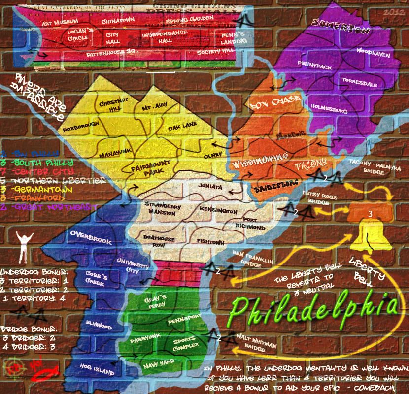
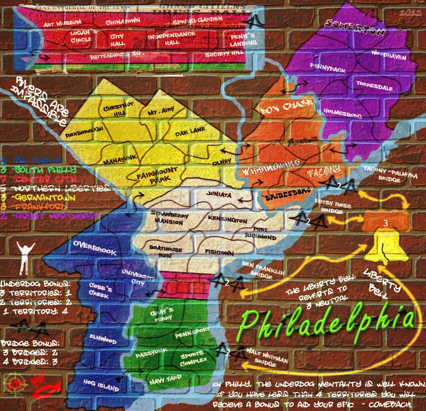
Hopefully now.... this satisfies most on the brick wall part. There is more work to do of course and I have new features here for you all to see, and new features to get your opinions on.
No borders.... well they are there, just using the difference in color to differentiate between regions.
Font fiddling: The outline is gone on all all the texts.... well almost all of them. I'm also looking at a few different fonts and styles. Frankford's territories are all all different fonts, some with outlines, some not. Also Overbrook and Fairmount Park are the original "Philly Sans" font but at 18 pt instead of 14. Somerton is also a different style all together. A graffiti font that is mainly a white outline, there is a colored layer beneath with a bit of white shine added, like was suggested in one of the tutorials in a previous post. I know the white isn't conducive to all the territories, and will work them all out one the font is set.
I still have some work to do, and I plan on doing more on all of this on at least a more frequent basis... otherwise it might take another year to finish up... lol
Whatever other suggestions are out there feel free to make them!
Will work on the lines that connect territories and the bridges and the Liberty Bell. And the bell itself I will work on as well.
-

lostatlimbo
- Posts: 1386
- Joined: Wed Mar 28, 2007 3:56 pm
- Location: Portland, OR


Re: Philadelphia - [17 Jan 2012] pg 27 -Revamped
![]() by ndrs on Wed Jan 18, 2012 3:50 am
by ndrs on Wed Jan 18, 2012 3:50 am
natty_dread wrote:I... have to disagree.
That wall looks way too uniform and clean, it looks what it is: a photoshop filter, not a real brick wall...
I liked the previous wall much better.
No, no. I have to say I like this new version of the wall (the first of them).
True, it does look like a PS filter, because it is, but it goes well with the style of the paint. The paint doesn't look like "real" paint – why should the wall have to?
Making the map (and paint) look "real" doesn't necessarily make for a better map. The style is consistent, it's decently easy to read (although some texts need tweaking),
and there's no doubt that it represents graffiti.
A few ideas:
– some tests are too hard to read, especially the white on green.
– keep it down to one font for terit labels.
– paint the Liberty Bell in the same manner as the main map; no out lines.
– the outline on the upper left mini map looks weird.
– the bridges and yellow arrows looks a bit blurry compared to the sharper regions.
Nice work
-
ndrs
- Posts: 181
- Joined: Tue Oct 26, 2010 9:34 am
- Location: Malmö, Sweden


Re: Philadelphia - [17 Jan 2012] pg 27 -Revamped
![]() by natty dread on Wed Jan 18, 2012 5:34 am
by natty dread on Wed Jan 18, 2012 5:34 am
ndrs wrote:but it goes well with the style of the paint. The paint doesn't look like "real" paint – why should the wall have to?
They should both look real. There's no point in trying to go for a wall painting style otherwise.
ndrs wrote:Making the map (and paint) look "real" doesn't necessarily make for a better map.
If the theme of the map is a map that's painted on a wall, then yes it does.
Even if the theme was a drawing of a wall with a map painted on it, the ps filter version still wouldn't cut it, because it doesn't look like a drawing... it simply looks like a map image with a filter applied on it.
The point is, if rb0 wants to go for a style of a wall painting, then the wall and the paint should look real. If it doesn't, then he might as well scrap the whole wall idea and go for a more abstract representation, but this half-way business just doen't look good either way.
-
natty dread
- Posts: 12877
- Joined: Fri Feb 08, 2008 8:58 pm
- Location: just plain fucked
Re: Philadelphia - [17 Jan 2012] pg 27 -Revamped
![]() by ndrs on Wed Jan 18, 2012 7:43 am
by ndrs on Wed Jan 18, 2012 7:43 am
natty_dread wrote:ndrs wrote:but it goes well with the style of the paint. The paint doesn't look like "real" paint – why should the wall have to?
They should both look real. There's no point in trying to go for a wall painting style otherwise.ndrs wrote:Making the map (and paint) look "real" doesn't necessarily make for a better map.
If the theme of the map is a map that's painted on a wall, then yes it does.
Even if the theme was a drawing of a wall with a map painted on it, the ps filter version still wouldn't cut it, because it doesn't look like a drawing... it simply looks like a map image with a filter applied on it.
The point is, if rb0 wants to go for a style of a wall painting, then the wall and the paint should look real. If it doesn't, then he might as well scrap the whole wall idea and go for a more abstract representation, but this half-way business just doen't look good either way.
To try to express myself a little better:
When I said it doesn't have to look "real", I meant that it doesn't have to look photorealistic. In fact, with the clarity a CC-map warrants, it's better if it doesn't.
The paint and the wall have to look real in a sense, but only in context of its own intended artistic style.
And I think the style of the map right now is far enough from photorealism to be described as an abstract representation.
-
ndrs
- Posts: 181
- Joined: Tue Oct 26, 2010 9:34 am
- Location: Malmö, Sweden
Re: Philadelphia - [17 Jan 2012] pg 27 -Revamped
![]() by natty dread on Wed Jan 18, 2012 10:47 am
by natty dread on Wed Jan 18, 2012 10:47 am
ndrs wrote:The paint and the wall have to look real in a sense, but only in context of its own intended artistic style.
Right, but if the "intended artistic style" of the map is "crappy PS filters", then it's best to change the intended style...
That version with the small bricks simply doesn't look like a wall, it just looks like a 2-minute bump map applied on a digital image. It doesn't look like graffiti.
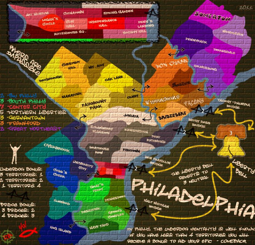
I think this version
- Click image to enlarge.
has the most potential currently. If the texture on the painted areas is fixed it should look pretty rad. Just make the mortar look darker than the bricks on the painted areas, not brighter like it is now... that would go a long way already.
-
natty dread
- Posts: 12877
- Joined: Fri Feb 08, 2008 8:58 pm
- Location: just plain fucked
Re: Philadelphia - [17 Jan 2012] pg 27 -Revamped
![]() by DiM on Wed Jan 18, 2012 11:09 am
by DiM on Wed Jan 18, 2012 11:09 am
the new version is horrible. i'm sorry, i can't even say it is poor or bad. it's simply awful.
if you want graffiti then make it look like graffiti
if you want graffiti then make it look like graffiti
“In the beginning God said, the four-dimensional divergence of an antisymmetric, second rank tensor equals zero, and there was light, and it was good. And on the seventh day he rested.”- Michio Kaku
-

DiM
- Posts: 10415
- Joined: Wed Feb 14, 2007 6:20 pm
- Location: making maps for scooby snacks


Re: Philadelphia - [17 Jan 2012] pg 27 -Revamped
![]() by RedBaron0 on Wed Jan 18, 2012 11:06 pm
by RedBaron0 on Wed Jan 18, 2012 11:06 pm
UGH This is why I changed my mind on the brick wall in the first place, some like it, others don't.... everyone has their opinion on what they THINK graffiti looks like! The point is it looks different from city to city, different from region to region.
Everyone is gonna have their own bloody opinion on what it should look like, so my version looks "too clean" "floating on top" or "is horrible, if you want graffiti then make it look like graffiti" (Beautifully stated by the way DiM... helpful.)
My God.... there is no satisfying everyone on this friggn theme, then maybe I was right the first time to ditch it and try something else. AGAIN. I have tried just about every suggestion within this theme and still no one is satisfied, especially me.
Do forgive my ranting, I'm frustrated. I want this to work. I want to work on this. But honestly I get more joy out of other stuff I draw, and prefer doing that to this, because I get SATISFACTION. This continues to be an exercise in futility.
-
RedBaron0
- Posts: 2657
- Joined: Sun Aug 19, 2007 12:59 pm
- Location: Pennsylvania
Re: Philadelphia - [17 Jan 2012] pg 27 -Revamped
![]() by DiM on Thu Jan 19, 2012 2:34 am
by DiM on Thu Jan 19, 2012 2:34 am
i never understood why you gave up on this version and started from scratch. since then it went downhill. it still needed some touch ups but it was very cool and it looked more natural.
i'm sorry my previous comment was not helpful but the only advice i could give was scratch it. with the earlier version i can give you plenty of feedback on various things that need improvement because overall the map looks ok and has potential but with the new map there's basically nothing that i like.
sorry.
“In the beginning God said, the four-dimensional divergence of an antisymmetric, second rank tensor equals zero, and there was light, and it was good. And on the seventh day he rested.”- Michio Kaku
-
DiM
- Posts: 10415
- Joined: Wed Feb 14, 2007 6:20 pm
- Location: making maps for scooby snacks
Re: Philadelphia - [17 Jan 2012] pg 27 -Revamped
![]() by koontz1973 on Thu Jan 19, 2012 3:07 am
by koontz1973 on Thu Jan 19, 2012 3:07 am
RedBaron, while I like he map, DiM has made a good point with his earlier version being better. Just a question though, why bricks and not another surface? Graffiti is sprayed on everything from posters to billboards (front and back) etc. It seems the bricks are causing the most problems and contention so why not try something different for the background.
You could go with...
White tiles (as in a subway)

Garden fence

Wood (billboard) This would give you lots of options for front or back and I am sure you can come up with a product for Philadelphia that can be a great advert.

Concrete or plaster

or if you want to keep the bricks, try painting them one colour.

Just some ideas for you. Hope you get this one right and it stops being frustrating for you.
You could go with...
White tiles (as in a subway)
Garden fence
Wood (billboard) This would give you lots of options for front or back and I am sure you can come up with a product for Philadelphia that can be a great advert.
Concrete or plaster
or if you want to keep the bricks, try painting them one colour.
Just some ideas for you. Hope you get this one right and it stops being frustrating for you.

-

koontz1973
- Posts: 6960
- Joined: Thu Jan 01, 2009 10:57 am


Re: Philadelphia - [17 Jan 2012] pg 27 -Revamped
![]() by thenobodies80 on Thu Jan 19, 2012 8:36 pm
by thenobodies80 on Thu Jan 19, 2012 8:36 pm
I'm of the opinion that your new version has 4 major problems:
1. Too dark
2. Too yellow
3. Borders, add them, some black line could help there
4. There's nothing wrong with the brick effect, just you have to apply it on the old background to give to it more depth, than align it with the ret of the map in this way you can have the image that is painted on the wall and not floating, but with a realistic wall.
Said that i'm not pushing you for a photorealistic map, it's just a useless pain
Nobodies
-

thenobodies80
- Posts: 5400
- Joined: Wed Sep 05, 2007 4:30 am
- Location: Milan


Re: Philadelphia - [29 Jan 2012] pg 28 -Revamped, again
![]() by RedBaron0 on Sun Jan 29, 2012 4:21 am
by RedBaron0 on Sun Jan 29, 2012 4:21 am
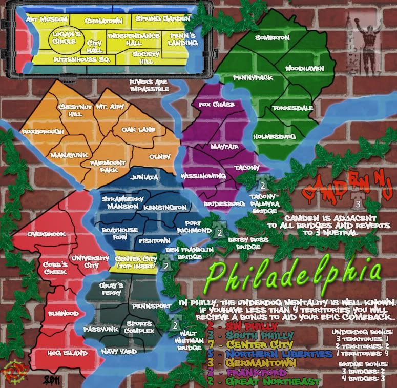
- Click image to enlarge.
Stepping backwards to see if I recapture some momentum. There is definitely some nitpicks with in this graffiti style, all which will be addressed... should this direction seem to place this map on its way.
Yes, yes, the fonts I keep trying things, and with in this style the slightly larger 18 pt Philly Sans font (Overbrook, Fairmount Park) is what I (still) like.
The borders are getting lost in the grout and the poster bits I have behind it. And would the inset still require some sort of frame at this point? (meh... either way on the frame)
Would the new title need to show how its anchored to the wall, and where its power is coming from? (probably not)
Too much grunge/imperfection now? (again probably not, but maybe just a tad bit toned down, maybe?)
Some placement of text issues... and perhaps I should reword the bottom legend text, to cerebral, not Philly. Then I might not even the upsize?
And then likely gonna need army circles of some kind.
-
RedBaron0
- Posts: 2657
- Joined: Sun Aug 19, 2007 12:59 pm
- Location: Pennsylvania
Re: Philadelphia - [29 Jan 2012] pg 28 -Revamped, again
![]() by koontz1973 on Sun Jan 29, 2012 4:34 am
by koontz1973 on Sun Jan 29, 2012 4:34 am
RedBaron0, as for the look of the map, I love it. It looks great and I know others better than me at graphics will nit pick the shit out of it but I see no real reason to change the style and overall look of this map. Quite frankly, you will never get this to look like a real sprayed on wall.
I will say that even though the title looks out of place, it very quickly grew on me. As for anchors, yes, place some in and a shadow. Try moving it to he right a tad so it covers a little of (or the shadow covers) the yellow attack line.
I will say that even though the title looks out of place, it very quickly grew on me. As for anchors, yes, place some in and a shadow. Try moving it to he right a tad so it covers a little of (or the shadow covers) the yellow attack line.
-
koontz1973
- Posts: 6960
- Joined: Thu Jan 01, 2009 10:57 am
Re: Philadelphia - [29 Jan 2012] pg 28 -Revamped, again
![]() by natty dread on Sun Jan 29, 2012 7:36 am
by natty dread on Sun Jan 29, 2012 7:36 am
You still have the problem of the bricks being darker than the mortar in the painted areas... when it should be the other way around.
-
natty dread
- Posts: 12877
- Joined: Fri Feb 08, 2008 8:58 pm
- Location: just plain fucked
Re: Philadelphia - [29 Jan 2012] pg 28 -Revamped, again
![]() by isaiah40 on Sun Jan 29, 2012 9:26 am
by isaiah40 on Sun Jan 29, 2012 9:26 am
natty_dread wrote:You still have the problem of the bricks being darker than the mortar in the painted areas... when it should be the other way around.
Actually it can be either way, I've seen reddish/brown bricks with tan colored mortar before.
-
isaiah40
- Posts: 3990
- Joined: Mon Aug 27, 2007 7:14 pm


Re: Philadelphia - [29 Jan 2012] pg 28 -Revamped, again
![]() by natty dread on Sun Jan 29, 2012 9:44 am
by natty dread on Sun Jan 29, 2012 9:44 am
isaiah40 wrote:natty_dread wrote:You still have the problem of the bricks being darker than the mortar in the painted areas... when it should be the other way around.
Actually it can be either way, I've seen reddish/brown bricks with tan colored mortar before.
In the painted areas.
-
natty dread
- Posts: 12877
- Joined: Fri Feb 08, 2008 8:58 pm
- Location: just plain fucked
Re: Philadelphia - [29 Jan 2012] pg 28 -Revamped, again
![]() by isaiah40 on Sun Jan 29, 2012 9:53 am
by isaiah40 on Sun Jan 29, 2012 9:53 am
natty_dread wrote:isaiah40 wrote:natty_dread wrote:You still have the problem of the bricks being darker than the mortar in the painted areas... when it should be the other way around.
Actually it can be either way, I've seen reddish/brown bricks with tan colored mortar before.
In the painted areas.
-
isaiah40
- Posts: 3990
- Joined: Mon Aug 27, 2007 7:14 pm
Re: Philadelphia - [29 Jan 2012] pg 28 -Revamped, again
![]() by RedBaron0 on Sun Jan 29, 2012 2:09 pm
by RedBaron0 on Sun Jan 29, 2012 2:09 pm
How do you mean by dark, you mean more like a shadow?
Better?
Better?
- Click image to enlarge.
-
RedBaron0
- Posts: 2657
- Joined: Sun Aug 19, 2007 12:59 pm
- Location: Pennsylvania
Re: Philadelphia - [29 Jan 2012] pg 28 -Revamped, again
![]() by natty dread on Sun Jan 29, 2012 2:15 pm
by natty dread on Sun Jan 29, 2012 2:15 pm
No, I mean the gaps between the bricks are lighter than the bricks on the painted areas. They shouldn't be, because the gaps only look lighter without the paint because of the colour difference, and with the paint on top (making the colour equal) they should look darker, due to shadow, not lighter.
Am I making sense?
Am I making sense?
-
natty dread
- Posts: 12877
- Joined: Fri Feb 08, 2008 8:58 pm
- Location: just plain fucked
Re: Philadelphia - [29 Jan 2012] pg 28 -Revamped, again
![]() by RedBaron0 on Sun Jan 29, 2012 2:36 pm
by RedBaron0 on Sun Jan 29, 2012 2:36 pm
That's what I thought... and now?
- Click image to enlarge.
-
RedBaron0
- Posts: 2657
- Joined: Sun Aug 19, 2007 12:59 pm
- Location: Pennsylvania
Re: Philadelphia - [29 Jan 2012] pg 28 -Revamped, again
![]() by natty dread on Sun Jan 29, 2012 2:59 pm
by natty dread on Sun Jan 29, 2012 2:59 pm
Ok, that looks better, except for the blue area, and maybe the green. Also, the water. By contrast, the yellow and violet areas look really good.
Another thing, the inset looks really unclear, it's hard to see what connects where, and also, on the blue area the borders are hard to see...
Another thing, the inset looks really unclear, it's hard to see what connects where, and also, on the blue area the borders are hard to see...
-
natty dread
- Posts: 12877
- Joined: Fri Feb 08, 2008 8:58 pm
- Location: just plain fucked
Re: Philadelphia - [29 Jan 2012] pg 28 -Revamped, again
![]() by RedBaron0 on Sun Jan 29, 2012 3:08 pm
by RedBaron0 on Sun Jan 29, 2012 3:08 pm
The paint is a darker color so it won't show up as well. I'll have to separate that so I can turn up the opacity a bit higher. I didn't add the shadow behind the water, yet.
And I know about the other issues with the inset, it'll all get taken care of... those are simple nitpick kinda fixes I can take care of, I just wanna be sure big picture wise I'm going in the right direction.
And I know about the other issues with the inset, it'll all get taken care of... those are simple nitpick kinda fixes I can take care of, I just wanna be sure big picture wise I'm going in the right direction.
-
RedBaron0
- Posts: 2657
- Joined: Sun Aug 19, 2007 12:59 pm
- Location: Pennsylvania
Who is online
Users browsing this forum: No registered users
|
|||||||
| Conquer Club is not associated with RISK online in any way. Copyright © 2006-2024 by Big Wham LLC | |||||||