Page 7 of 25

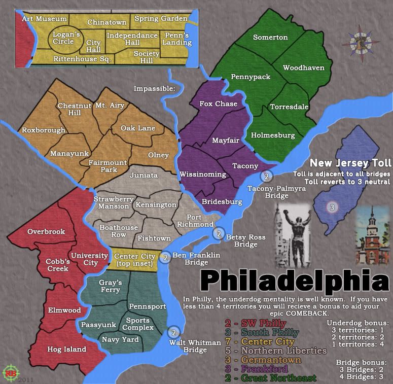
Re: Philadelphia (GP)- updated 2/13 pg 10

PostPosted: Mon Feb 14, 2011 10:59 pm
by Victor Sullivan
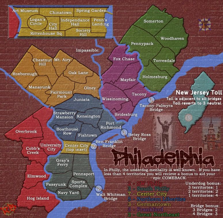
Hm, good update. Following suit with others' comments, I like the texture and feel the scattered images need to be brought together (as you had before, except more obvious). The effect on the New Jersey toll is a little overdone, though the posterized Philly pics you have actually look pretty good. Franklin Gothic for the title text is fabulous, a great improvement. I find the inset in a strange place - the top-left corner of the map. It just feels like the title should be there, though the title still manages to look pretty good in the bottom-right... Idk, I'll leave that up to you (well, I mean, technically it's all up to you, but you know what I mean). Northern Liberties seems really faded with it's new color and sort of blends into the background partially due to it's hue being similar to the non-playable area, but partially due to the fact that the other bonus areas are so vibrant (at least in comparison).

Re: Philadelphia (GP)- updated 2/16 pg 11

PostPosted: Wed Feb 16, 2011 3:14 am
by RedBaron0
Click image to enlarge.
image


Done a couple things here, let's see how they go over!

-The gradient overlay was starting to bother me, primarily as it interacted with the bonus colors, so I switched to just a color overlay, and the bonus regions I believe look quite good.
-Applied the canvas texture to the background texture, so as it interacts with the bonuses, it creates a cross pattern which I think works out.
-Went with just 2 of the Philly icons, right near the title.
-New Jersey toll redone again, to a very simple look, hopefully not too simple.
-Compass rose added, the Liberty Bell is on the center of the rose
-Bridge army circle now with a black ring to help them stand out a bit more.
-The river in the inset has been altered to better be in line with the main map.

Trends-
I think I will just keep the inset at the top of the map. The title just works so much better when its with the legend. The inset being tilted to properly align with the main map I really think is unnecessary. When ever Center City is pulled out to be blown up on any other map it always disregards the natural tilt for better clarity of the city grid.

Re: Philadelphia (GP)- updated 2/16 pg 11

PostPosted: Wed Feb 16, 2011 4:18 am
by natty dread
As for the gradient overlay, don't give up on the idea just yet... here's an illustration of how I suggest it would be used:

Click image to enlarge.
image


Here, I'm using "soft light" on the gradient layer, I think it's pretty much the same as "overlay", but it might be different in PS... so you need to experiment with the layer modes a bit.

Note the additional gradients around the title.

Re: Philadelphia (GP)- updated 2/16 pg 11

PostPosted: Wed Feb 16, 2011 11:23 am
by Z-Rambo
Everything looks great to me. Now when do I get to play on it? lol

Re: Philadelphia (GP)- updated 2/16 pg 11

PostPosted: Wed Feb 16, 2011 3:21 pm
by RedBaron0
natty_dread wrote:As for the gradient overlay, don't give up on the idea just yet... here's an illustration of how I suggest it would be used:

Click image to enlarge.
image


Here, I'm using "soft light" on the gradient layer, I think it's pretty much the same as "overlay", but it might be different in PS... so you need to experiment with the layer modes a bit.

Note the additional gradients around the title.


I do like that, PS is different, I can fiddle with it some. The color's I was using probably made me dislike what I had before. Should just use white and black.

Re: Philadelphia (GP)- updated 2/16 pg 11

PostPosted: Wed Feb 16, 2011 4:50 pm
by natty dread
I read a bit on layer modes... It seems GIMP's soft light is pretty much same as PS soft light, but hard light and overlay are a lot different in each... Moreover, seems that GIMP also has a bug which makes overlay the same as soft light, but they're hesitant to fix it because it would mess up old saved files #-o

Anyway, glad you like the suggestion.

Re: Philadelphia (GP)- updated 2/16 pg 11

PostPosted: Wed Feb 16, 2011 10:20 pm
by Industrial Helix
What about going for more of a brick or block texture and feel... make the map more urban, more industrial, more blue collar, more underdog.

Re: Philadelphia (GP)- updated 2/17 pg 11

PostPosted: Thu Feb 17, 2011 3:13 pm
by RedBaron0
Click image to enlarge.
image


Brick texrure and gradient overlay.

Tried a couple textures I liked this the best. :mrgreen:

Re: Philadelphia (GP)- updated 2/17 pg 11

PostPosted: Thu Feb 17, 2011 3:21 pm
by Victor Sullivan
Try a smaller scale texture. With the "bricks" sized as they are, it throws proportions off, making the region look tiny or painted on a wall, if you know what I mean.

Re: Philadelphia (GP)- updated 2/17 pg 11

PostPosted: Thu Feb 17, 2011 6:08 pm
by carlpgoodrich
I think the bricks have potential. If you do keep them, I think it has be be going for the graffiti look, in which case the water would need to have the same texture. Maybe you could add more "smudges" like in the bottom left so it doesn't stand out so much.

Re: Philadelphia (GP)- updated 2/17 pg 11

PostPosted: Sat Feb 19, 2011 3:45 am
by RedBaron0
I'm with carl on this, let me put all the aspects of the map into the "on the wall" urban mural/graffiti look and we'll go from there.

Re: Philadelphia - updated 2/22 pg 11

PostPosted: Tue Feb 22, 2011 2:26 am
by RedBaron0
Click image to enlarge.
image


The brick should show though just about everything now, and really gives it a graffiti mural kind of look. I've altered my signature to reflect this. I probably still need to add in some some minor graphical ascents, like paint spatter and drips.

Re: Philadelphia - updated 2/22 pg 11

PostPosted: Tue Feb 22, 2011 3:50 am
by natty dread
Can you lower the opacity of the white text slightly?

Re: Philadelphia - updated 2/22 pg 11

PostPosted: Tue Feb 22, 2011 7:34 am
by isaiah40
Now this is really looking good Red!! Yea a few paint drips drips and splatter would do this map good.

natty_dread wrote:Can you lower the opacity of the white text slightly?


This I agree with as they really stand out IMO.

Re: Philadelphia - updated 2/22 pg 11

PostPosted: Tue Feb 22, 2011 12:40 pm
by Z-Rambo
Could you make the bricks(that's not part of the map) more of a rustic color and change SW Philly to the greyish color? This way it gives it that traditional color of brick found in Philly. Other than that it's coming along rather nicely.

Re: Philadelphia - updated 2/22 pg 11

PostPosted: Tue Feb 22, 2011 3:05 pm
by Victor Sullivan
You can probably drop the canvas texture now, I don't think it's really necessary with the brick texture and all. Also, you still need to change Northern Liberties' color! That grey has been bothering me since you've changed it.

Re: Philadelphia - updated 2/22 pg 11

PostPosted: Tue Feb 22, 2011 4:23 pm
by Industrial Helix
I'm liking the brick texture but the lines and colors could use some wear and tear. In my mind I'm thinking as if I was viewing the map on a brick wall somewhere... This comes to mind: http://blackmaps.wordpress.com/2010/11/ ... and-paint/

Obviously its a bit plain, but something like the colored plaster for the regions on Phllie would work nicely. I'm thinking like spray paint for the logo and all that.

Re: Philadelphia - updated 2/22 pg 11

PostPosted: Tue Feb 22, 2011 5:52 pm
by carlpgoodrich
That's a cool pic, IH. I think there is a middle ground between something with that feel and pure graffiti. Although I'm getting dangerously close to talking out of my *ss.

Re: Philadelphia - updated 2/22 pg 11

PostPosted: Wed Feb 23, 2011 7:13 am
by natty dread
Also, now that this is a kind of graffiti map, I think you should consider changing the title font again...

http://www.dafont.com/whoa.font?text=Philadelphia

Re: Philadelphia - updated 2/25 pg 12

PostPosted: Fri Feb 25, 2011 3:56 am
by RedBaron0
Click image to enlarge.
image


Here it is kids, this should have incorporated all recent suggestions.
I used the font I downloaded for my own sig for the title first than the one natty suggested.
There are a couple paint drips coming off the river, could use a couple more perhaps, but the river will likely be the source of any drips/splatter. I'd also be against any drippings coming across the playing surface.
The plastery bevel/texture has been added to the territories.
The bricks have gone from grey to red, much like the architecture of Olde City.

Discuss!

Depending on issues... The small map should come pretty soon. Couple things: circles or no? gotta check vischeck for sure. I should have these test images up pretty soon if we're ready to proceed. :D

Re: Philadelphia - updated 2/25 pg 12

PostPosted: Fri Feb 25, 2011 5:19 am
by natty dread
No circles! :)

I think you could add some drips for the land areas too. It would look more authentic.


Now I also wonder, if maybe the territory name/legend texts should acquire a more handwritten look... The clean serif font seems a bit out of place now. Maybe you could try a handwritten-ish font, add some slight tilt or bend here and there...


Oh and one more thing: the beveled frame of the inset doesn't fit the new style... I suggest replacing it with just a black outline, similar to the land areas.

Re: Philadelphia - updated 2/25 pg 12

PostPosted: Fri Feb 25, 2011 9:06 am
by Industrial Helix
I only noticed the plaster once you pointed it out. What about dropping the brick pattern in the areas where the plaster is?

The font kicks ass though.

New Jersey toll and the two pictures are kind of a mess still.

Paint drips on the edges of the map would be cool, like how you did on the river.

The line work could be more dynamic. Everything is computerized perfection in terms of line width. Since you're going for more of an urban art feel, maybe it should be more varied.

Re: Philadelphia - updated 2/25 pg 12

PostPosted: Fri Feb 25, 2011 9:51 am
by Z-Rambo
Instead of circles, how about using mini liberty bells as the markers?

Re: Philadelphia - updated 2/25 pg 12

PostPosted: Fri Feb 25, 2011 11:43 am
by ghirrindin
Cool map. Perhaps make the territorial colors a tad more vibrant? They're a little drab... at least to me.

Re: Philadelphia - updated 2/25 pg 12

PostPosted: Fri Feb 25, 2011 11:46 am
by natty dread
ghirrindin wrote:Cool map. Perhaps make the territorial colors a tad more vibrant? They're a little drab... at least to me.


I disagree. Something painted on a brick wall is supposed to look a bit "drab".