Page 6 of 9

Re: CLASSIC CITIES: Sydney [12.5.12] P8-V14 GFX?
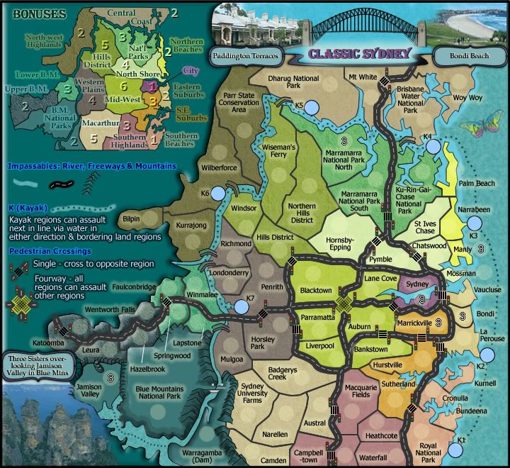
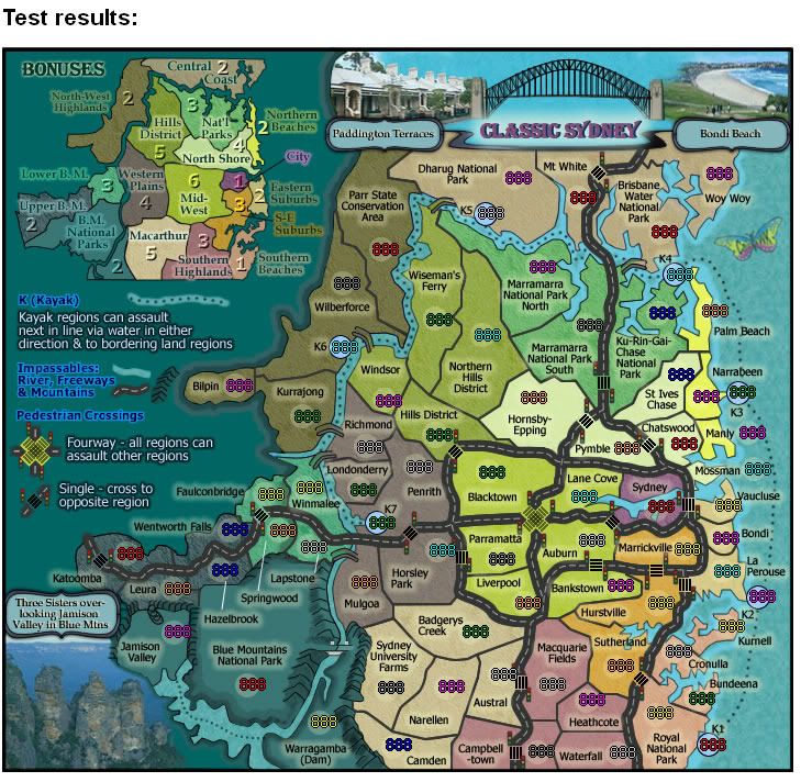
PostPosted: Thu May 17, 2012 12:26 pm
by cairnswk
chapcrap wrote:
cairnswk wrote:
chapcrap wrote:
Nola_Lifer wrote:Hey, the border lines are thicker in some spots; i.e., S.E. Suburbs and Southern Highlands, while most of the others are thinner. Love how clean this map looks.

That whole statement sounds like an oxymoron.

chapcrap, i appreciate your post, but critisizing other's posts will only serve to deter them from posting, and there is little enough proactive posting done in the foundry these days. I would rather keep quiet than offer something that doesn't advance or encourage the map if i can't find domething decent to say.

Are you trying to discourage me from posting? ;)

I was just saying that it doesn't make sense what he said. He says that the borders aren't that great and then calls the map clean. That's contradictory. It wasn't a personal attack.

I realise what you were saying. Why would i want to disourage you from posting when i have already stated there is not enough posting. But there is a line that gets crossed quite often. If you don't have anything pleasant to say instead of picking on the way someone posts, then...gees, i don't know, go throw those thoughts at another forum.
Why pick on someone's post...when none of us are perfect.

Re: CLASSIC CITIES: Sydney [18.5.12] P9-V15 GFX?

PostPosted: Fri May 18, 2012 2:16 am
by cairnswk
Version 15
1. Fixed the border lines for consistency
2. added a hard drop shadow to image texts.

Image

Re: CLASSIC CITIES: Sydney [18.5.12] P9-V15 GFX?

PostPosted: Tue May 22, 2012 1:20 am
by Nola_Lifer
Stamp time?

Re: CLASSIC CITIES: Sydney [18.5.12] P9-V15 GFX?

PostPosted: Fri May 25, 2012 3:07 pm
by cairnswk
Nola_Lifer wrote:Stamp time?

Appreciate your sentiments Nola_Lifer, but let this sit for a while and give people a chance to see what it what...there may be some things that need attention. ;)

Re: CLASSIC CITIES: Sydney [27.5.12] P9-V16 GFX?

PostPosted: Sat May 26, 2012 10:24 pm
by cairnswk
Version 16

1. Tidied the mini-map legend for name positions
2. Re-orgnised the legend to give some eye-space in there and make things seem less crowded.

Image

Re: CLASSIC CITIES: Sydney [27.5.12] P9-V16 GFX?

PostPosted: Mon May 28, 2012 11:58 pm
by RedBaron0
I think the mountains can be better, they're primarily line art atm.
The road in the legend is darker than the roads on the map itself for consistency they should be the same color.
The bevel on the western edge of the map is kinda distracting and seems more like a blue blob is creeping from the left over the map. It's probably better flat and with a bit of texture.
The bridge between kurrajong and richmond has the wrong color on the kurrajong side.

Re: CLASSIC CITIES: Sydney [27.5.12] P9-V16 GFX?

PostPosted: Tue May 29, 2012 1:56 am
by cairnswk
RedBaron0 wrote:I think the mountains can be better, they're primarily line art atm.

I guess you are talking about the legend mountain indicators...i agree, but the others...wrong....they are a mixture of vector lines and painted bitmap undertones.
I think the non-legend ones are fine for what i want, i'll try to improve some of the shapes around Falconbridge.

The road in the legend is darker than the roads on the map itself for consistency they should be the same color.

Fixed

The bevel on the western edge of the map is kinda distracting and seems more like a blue blob is creeping from the left over the map. It's probably better flat and with a bit of texture.

i disagree. i think it fulfills my purpose of separating the map from the actual map whilst providing resemblance of some height without having a great big long chain of mountains running the full length of the map...i think texture would be distracting to reading the legend considering it's a dark colour.

The bridge between kurrajong and richmond has the wrong color on the kurrajong side.

Fixed.

Re: CLASSIC CITIES: Sydney [27.5.12] P9-V16 GFX?

PostPosted: Wed May 30, 2012 9:41 am
by koontz1973
cairnswk, forgive me but not really looked in for a while. But one thing that really popped out at me is this.
You seem to have 4 different edges to the map, I have circled them and am just wondering why the different styles for the one map?
Click image to enlarge.
image

Just noticed as posting this, at Blue mountains national park, you have a white glow poking its head out from under the mountains on the left (just above the yellow line). Is this necessary and if not, can it be removed.

Re: CLASSIC CITIES: Sydney [27.5.12] P9-V16 GFX?

PostPosted: Wed May 30, 2012 10:05 am
by cairnswk
koontz1973 wrote:cairnswk, forgive me but not really looked in for a while. But one thing that really popped out at me is this.
You seem to have 4 different edges to the map, I have circled them and am just wondering why the different styles for the one map?
...
Just noticed as posting this, at Blue mountains national park, you have a white glow poking its head out from under the mountains on the left (just above the yellow line). Is this necessary and if not, can it be removed.

koontz...that whole piece from below the dam lake at bottom to top of map is one bevel set on 175 degrees.
that's why there is a difference in places because of the light on angles. the blue and yellow result from the same treatment of the bevel on a top/bottom edge. the yellow is painted on that BM NP territory to create similar effect so that territory appears to rise above the surrounding landscape.
i really don't see what the problem is with this :?:
I don't understand what the white glow is about... :?

Re: CLASSIC CITIES: Sydney [27.5.12] P9-V16 GFX?

PostPosted: Wed May 30, 2012 10:52 am
by koontz1973
Sorry cairns, it just looks like 4 different ones to me but I understand your explanation.

Re: CLASSIC CITIES: Sydney [27.5.12] P9-V16 GFX?

PostPosted: Thu May 31, 2012 4:51 pm
by iancanton
i missed one in the last round of spelling checks: mossman ought to be mosman.

http://www.mosman.nsw.gov.au/

ian. :)

Re: CLASSIC CITIES: Sydney [27.5.12] P9-V16 GFX?

PostPosted: Thu May 31, 2012 10:56 pm
by RedBaron0
koontz1973 wrote:cairnswk, forgive me but not really looked in for a while. But one thing that really popped out at me is this.
You seem to have 4 different edges to the map, I have circled them and am just wondering why the different styles for the one map?
Click image to enlarge.
image

Just noticed as posting this, at Blue mountains national park, you have a white glow poking its head out from under the mountains on the left (just above the yellow line). Is this necessary and if not, can it be removed.


This.

My point is that this whole left side of the map is a single color, lifted up beyond the rest of the map, it does appear that this whole section of the map is flowing over the remainder of the map, the beveling is just way too strong. What koontz pointed out I see also, parts of the beveling putting lighter spots in odd areas, I see also, a artifact of the overbeveling. You don't want texture fine, but the bevel has to go.

The mountains are lines that could have been drawn by a kid imo, yeah they do the job, but you can (and have) do better.

Re: CLASSIC CITIES: Sydney [27.5.12] P9-V16 GFX?

PostPosted: Fri Jun 01, 2012 12:52 am
by iancanton
the flowing wax effect appears south of the lake as well as in the legend area. is this an attempt to show that the blue mountains extend to these areas?

ian. :)

Re: CLASSIC CITIES: Sydney [3.6.12] P10-V17 GFX?

PostPosted: Sat Jun 02, 2012 4:53 pm
by cairnswk
RedBaron0 wrote:...
This.

My point is that this whole left side of the map is a single color, lifted up beyond the rest of the map, it does appear that this whole section of the map is flowing over the remainder of the map, the beveling is just way too strong.

Beveling has been reduced

What koontz pointed out I see also, parts of the beveling putting lighter spots in odd areas, I see also, a artifact of the overbeveling. You don't want texture fine, but the bevel has to go.

The beveling has to go...well no, i beg to differ, it doesn't have to go, you only want it to go. I happen to not want it to go.
Thus is has been reduced for you, and done using brushes rather than the harsher beveled effect.

iancanton wrote:the flowing wax effect appears south of the lake as well as in the legend area. is this an attempt to show that the blue mountains extend to these areas?

ian. :)

thanks for commenting ian...i hope this new version does something to appease everyone.

Version 17.
1. bevel effect has been reduced along the side of the map
2. bevel has been hand-painted in
3. mountains on the northern side of BMNP have been adjusted
4. mountains in the legend have been enhanced.

Image

Re: CLASSIC CITIES: Sydney [3.6.12] P10-V17 GFX?

PostPosted: Sun Jun 03, 2012 1:07 am
by chapcrap
I think that looks better, but it seems like there isn't a very good uniformity of the edges where there should be. Most notably to me around Bilpin and Wilberforce.

Re: CLASSIC CITIES: Sydney [3.6.12] P10-V17 GFX?

PostPosted: Sun Jun 03, 2012 1:21 am
by koontz1973
Like the hand drawn effect (the non uniform look works)for the bevel but what Chapcrap said about that one part, I seem to agree with. A couple of extra pixels to make the bevel there stand out more would be nice.

Could I ask for a different colour for the mountains as they are very close to the territ colour. I take it they are the blue mountains, but I can see some brown in the photo you used and that should make the pop out more. As for the hand drawn side of them, I have no problem with that part.

Between blue mountains and Warragamba, you have a road cut out of the mountains, can you do something similar between Warragamba and Sydney university along the same line. I know you have the cut away further south. :mrgreen:

Re: CLASSIC CITIES: Sydney [3.6.12] P10-V17 GFX?

PostPosted: Sun Jun 03, 2012 1:59 am
by cairnswk
chapcrap wrote:I think that looks better, but it seems like there isn't a very good uniformity of the edges where there should be. Most notably to me around Bilpin and Wilberforce.

chapcrap, these edges replace the previous bevel as you know.
the argument before was it was too strong.
so i changed it and now it is not uniform.
the other thing is that these lines replace contour lines of sort and i am sure you have looked at contour lines and seen that the distances between lines is hardly even uniform.
so to me, that is not an issue, and uniformity is not something i am totally after with this effect.

Re: CLASSIC CITIES: Sydney [3.6.12] P10-V17 GFX?

PostPosted: Sun Jun 03, 2012 2:07 am
by cairnswk
koontz1973 wrote:Like the hand drawn effect (the non uniform look works)for the bevel but what Chapcrap said about that one part, I seem to agree with. A couple of extra pixels to make the bevel there stand out more would be nice. [/quote}
Nice but not necessary. :)

Could I ask for a different colour for the mountains as they are very close to the territ colour. I take it they are the blue mountains, but I can see some brown in the photo you used and that should make the pop out more. As for the hand drawn side of them, I have no problem with that part.

Yes you can ask, but i don't think that is in the best interest to add more colour to that section, as it might only look confusing and ugly. Yes there is a solid sandstone ridge vertical drop looking back from the three sisters, but i don't think it is inportant enough to warrant what you request.

Between blue mountains and Warragamba, you have a road cut out of the mountains, can you do something similar between Warragamba and Sydney university along the same line. I know you have the cut away further south. :mrgreen:

i am not sure what you're meaning there because between the BMNP and Warragamba region is the dam wall which forms the borders, and that would hardly be appropriate between Warragamba Dam and SU Farms. I think the gap between SUFarms and Warragamba is adequate to show a bordering regions. :)

Re: CLASSIC CITIES: Sydney [3.6.12] P10-V17 GFX?

PostPosted: Mon Jun 04, 2012 4:53 pm
by chapcrap
cairnswk wrote:
chapcrap wrote:I think that looks better, but it seems like there isn't a very good uniformity of the edges where there should be. Most notably to me around Bilpin and Wilberforce.

chapcrap, these edges replace the previous bevel as you know.
the argument before was it was too strong.
so i changed it and now it is not uniform.
the other thing is that these lines replace contour lines of sort and i am sure you have looked at contour lines and seen that the distances between lines is hardly even uniform.
so to me, that is not an issue, and uniformity is not something i am totally after with this effect.

I'm talking about how the effect coming out from the terts is not the same width all the way around? You want that to be random widths around the edges? That looks really bad, IMO.

Re: CLASSIC CITIES: Sydney [3.6.12] P10-V17 GFX?

PostPosted: Sat Jun 16, 2012 4:18 pm
by cairnswk
chapcrap wrote:...
I'm talking about how the effect coming out from the terts is not the same width all the way around? You want that to be random widths around the edges? That looks really bad, IMO.

that should be fixed for you chapcrap in v17 above.

Re: CLASSIC CITIES: Sydney [17.6.12] P10-V17 S & L

PostPosted: Sat Jun 16, 2012 5:05 pm
by cairnswk
Version 17 large and Small

Image

Click image to enlarge.
image


888s
Image

Re: CLASSIC CITIES: Sydney [17.6.12] P10-V17 S & L

PostPosted: Sat Jun 16, 2012 7:54 pm
by cairnswk
The xml is complete...
as soon as this makes forge, i'll post it in the official place.
http://www.fileden.com/files/2011/10/26 ... ey_v17.xml

Re: CLASSIC CITIES: Sydney [17.6.12] P10-V17 S & L

PostPosted: Sun Jun 17, 2012 4:33 pm
by cairnswk
I've adjusted the above images V17L/S...K1,2,3 and Narrabeen names so they don't cause confusion.

Re: CLASSIC CITIES: Sydney [18.6.12] P10-V17 S & L

PostPosted: Mon Jun 18, 2012 3:24 am
by pamoa
small graphic inconsistency
double crossing are grey (transparent)
simple ones are black
roads are dark grey (all should be like this)

Re: CLASSIC CITIES: Sydney [18.6.12] P10-V17 S & L

PostPosted: Mon Jun 18, 2012 3:20 pm
by cairnswk
pamoa wrote:small graphic inconsistency
double crossing are grey (transparent)
simple ones are black
roads are dark grey (all should be like this)

well yes pamoa, but for me no.
the major 4way crossing has an average property to it, and having just explored it again with a normal properties which makes it very harsh black, i actually prefer it the way it is. :)
the other single crossings are black on a backing ground colour to give them contrast.
i've never seen bitumen that is totally black, it's more like a dark grey, some places it is light gray depending on the mix they lay.
so i'd like to keep things as they are thanks. :)