http://www.mosman.nsw.gov.au/
ian.
Moderator: Cartographers
![]() by iancanton on Thu May 31, 2012 4:51 pm
by iancanton on Thu May 31, 2012 4:51 pm


![]() by RedBaron0 on Thu May 31, 2012 10:56 pm
by RedBaron0 on Thu May 31, 2012 10:56 pm
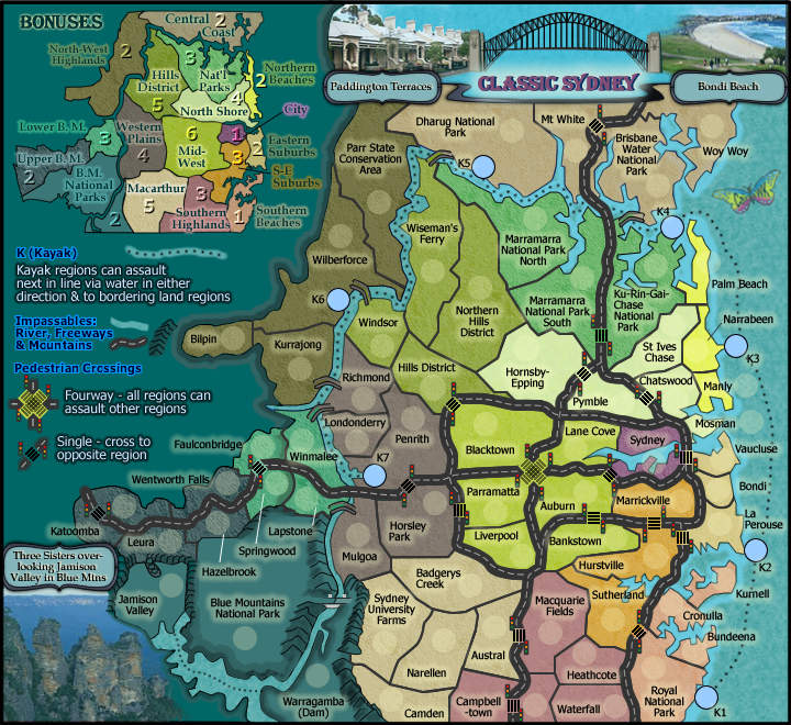
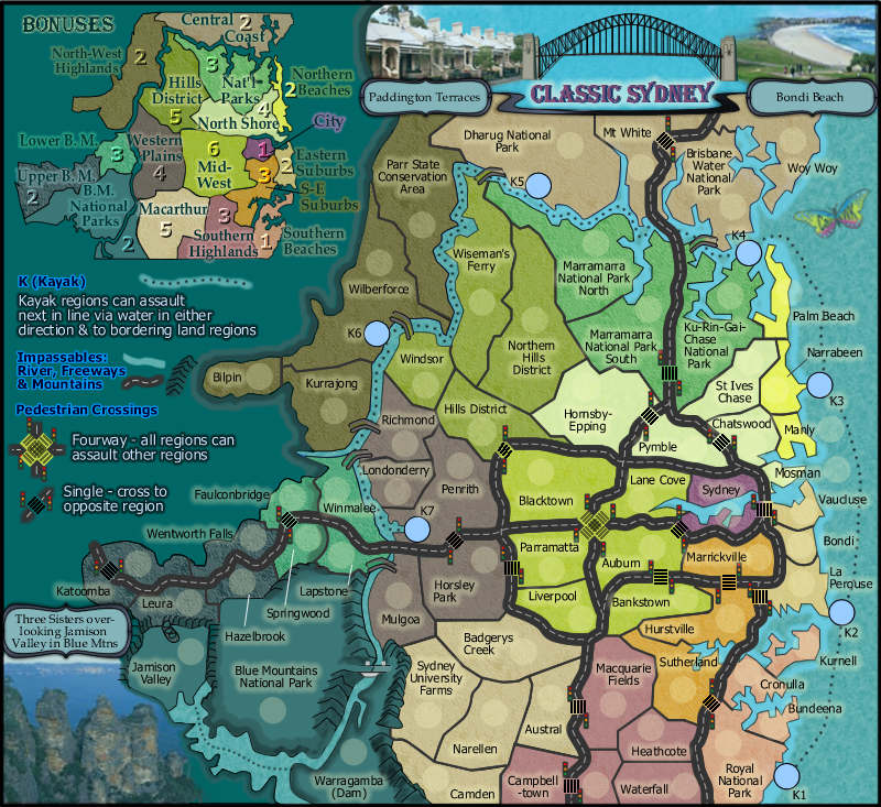
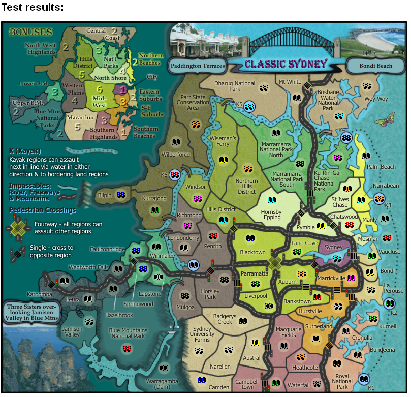
koontz1973 wrote:cairnswk, forgive me but not really looked in for a while. But one thing that really popped out at me is this.
You seem to have 4 different edges to the map, I have circled them and am just wondering why the different styles for the one map?
- Click image to enlarge.
Just noticed as posting this, at Blue mountains national park, you have a white glow poking its head out from under the mountains on the left (just above the yellow line). Is this necessary and if not, can it be removed.


![]() by iancanton on Fri Jun 01, 2012 12:52 am
by iancanton on Fri Jun 01, 2012 12:52 am
![]() by cairnswk on Sat Jun 02, 2012 4:53 pm
by cairnswk on Sat Jun 02, 2012 4:53 pm
RedBaron0 wrote:...
This.
My point is that this whole left side of the map is a single color, lifted up beyond the rest of the map, it does appear that this whole section of the map is flowing over the remainder of the map, the beveling is just way too strong.
What koontz pointed out I see also, parts of the beveling putting lighter spots in odd areas, I see also, a artifact of the overbeveling. You don't want texture fine, but the bevel has to go.
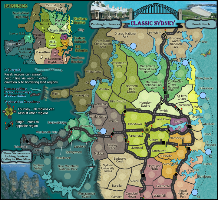
iancanton wrote:the flowing wax effect appears south of the lake as well as in the legend area. is this an attempt to show that the blue mountains extend to these areas?
ian.


![]() by chapcrap on Sun Jun 03, 2012 1:07 am
by chapcrap on Sun Jun 03, 2012 1:07 am


![]() by koontz1973 on Sun Jun 03, 2012 1:21 am
by koontz1973 on Sun Jun 03, 2012 1:21 am


![]() by cairnswk on Sun Jun 03, 2012 1:59 am
by cairnswk on Sun Jun 03, 2012 1:59 am
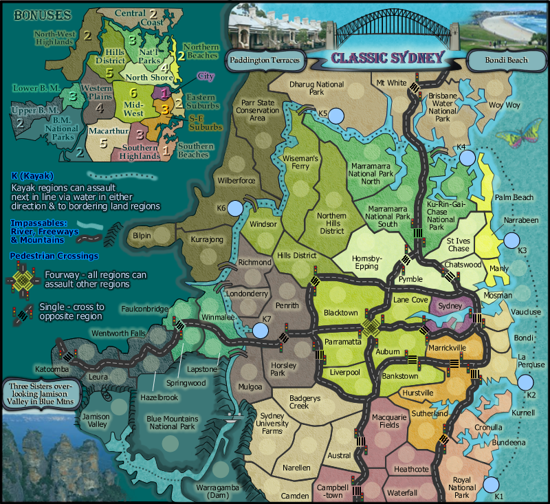
chapcrap wrote:I think that looks better, but it seems like there isn't a very good uniformity of the edges where there should be. Most notably to me around Bilpin and Wilberforce.
![]() by cairnswk on Sun Jun 03, 2012 2:07 am
by cairnswk on Sun Jun 03, 2012 2:07 am
koontz1973 wrote:Like the hand drawn effect (the non uniform look works)for the bevel but what Chapcrap said about that one part, I seem to agree with. A couple of extra pixels to make the bevel there stand out more would be nice. [/quote}
Nice but not necessary. Could I ask for a different colour for the mountains as they are very close to the territ colour. I take it they are the blue mountains, but I can see some brown in the photo you used and that should make the pop out more. As for the hand drawn side of them, I have no problem with that part.
Yes you can ask, but i don't think that is in the best interest to add more colour to that section, as it might only look confusing and ugly. Yes there is a solid sandstone ridge vertical drop looking back from the three sisters, but i don't think it is inportant enough to warrant what you request.Between blue mountains and Warragamba, you have a road cut out of the mountains, can you do something similar between Warragamba and Sydney university along the same line. I know you have the cut away further south.
![]() by chapcrap on Mon Jun 04, 2012 4:53 pm
by chapcrap on Mon Jun 04, 2012 4:53 pm
cairnswk wrote:chapcrap wrote:I think that looks better, but it seems like there isn't a very good uniformity of the edges where there should be. Most notably to me around Bilpin and Wilberforce.
chapcrap, these edges replace the previous bevel as you know.
the argument before was it was too strong.
so i changed it and now it is not uniform.
the other thing is that these lines replace contour lines of sort and i am sure you have looked at contour lines and seen that the distances between lines is hardly even uniform.
so to me, that is not an issue, and uniformity is not something i am totally after with this effect.
![]() by cairnswk on Sat Jun 16, 2012 4:18 pm
by cairnswk on Sat Jun 16, 2012 4:18 pm
chapcrap wrote:...
I'm talking about how the effect coming out from the terts is not the same width all the way around? You want that to be random widths around the edges? That looks really bad, IMO.
![]() by cairnswk on Sat Jun 16, 2012 5:05 pm
by cairnswk on Sat Jun 16, 2012 5:05 pm
![]() by cairnswk on Sat Jun 16, 2012 7:54 pm
by cairnswk on Sat Jun 16, 2012 7:54 pm
![]() by cairnswk on Sun Jun 17, 2012 4:33 pm
by cairnswk on Sun Jun 17, 2012 4:33 pm
![]() by pamoa on Mon Jun 18, 2012 3:24 am
by pamoa on Mon Jun 18, 2012 3:24 am


![]() by cairnswk on Mon Jun 18, 2012 3:20 pm
by cairnswk on Mon Jun 18, 2012 3:20 pm
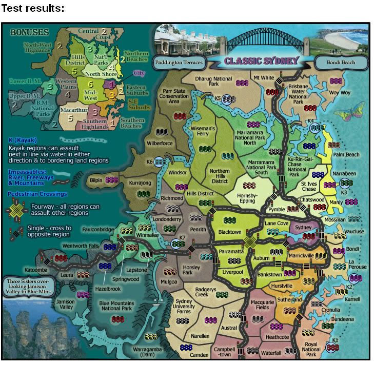
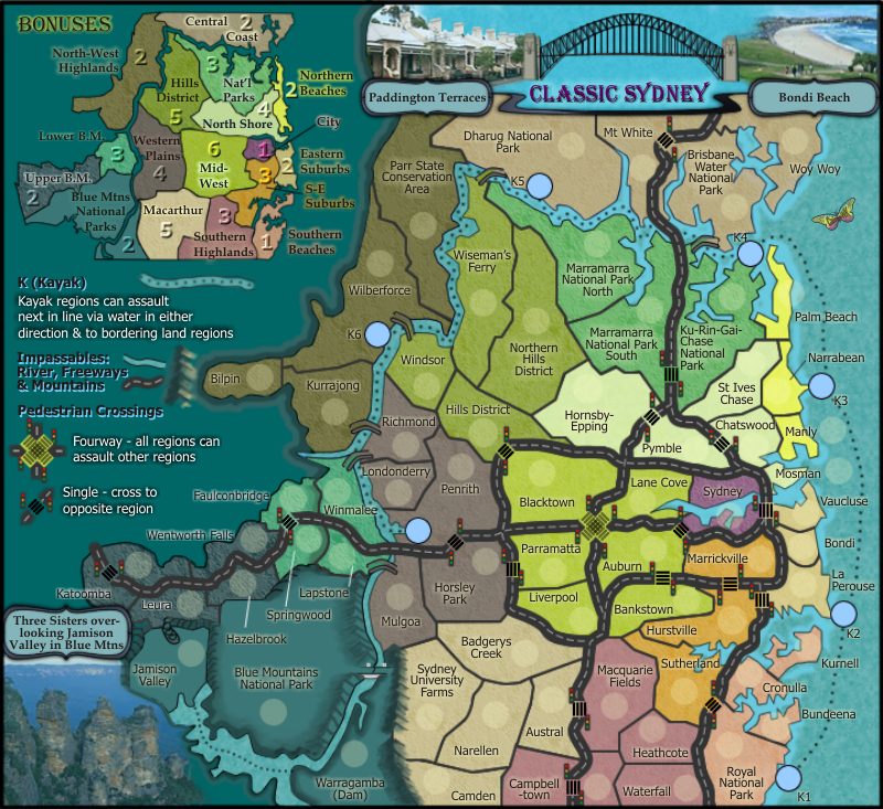
pamoa wrote:small graphic inconsistency
double crossing are grey (transparent)
simple ones are black
roads are dark grey (all should be like this)
![]() by cairnswk on Thu Jun 21, 2012 3:10 am
by cairnswk on Thu Jun 21, 2012 3:10 am
iancanton wrote:i missed one in the last round of spelling checks: mossman ought to be mosman.
http://www.mosman.nsw.gov.au/
ian.
![]() by cairnswk on Thu Jun 21, 2012 5:45 pm
by cairnswk on Thu Jun 21, 2012 5:45 pm
![]() by isaiah40 on Sat Jun 30, 2012 8:32 pm
by isaiah40 on Sat Jun 30, 2012 8:32 pm


![]() by cairnswk on Sat Jun 30, 2012 11:00 pm
by cairnswk on Sat Jun 30, 2012 11:00 pm
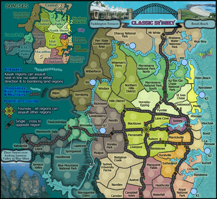
isaiah40 wrote:A few things:
1. Some of the Territory names such as Mosman, Manly, Woy Woy go over the outline. Remove the outline under the names for an easier read.
2. The outer glow around the text in the legend and mini-map. I don't think it is really needed considering that the background is a light enough color. You can either remove the outer glow or tone it down a couple of notches.
3. The out glow around the text in the landmark areas, I think you can remove the glow all together.
4. The cross walks on the small look good, but on the large they are all messed up. Probably from enlarging them.
5. There is what looks like a smudge here down by Jamison Valley:
![]() by isaiah40 on Sun Jul 01, 2012 7:00 am
by isaiah40 on Sun Jul 01, 2012 7:00 am
![]() by cairnswk on Sun Jul 01, 2012 10:19 am
by cairnswk on Sun Jul 01, 2012 10:19 am
isaiah40 wrote:Looking better. Woy Woy, I think ti would be better if you move the circle down and move the name up above it, as some people would think it reads Wo"V" Woy.
![]() by cairnswk on Thu Jul 12, 2012 10:19 pm
by cairnswk on Thu Jul 12, 2012 10:19 pm
![]() by cairnswk on Wed Jul 18, 2012 8:16 pm
by cairnswk on Wed Jul 18, 2012 8:16 pm
![]() by isaiah40 on Wed Aug 01, 2012 9:19 am
by isaiah40 on Wed Aug 01, 2012 9:19 am
![]() by cairnswk on Thu Aug 02, 2012 12:28 am
by cairnswk on Thu Aug 02, 2012 12:28 am
cairnswk wrote:3 - On the mini-map, can you place the bonus value beside the word City, and have the line going more to the center of that area?
i prefer it have it where it is as it fits better with the consistency of the others in the mini-map i.e. all on their territories where possible; the only reason northern beaches is off its territory is because it would be too close to the North Shore bonus number and there is very little room on northern beaches for it.
Users browsing this forum: No registered users
|
|||||||
| Conquer Club is not associated with RISK online in any way. Copyright © 2006-2024 by Big Wham LLC | |||||||
