Page 7 of 9

PostPosted: Fri Aug 04, 2006 6:35 pm
by Marvaddin
No, sadly no... :cry:
And I said, the single thing I can do for the legend is return the one with ovals, I liked it more too.

So, dont trust me, heh, Andy:
Image
Image

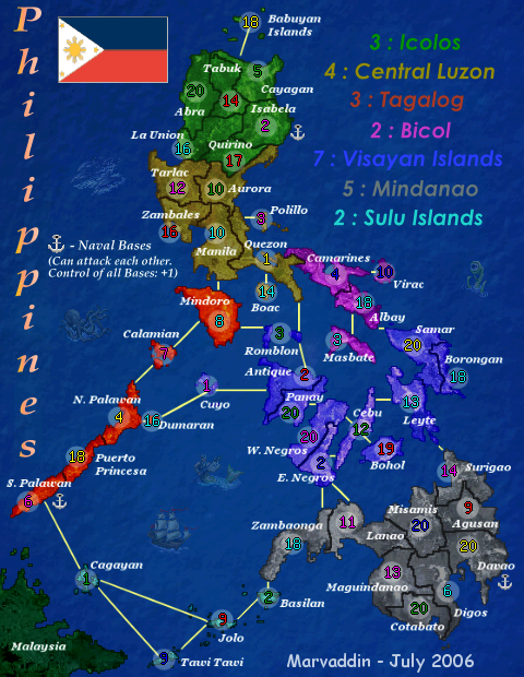
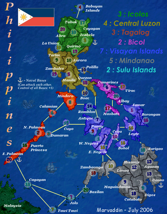
Well, some numbers can look a bit uncentered, but then when you reload and there is another number, the old position seems better. Lack could add a way we can choose a same number to all countries, so they would really be at same position. This way this was the better I could do.

PostPosted: Fri Aug 04, 2006 7:13 pm
by happysadfun
dumaran could be amalgamated into whatever the country is that's next to it, then you could put the circle in closer. and the dark blue islands could be a bit lighter. otherwise, i would definitely play it. but it could be more challenging without some of the bridges.

PostPosted: Fri Aug 04, 2006 7:19 pm
by happysadfun
Marvaddin wrote:Image
Here is the legend of the map I got almost all names. ... I also know here is written Mindanio instead of Mindanao, but several maps had Mindanao, so I assumed its the correct form...


Mindanio is a variant name, used primarily in oriental asia. mindanao is the europeanized form

PostPosted: Sat Aug 05, 2006 4:21 pm
by Marvaddin
Thanks for the info, but the european form is fine to me.

happysadfun wrote:dumaran could be amalgamated into whatever the country is that's next to it, then you could put the circle in closer. and the dark blue islands could be a bit lighter. otherwise, i would definitely play it. but it could be more challenging without some of the bridges.


I will not merge Dumaran and N. Palawan. Dumaran is there to make the continent less linear, and also is completing the number of countries (48 ). Simply remove it as territory would create more problems than solve (in fact, I see no problem, since both countries are well individualized).

About the colour of the blue continent, I dont intend change it too. It looks fine to me. I was worried about make continents easily identified, so i dont want any proximity with the colour of the light blue continent. Why are you complaining? Is there something hard to see?

If you want to suggest some less connections, be more specific. Anyway, I want to say, at this stage I dont intend make any big alterations on the map. I really consider it done, both in graphics and playability. Of course some changes could be pleasant to some people, and not for others. So, Im working already at my next project, I only want this alive.

Andy, how about the images with numbers? Good enough?

PostPosted: Sat Aug 05, 2006 4:27 pm
by dussle
This map is really awsome, but there's one thing I'd change. It's unclear what the bottom Islands are, I had to check the continent list before i realized it was part of Tagalog or Mindanao! It would be easier to see if you moved the numbers over a bit, at least on the small map, the big map is easily readable.

PostPosted: Sat Aug 05, 2006 6:21 pm
by AndyDufresne
The army coordinates are acceptable. As for the post above, I think it is a bit unclear what the continent is at the bottom, the islands. Perhaps if you consider moving the circles slightly more into the ocean so we can actually see what country colors are.


--Andy

PostPosted: Sun Aug 06, 2006 6:22 am
by gavin_sidhu
Marvaddin all your maps (Brazil and this one) seem to be very jagged, is this because of the program you are using or something else you cant fix?

PostPosted: Sun Aug 06, 2006 6:45 am
by kevinc
You need to either left align or right align the legend. Having it centered like that is very difficult to read, and looks awkward.

I agree with gavin, you really need to learn to use another program with proper anti-aliasing. This looks like a great map, and it would be much better without the rough edges.

All the best with it - looking forward to it.

PostPosted: Sun Aug 06, 2006 6:55 am
by gavin_sidhu
kevinc wrote:You need to either left align or right align the legend. Having it centered like that is very difficult to read, and looks awkward.

I agree with gavin, you really need to learn to use another program with proper anti-aliasing. This looks like a great map, and it would be much better without the rough edges.

All the best with it - looking forward to it.


I like the ledgend as is (centred and big)

KevinC, I use GIMP, nd was having the problem of jagged edges, i just made my borders thicker to fix it, how do u "anti-aliase"? is it possible with GIMP?

PostPosted: Sun Aug 06, 2006 7:57 am
by kevinc
gavin_sidhu wrote:I like the ledgend as is (centred and big)


People often say that, but it's proven to be wrong. Big is fine, but ,multi-line centered text is very hard for the eyes to read. It's not something you ever see in professional work.

gavin_sidhu wrote:KevinC, I use GIMP, nd was having the problem of jagged edges, i just made my borders thicker to fix it, how do u "anti-aliase"? is it possible with GIMP?


I don' tuse Gimp I'm afraid. It's not the best piece of software for creating maps. Inkscape, Fireworks, Xara, or Illustrator are much better suited to it. Gimp is good for photo montages, and image editing,. Vector applications like the ones mentioned are more suited to this work and make it all a lot less painful.

PostPosted: Sun Aug 06, 2006 1:14 pm
by Marvaddin
AndyDufresne wrote:The army coordinates are acceptable. As for the post above, I think it is a bit unclear what the continent is at the bottom, the islands. Perhaps if you consider moving the circles slightly more into the ocean so we can actually see what country colors are.

I was thinking about it, I believe move the circles is not a very good idea. I did the surrounding islands lighter, and I consider the problem solved:
http://i44.photobucket.com/albums/f44/M ... mnumb2.png
http://i44.photobucket.com/albums/f44/M ... gnumb2.png

kevinc wrote:You need to either left align or right align the legend. Having it centered like that is very difficult to read, and looks awkward.

I agree with gavin, you really need to learn to use another program with proper anti-aliasing. This looks like a great map, and it would be much better without the rough edges.

I will maintain the legend centralized, I cant see any difficulty. But if you see, dont worry. We all memorize the bonuses of the maps we like and rarely read the legend :wink:

About the anti-aliasing, I also use Gimp and Inkscape, but I dont know how to use all the resources. In fact, the simple things I prefer do in Paint. I will try something, but I dont know if I will suceed, so dont expect too much. Anyway, its not thaaaaat bad, is it?

PostPosted: Sun Aug 06, 2006 2:35 pm
by kevinc
Marvaddin wrote:I will maintain the legend centralized, I cant see any difficulty. But if you see, dont worry. We all memorize the bonuses of the maps we like and rarely read the legend :wink:

Well, it's not like your trying to read a book with it or anything, but it would just look a bit more professional with it left or right aligned.
About the anti-aliasing, I also use Gimp and Inkscape, but I dont know how to use all the resources. In fact, the simple things I prefer do in Paint. I will try something, but I dont know if I will suceed, so dont expect too much. Anyway, its not thaaaaat bad, is it?

Yea, they've a pretty high learning curve which is a shame. Inkscape for windows is still a bit flakey sadly.

Your map isn't bad by any means, but it would do justice to your map and make it ever better. Here's a simple example of aliased graphics vs anti-aliased side by side, for you to decide for yourself.
Image

PostPosted: Sun Aug 06, 2006 5:19 pm
by Marvaddin
Yeah, but I cant do it manually and I dont know how to do in these editors. I will try, but I will probably fail. :?
The problem with the islands in the bottom, I believe its solved, what you guys think? C'mon, Andy, lets put it to play! :D

PostPosted: Sun Aug 06, 2006 6:06 pm
by kevinc
Marvaddin wrote:Yeah, but I cant do it manually and I dont know how to do in these editors. I will try, but I will probably fail. :?


Yea, you'd probbaly need to start again really, and that's not worth it.

If Inksacape for Windows ever matures enough I might see about putting otgether a tutorial for it to help map editors.

all the best!

PostPosted: Mon Aug 07, 2006 2:25 am
by gavin_sidhu
kevinc wrote:
Marvaddin wrote:Yeah, but I cant do it manually and I dont know how to do in these editors. I will try, but I will probably fail. :?


Yea, you'd probbaly need to start again really, and that's not worth it.

If Inksacape for Windows ever matures enough I might see about putting otgether a tutorial for it to help map editors.

all the best!


So if i have windows and no money to buy programs i cant anti-alliase?

PostPosted: Mon Aug 07, 2006 11:17 am
by kevinc
gavin_sidhu wrote:So if i have windows and no money to buy programs i cant anti-alliase?


I'm sure there's tons of vector apps that do it, they're just not as good as commercial apps.

If you use a free application like paint.net or GIMP and actually 'paint' your map as if you were using oil paints you won't get rough lines like that. Just use soft brushes not 1pixel hard brushes.

PostPosted: Tue Aug 08, 2006 2:39 am
by gavin_sidhu
kevinc wrote:
gavin_sidhu wrote:So if i have windows and no money to buy programs i cant anti-alliase?


I'm sure there's tons of vector apps that do it, they're just not as good as commercial apps.

If you use a free application like paint.net or GIMP and actually 'paint' your map as if you were using oil paints you won't get rough lines like that. Just use soft brushes not 1pixel hard brushes.


kool, thnx for advice.

PostPosted: Tue Aug 15, 2006 2:30 pm
by Marvaddin
Ok, people. I tried reduce the problem of the blocky frontiers, and this is the better I can do:

Image
Image

Of course its not perfect, but its good, I think. Now, Andy, lets put it alive :D

PostPosted: Tue Aug 15, 2006 2:37 pm
by Phobia
excellent map marv! ive even noticed the civ 2 ship! :D

PostPosted: Tue Aug 15, 2006 4:09 pm
by reverend_kyle
Marvaddin wrote:Ok, people. I tried reduce the problem of the blocky frontiers, and this is the better I can do:


Of course its not perfect, but its good, I think. Now, Andy, lets put it alive :D


It looks great.. I hope it plays as well as your brazil map...


btw, marv thanks for making my favorite map on cc..

PostPosted: Tue Aug 15, 2006 6:39 pm
by devilseyesdd
ya whens it becoming an a map u can pick from?

PostPosted: Tue Aug 15, 2006 7:07 pm
by reverend_kyle
when andy says so.

PostPosted: Wed Aug 16, 2006 12:48 am
by gavin_sidhu
Still blocky but much less than before. I think you should switch the positions of that one eyed tentacle creature thing and that thing next to the ship and W.Negros (I only just noticed the homour in that islands name). They need to be changed because that ship and the thing next to W.Negros are framed in the same direction and makes the background look to linear (congratulations if you understood that because rereading it i struggle to understand what i wrote).

PostPosted: Thu Aug 17, 2006 7:01 pm
by AndyDufresne
Alright, when Marv. checks this again and responds to the last few posts, we'll see if it can be Quenched.

Suggestion (again Marv :P), make your name and date smaller. I know you are proud, but make it discreet so it blends with the map, and doesn't stick out. ;) But then again, just a suggestion.


--Andy

PostPosted: Fri Aug 18, 2006 1:13 am
by Marvaddin
So, Andy:

:D Thanks all for the good comments :D

gavin_sidhu wrote:Still blocky but much less than before. I think you should switch the positions of that one eyed tentacle creature thing and that thing next to the ship and W.Negros (I only just noticed the homour in that islands name). They need to be changed because that ship and the thing next to W.Negros are framed in the same direction and makes the background look to linear (congratulations if you understood that because rereading it i struggle to understand what i wrote).


About the borders, as I said, is the best I can do. About changing the creatures, I cant understand your point. The little ship and the creatures have no background, they are just over the sea I created mixing other images. And about the direction, of course the ship is going to east, while the triton is going to west (or is stopped just watching the ship, as if it was planning an attack (that was my idea when I positioned it). I couldnt understand, so...

And I will probably reduce my name, Andy, but Im lazy now and its not necessary post another images after this great update, is it? So, quenche it, Im already working on SA map. :)