Page 10 of 22

Re: Baltic States [3-1-12] Verion 14 P 16 Gameplay Stamp Re

PostPosted: Wed Mar 14, 2012 12:52 am
by Bruceswar
I will fix West Estonia as that was an oversight. As far as the texture it is the same level in all regions, just some colors show more than others. I will look into the legend and test some things out on that. On a final note I will be open to other trees if someone has some suggestions.

Re: Baltic States [3-1-12] Verion 14 P 16 Gameplay Stamp Re

PostPosted: Wed Mar 14, 2012 5:19 pm
by thenobodies80
Victor Sullivan wrote:West Estonia should be +3, due to its 3 borders and only one extra region.


For what I can see west estonia has 4 borders, in fact I can see a clear connection between Rapla and Paide :mrgreen: ;)

Victor Sullivan wrote:Central Latvia is undervalued at +5 compared to the +5 of East Latvia. With 6 borders and its central location, I think +6 is fair here.


I'm fine with +5, but I have nothing against +6 even if it I don't see +5 as an unfair value. Both zones are in a central position and both will end as a no man land in mostly all games due Cesis-Madona bottleneck.

Graphically speaking I don't like the title, is really bold and too black/dark compared with the rest of the map. Also the signatures are a eyesore.
The map is a bit unbalanced, it appears really full on the left side and totally empty on the right side (neutral space above the legend).

Why there's a lighter part on the right side of the map, like a lighter rectangule that starts in the upper part between the a and the n of "Comander9" and that ends in the lower part a bit on the left of "South lithuania" in the legend. But maybe it's just me. O:)

Re: Baltic States [3-1-12] Verion 14 P 16 Gameplay Stamp Re

PostPosted: Fri Mar 16, 2012 2:49 am
by Bruceswar
Sooo I am going to fix the typo... and work on some small graphical fixes. What else?

Re: Baltic States [3-1-12] Verion 14 P 16 Gameplay Stamp Re

PostPosted: Mon Mar 19, 2012 2:13 pm
by RedBaron0
Click image to enlarge.
image


thenobodies80 wrote:Graphically speaking I don't like the title, is really bold and too black/dark compared with the rest of the map. Also the signatures are a eyesore.
The map is a bit unbalanced, it appears really full on the left side and totally empty on the right side (neutral space above the legend).


Definitely with tnb80 on these rearranging the legend items to use all the space is a solution, as well as perhaps going to a minimap. Also can try narrowing the map to eliminate the negative spaces. Or of course trying various combinations of some or all of these.

Less bold on the title, blend it into the map itself. Could also look into a similar looking font if that is the issue with it being so bold. There are usually ways around it though.

I agree about the trees, ask your consultants about area specific trees, considering the area, I'd guess that a type of conifer would be much more in line with the region, rather then the mushroom shaped trees currently there.

The grid isn't good. It's on TOP of the map when it should be a part of the map. It's like looking through a tan fence at the map. :/ It probably just needs to be dropped down in the layer list, or set on a different blending option.

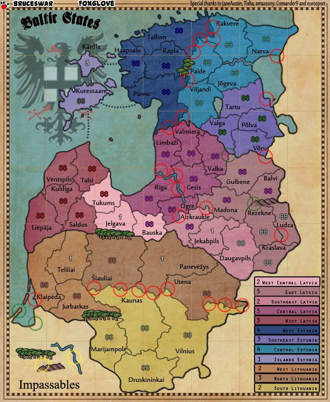
I've circled some areas of concern above:

Red: most of these are just areas of colors bleeding under borders, there are a couple that are specific with borders though.
The river's border is a lil pixely and has some bleed of the river's color onto the land. I circled the river in yellow to in the legend cuz there is 2 oddly parallel erasures in the river's border which is also present in the river circled in red.. Not that it necessarily matters, I really think you're going to have to redraw the river border anyways.
The 3 red circles in E Latvia and SE Latvia have issues with the borders that are a little different. Between Ogre and Aizkrakukle there is a stretch where its lighter than the rest of the border. In Madona there is an odd dot there on the border. And between Ludza and Rezekne the border is darker and pixelly.

Green: These borders are incomplete. there is also a spot of border under the mountains in Rezekne that should be erased. Also here the mountains should be nudged over or another mountain added to prevent confusion that Rezekne and Bavli could be connected. The circle in the nonplayable area the border looks oddly doubled with a gap there too.

Yellow: Legend goofs, I already mentioned the river, but the other circle there has an odd spot there l=that looks like it's a part of the layer that the mountains are on.

Re: Baltic States [3-1-12] Verion 14 P 16 Gameplay Stamp Re

PostPosted: Wed Mar 28, 2012 6:31 pm
by Bruceswar
I will be working on this over the weekend. I will try to fix everything mentioned. Stay tuned.

Re: Baltic States [3-1-12] Verion 14 P 16

PostPosted: Sat Mar 31, 2012 11:12 am
by Gillipig
I've got to say I don't like the colour scheme. It doesn't mesh well. I suggest no pink and purple colours. Try to get a lot of green colours into the map. I think most people symbolize the Baltic States with a lot of forests. Changing bonus colours is pretty easy and fun anyway :).

Re: Baltic States [3-1-12] Verion 14 P 16

PostPosted: Mon Apr 02, 2012 12:20 am
by RedBaron0
:kick: Bruce, how goes?

Re: Baltic States [3-1-12] Verion 14 P 16

PostPosted: Sat Apr 14, 2012 11:44 pm
by RedBaron0
Seems the progress on this map has stalled. Please contact any CA to return this map to the Main Foundry when an update is made. Please be aware that gameplay standards may be further reviewed upon return to the Main Foundry and may be required to once again pass through gp scrutiny. Should the map be found to be deficient in any way the GP stamp may be removed.

[Moved]

Re: [Vacation valid until Oct. 2012] Baltic States

PostPosted: Wed May 02, 2012 9:00 am
by Bruceswar
I will pick this back up soon, once work and such slows down.

Re: [Vacation valid until Oct. 2012] Baltic States

PostPosted: Tue Oct 30, 2012 5:46 am
by thenobodies80
Bruce, the deadline for the vacation period is behind the corner. If you want to continue this project , this is the right moment for an update! ;)

Re: [Vacation valid until Oct. 2012] Baltic States

PostPosted: Wed Oct 31, 2012 10:05 am
by AndyDufresne
I liked this map idea...keep it up!


--Andy

Re: [Vacation valid until Oct. 2012] Baltic States

PostPosted: Fri Nov 02, 2012 9:12 pm
by Bruceswar
Yep I know. Open game now but I will get on it soon.

Re: Baltic States Verion 14 P 15

PostPosted: Fri Nov 02, 2012 9:41 pm
by RjBeals
Click image to enlarge.
image


stepping in with a first look - here's my thoughts....


As an overall feel, I prefer the green map. Current map has a strong blue/purple feel. Green always looks better for land. I like your yellow/brown shades also. It takes lots of experiemting with colors before you get a good feel. Maybe less purple & more red. Keep working - there's plenty of colorful maps that work.

Your map looks very basic. Borders filled with color, subtle grunge overlay, and plain text territory names. It's fine, but I would push yourself to be more creative. If you've come this far, I would think you're dedicated to push a little further.

The emblem (Eagle/flag) looks like a 10 second job. Dropped in and lightened and moved to background. I don't like it. The legend is okay, but it's just text boxes. I think I would accept text box legends more if the title and map were a little more creative.

The water color blends in too much with the blue land colors.

I hate the grid overlayed on the map. No point and it looks bad.

I like the trees & mountains. They add something unique to this map. To get a bit more from them, add more shading - it will give them more 3D look.

The borders look a little blurry in spots. Make sure the borders are crisp - it's a hot button for players on this site. Those look like Tisha mountains :)

I guess that's enough - Bruce, if you want specific help on graphics, hit me up and I'll lend my help. Just remember, layers are your friend. !!!


The emblem looks

Re: [Vacation valid until Oct. 2012] Baltic States

PostPosted: Sat Nov 03, 2012 1:56 am
by Bruceswar
update... I am gonna try to use the green look again...

Image


Now how do I get the all green to work yet still define the bonuses. Open to ideas graphically speaking.

Re: Baltic States Updated! V 15 P 17

PostPosted: Sat Nov 03, 2012 9:51 am
by nolefan5311
Are you ready to get this moved back into the MFW? You already have the GP stamp, so as long as you don't plan on changing the bonus structure you're good as far as that is concerned, and can just focus on graphics.

Re: Baltic States Updated! V 15 P 17

PostPosted: Sat Nov 03, 2012 10:42 am
by thenobodies80
Bruceswar wrote:Now how do I get the all green to work yet still define the bonuses. Open to ideas graphically speaking.


More than a single option, these are the standard ways:

  • Symbols
  • Colored Names
  • Colored Borders + Minimap
  • Different shades of green

But you can find others with a bit of creativity. ;)

Re: Baltic States Updated! V 15 P 17

PostPosted: Sat Nov 03, 2012 8:35 pm
by Bruceswar
I am ready to be moved back please. Game play will not change unless something comes up and we all agree on the change, such as in beta.

Re: Baltic States Updated! V 15 P 17

PostPosted: Sun Nov 04, 2012 8:00 am
by koontz1973
Bruceswar wrote:I am ready to be moved back please. Game play will not change unless something comes up and we all agree on the change, such as in beta.


[Moved]

Back you go into the fray. Good luck Brucewar.

Some thoughts for you. I like the green look and different shades can work. Like my 1982 map, I only have 3 shades (dark, light and one in the middle). This provides enough contrast to show the different regions and means you do not have to worry about so many different shades blending into each other. Trees and mountains. They look comical compared to the rest of the map. Something similar but more realistic should work. Title needs work (you know this but I like to point out the obvious :D ). Have you made a decision on a mini map or will you keep the legend as it is. A mini map will work better though.

Re: Baltic States Updated! V 15 P 17

PostPosted: Wed Nov 14, 2012 10:10 pm
by Bruceswar
I could do something like this to mark the territories. Thoughts??

Image

Re: Baltic States Updated! V 15 P 17

PostPosted: Thu Nov 15, 2012 11:18 am
by AndyDufresne
That could work, though it might look strange when we see it on every region. But who knows!


--Andy

Re: Baltic States Updated! V 15 P 17

PostPosted: Thu Nov 15, 2012 11:33 am
by koontz1973
You could try turning them around and putting them onto flag poles. With a little detail it might just work.

Re: Baltic States Updated! V 15 P 17

PostPosted: Fri Nov 16, 2012 9:30 pm
by Bruceswar
koontz1973 wrote:You could try turning them around and putting them onto flag poles. With a little detail it might just work.


Good call.. Let me try that and see.

Re: Baltic States Updated! V 15 P 17

PostPosted: Sun Nov 25, 2012 11:53 pm
by isaiah40
Bruceswar wrote:
koontz1973 wrote:You could try turning them around and putting them onto flag poles. With a little detail it might just work.


Good call.. Let me try that and see.

How is this coming Bruce? Also please change the title to read as follows: Baltic States v.X [25 Nov 2012] pg.X This will make it easier for everyone to know when the last update was done, and what page it is on.

Re: Baltic States Updated! V 15 P 17

PostPosted: Thu Nov 29, 2012 10:00 pm
by RedBaron0
That not a bad idea with the flags Bruce, see if you can't find something.... a few somethings that are regional relavent symbol wise for those flags, and I think you'll be well on your way.

Image

Re: Baltic States Updated! V 15 P 17

PostPosted: Mon Dec 17, 2012 9:38 pm
by isaiah40
Bruce, any word on an update?? If there won't be an update soon, we will have to move it back into the Recycling Bin by the end of this week.