I still think the font is hard to read. Not for the territories bu the bonus text.
I think that before we worry about what this is going to look like we need to talk about the gameplay. What are the Bonuses/Territory layout/Boarders/ETC that will make this map play well? There is no point in making a great looking map that plays bad.
If you get the map looking sweet and then need to change it for gameplay reasons, you just lost all that time tweaking the map for no reason.
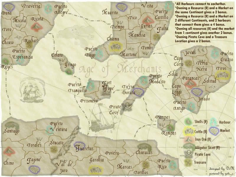
The gameplay will be great. I do have a question. It is in regards to the "Continents" Not all of the continents have the same number of each resource or even all of the resources. If you get bonus of +2 for holding all resources and market how is it fair if other "continents" ahve more resources.
What are the islands in the middle? Are they art of another continent or what?
Great map. It is coming along nicely.
Age of Merchants - [Quenched]
Moderator: Cartographers


![]() by yeti_c on Mon Mar 12, 2007 11:30 am
by yeti_c on Mon Mar 12, 2007 11:30 am
I think there should be more "empty" territories... (and perhaps more territories in total?)
Also change the word continent to "Island" I reckon... to do this you will probably need to make each land mass an island.
C.
Also change the word continent to "Island" I reckon... to do this you will probably need to make each land mass an island.
C.

Highest score : 2297
-

 yeti_c
- Posts: 9624
- Joined: Thu Jan 04, 2007 9:02 am


![]() by DiM on Mon Mar 12, 2007 11:48 am
by DiM on Mon Mar 12, 2007 11:48 am
WidowMakers wrote:I still think the font is hard to read. Not for the territories bu the bonus text.
I think that before we worry about what this is going to look like we need to talk about the gameplay. What are the Bonuses/Territory layout/Boarders/ETC that will make this map play well? There is no point in making a great looking map that plays bad.
If you get the map looking sweet and then need to change it for gameplay reasons, you just lost all that time tweaking the map for no reason.
The gameplay will be great. I do have a question. It is in regards to the "Continents" Not all of the continents have the same number of each resource or even all of the resources. If you get bonus of +2 for holding all resources and market how is it fair if other "continents" ahve more resources.
What are the islands in the middle? Are they art of another continent or what?
Great map. It is coming along nicely.
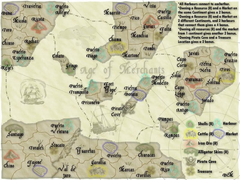
actually each continent has 2 resources and a market.
top right island
iron ore + shells + market + 2 ports
top central island
iron ore + cattle + market + 2 ports
left island
iron ore + cattle + market + 2 ports
central group of islands
shells + shells + market + 2 ports
bottom left continent (ends at impassable mountains+val de juro border)
alligator skins + iron ore + market + 1 port
bottom right continent (starts at impassable mountains+val de juro border)
alligator skins + cattle + market + 1 port
there are 5 treasure spots one in each continent (except central islands group) and one pirate cove (in the central islands group)
each continent has 4 borders (ports included)
oh and the middle islands form a continent on their own.
“In the beginning God said, the four-dimensional divergence of an antisymmetric, second rank tensor equals zero, and there was light, and it was good. And on the seventh day he rested.”- Michio Kaku
-

DiM
- Posts: 10415
- Joined: Wed Feb 14, 2007 6:20 pm
- Location: making maps for scooby snacks


![]() by DiM on Mon Mar 12, 2007 11:57 am
by DiM on Mon Mar 12, 2007 11:57 am
yeti_c wrote:I think there should be more "empty" territories... (and perhaps more territories in total?)
Also change the word continent to "Island" I reckon... to do this you will probably need to make each land mass an island.
C.
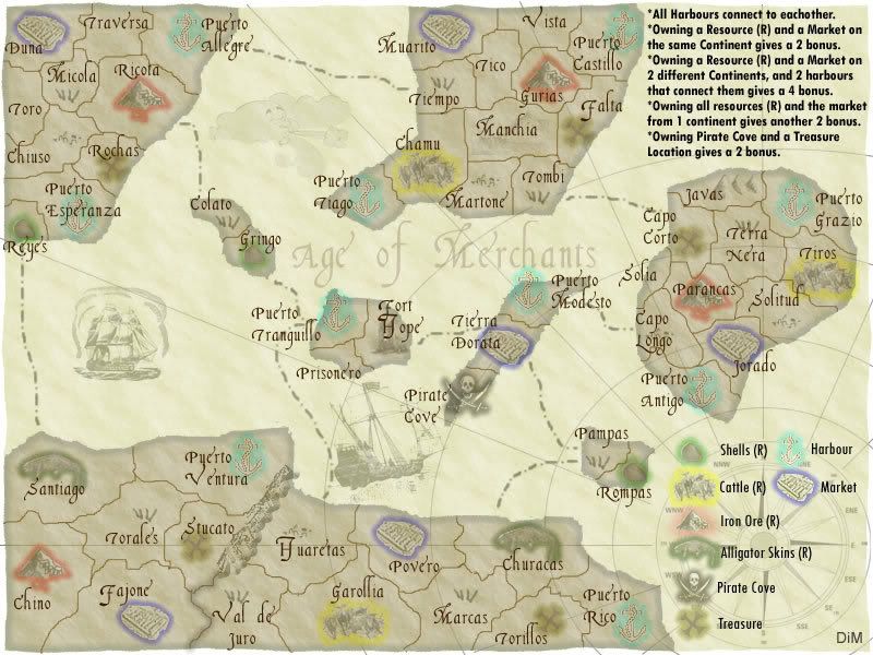
if i insert too many territories the map will get too crowded. i think.
i could split the bottom land mass in 2 parts to make things more clear but first i'll try with the highlited borders.
here i have higlighted each border. i guess the split between the bottom continents is more clear now. but i still don't know how to make the central islands stand out as a single continent.

“In the beginning God said, the four-dimensional divergence of an antisymmetric, second rank tensor equals zero, and there was light, and it was good. And on the seventh day he rested.”- Michio Kaku
-
DiM
- Posts: 10415
- Joined: Wed Feb 14, 2007 6:20 pm
- Location: making maps for scooby snacks
![]() by Bad Speler on Mon Mar 12, 2007 12:00 pm
by Bad Speler on Mon Mar 12, 2007 12:00 pm
personally, i hate this font. Again, can you add the title resources to the legend at the bottom to make sure its clear?
Highest Score: 2532
Highest Position: 69 (a long time ago)
Highest Position: 69 (a long time ago)
-

Bad Speler
- Posts: 1027
- Joined: Fri Jun 02, 2006 8:16 pm
- Location: Ottawa


![]() by DiM on Mon Mar 12, 2007 12:05 pm
by DiM on Mon Mar 12, 2007 12:05 pm
Bad Speler wrote:personally, i hate this font. Again, can you add the title resources to the legend at the bottom to make sure its clear?
if i add the title resources, what would i add to the others? and is pirate cove considered a resource? it contributes to bonus
i'll do something else. in 5 mins.
here it is:
“In the beginning God said, the four-dimensional divergence of an antisymmetric, second rank tensor equals zero, and there was light, and it was good. And on the seventh day he rested.”- Michio Kaku
-
DiM
- Posts: 10415
- Joined: Wed Feb 14, 2007 6:20 pm
- Location: making maps for scooby snacks
![]() by DiM on Mon Mar 12, 2007 2:13 pm
by DiM on Mon Mar 12, 2007 2:13 pm
i was thinking of adding army numbers (without circles) but i have no idea how to do this.
is it a special tool? or i just simply write some numbers? do thay have to be a certain size and font?
is it a special tool? or i just simply write some numbers? do thay have to be a certain size and font?
“In the beginning God said, the four-dimensional divergence of an antisymmetric, second rank tensor equals zero, and there was light, and it was good. And on the seventh day he rested.”- Michio Kaku
-
DiM
- Posts: 10415
- Joined: Wed Feb 14, 2007 6:20 pm
- Location: making maps for scooby snacks
![]() by yeti_c on Mon Mar 12, 2007 2:36 pm
by yeti_c on Mon Mar 12, 2007 2:36 pm
DiM wrote:i was thinking of adding army numbers (without circles) but i have no idea how to do this.
is it a special tool? or i just simply write some numbers? do thay have to be a certain size and font?
Adding numbers is done via creating your XML and then running it through the map tester and screenshotting it... (Well that was how I did it!)
C.
Highest score : 2297
-
yeti_c
- Posts: 9624
- Joined: Thu Jan 04, 2007 9:02 am


![]() by Bad Speler on Mon Mar 12, 2007 3:35 pm
by Bad Speler on Mon Mar 12, 2007 3:35 pm
I agree with Molacole, font is good, but to black, perhaps try a dark brown. Also thats a good way to mark resources
Highest Score: 2532
Highest Position: 69 (a long time ago)
Highest Position: 69 (a long time ago)
-
Bad Speler
- Posts: 1027
- Joined: Fri Jun 02, 2006 8:16 pm
- Location: Ottawa
![]() by fluffybunnykins on Mon Mar 12, 2007 4:09 pm
by fluffybunnykins on Mon Mar 12, 2007 4:09 pm
maybe if the icons were slightly clearer it would be easier to follow?
also, for a trade type game, is the prate map look still the right way to go?
maybe it should look more like a modern map with coloured sea & land?
Fancy fonts are great for one-off stuff, like continent names, but a simpler font will work best for the territories, because there are so many of them all piled up next to each other........... er, IMHO!
I definitely think it might be time to take the look away from the faded parchment, anyway. It doesn't need to look like that anymore, it's just a throwback to when this was a different idea! And anyway, Mid east & Bill of Rights have the parchment look sewn up, yeah?
but I do actuallylike that font... hmmm
Superman wears 'Fluffybunnykins' pyjamas
-

fluffybunnykins
- Posts: 385
- Joined: Tue May 02, 2006 6:43 am
- Location: Liverpool, UK

![]() by DiM on Mon Mar 12, 2007 6:50 pm
by DiM on Mon Mar 12, 2007 6:50 pm
yeti_c wrote:DiM wrote:i was thinking of adding army numbers (without circles) but i have no idea how to do this.
is it a special tool? or i just simply write some numbers? do thay have to be a certain size and font?
Adding numbers is done via creating your XML and then running it through the map tester and screenshotting it... (Well that was how I did it!)
C.
some time ago you offerd to help me with the xml.
i think i want to accept your offer. so if you have time please do the xml or if you don't give me some advice on where to start and do it myself.
thanks.
“In the beginning God said, the four-dimensional divergence of an antisymmetric, second rank tensor equals zero, and there was light, and it was good. And on the seventh day he rested.”- Michio Kaku
-
DiM
- Posts: 10415
- Joined: Wed Feb 14, 2007 6:20 pm
- Location: making maps for scooby snacks
![]() by DiM on Mon Mar 12, 2007 6:56 pm
by DiM on Mon Mar 12, 2007 6:56 pm
here are 2 more versions.
the same fancy font but less darker and in a shade of brown (i think this looks the best so far)
and a simpler font
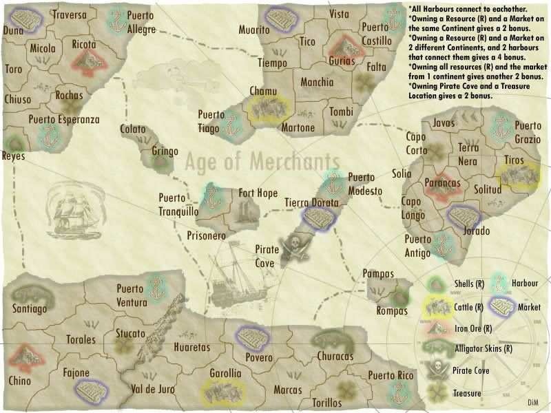
the same fancy font but less darker and in a shade of brown (i think this looks the best so far)
and a simpler font
“In the beginning God said, the four-dimensional divergence of an antisymmetric, second rank tensor equals zero, and there was light, and it was good. And on the seventh day he rested.”- Michio Kaku
-
DiM
- Posts: 10415
- Joined: Wed Feb 14, 2007 6:20 pm
- Location: making maps for scooby snacks
![]() by DiM on Mon Mar 12, 2007 6:58 pm
by DiM on Mon Mar 12, 2007 6:58 pm
fluffybunnykins wrote:maybe if the icons were slightly clearer it would be easier to follow?
also, for a trade type game, is the prate map look still the right way to go?
maybe it should look more like a modern map with coloured sea & land?
Fancy fonts are great for one-off stuff, like continent names, but a simpler font will work best for the territories, because there are so many of them all piled up next to each other........... er, IMHO!
I definitely think it might be time to take the look away from the faded parchment, anyway. It doesn't need to look like that anymore, it's just a throwback to when this was a different idea! And anyway, Mid east & Bill of Rights have the parchment look sewn up, yeah?
but I do actuallylike that font... hmmm
the bill of rights map is currently suspended. not abbandoned just suspended. i have hundreds of layers that need to be organized in that map and i don't have the time and willpower to do it now.
after i finish with this one i'll move back to the bill of rights and see what happens.
“In the beginning God said, the four-dimensional divergence of an antisymmetric, second rank tensor equals zero, and there was light, and it was good. And on the seventh day he rested.”- Michio Kaku
-
DiM
- Posts: 10415
- Joined: Wed Feb 14, 2007 6:20 pm
- Location: making maps for scooby snacks
![]() by Bad Speler on Mon Mar 12, 2007 7:01 pm
by Bad Speler on Mon Mar 12, 2007 7:01 pm
first version looks great! Also, could you turn the text in the top right to ths same shade of brown, as well as the legend text?
Highest Score: 2532
Highest Position: 69 (a long time ago)
Highest Position: 69 (a long time ago)
-
Bad Speler
- Posts: 1027
- Joined: Fri Jun 02, 2006 8:16 pm
- Location: Ottawa
![]() by DiM on Mon Mar 12, 2007 7:04 pm
by DiM on Mon Mar 12, 2007 7:04 pm
Bad Speler wrote:first version looks great! Also, could you turn the text in the top right to ths same shade of brown, as well as the legend text?
yes ofcourse i left that so the difference can be clear
edit// here you go. sorry for the delay but i had to eat
“In the beginning God said, the four-dimensional divergence of an antisymmetric, second rank tensor equals zero, and there was light, and it was good. And on the seventh day he rested.”- Michio Kaku
-
DiM
- Posts: 10415
- Joined: Wed Feb 14, 2007 6:20 pm
- Location: making maps for scooby snacks
![]() by yeti_c on Tue Mar 13, 2007 4:32 am
by yeti_c on Tue Mar 13, 2007 4:32 am
DiM wrote:yeti_c wrote:DiM wrote:i was thinking of adding army numbers (without circles) but i have no idea how to do this.
is it a special tool? or i just simply write some numbers? do thay have to be a certain size and font?
Adding numbers is done via creating your XML and then running it through the map tester and screenshotting it... (Well that was how I did it!)
C.
some time ago you offerd to help me with the xml.
i think i want to accept your offer. so if you have time please do the xml or if you don't give me some advice on where to start and do it myself.
thanks.
I'll knock you up some countries & co-ords to work on - we can do the continents later...
PM me your email address so I can send it to you - it won't be til later though as I'm busy at work today!
C.
Highest score : 2297
-
yeti_c
- Posts: 9624
- Joined: Thu Jan 04, 2007 9:02 am
![]() by DiM on Tue Mar 13, 2007 9:26 am
by DiM on Tue Mar 13, 2007 9:26 am
yeti_c wrote:DiM wrote:yeti_c wrote:DiM wrote:i was thinking of adding army numbers (without circles) but i have no idea how to do this.
is it a special tool? or i just simply write some numbers? do thay have to be a certain size and font?
Adding numbers is done via creating your XML and then running it through the map tester and screenshotting it... (Well that was how I did it!)
C.
some time ago you offerd to help me with the xml.
i think i want to accept your offer. so if you have time please do the xml or if you don't give me some advice on where to start and do it myself.
thanks.
I'll knock you up some countries & co-ords to work on - we can do the continents later...
PM me your email address so I can send it to you - it won't be til later though as I'm busy at work today!
C.
thanks. you have a PM.
“In the beginning God said, the four-dimensional divergence of an antisymmetric, second rank tensor equals zero, and there was light, and it was good. And on the seventh day he rested.”- Michio Kaku
-
DiM
- Posts: 10415
- Joined: Wed Feb 14, 2007 6:20 pm
- Location: making maps for scooby snacks
![]() by DiM on Tue Mar 13, 2007 3:51 pm
by DiM on Tue Mar 13, 2007 3:51 pm
the lack of suggestions can mean only 2 things
* the map has no appeal and i should abbandon it (hopefully not)
* the map is perfect and does not need any improvement (i wish)
i think there's a lot of room for improovements so i'm waiting for feedback.
* the map has no appeal and i should abbandon it (hopefully not)
* the map is perfect and does not need any improvement (i wish)
i think there's a lot of room for improovements so i'm waiting for feedback.
“In the beginning God said, the four-dimensional divergence of an antisymmetric, second rank tensor equals zero, and there was light, and it was good. And on the seventh day he rested.”- Michio Kaku
-
DiM
- Posts: 10415
- Joined: Wed Feb 14, 2007 6:20 pm
- Location: making maps for scooby snacks
![]() by DiM on Tue Mar 13, 2007 3:56 pm
by DiM on Tue Mar 13, 2007 3:56 pm
JCRuffino wrote:I like the idea of the map, just not that keen on the look so much.
what's the problem with the look, tell me what you don't like and maybe there's something i can do about it.
“In the beginning God said, the four-dimensional divergence of an antisymmetric, second rank tensor equals zero, and there was light, and it was good. And on the seventh day he rested.”- Michio Kaku
-
DiM
- Posts: 10415
- Joined: Wed Feb 14, 2007 6:20 pm
- Location: making maps for scooby snacks
![]() by JCRuffino on Tue Mar 13, 2007 4:02 pm
by JCRuffino on Tue Mar 13, 2007 4:02 pm
Not sure if I can put my finger exactly on it, I think it's just that it's too busy and cluttered. I'd say try making the icons a little smaller perhaps, or taking a few of them out. Maybe mess around with a few different icon designs.
Just so I'm not completely negative, I like the new fonts.
Just so I'm not completely negative, I like the new fonts.
-
JCRuffino
- Posts: 29
- Joined: Mon Jan 22, 2007 2:51 pm
![]() by DiM on Tue Mar 13, 2007 4:18 pm
by DiM on Tue Mar 13, 2007 4:18 pm
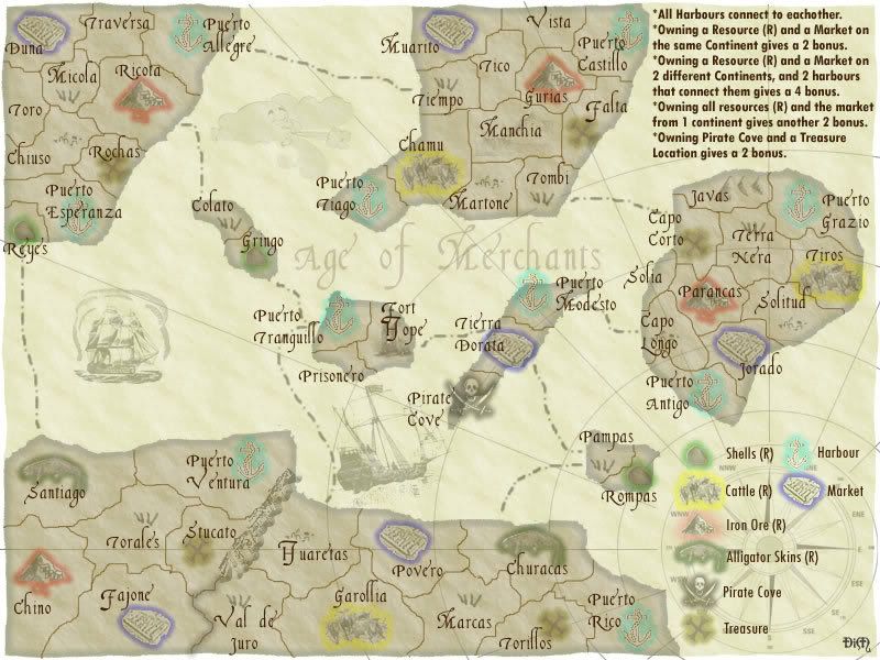
here are some smaller icons
“In the beginning God said, the four-dimensional divergence of an antisymmetric, second rank tensor equals zero, and there was light, and it was good. And on the seventh day he rested.”- Michio Kaku
-
DiM
- Posts: 10415
- Joined: Wed Feb 14, 2007 6:20 pm
- Location: making maps for scooby snacks
![]() by JCRuffino on Tue Mar 13, 2007 4:27 pm
by JCRuffino on Tue Mar 13, 2007 4:27 pm
I do prefer that, although you should probably get feedback from someone who isn't me if you can otherwise you'll just end up doing it how I want it, which probably won't coincide with anyone elses opinions.
Now I think where possible you should move the icons out from under the country names, mostly Puerto Ventura (it could easily sit to the top left of the text) and Huaretas (could be moved above the text).
But like I said, wait for someone else's input as well.
Now I think where possible you should move the icons out from under the country names, mostly Puerto Ventura (it could easily sit to the top left of the text) and Huaretas (could be moved above the text).
But like I said, wait for someone else's input as well.
-
JCRuffino
- Posts: 29
- Joined: Mon Jan 22, 2007 2:51 pm
![]() by DiM on Tue Mar 13, 2007 4:32 pm
by DiM on Tue Mar 13, 2007 4:32 pm
here you go:
ofcourse i'll wait for other opinions but i try to do each modification i'm asked because this way everybody can see it and give me feedback.
ofcourse i'll wait for other opinions but i try to do each modification i'm asked because this way everybody can see it and give me feedback.
“In the beginning God said, the four-dimensional divergence of an antisymmetric, second rank tensor equals zero, and there was light, and it was good. And on the seventh day he rested.”- Michio Kaku
-
DiM
- Posts: 10415
- Joined: Wed Feb 14, 2007 6:20 pm
- Location: making maps for scooby snacks
Who is online
Users browsing this forum: No registered users
|
|||||||
| Conquer Club is not associated with RISK online in any way. Copyright © 2006-2024 by Big Wham LLC | |||||||