Page 2 of 50

Posted:
Sun Mar 11, 2007 5:24 pmby DiM
yeti_c wrote:The pirate cove idea won't work - it's a nice idea but impossible to code into the XML...
Having said that - once you have a finished map - give me a shout and I'll code you up some XML - or alternatively if you wanna learn I can teach you how to code it up. (You've picked up photoshop quickly - XML is a breeze in comparison)
C.
thanks man. i'll give you a shout for help when i get to the xml part.
Posted:
Sun Mar 11, 2007 5:27 pmby johloh
interesting idea...
id give each resource on the map its own different color...so you can easily spot the other resources of the type youre looking for.
Posted:
Sun Mar 11, 2007 5:55 pmby DiM
johloh wrote:interesting idea...
id give each resource on the map its own different color...so you can easily spot the other resources of the type youre looking for.
if i put other colours it messes the overall aspect of an old map.

i'll toy with the shades too see what i can do.
Posted:
Sun Mar 11, 2007 7:00 pmby DiM
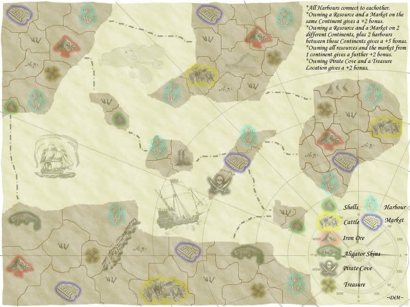
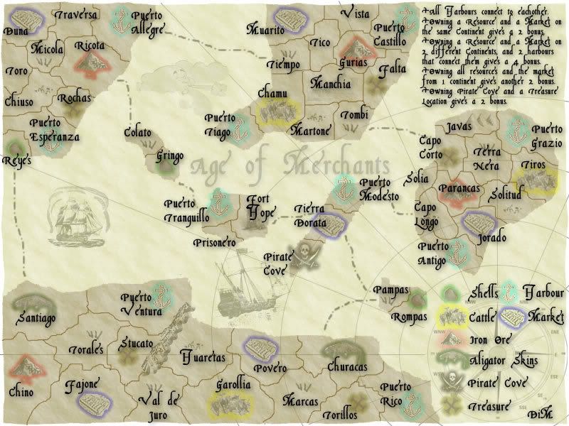
here is the new version. i added some shades. the bonuses should be very clear.
Posted:
Sun Mar 11, 2007 9:19 pmby DiM
i added region names (with larger font) and modified the borders (they were a bit edgy).
and this is pretty much all i can think of. i'm waiting for suggestions.
Posted:
Sun Mar 11, 2007 9:23 pmby Nukora
I like your bonuses on this one DiM. It's very interesting and has a whole new stragety to it, so it woudl be interesting to play.
Posted:
Sun Mar 11, 2007 9:27 pmby DiM
Nukora wrote:I like your bonuses on this one DiM. It's very interesting and has a whole new stragety to it, so it woudl be interesting to play.
and yet the poll is rather dissapointing even though i only have positive feedback on the thread

i would like the 6 people that voted NO to post their opinion, maybe things can be changed and they'd end up loving this map
Posted:
Sun Mar 11, 2007 9:39 pmby Hologram
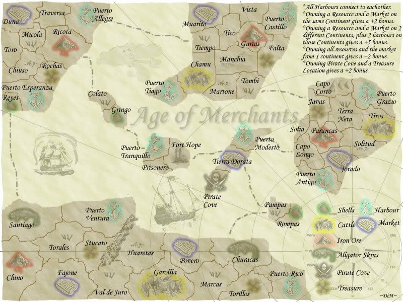
It's quite hard to read... Maybe more contrasting colors than old newsprint and faded black...
Posted:
Sun Mar 11, 2007 9:45 pmby Hologram
DiM wrote:i added region names (with larger font) and modified the borders (they were a bit edgy).
and this is pretty much all i can think of. i'm waiting for suggestions.
It's still quite hard to read...
Posted:
Sun Mar 11, 2007 9:50 pmby DiM
Hologram wrote:It's still quite hard to read...
you're kidding me

either you have problems with your vision or i have really good eyes
i can't possibly understand how can someone not be able to read the text now. it's 16 font. if i make it any larger it will be more text than map.

i think the text is readable even in the small size version.
Posted:
Sun Mar 11, 2007 10:07 pmby KEYOGI
Maybe it's just the choice of font that makes it hard to read.
I'm confused though... is this the same as the pirate map or different? What's going on there, they're the same image yes?
Posted:
Sun Mar 11, 2007 10:13 pmby Bad Speler
the font is readable, but Parancas is a bit harder to read.
Also, please specify on the map what the continents are, and what the resources are. Also, wouldnt it make a bit more sense if the sea routes came from harbours?
(edit) also the text is readable in the small version to a point, but not the text in the top right corner
Posted:
Sun Mar 11, 2007 10:17 pmby DiM
KEYOGI wrote:Maybe it's just the choice of font that makes it hard to read.
I'm confused though... is this the same as the pirate map or different? What's going on there, they're the same image yes?
i'm no longer doing the pirate map so i transformed it into Age of Merchants. i think this one has better gameplay.
what font should i use? i think something that looks like handwrite is the best choice for this map. puting something like arial or tnr spoils the feeling.
Posted:
Sun Mar 11, 2007 10:20 pmby DiM
Bad Speler wrote:the font is readable, but Parancas is a bit harder to read.
Also, please specify on the map what the continents are, and what the resources are. Also, wouldnt it make a bit more sense if the sea routes came from harbours?
(edit) also the text is readable in the small version to a point, but not the text in the top right corner
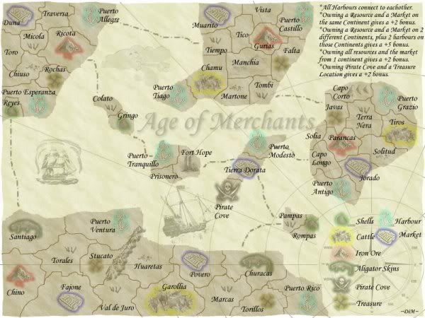
there are no continents. on this map you don't get bonuses for continents so they don't matter. and the resources are explained in the bottom right corner. i also added colour for better recognition.
i admit in the small version the top right text is a bit hard to read. i'll go now and serch for new fonts.
Posted:
Sun Mar 11, 2007 10:25 pmby Bad Speler
ok, if there are no continents why does it say at the top right:
owning a resource and a market on the same CONTINENT gives a bonus of 2
Owning a resource and a market on 2 different CONTINENTS...well you get the point
Also i thought the resources were just the 1st 4, but i guess im wrong, perhaps just put a title of resources above that legend to make sure its clear.
Posted:
Sun Mar 11, 2007 10:29 pmby DiM
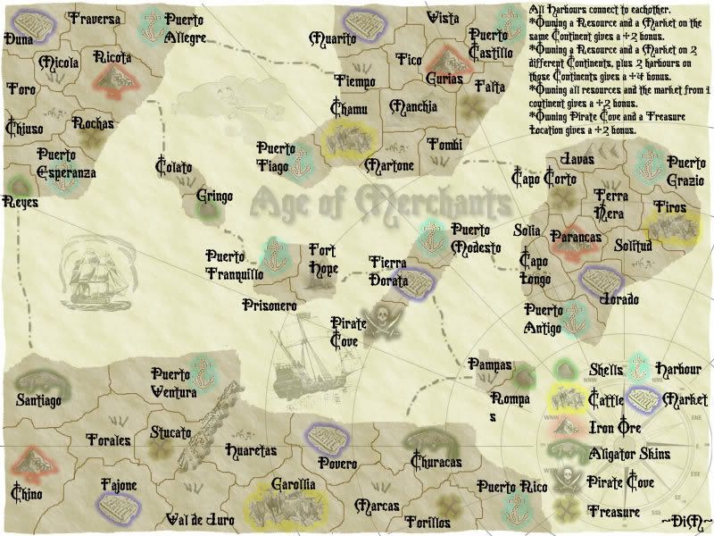
here are some fonts which one should i use?
http://www.dafont.com/infiltrace.font this one is really nice but it may make the map even more unreadable
http://www.dafont.com/morpheus.font nice and maybe more readable
http://www.dafont.com/rapscallion.font nice feeling - it's readable.
http://www.dafont.com/crusades.font interesting
http://www.dafont.com/benegraphic.font also nice one.
Posted:
Sun Mar 11, 2007 10:32 pmby DiM
Bad Speler wrote:ok, if there are no continents why does it say at the top right:
owning a resource and a market on the same CONTINENT gives a bonus of 2
Owning a resource and a market on 2 different CONTINENTS...well you get the point
Also i thought the resources were just the 1st 4, but i guess im wrong, perhaps just put a title of resources above that legend to make sure its clear.
ok i understand what you mean. i guess continents need to be more clear.
the first 4 are resources the other are harbours markets etc.
Posted:
Sun Mar 11, 2007 11:25 pmby DiM
i gotta go home to sleep. this evening i'll try to do some more things like figuring out a way to clearly show the continents, probably finding a new font, and trying to somehow make the explanation box in the upper right corner take up less space and still be visible.
is this font better?? if you guys can't read this one either then you're blind

Posted:
Mon Mar 12, 2007 1:12 amby Captain Crash
DiM wrote:is this font better?? if you guys can't read this one either then you're blind
Its not the size of the font, its the font itself...and that one is even worse!!

Posted:
Mon Mar 12, 2007 4:06 amby yeti_c
Captain Crash wrote:DiM wrote:is this font better?? if you guys can't read this one either then you're blind
Its not the size of the font, its the font itself...and that one is even worse!!
I concur - the new font is worse... the original font was fine for the larger map but a bit tricky on the smaller map - be aware of course that different people have different resolutions/monitor sizes that will change the physical size of the font.
C.
Posted:
Mon Mar 12, 2007 8:43 amby Bad Speler
definately worse. readable but worse. One thing i noticed is that the cattle symbol in Garollia is larger then the rest.
Posted:
Mon Mar 12, 2007 10:07 amby DiM
yeti_c wrote:Captain Crash wrote:DiM wrote:is this font better?? if you guys can't read this one either then you're blind
Its not the size of the font, its the font itself...and that one is even worse!!
I concur - the new font is worse... the original font was fine for the larger map but a bit tricky on the smaller map - be aware of course that different people have different resolutions/monitor sizes that will change the physical size of the font.
C.
yes i forgot about monitor sizes.

at home and at work (the 2 places i make this map) i have 21' monitors so maybe that's why i can read it very clear.
what do you say about the other fonts? also go at dafont.com and if you see something nice post the link here.
Posted:
Mon Mar 12, 2007 10:08 amby DiM
Bad Speler wrote:definately worse. readable but worse. One thing i noticed is that the cattle symbol in Garollia is larger then the rest.
will take care of the cattle symbol in the next update. thanks for pointing it out.
Posted:
Mon Mar 12, 2007 10:46 amby DiM
here is a new font. again i'm able to read it very well but i don't know about the ones with low res monitors.
please post your opinion, and don't forget, if you see a nice font just give me a link and i'll try it.
also modiffied cattle symbol in garollia.
Posted:
Mon Mar 12, 2007 10:53 amby DiM
do you guys have any suggestions on how i could make the continents stand out? i was thinking of outlining the borders like on keyogi's revamp of middle east but i already think there's too much colour on this map
should i try different shades on the continents? would that make things more visible? i'm especially worried about the middle islands continent