Page 3 of 30
Re: Mega USA Map [13 Sept 2011] V5 pg 4

Posted:
Wed Sep 14, 2011 10:02 amby Gillipig
Darn isaiah some of the coffee I was drinking went down my lungs when I saw this map. USA meets Hive and I like it!! Brilliant idea that continues on the same road as the smaller maps focusing on different parts of US. You'll have a hard time with the legend though. There are so many bonuses that need to be displayed. Also are you going to have a roof on the territory bonuses or just continue on as usual? 100 regions gives 33 troops or a fixed amount?
Re: Mega USA Map [13 Sept 2011] V5 pg 4
Posted:
Wed Sep 14, 2011 10:23 amby porkenbeans
Sorry, but I do not have the time right now to read the entirety of this thread. But, I thought that I would offer up my first impressions that only a set of "new eyes" can provide.
Yeah, there is certainly a whole lot going on, (not a bad thing necessarily). I think that if you experiment with a drop shadow on the roads, you can visually clear things up a bit.
Good luck on this one friend, you have a nice start here.

Re: Mega USA Map [13 Sept 2011] V5 pg 4
Posted:
Wed Sep 14, 2011 2:22 pmby isaiah40
Gillipig wrote:Darn isaiah some of the coffee I was drinking went down my lungs when I saw this map. USA meets Hive and I like it!! Brilliant idea that continues on the same road as the smaller maps focusing on different parts of US. You'll have a hard time with the legend though. There are so many bonuses that need to be displayed. Also are you going to have a roof on the territory bonuses or just continue on as usual? 100 regions gives 33 troops or a fixed amount?
I hate it when soda goes down the wrong way!

Anyways I haven'
t given a lot of thought about the territory bonus just yet, but that is an idea that is well worth looking into! I was thinking of just having a mini-map split apart with the bonuses on it. That will save room and should be easier to decipher what bonus is what.
Re: Mega USA Map [13 Sept 2011] V5 pg 4
Posted:
Wed Sep 14, 2011 2:53 pmby Gillipig
isaiah40 wrote:I was thinking of just having a mini-map split apart with the bonuses on it. That will save room and should be easier to decipher what bonus is what.
That's probably the best idea unless it's so small we can't see it clearly enough. Maybe you could do a sketch off it just to make sure it's possible to see the bonuses on the mini map? As I recall it it's around 50 different bonuses and the mini map may well be so cluttered that it'll be hard to make sense of it!
Re: Mega USA Map [13 Sept 2011] V5 pg 4
Posted:
Thu Sep 15, 2011 12:02 amby Bruceswar
the more I look at this map... The more it looks very cluttered.
Re: Mega USA Map [13 Sept 2011] V5 pg 4
Posted:
Thu Sep 15, 2011 8:55 amby ironsij0287
Just a thought. But maybe tone down the colors of the states to a rather muted palette of 4-5 colors. That might help it look less messy and also make the highway colors pop out more.
Re: Mega USA Map [13 Sept 2011] V5 pg 4
Posted:
Sat Sep 17, 2011 2:04 pmby porkenbeans
ironsij0287 wrote:Just a thought. But maybe tone down the colors of the states to a rather muted palette of 4-5 colors. That might help it look less messy and also make the highway colors pop out more.
Yes, darker muted colors. this and the drop shadow on the roads. This will lift them up from the map, thus helping to give it separation.
Also, unless you were to make this map larger, I would just go ahead and loose the territs that are not on the highway system. This will De-clutter things a bit.
Re: Mega USA Map [13 Sept 2011] V5 pg 4
Posted:
Sun Sep 18, 2011 12:02 amby koontz1973
porkenbeans wrote:ironsij0287 wrote:Just a thought. But maybe tone down the colors of the states to a rather muted palette of 4-5 colors. That might help it look less messy and also make the highway colors pop out more.
Yes, darker muted colors. this and the drop shadow on the roads. This will lift them up from the map, thus helping to give it separation.
Also, unless you were to make this map larger, I would just go ahead and loose the territs that are not on the highway system. This will De-clutter things a bit.
isaiah40 has to have the colours the same, if not very close to the same as the map pack, same goes with the territs not on the highways, or this is not the map pack mega map. It might be cluttered, it also might be somewhat hard to read, but that is one of the biggest things going for this right now. Why have supersized maps if the mapmakers cannot use the space to its full potential.
Re: Mega USA Map [13 Sept 2011] V5 pg 4
Posted:
Sun Sep 18, 2011 1:18 pmby porkenbeans
koontz1973 wrote:porkenbeans wrote:ironsij0287 wrote:Just a thought. But maybe tone down the colors of the states to a rather muted palette of 4-5 colors. That might help it look less messy and also make the highway colors pop out more.
Yes, darker muted colors. this and the drop shadow on the roads. This will lift them up from the map, thus helping to give it separation.
Also, unless you were to make this map larger, I would just go ahead and loose the territs that are not on the highway system. This will De-clutter things a bit.
isaiah40 has to have the colours the same, if not very close to the same as the map pack, same goes with the territs not on the highways, or this is not the map pack mega map. It might be cluttered, it also might be somewhat hard to read, but that is one of the biggest things going for this right now. Why have supersized maps if the mapmakers cannot use the space to its full potential.
Well something needs to be done. You can still keep to the original colors, just Tweak them a bit. Do the drop shadow as I suggested on the highways. You will be surprised at how making them in relief, will help this situation out. Make the highways contrast with the rest of the map by making one dark and the other light. Highways=light Territs=dark.
Re: Mega USA Map [13 Sept 2011] V5 pg 4
Posted:
Sun Sep 18, 2011 10:18 pmby isaiah40
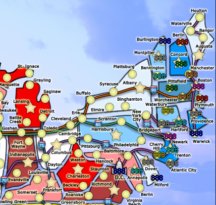
Okay this is just a preview of what I'm doing. It looks less cluttered to me. This is actual size of everything on the small.
Re: Mega USA Map [13 Sept 2011] V5 pg 4
Posted:
Sun Sep 18, 2011 11:42 pmby koontz1973
Nice and it is clearer. One question though looking at this.
Highways 90 and 80 run next to each other with territs placed on both (Goshen, Cleveland etc). Are these placed on both or either one?
Re: Mega USA Map [13 Sept 2011] V5 pg 4
Posted:
Mon Sep 19, 2011 8:04 amby isaiah40
koontz1973 wrote:Nice and it is clearer. One question though looking at this.
Highways 90 and 80 run next to each other with territs placed on both (Goshen, Cleveland etc). Are these placed on both or either one?
Both.
Re: Mega USA Map [13 Sept 2011] V5 pg 4
Posted:
Tue Sep 20, 2011 5:40 pmby isaiah40
New version, hopefully it is less cluttered looking. I am currently working on the color scheme. I am working on doing the colors for each region. The Southwest bonus is done and I am working on New England.
Interstates have been reduced, along with the circles and stars. The circles are currently at 18x18, the smallest I can go on them.
- Click image to enlarge.

Re: Mega USA Map [20 Sept 2011] V6 pg 5
Posted:
Tue Sep 20, 2011 7:32 pmby Victor Sullivan
Wouldn't Southwest include New Mexico? As far as colors go, I don't think that should be as high on you priorities list as the legend, tbh.
-Sully
Re: Mega USA Map [20 Sept 2011] V6 pg 5
Posted:
Tue Sep 20, 2011 8:42 pmby isaiah40
Victor Sullivan wrote:Wouldn't Southwest include New Mexico? As far as colors go, I don't think that should be as high on you priorities list as the legend, tbh.
-Sully
Actually to get the legend done I need the colors done first. The Rocky Mountain bonus area colors are going to be changed, so yes NM will be different.
Re: Mega USA Map [20 Sept 2011] V6 pg 5
Posted:
Wed Sep 21, 2011 9:36 amby Criticalwinner
Are you planning on doing a capital bonus or a D.C. bonus, as well as territory bonuses?
Re: Mega USA Map [13 Sept 2011] V5 pg 4
Posted:
Wed Sep 21, 2011 12:26 pmby Gillipig
isaiah40 wrote:New version, hopefully it is less cluttered looking. I am currently working on the color scheme. I am working on doing the colors for each region. The Southwest bonus is done and I am working on New England.
Interstates have been reduced, along with the circles and stars. The circles are currently at 18x18, the smallest I can go on them.
- Click image to enlarge.
Yes less cluttered.
Re: Mega USA Map [20 Sept 2011] V6 pg 5
Posted:
Sat Sep 24, 2011 3:49 pmby RjBeals
i think the glow on all the territories makes it look more cluttered. You don't need it for most of those colors.
Re: Mega USA Map [20 Sept 2011] V6 pg 5
Posted:
Sun Sep 25, 2011 12:27 amby danfrank
i would not worry too much about the clutteredness , since you will also be adding road lines to connect all the cities ( i think ) .. and besides road maps are pretty cluttered anyway.i am looking forward to this one becoming playable

Re: Mega USA Map [20 Sept 2011] V6 pg 5
Posted:
Wed Sep 28, 2011 12:19 amby machrs
COOL MAP!!! if you could it would be great to get alaska and Hawaii in the map as well... maybe a sub map!!! keep up the great work!!
Re: Mega USA Map [20 Sept 2011] V6 pg 5
Posted:
Wed Sep 28, 2011 3:51 amby Gillipig
machrs wrote:COOL MAP!!! if you could it would be great to get alaska and Hawaii in the map as well... maybe a sub map!!! keep up the great work!!
Yeah I was thinking of that too. Not sure how you could fit in even with a supersize stamp. But that would really make this map even better. Hawaii will be a lot easier to fit in than Alaska. Especially if you want to keep it proportional. On second thoughts I don't think it's going to be possible to make Alaska proportional. and since you can't do that I'd say skip it all and just go with the image you have now. It will be enough trouble to fit in a mini map, or all the bonuses listed if the mini map won't be clear enough. So my vote is on skipping it.
Re: Mega USA Map [20 Sept 2011] V6 pg 5
Posted:
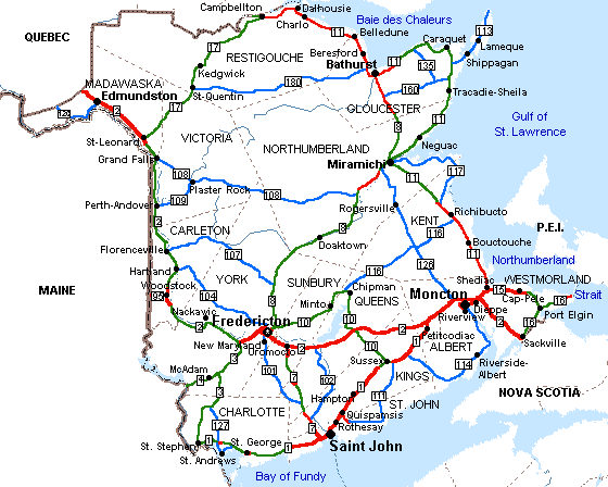
Sat Oct 01, 2011 3:15 amby natty dread
I think it would help with the clutter if you adopted a more "road map" like style - which would also fit the theme of the map better than the current cartoonish style.
Something like this:
- Click image to enlarge.
Re: Mega USA Map [20 Sept 2011] V6 pg 5
Posted:
Thu Oct 06, 2011 9:15 pmby porkenbeans
The style is perfect as it is. It is after all an addition to the map pack family, ...is it not ?
Re: Mega USA Map [20 Sept 2011] V6 pg 5
Posted:
Sat Oct 08, 2011 6:36 amby natty dread
Yeah... the current map pack doesn't look too good either. But since those aren't likely to be changed, and this one still can be... I see no reason to restrict the style of this map to some arbitrary specifications.
Re: Mega USA Map [20 Sept 2011] V6 pg 5
Posted:
Sat Oct 08, 2011 8:52 amby isaiah40
Just to let everyone know, I'm still working on this. Working on fitting in a mini-map and so forth, so I can possibly work in Alaska and Hawaii, since what is a MEGA USA Map without our 49th and 50th states?