Page 6 of 13

Re: New Jersey [12.17.2011, p9]

PostPosted: Thu Feb 02, 2012 4:20 pm
by chaos32679
*** UPDATE ***

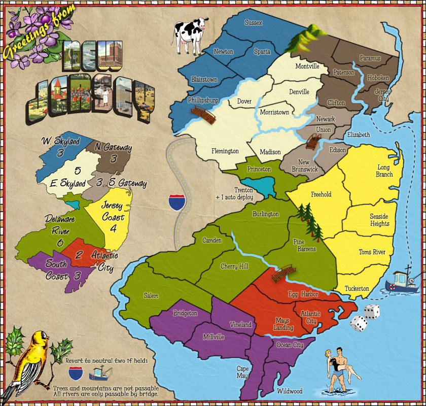
removed img from upper right
removed interstate sign from left hand side
moved auto deploy text from key area and put it next to region (trenton)
new font/img for map title (New Jersey)
changed look of trees (near pine barrens)

anything else holding this up?

Click image to enlarge.
image

Re: New Jersey [UPDATE, 02.02.2012, p10]

PostPosted: Thu Feb 02, 2012 8:32 pm
by thechuck51
I really can't wait for this map to come online so i can run a huge 256 player tournament based on Nj state wrestling tournament

Re: New Jersey [UPDATE, 02.02.2012, p10]

PostPosted: Fri Feb 03, 2012 11:07 am
by chaos32679
thechuck51 wrote:I really can't wait for this map to come online so i can run a huge 256 player tournament based on Nj state wrestling tournament


LOL, guess that means you approve?

Re: New Jersey [UPDATE, 02.02.2012, p10]

PostPosted: Sun Feb 05, 2012 8:01 am
by Flapcake
I kind of liked the interstate sign, it gave something visiual.

The bridges looks like boat jettys (correct spelled ?) they dont look like they connect anything.

I still think the cow should be a Jersey cow :)

But overall Im happy that you stayd with the current appearance, looks nice

Re: New Jersey [12.17.2011, p9]

PostPosted: Sun Feb 05, 2012 10:10 am
by thenobodies80
chaos32679 wrote:
thenobodies80 wrote:Bringing the discussion back on gameplay, how many neutrals, apart the 3 obvious trenton, ship and interstate, do you have planned for this map?
Atlantic City should be managed in some way to not give an advantage to a player due a lucky drop and on the opposite Dalware River number of regions should be probalby reduced, it's a large bonus in the middle that mostly it's not a good thing. Anyway I'll give you more inputs as soon as I know where your starting neutrals are. ;)
Btw sorry if you have them in the first post and I totally missed them.


Starting neutrals will be Atlantic City, Trenton, and then the two passages (killer neutrals). thoughts?


Ok, in this case my first idea doesn't work. I was going to suggest you to merge camden with cherry hill and burlington with pine barrens. The issue doing this is that you come out with 38 regions at the start = 12 territories in 2 and 3 players games. Considering that is something not good, in this case I would suggest you to reduce the number of regions in the delaware zone anyway, but merge ONLY two regions to have this zone composed of a total of 6 regions instead of 7. So you could merge OR camden with cherry hill OR burlington with pine barrens. It will help to make that zone more holdable. ;)

How many neutrals will have trenton and atlantic city at the start? 3, 4 troops ?

Re: New Jersey [UPDATE, 02.02.2012, p10]

PostPosted: Sun Feb 05, 2012 4:41 pm
by chaos32679
I was thinking 3's for AC and Trenton, and maybe 2's for the killer neutrals.

as for merging, i'd rather keep camden and cherry hill. what if they were extended and glassboro went away? idk, i kinda like that its not an easy region to hold, if you can get it, you'll definitely be earning that +6 bonus.

I'll talk to my partner in crime, see what she thinks...

Re: New Jersey [UPDATE, 02.02.2012, p10]

PostPosted: Sun Feb 05, 2012 4:54 pm
by thenobodies80
I'm fine with extend them and get rid of glassboro. I agree that is worth the 6 troops, but I'm worried that as it is now it will be a no man land. The "if you can get it" is my real concern ;)

Re: New Jersey [UPDATE, 02.02.2012, p10]

PostPosted: Tue Feb 21, 2012 12:18 pm
by chaos32679
*** UPDATE ***

Camden and Cherry Hill extended, Glassboro removed...

Click image to enlarge.
image

Re: New Jersey [UPDATE, 02.21.2012, p10]

PostPosted: Fri Feb 24, 2012 12:36 pm
by isaiah40
Onward and upward we go!!
Image

Re: New Jersey [UPDATE, 02.21.2012, p10]

PostPosted: Fri Feb 24, 2012 12:52 pm
by Gillipig
The white/grey area on the birds head looks very strange. It took ages before I saw that little beak underneath it. Nice coloured bird though :).

Re: New Jersey [UPDATE, 02.21.2012, p10]

PostPosted: Sat Mar 03, 2012 1:35 am
by RedBaron0
Well-well-well Jersey seems to be taking over everything... isn't it? Damn you Snooki! LOL

alright, your bridge isn't a bridge.... its a dock. I think it'll be alright as long as no one else protests and that you label it as such somewhere. Putting a "bridge" by the word bridge along the bottom will likely solve this.

The rivers don't have the same oceanic whitish outline. I understand they aren't as wide and they'll just make the rivers whiter. It just seems a little off. I'd think putting a similar outline on the sides of the river would help, but at a smaller width.

The pine trees while nice look a little todd to me being able to see the trunk all the way to the top, they'd be better with the green covering that area over.

Add an impassible legend, we know right now that rivers are impassible, but it isn't mentioned if the trees or mountains are impassible.

The playable surface could use a bit of texture, something subtle and theme appropriate.

Connectors to the tugboat... eh try a few different things there, dotted/dashed lines

Re: New Jersey [UPDATE, 02.21.2012, p10]

PostPosted: Sat Mar 03, 2012 2:50 am
by Flapcake
RedBaron0 wrote:
alright, your bridge isn't a bridge.... its a dock. I think it'll be alright as long as no one else protests and that you label it as such somewhere. Putting a "bridge" by the word bridge along the bottom will likely solve this.


It has been mentioned further back in the thread whit out any respond.

Re: New Jersey [UPDATE, 02.21.2012, p10]

PostPosted: Sat Mar 03, 2012 3:38 am
by Bruceswar
I bet if you run a color blind test you will not pass it with the current colors.

Re: New Jersey [UPDATE, 02.21.2012, p10]

PostPosted: Sat Mar 03, 2012 4:54 am
by natty dread
Bruceswar wrote:I bet if you run a color blind test you will not pass it with the current colors.


I did and they look fine to me. No two areas that are next to each other are similar, and there's a minimap so I don't see any problem.

However, the colours seem a tad bit dark to me. Maybe the whole playable area could be lightened up by 10% or so.

RedBaron0 wrote:The playable surface could use a bit of texture, something subtle and theme appropriate.


Agreed. It looks weird when the non-playable area has texture but playable area doesn't. I'd also add some texture to the sea.

Re: New Jersey [UPDATE, 02.21.2012, p10]

PostPosted: Sat Mar 17, 2012 6:32 pm
by laughingcavalier
It looks good to me.
I like the slightly twee themes of the graphics - feels like I am on a 1950s holiday.
If you are considering more changes, Natty's suggestions about lightening up or adding texture seem to be a good way to go.
I was a bit confused about the tugboat, did not realise it was a connection until I read about it - is there a way to make the connecting line a bit more obvious?

Re: New Jersey [UPDATE, 02.21.2012, p10]

PostPosted: Thu Mar 22, 2012 3:19 am
by RedBaron0
What'd the status here Flapcake, we've come to 1 month without an update.

Re: New Jersey [UPDATE, 02.21.2012, p10]

PostPosted: Thu Mar 22, 2012 3:44 am
by Flapcake
RedBaron0 wrote:What'd the status here Flapcake, we've come to 1 month without an update.


(cough cough) Its chaos32679 doing this map ;)

Re: New Jersey [UPDATE, 02.21.2012, p10]

PostPosted: Thu Mar 22, 2012 4:33 am
by RedBaron0
ugh.... it's to bloody late, or early. DX And Tisha's helping out too, chaos, Tish??

Re: New Jersey [UPDATE, 02.21.2012, p10]

PostPosted: Thu Mar 22, 2012 8:03 am
by chaos32679
update friday 3/23

Re: New Jersey [UPDATE, 02.21.2012, p10]

PostPosted: Fri Mar 23, 2012 2:43 pm
by chaos32679
*** UPDATE ***

+ changed mountains
+ added texture to the whole image
+ changed the water route to make it more noticeable
+ took the light blue glow down to make it less noticeable
+ added that trees and mountains are not passable

+ bridges still a work in progress...


Click image to enlarge.
image

Re: New Jersey [UPDATE, 03.23.2012, p11]

PostPosted: Sun Mar 25, 2012 6:11 am
by Flapcake
Nice progress.

This is only my personal opinion ;)
your bridges looks good, to improve them you can add a drop shadow, that would do some magic. (same with the trees)

Mountains are super nice, pls keep them ;)

For the rivers, you can add a (dark) outer glow to make them "sit or melt" in the landscape, it will get them a more natrual look, rigth now they dont look like they belong. that you can also do with the coast line, but here to only getting the glow on the side towards the sea, you create a new layer (copy) of the outer border line, add a (ligth) outer glow, put the layer between the sea layer and the landarea layer.


your about to have a overall fitted theme, nice work =D>

Re: New Jersey [UPDATE 03.28.2012, p11]

PostPosted: Wed Mar 28, 2012 12:38 pm
by chaos32679
wood bridges

Click image to enlarge.
image

Re: New Jersey [UPDATE 03.28.2012, p11]

PostPosted: Wed Mar 28, 2012 3:23 pm
by The Bison King
I think it would look better if there were outlines surrounding the entire rivers, rather than just around the mouth.

Re: New Jersey [UPDATE 03.28.2012, p11]

PostPosted: Wed Mar 28, 2012 4:43 pm
by Tisha
The Bison King wrote:I think it would look better if there were outlines surrounding the entire rivers, rather than just around the mouth.

I tried.. looks really mess, too busy.

Re: New Jersey [UPDATE 03.28.2012, p11]

PostPosted: Wed Mar 28, 2012 5:06 pm
by The Bison King
Tisha wrote:
The Bison King wrote:I think it would look better if there were outlines surrounding the entire rivers, rather than just around the mouth.

I tried.. looks really mess, too busy.

:-k shouldn't...