Page 1 of 14
Re: Quilt Wars [17.Oct.11] - V1 - p1

Posted:
Mon Oct 17, 2011 9:46 amby DiM
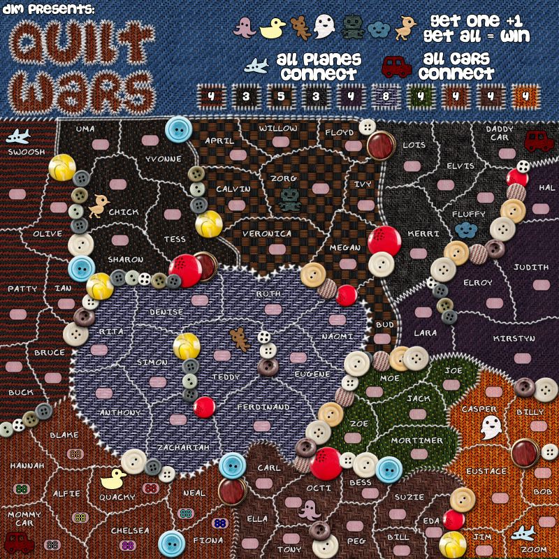
V2:*added terit names
*army circles
*split up the top right continent into 2 different ones
*added some more impassables
*changed the continent bonuses.
- Click image to enlarge.
Re: Quilt Wars [17.Oct.11] - V2 - p1&2
Posted:
Mon Oct 17, 2011 9:55 amby natty dread
One thing: the bonus legend isnt' very clear, the quilt patterns are partially obscured by the bonus numbers... maybe you could move the numbers to the sides of the patches or make the patches larger?
Also you should probably also have names for the bonus areas.
Also, the 2nd and 4th one look kinda similar... maybe tweak the colours a bit?
One more thing, and this might be too troublesome to actually do, but it would be really cool if you could make all the text look like it was stitched on...
Re: Quilt Wars [17.Oct.11] - V2 - p1&2
Posted:
Mon Oct 17, 2011 10:13 amby Industrial Helix
Pokemon meets grandma's quilting club...
The concept is novel... but I'm not sure I'd play it more than once cause I really don't give a crap about quilting.
Re: Quilt Wars [17.Oct.11] - V2 - p1&2
Posted:
Mon Oct 17, 2011 10:16 amby AndyDufresne
The more I look at the map, the more I think I'd like to play on it, if only for a nice change of pace from all the war themed maps we have.
--Andy
Re: Quilt Wars [17.Oct.11] - V2 - p1&2
Posted:
Mon Oct 17, 2011 10:56 amby Gillipig
Reminds me of the "Monsters" map so I'm gonna have to say no to it.
Re: Quilt Wars [17.Oct.11] - V2 - p1&2
Posted:
Mon Oct 17, 2011 12:54 pmby DiM
Gillipig wrote:Reminds me of the "Monsters" map so I'm gonna have to say no to it.
there is absolutely NOTHING in common with that map. not the gameplay and certainly not the graphics and obviously neither the theme.

Re: Quilt Wars [17.Oct.11] - V2 - p1&2
Posted:
Mon Oct 17, 2011 4:47 pmby Gillipig
The twist I get in my stomach when I look at it is very similar to when I look at the monsters map

. I like a lot of your maps but not this one so I'll opt out on following it.
Re: Quilt Wars [17.Oct.11] - V2 - p1&2
Posted:
Tue Oct 18, 2011 9:08 amby Flapcake
I think it's sweet, go for it. I'm excited about your graphic skills, there is nothing to pinpoint.
I agree with Natty that bonus patches can be difficult to distinguish from each other, with names or more diffrend color it will be more clearly.
when that is said, then who ever wear that shirt has a creepy taste

Re: Quilt Wars [17.Oct.11] - V2 - p1&2
Posted:
Tue Oct 18, 2011 9:16 amby AndyDufresne
I'm going to give this map a look over maybe today or tomorrow, and see what real feedback I can give it, since I think I'd actually like to see it in play.
This is why I love the Foundry. We can have the following maps all in development at the same time: Quilt Wars, Trench Warfare, and Tokyo.
--Andy
Re: Quilt Wars [17.Oct.11] - V2 - p1&2
Posted:
Tue Oct 18, 2011 10:06 amby DiM
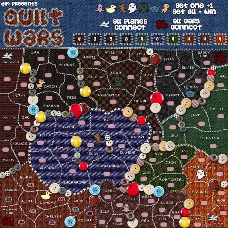
V3:*made the patches in the legend a bit bigger. i hope the textures are visible now.
*made all the terit names look like they're made of thread whilst still keeping them as readable as possible.
*changed some colours
- Click image to enlarge.
Re: Quilt Wars [17.Oct.11] - V2 - p1&2
Posted:
Tue Oct 18, 2011 10:09 amby DiM
Flapcake wrote:I think it's sweet, go for it. I'm excited about your graphic skills, there is nothing to pinpoint.
I agree with Natty that bonus patches can be difficult to distinguish from each other, with names or more diffrend color it will be more clearly.
when that is said, then who ever wear that shirt has a creepy taste
thanks for the support.
i have increased the patches (see previous post).
if it is still a problem i will try and rearrange them some other way and put the bonus numbers outside so the texture is fully visible.
Re: Quilt Wars [17.Oct.11] - V2 - p1&2
Posted:
Tue Oct 18, 2011 10:11 amby DiM
AndyDufresne wrote:I'm going to give this map a look over maybe today or tomorrow, and see what real feedback I can give it, since I think I'd actually like to see it in play.
looking forward to it.
AndyDufresne wrote:This is why I love the Foundry. We can have the following maps all in development at the same time: Quilt Wars, Trench Warfare, and Tokyo.
true, it's great to see different mapping styles and different gameplay experiences.
Re: Quilt Wars [18.Oct.11] - V3 - p1&2
Posted:
Tue Oct 18, 2011 9:33 pmby A_Communist
I really like this idea, and the map is just adorable. Though I think bonus continents are techincally supposed to have names... which also might help clear up the confusion with which bonus is which. And since there are so many territories and names, perhaps it's a community quilt, and each bonus region was stitched on by a different family? You can have the Smiths, the Johnsons, etc. as the bonuses.
Re: Quilt Wars [18.Oct.11] - V3 - p1&2
Posted:
Wed Oct 19, 2011 2:14 amby zimmah
lol it's a bit like kirbies epic yarn.
the colors are a bit dark tho.
Re: Quilt Wars [18.Oct.11] - V3 - p1&2
Posted:
Wed Oct 19, 2011 8:46 amby DiM
zimmah wrote:lol it's a bit like kirbies epic yarn.
the colors are a bit dark tho.
i tried using lighter colours like the blue orange or green but i had to darken them because the text and the army labels were barely visible.
Re: Quilt Wars [18.Oct.11] - V3 - p1&2
Posted:
Wed Oct 19, 2011 12:54 pmby zimmah
DiM wrote:zimmah wrote:lol it's a bit like kirbies epic yarn.
the colors are a bit dark tho.
i tried using lighter colours like the blue orange or green but i had to darken them because the text and the army labels were barely visible.
have you tried using white letters with a black outline?
you should be able to read that on any background.
Re: Quilt Wars [18.Oct.11] - V3 - p1&2
Posted:
Wed Oct 19, 2011 2:47 pmby DiM
zimmah wrote:DiM wrote:zimmah wrote:lol it's a bit like kirbies epic yarn.
the colors are a bit dark tho.
i tried using lighter colours like the blue orange or green but i had to darken them because the text and the army labels were barely visible.
have you tried using white letters with a black outline?
you should be able to read that on any background.
yeah, if you look back in V2 it was just like that, white with black outline but in V3 i removed the black outline and added some effects to make it look like it's made of string. now the text looks like it's sawn into the blanket and it fits the theme much better.
Re: Quilt Wars [18.Oct.11] - V3 - p1&2
Posted:
Wed Oct 19, 2011 7:54 pmby isaiah40
Let me just quilt this in for you!

Congrats!!
Re: Quilt Wars [18.Oct.11] - V3 - p1&2
Posted:
Wed Oct 19, 2011 8:38 pmby DiM
isaiah40 wrote:Let me just quilt this in for you!
Congrats!!
sweet, i'm gonna go ahead and stitch it to make sure i don't lose it

Re: Quilt Wars [18.Oct.11] - V3 - p1&2
Posted:
Thu Oct 20, 2011 9:50 amby AndyDufresne
Looking at the gameplay, the bonus zones of Swoosh and Chick (I don't know what else to call them for now) seem like some of the stronger areas as they allow for expansion while generally keeping your borders at the minimum. Most of the bonus zones don't allow for any easy expansion past the bonus zone.
Zoe-moe-joe and Casper aren't too bad to hold out in either, though as mentioned expansion in each is generally limited.
Removing the Hal-Daddy Car border could make for Hal-Lara-Kristin bonus zone to have a little more expansion possibility than before. But doing so removes some of the symmetry you've established (such as in the top of the map, Swoosh and Daddy's Cars border neighboring bonus zones while in the bottom of the map Mommy's Car and Zoom do not).
How are bonus zones going to be named in the xml/gamelog?
For graphics, I'm not too fond of the checkerboard pattern. And a little more differentiation between Chick and Fluffy patterns/colors might be nice for the legend.
Just some random initial thoughts.
--Andy
Re: Quilt Wars [18.Oct.11] - V3 - p1&2
Posted:
Thu Oct 20, 2011 10:08 amby zimmah
you do have a point about this font fitting the theme better, however i'd really like to see some brighter colors or at least something easier on the eye, because dark isn't bad in particular, but the darkness makes the patterns hard to see, especially when there's light falling on the screen coming from my windows. this makes it really hard to see the continents. sometimes it just looks like everything is one color.
i see you're using mostly black+red, but in the middle it's dark+medium blue and in the right you have black+green (or just dark and light green). is it possible to use Black+color like for example black+green, black+a bit light blue (not too light ofc. but also not so dark it's hard to see) black+yellow etc. so it's easier to see the patterns?
i think the territories with chick and fluffi in them are especially dark, maybe they can be chanced a little.
Re: Quilt Wars [18.Oct.11] - V3 - p1&2
Posted:
Fri Oct 21, 2011 6:14 amby natty dread
When I think of the name "Quilt wars", it makes me think of two armies shooting quilts at each other...
Re: Quilt Wars [18.Oct.11] - V3 - p1&2
Posted:
Fri Oct 21, 2011 6:17 amby Flapcake
natty_dread wrote:When I think of the name "Quilt wars", it makes me think of two armies shooting quilts at each other...
I think of drunk Scots wearing only Quilts, who fights with each other.

Re: Quilt Wars [18.Oct.11] - V3 - p1&2
Posted:
Fri Oct 21, 2011 8:36 amby AndyDufresne
'Quilt-ageddon'
'Quilt-astrophe'
'Quilt-alpyse'
--Andy
Re: Quilt Wars [18.Oct.11] - V3 - p1&2
Posted:
Fri Oct 21, 2011 8:54 amby DiM
zimmah wrote:you do have a point about this font fitting the theme better, however i'd really like to see some brighter colors or at least something easier on the eye, because dark isn't bad in particular, but the darkness makes the patterns hard to see, especially when there's light falling on the screen coming from my windows. this makes it really hard to see the continents. sometimes it just looks like everything is one color.
i see you're using mostly black+red, but in the middle it's dark+medium blue and in the right you have black+green (or just dark and light green). is it possible to use Black+color like for example black+green, black+a bit light blue (not too light ofc. but also not so dark it's hard to see) black+yellow etc. so it's easier to see the patterns?
i think the territories with chick and fluffi in them are especially dark, maybe they can be chanced a little.
i changed fluffy to something lighter, i also added some yellow. everything is hopefully much easier to see now.