Page 2 of 14

Re: Quilt Wars [17.Oct.11] - V2 - p1&2

PostPosted: Tue Oct 18, 2011 10:09 am
by DiM
Flapcake wrote:I think it's sweet, go for it. I'm excited about your graphic skills, there is nothing to pinpoint.

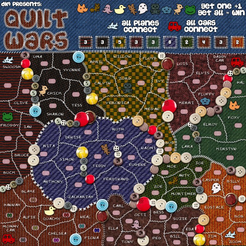
I agree with Natty that bonus patches can be difficult to distinguish from each other, with names or more diffrend color it will be more clearly.

when that is said, then who ever wear that shirt has a creepy taste :mrgreen:


thanks for the support.
i have increased the patches (see previous post).
if it is still a problem i will try and rearrange them some other way and put the bonus numbers outside so the texture is fully visible.

Re: Quilt Wars [17.Oct.11] - V2 - p1&2

PostPosted: Tue Oct 18, 2011 10:11 am
by DiM
AndyDufresne wrote:I'm going to give this map a look over maybe today or tomorrow, and see what real feedback I can give it, since I think I'd actually like to see it in play.


looking forward to it.

AndyDufresne wrote:This is why I love the Foundry. We can have the following maps all in development at the same time: Quilt Wars, Trench Warfare, and Tokyo.


true, it's great to see different mapping styles and different gameplay experiences.

Re: Quilt Wars [18.Oct.11] - V3 - p1&2

PostPosted: Tue Oct 18, 2011 9:33 pm
by A_Communist
I really like this idea, and the map is just adorable. Though I think bonus continents are techincally supposed to have names... which also might help clear up the confusion with which bonus is which. And since there are so many territories and names, perhaps it's a community quilt, and each bonus region was stitched on by a different family? You can have the Smiths, the Johnsons, etc. as the bonuses.

Re: Quilt Wars [18.Oct.11] - V3 - p1&2

PostPosted: Wed Oct 19, 2011 2:14 am
by zimmah
lol it's a bit like kirbies epic yarn.

the colors are a bit dark tho.

Re: Quilt Wars [18.Oct.11] - V3 - p1&2

PostPosted: Wed Oct 19, 2011 8:46 am
by DiM
zimmah wrote:lol it's a bit like kirbies epic yarn.

the colors are a bit dark tho.


i tried using lighter colours like the blue orange or green but i had to darken them because the text and the army labels were barely visible.

Re: Quilt Wars [18.Oct.11] - V3 - p1&2

PostPosted: Wed Oct 19, 2011 12:54 pm
by zimmah
DiM wrote:
zimmah wrote:lol it's a bit like kirbies epic yarn.

the colors are a bit dark tho.


i tried using lighter colours like the blue orange or green but i had to darken them because the text and the army labels were barely visible.


have you tried using white letters with a black outline?

you should be able to read that on any background.

Re: Quilt Wars [18.Oct.11] - V3 - p1&2

PostPosted: Wed Oct 19, 2011 2:47 pm
by DiM
zimmah wrote:
DiM wrote:
zimmah wrote:lol it's a bit like kirbies epic yarn.

the colors are a bit dark tho.


i tried using lighter colours like the blue orange or green but i had to darken them because the text and the army labels were barely visible.


have you tried using white letters with a black outline?

you should be able to read that on any background.


yeah, if you look back in V2 it was just like that, white with black outline but in V3 i removed the black outline and added some effects to make it look like it's made of string. now the text looks like it's sawn into the blanket and it fits the theme much better.

Re: Quilt Wars [18.Oct.11] - V3 - p1&2

PostPosted: Wed Oct 19, 2011 7:54 pm
by isaiah40
Let me just quilt this in for you!
Image

Congrats!!

Re: Quilt Wars [18.Oct.11] - V3 - p1&2

PostPosted: Wed Oct 19, 2011 8:38 pm
by DiM
isaiah40 wrote:Let me just quilt this in for you!
Image

Congrats!!


sweet, i'm gonna go ahead and stitch it to make sure i don't lose it :)

Image

Re: Quilt Wars [18.Oct.11] - V3 - p1&2

PostPosted: Thu Oct 20, 2011 9:50 am
by AndyDufresne
Looking at the gameplay, the bonus zones of Swoosh and Chick (I don't know what else to call them for now) seem like some of the stronger areas as they allow for expansion while generally keeping your borders at the minimum. Most of the bonus zones don't allow for any easy expansion past the bonus zone.

Zoe-moe-joe and Casper aren't too bad to hold out in either, though as mentioned expansion in each is generally limited.

Removing the Hal-Daddy Car border could make for Hal-Lara-Kristin bonus zone to have a little more expansion possibility than before. But doing so removes some of the symmetry you've established (such as in the top of the map, Swoosh and Daddy's Cars border neighboring bonus zones while in the bottom of the map Mommy's Car and Zoom do not).

How are bonus zones going to be named in the xml/gamelog?

For graphics, I'm not too fond of the checkerboard pattern. And a little more differentiation between Chick and Fluffy patterns/colors might be nice for the legend.

Just some random initial thoughts.


--Andy

Re: Quilt Wars [18.Oct.11] - V3 - p1&2

PostPosted: Thu Oct 20, 2011 10:08 am
by zimmah
you do have a point about this font fitting the theme better, however i'd really like to see some brighter colors or at least something easier on the eye, because dark isn't bad in particular, but the darkness makes the patterns hard to see, especially when there's light falling on the screen coming from my windows. this makes it really hard to see the continents. sometimes it just looks like everything is one color.

i see you're using mostly black+red, but in the middle it's dark+medium blue and in the right you have black+green (or just dark and light green). is it possible to use Black+color like for example black+green, black+a bit light blue (not too light ofc. but also not so dark it's hard to see) black+yellow etc. so it's easier to see the patterns?

i think the territories with chick and fluffi in them are especially dark, maybe they can be chanced a little.

Re: Quilt Wars [18.Oct.11] - V3 - p1&2

PostPosted: Fri Oct 21, 2011 6:14 am
by natty dread
When I think of the name "Quilt wars", it makes me think of two armies shooting quilts at each other... ;)

Re: Quilt Wars [18.Oct.11] - V3 - p1&2

PostPosted: Fri Oct 21, 2011 6:17 am
by Flapcake
natty_dread wrote:When I think of the name "Quilt wars", it makes me think of two armies shooting quilts at each other... ;)


I think of drunk Scots wearing only Quilts, who fights with each other. :roll:

Re: Quilt Wars [18.Oct.11] - V3 - p1&2

PostPosted: Fri Oct 21, 2011 8:36 am
by AndyDufresne
'Quilt-ageddon'
'Quilt-astrophe'
'Quilt-alpyse'

;)


--Andy

Re: Quilt Wars [18.Oct.11] - V3 - p1&2

PostPosted: Fri Oct 21, 2011 8:54 am
by DiM
zimmah wrote:you do have a point about this font fitting the theme better, however i'd really like to see some brighter colors or at least something easier on the eye, because dark isn't bad in particular, but the darkness makes the patterns hard to see, especially when there's light falling on the screen coming from my windows. this makes it really hard to see the continents. sometimes it just looks like everything is one color.

i see you're using mostly black+red, but in the middle it's dark+medium blue and in the right you have black+green (or just dark and light green). is it possible to use Black+color like for example black+green, black+a bit light blue (not too light ofc. but also not so dark it's hard to see) black+yellow etc. so it's easier to see the patterns?

i think the territories with chick and fluffi in them are especially dark, maybe they can be chanced a little.


i changed fluffy to something lighter, i also added some yellow. everything is hopefully much easier to see now.

Re: Quilt Wars [18.Oct.11] - V3 - p1&2

PostPosted: Fri Oct 21, 2011 8:59 am
by DiM
AndyDufresne wrote:Looking at the gameplay, the bonus zones of Swoosh and Chick (I don't know what else to call them for now) seem like some of the stronger areas as they allow for expansion while generally keeping your borders at the minimum. Most of the bonus zones don't allow for any easy expansion past the bonus zone.

Zoe-moe-joe and Casper aren't too bad to hold out in either, though as mentioned expansion in each is generally limited.

Removing the Hal-Daddy Car border could make for Hal-Lara-Kristin bonus zone to have a little more expansion possibility than before. But doing so removes some of the symmetry you've established (such as in the top of the map, Swoosh and Daddy's Cars border neighboring bonus zones while in the bottom of the map Mommy's Car and Zoom do not).


so aside from removing the hal-daddy car border, any other solutions?

AndyDufresne wrote:How are bonus zones going to be named in the xml/gamelog?


i have no idea. it was suggested i name them like families/communities (ie. Johnsons, Andersons etc)

AndyDufresne wrote:For graphics, I'm not too fond of the checkerboard pattern. And a little more differentiation between Chick and Fluffy patterns/colors might be nice for the legend.


done in the next update.

Re: Quilt Wars [18.Oct.11] - V3 - p1&2

PostPosted: Fri Oct 21, 2011 9:43 am
by DiM
V4:
*changed some colours for better visibility
*added an impassable between Jack/Mortimer <> Casper/Eustace
*added an impassable between Daddy Car <> Hal
*added an impassable between Bruce <> Rita
*added an impassable between Swoosh <> Uma
*added an impassable between Naomi <> Bud
*opened up the Ian <> Sharon <> Rita border
*opened up the Zoe <> Eugene border
*added 3 more toys (foxy/anty/froggy) and the continents will be named in the xml according to the toy they have.
*changed bonuses accordingly

Click image to enlarge.
image

Re: Quilt Wars [21.Oct.11] - V4 - p1&3

PostPosted: Fri Oct 21, 2011 12:11 pm
by isaiah40
This is kinda growing on me. First thing is the center bonus region. The text is hard to read with the current fabric background with the diagonal lines. It's making me go cross eyed. Maybe change the fabric or do something with the text, one of them has to change.

Re: Quilt Wars [21.Oct.11] - V4 - p1&3

PostPosted: Fri Oct 21, 2011 12:14 pm
by koontz1973
DiM, I have only 2 suggestion, can you make the cloth more shades as a few of them look alike. Secondly, a territ with DiM on it would be good. koontz as well ;) Glad to see you are continuing this. It is so unlike anything else you have done.

Re: Quilt Wars [21.Oct.11] - V4 - p1&3

PostPosted: Fri Oct 21, 2011 12:33 pm
by Flapcake
koontz1973 wrote:DiM, I have only 2 suggestion, can you make the cloth more shades as a few of them look alike. Secondly, a territ with DiM on it would be good. koontz as well ;) Glad to see you are continuing this. It is so unlike anything else you have done.

Hey ! Kids love Flapcakes 8-)

Re: Quilt Wars [21.Oct.11] - V4 - p1&3

PostPosted: Fri Oct 21, 2011 12:57 pm
by DiM
isaiah40 wrote:This is kinda growing on me. First thing is the center bonus region. The text is hard to read with the current fabric background with the diagonal lines. It's making me go cross eyed. Maybe change the fabric or do something with the text, one of them has to change.


i'll fiddle with the fabric to make the text more visible.

glad it's growing on you :)

Re: Quilt Wars [21.Oct.11] - V4 - p1&3

PostPosted: Fri Oct 21, 2011 12:59 pm
by DiM
koontz1973 wrote:DiM, I have only 2 suggestion, can you make the cloth more shades as a few of them look alike. Secondly, a territ with DiM on it would be good. koontz as well ;) Glad to see you are continuing this. It is so unlike anything else you have done.


i just changed the colours :? i'll further tweak the central blue. hope it will all come together nicely.

as for the names i guess it can be done. there are plenty of terits and a foundry names here and there can't hurt :)

Re: Quilt Wars [21.Oct.11] - V4 - p1&3

PostPosted: Fri Oct 21, 2011 12:59 pm
by DiM
Flapcake wrote:
koontz1973 wrote:DiM, I have only 2 suggestion, can you make the cloth more shades as a few of them look alike. Secondly, a territ with DiM on it would be good. koontz as well ;) Glad to see you are continuing this. It is so unlike anything else you have done.

Hey ! Kids love Flapcakes 8-)


:mrgreen:

Re: Quilt Wars [21.Oct.11] - V4 - p1&3

PostPosted: Fri Oct 21, 2011 3:21 pm
by ender516
It seems obvious to me, but should the map state that buttons are impassables?

Re: Quilt Wars [21.Oct.11] - V4 - p1&3

PostPosted: Fri Oct 21, 2011 5:00 pm
by DiM
ender516 wrote:It seems obvious to me, but should the map state that buttons are impassables?


i guess i could add them on the legend. does anybody else have this concern? :-s