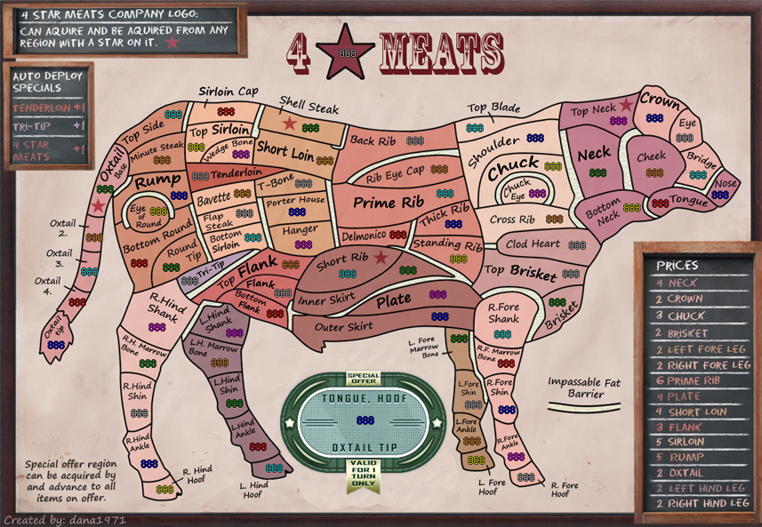
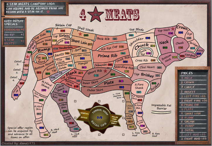
Re: 4 Star Meats [18 November 2012] v22pg 31
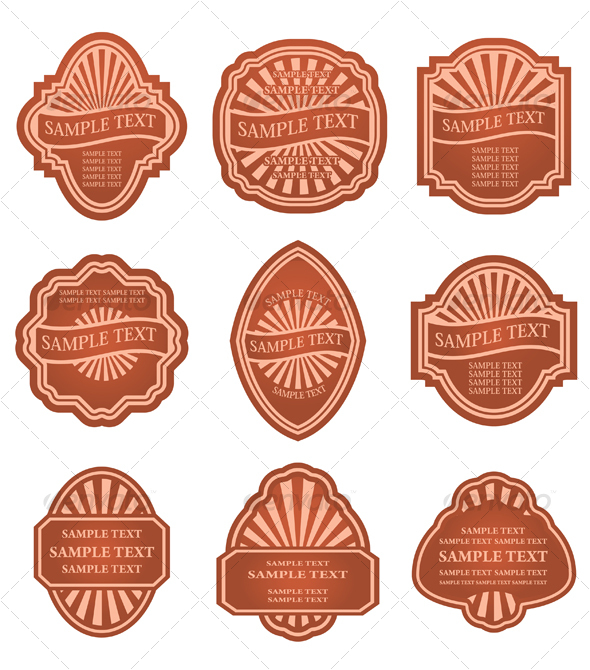
I think a more retro special offer image can be use like this. Obviously the colors can be changed to reflect the rest of the map.
Conquer Club, a free online multiplayer variation of a popular world domination board game.
https://www.conquerclub.com/forum/
https://www.conquerclub.com/forum/viewtopic.php?f=358&t=156204
isaiah40 wrote:I think a more retro special offer image can be use like this. Obviously the colors can be changed to reflect the rest of the map.
ManBungalow wrote:isaiah40 wrote:I think a more retro special offer image can be use like this. Obviously the colors can be changed to reflect the rest of the map.
Nice, but I don't think it looks right.
anamainiacks wrote:ManBungalow wrote:isaiah40 wrote:I think a more retro special offer image can be use like this. Obviously the colors can be changed to reflect the rest of the map.
Nice, but I don't think it looks right.
Ditto. It doesn't really fit in...
koontz1973 wrote:anamainiacks wrote:ManBungalow wrote:isaiah40 wrote:I think a more retro special offer image can be use like this. Obviously the colors can be changed to reflect the rest of the map.
Nice, but I don't think it looks right.
Ditto. It doesn't really fit in...
Have to agree and disagree with isaiah. It is not right (and he did say this) but it is far better than the current one. A special offer sticker should look like a sticker and not part of the poster. And that I think is the main problem with the current one, it looks like it is part of the poster that has been hanging for a while (blood spots, old looking and tatty in places). Do offers last that long? No, so an offer should look noticeable better (current one does not). Give it a slight angle and you might have a winner.
I could go for one like isaiah posted but maybe not that one.Either way, the current one does not fit the map.
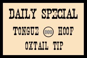
isaiah40 wrote:Or something like this, colors go with the theme a little more.
The checked background is actually transparent. So just ignore that. So it would look like this on the map:
generalhead wrote:isaiah40 wrote:Or something like this, colors go with the theme a little more.
The checked background is actually transparent. So just ignore that. So it would look like this on the map:
I +1 this one. This one does go with the theme of the map. Did you mean for it to be crooked though or is that just how you posted it?
I wonder if it would look better straight?
isaiah40 wrote:Or something like this, colors go with the theme a little more.


ironmanbravo wrote:looks great Dana1971...I am ready to play
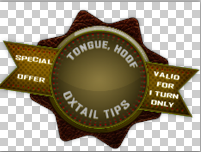
anamainiacks wrote:"reverts back to 3 after one full round." - The 'r' at the start of the sentence should be capitalised.
On the sticker itself, "Oxtail Tips" should be singular form, "Oxtail Tip". You MIGHT want to change "Hoof" to "Hooves", since there are 4 of them, but I think this one's understood.
Looking good, hope it gets the stamp! (:
koontz1973 wrote:dana, can you see if you can get the sticker to have a slight peeling effect on one of the corners, as if it is coming of. Do not forget the shadow that would create though.
apart from that, the sticker looks much better.
Funkyterrance wrote:Make the stars from a branding iron and I'm ready to play it.
Seriously though, the red/brown/pink contrasts are a little hard to see. Make it a nice black star with the inside empty like a brand and problem solved.