Re: New Zealand [17.2.12] V10-P8 - CB Check added
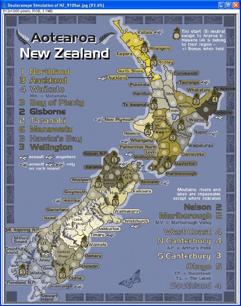
This is the deuteranope CB test for these colours on this map using ImageJ from the Visicheck site...V10 CB test addded to Page 1
Conquer Club, a free online multiplayer variation of a popular world domination board game.
https://www.conquerclub.com/forum/
https://www.conquerclub.com/forum/viewtopic.php?f=358&t=156364
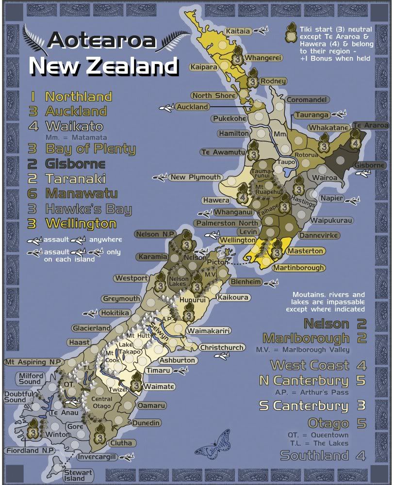
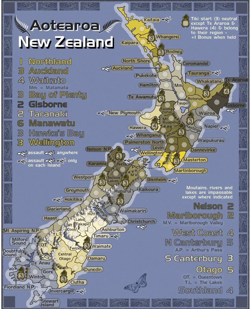
cairnswk wrote:Ian, sorry, do you mean S canterbury? S canterbury is +5 on the spreadsheet...N canterbury is +7, so i'm a little confused as to which region you're talking about. Could you clarify please.
Also i looked at N Canterbury and it already has 1 tiki bonus and only needs 4 other forts to covers its borders.
It has 6 terrs while S Canterbury has 7 terrs. I thought it would be easier to holder this than the S Canterbury.
iancanton wrote:...
i'm agreeing with north canterbury's +6.5 on the spreadsheet: +5.5 normal and +1 tiki. given the 5 borders, including one-way attacks to christchurch, we need at least +5 normal and +1 tiki, which matches the spreadsheet's +6.5 rounded downward.
south canterbury is fine at +3 normal and +1 tiki. the spreadsheet gives +4.58, which can go either way and u've chosen downward. compared with north canterbury, downward is correct because there are only 3 borders, no one-way attacks into timaru and one of the smallest numbers of adjacent enemy bonus zones on the map.
to help those whose vision isn't so good, may i suggest using the auckland colour in hawke's bay and vice versa? hawke's bay and bay of plenty are very similar in shade. having the bright yellow auckland colour in hawke's bay provides much-needed contrast.
ian.
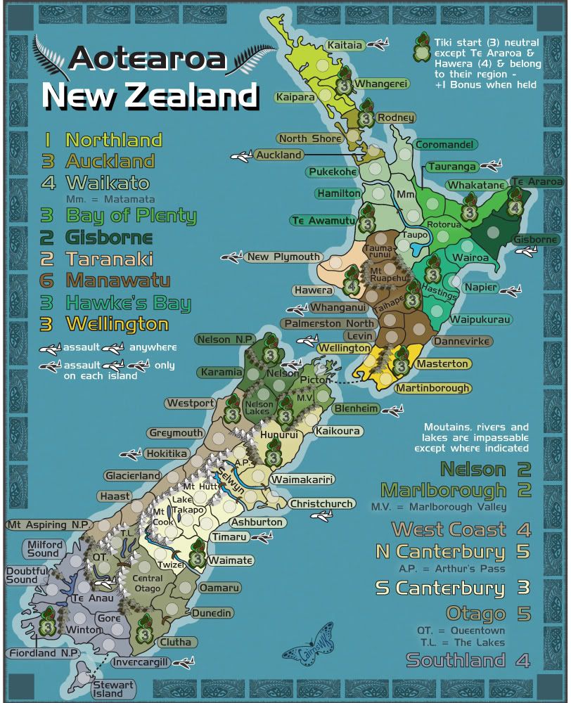
isaiah40 wrote:Hmmm ... I think that Otago and S Canterbury's colors could be switched. Otago is too close to West Coast, and S Canterbury is too close to N Canterbury in the CB test.
cairnswk wrote:isaiah40 wrote:Hmmm ... I think that Otago and S Canterbury's colors could be switched. Otago is too close to West Coast, and S Canterbury is too close to N Canterbury in the CB test.
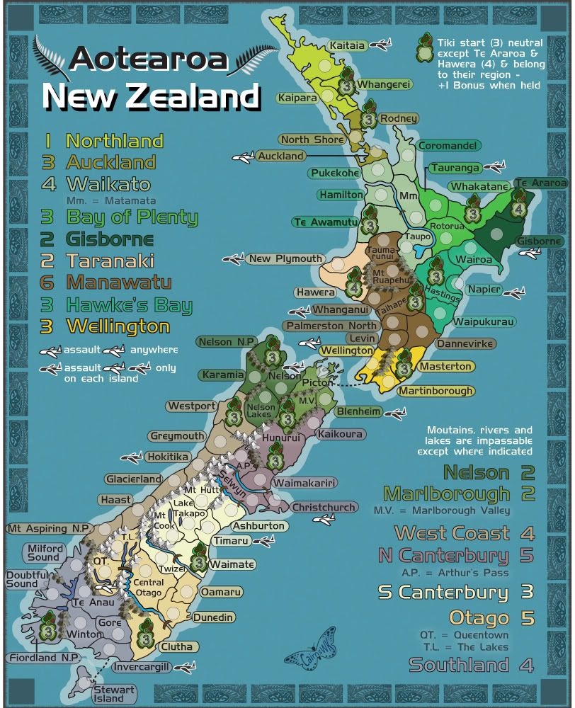
Wouldn't that still make the S Caterbury and West Coast CB colours too close.
I'll keep searching for a solution that makes good aesthetics on the map also.
isaiah40 wrote:cairnswk wrote:isaiah40 wrote:Hmmm ... I think that Otago and S Canterbury's colors could be switched. Otago is too close to West Coast, and S Canterbury is too close to N Canterbury in the CB test.
Wouldn't that still make the S Caterbury and West Coast CB colours too close.
I'll keep searching for a solution that makes good aesthetics on the map also.
On my monitor, I they wouldn't be close at all.
natty dread wrote:Guys, you need to calibrate your monitors.
natty dread wrote:Was there a colour profile (.icm) file provided with your monitor?
If not, the monitor manufacturer might provide one on their website... they're usually in the same place where they provide driver updates and such. After you have the colour profile file, you need to go to the display settings (if you use windows) and there to the advanced settings, and there should be a tab where you can select the colour profile to use - there, add the colour profile you downloaded and set your system to use it.
Alternatively, your monitor might have an option in it's settings to use the sRGB colourspace, in which case you can use the standard sRGB colour profile, which should be installed in your system by default.
AndyDufresne wrote:Guys, the colors look fine on my screen. Well, everything looks a little green.
In all seriousness, this map is growing on me more and more.
--Andy
ender516 wrote:The way the bonuses are described right now seems perfectly clear. I see no need for a minimap.
ender516 wrote:The way the bonuses are described right now seems perfectly clear. I see no need for a minimap.
AndyDufresne wrote:ender516 wrote:The way the bonuses are described right now seems perfectly clear. I see no need for a minimap.
I think I agree.
--Andy
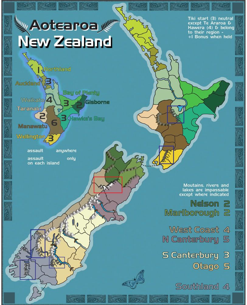
koontz1973 wrote:cairnswk, always looking for ways to improve, I like it. The mountains you had (without box) where fine. They looked OK to me. But the mini map with the text looks like a winner. Not only does it fill the space up better than the large text, it just looks nicer. It may not be needed, like Andy and enders said, but it is a winner IMO.
koontz1973 wrote:just because one or two may not like the look or style to them, it can be said that a majority do and they can stay.
natty dread wrote:What does "majority" have to do with anything?