Page 9 of 30
Re: FRANCE 2.0 - Version 9.1 [11 October 2012] pg 13/13

Posted:
Tue Oct 16, 2012 2:19 amby iancanton
in the île-de-france inset, the outer départements have a sharp edge with shadow at the moment, which implies that this bonus zone has a square shape with rounded corners. we know that this shape cannot be found on the map, but it might confuse new players at first.
can i suggest that, in the inset, u remove the sharp edges and shadow of the four outer départements? instead, fade their outer edges into the background.
ian.

Re: FRANCE 2.0 - Version 9.1 [11 October 2012] pg 13/13
Posted:
Wed Oct 17, 2012 1:15 pmby Lancelot du Lac
koontz1973 wrote:Manche is going into the Paris cut out. Move your layers so it fits under.
pamoa wrote:you can small down Ile-de-France minimap of 5% so it doesn't touch the mainland
Now it's ok :

koontz1973 wrote:Bridges - all three are different sizes and of a different style. Can we get a bridge put in like the mountains and also at the correct orientation.
pamoa wrote:you have to work a bit on your bridges and your mountains
I propose these bridges, i am again working for mountains :

koontz1973 wrote:Why does BZH have a nice jagged coastline while some other parts look flat? Is this really the French coastline?
Really the French coastline in BZH

koontz1973 wrote:Rivers, they are massive in places. Some like the one between Gard and Bouche de rhone are nice. Can we get the others at a similar width?
pamoa wrote:I would also add a thin dark grey line around the rivers
Last picture, is it ok for you ?
- standardize rivers
- add a black border on rivers
pamoa wrote:also the blending of the Loire in the ocean is too abrupt
I am working for that
Re: FRANCE 2.0 - Version 9.1 [11 October 2012] pg 13/13
Posted:
Wed Oct 17, 2012 2:20 pmby Lancelot du Lac
iancanton wrote:in the île-de-france inset, the outer départements have a sharp edge with shadow at the moment, which implies that this bonus zone has a square shape with rounded corners. we know that this shape cannot be found on the map, but it might confuse new players at first.
can i suggest that, in the inset, u remove the sharp edges and shadow of the four outer départements? instead, fade their outer edges into the background.
ian.
ok for you ?
Re: FRANCE 2.0 - Version 9.1 [11 October 2012] pg 13/13
Posted:
Wed Oct 17, 2012 11:37 pmby koontz1973
The small pictures look good, but can we have a big one.
Re: FRANCE 2.0 - Version 9.1 [21 October 2012] pg 14/14
Posted:
Sun Oct 21, 2012 7:58 amby Lancelot du Lac
Here the new graphics updates with rivers and bridges :
- Click image to enlarge.

Re: FRANCE 2.0 - Version 9.1 [21 October 2012] pg 14/14
Posted:
Sun Oct 21, 2012 4:41 pmby isaiah40
This is really looking good!
Just a couple of things right now:
1 - You can make the non-playable areas a light grey as the mini-map is hard to see.
2 - As good looking of a map this is, the army circles detract from it. My suggestion is to remove them except for the foreign claims.
This is all I have for now.
isaiah40
Re: FRANCE 2.0 - Version 9.1 [21 October 2012] pg 14/14
Posted:
Sun Oct 21, 2012 5:34 pmby betiko
super lancelot, t'as bien avancé! can't wait to try it!
Re: FRANCE 2.0 - Version 9.1 [21 October 2012] pg 14/14
Posted:
Sun Oct 21, 2012 9:56 pmby koontz1973
A couple more from me.
Course Sud to Bouche du rhone sea route. It hits the tip of the outcropping and then carries on with the sea for 2 dots. Remove the two that come after the land.
Mountains. Please look at doing a different type for this map.
Re: FRANCE 2.0 - Version 9.1 [21 October 2012] pg 14/14
Posted:
Mon Oct 22, 2012 12:11 pmby Lancelot du Lac
isaiah40 wrote:1 - You can make the non-playable areas a light grey as the mini-map is hard to see.
isaiah40
I don't understand your suggestion?
Re: FRANCE 2.0 - Version 9.1 [21 October 2012] pg 14/14
Posted:
Mon Oct 22, 2012 12:18 pmby koontz1973
Try and bring the mini map out like you have for Paris. A few pixels of the grey texture with a black outline surrounding the mini map would really make it pop out. Right now it is very hard to see unless you are really looking for it.
Last one from me (I promise), can I ask to get the 1 troop for 4 in the legend area. Maybe make the legend box a bit bigger and place the reinforcements in it at the bottom.
Re: FRANCE 2.0 - Version 9.2 [22 October 2012] pg 15/15
Posted:
Mon Oct 22, 2012 3:27 pmby Lancelot du Lac
isaiah40 wrote:2 - As good looking of a map this is, the army circles detract from it. My suggestion is to remove them except for the foreign claims.
done
koontz1973 wrote:Course Sud to Bouche du rhone sea route. It hits the tip of the outcropping and then carries on with the sea for 2 dots. Remove the two that come after the land.
Mountains. Please look at doing a different type for this map.
done
koontz1973 wrote:Try and bring the mini map out like you have for Paris. A few pixels of the grey texture with a black outline surrounding the mini map would really make it pop out. Right now it is very hard to see unless you are really looking for it.
done
koontz1973 wrote:Last one from me (I promise), can I ask to get the 1 troop for 4 in the legend area. Maybe make the legend box a bit bigger and place the reinforcements in it at the bottom.
and done
Last updateVERSION 9.2
1. Map Name France 2.0
2. Version 9.1 [22 October 2012]
3. Dimension : 915 * 927
- Click image to enlarge.

Re: FRANCE 2.0 - Version 9.2 [22 October 2012] pg 15/15
Posted:
Mon Oct 22, 2012 11:22 pmby koontz1973
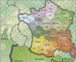
Sorry Lance, maybe I was not clear. The white and black line needs to go around the mini map for the bonuses, not the cut out of Paris. But I like it so keep it on Paris and do the same for the bonuses.
Re: FRANCE 2.0 - Version 9.2 [22 October 2012] pg 15/15
Posted:
Tue Oct 23, 2012 4:03 pmby Lancelot du Lac
Is it your suggestion?

Re: FRANCE 2.0 - Version 9.2 [22 October 2012] pg 15/15
Posted:
Tue Oct 23, 2012 7:04 pmby isaiah40
Lancelot du Lac wrote:Is it your suggestion?
No koontz meant something like this:
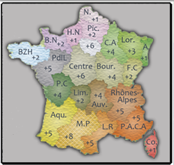
You can do something like this as well, which brings the mini-map out and off the background:
Notice that I also increased the opacity of the non-playable areas - the parts that are not part of France. I applied an outer-glow and a tad bit of a drop shadow.
Either way will work for me, but the mini-map needs to be seen clearly. Also the text on the mini-map needs to be clearer as well.
Re: FRANCE 2.0 - Version 9.2 [22 October 2012] pg 15/15
Posted:
Wed Oct 24, 2012 1:57 amby Lancelot du Lac
Okay, I'm sorry for the confusion. I focus on the zoom Paris
Re: FRANCE 2.0 - Version 9.3 [24 October 2012] pg 15/15
Posted:
Wed Oct 24, 2012 4:20 pmby Lancelot du Lac
I have not chosen a square around the mini map otherwise I'll have to significantly reduce it does not exceed the map.
Now I propose a new version for mini-map and I hope the last
Last updateVERSION 9.3
1. Map Name France 2.0
2. Version 9.2 [24 October 2012]
3. Dimension : 915 * 927
- Click image to enlarge.

Re: FRANCE 2.0 - Version 9.3 [24 October 2012] pg 15/15
Posted:
Sat Oct 27, 2012 12:04 pmby koontz1973
Lancelot, sorry it taken time to get this posted, just a tad busy, but here are some thoughts for you.
Reduce the texture on the mini map. It is causing the names to become harder to read.
Impassables, this is almost hidden from view. Like the troop text, might as well put this into the grey box legend and lump all the rules into one place.
Territ names, slightly darker and bigger if you have room. Not to much but some.
You have some highlights all over the map. Whilst nice, they are too strong. Reduce.
Meurthe et Moselle name is going over the territ lines. Move the name south some so as it does not. Go around the other names and spot ones like Belfort. This goes onto the line but has room to be moved into the territ. Some of the other names could do with a move as well. Corse de Sud name is hard to read in the sea.
Bridges, fill the bridges up with a colour. Now they are nice apart from the one between Morbihan and Loire.
Rivers to sea, blend the colours more.
And with the sea, how about some gradient so it is not a flat colour. I remember you had the map effect early on. Try to get that back or if not, try to create the same effect with what you have.
Mountains, I like the ones you have in the south the most. The rest are just overboard. Too bright and garish. But most of all, you need to tone them down some. Either way, I think you have two option, 1,try to replicate what you have but toned down a lot but I was looking at Africa 2 lately and like the sand dunes on that. They look very similar to the mountains on the right (proper map jpeg) and might be the best thing. What are your thoughts on this? Would you be willing to try (the Africa 2 sand dunes) the new mountains to see how they look?
Lastly, name change to France 2.1 - This is really a personal request as I love World 2.1 and USA 2.1.
I know this might seem a lot but it really is just the last few things to tidy up. I love this map and cannot wait to play it. Thankfully, you are probably 99.9% their.
Re: FRANCE 2.0 - Version 9.3 [24 October 2012] pg 15/15
Posted:
Sat Oct 27, 2012 1:34 pmby isaiah40
I agree with koontz on everything except the bridges. The bridges have the color of the regions they are in, so IMO they are fine.
I think you can swap the mini-map and the Paris Inset. Move the Paris inset over to where the mini-map is, and move the mini-map over to where the inset is. You can then make the mini-map larger so the bonus regions can be seen easier - this is especially true when you do the small map. You will not need to do anything to the Paris inset as it fits in the top right corner perfectly.
Also, place the bonus region borders on the mini-map as well. This will also help to make it clearer as to what bonus is where. Move the title down so that it is on the water instead of on the land and water.
In regards to what koontz said about the mountains, I agree that the southern ones look much better. But can you vary them so that it doesn't look like you just copy and pasted them. In other words make each mountain slightly different. You can use 4-5 different mountains, but place them so that they look like a mountain range, as we know that every mountain looks very different. Take a look at my Fractured America and China maps for instance. I used the same mountains but placed them so that it looks like mountains ranges.
You are getting close, so keep up the good work!!
isaiah40
Re: FRANCE 2.0 - Version 9.3 [24 October 2012] pg 15/15
Posted:
Tue Oct 30, 2012 2:55 amby koontz1973
isaiah40 wrote:I agree with koontz on everything except the bridges. The bridges have the color of the regions they are in, so IMO they are fine.
Fine, but at least do the bridge that separates two regions, have the colours meet in the middle.
Re: FRANCE 2.0 - Version 9.3 [24 October 2012] pg 15/15
Posted:
Fri Nov 02, 2012 8:08 pmby RedBaron0
I'm with my colleagues here, and am with isaiah on the bridges.
I'll doubly reiterate varying the mountains, repetition=death.
The outline around the map itself, is that a bevel of some sort? MOstly its absent from veiw but it visible on the Med coast and has a strange artifact of some kind in the ocean off the Spanish coast. I think you'd do better with a light drop shadow or even just a light outline.
To me the map is kinda floating on top of the background, the borders and texture doesn't match the map itself. match up the background enough so it's a part of the entire image, and that should clear that right up.
Re: FRANCE 2.0 - Version 9.3 [24 October 2012] pg 15/15
Posted:
Sat Nov 03, 2012 7:57 pmby Industrial Helix
Wow, this one has come a long way since last I checked on it.
One thing bugs me, the Paris inset should have a title indicating it is Paris. Same for the Paris on the map, put a little box that mirrors the inset and put "See Inset" It reduces confusion and unifies the map a bit.
One thing also confuses me, the fire symbols do they indicate a decay on those territories?
And do Vendee and Belfort only have one flag of that type?
Re: FRANCE 2.0 - Version 9.3 [24 October 2012] pg 15/15
Posted:
Mon Nov 12, 2012 3:26 pmby Lancelot du Lac
update scheduled for the end of the week
Re: FRANCE 2.0 - Version 9.3 [24 October 2012] pg 15/15
Posted:
Thu Nov 15, 2012 4:51 pmby Lancelot du Lac
isaiah40 wrote:I think you can swap the mini-map and the Paris Inset. Move the Paris inset over to where the mini-map is, and move the mini-map over to where the inset is. You can then make the mini-map larger so the bonus regions can be seen easier - this is especially true when you do the small map. You will not need to do anything to the Paris inset as it fits in the top right corner perfectly.
Also, place the bonus region borders on the mini-map as well. This will also help to make it clearer as to what bonus is where. Move the title down so that it is on the water instead of on the land and water.
isaiah40
koontz1973 wrote:Lastly, name change to France 2.1 - This is really a personal request as I love World 2.1 and USA 2.1.
Something you like it?

Re: FRANCE 2.0 - Version 9.3 [24 October 2012] pg 15/15
Posted:
Thu Nov 15, 2012 10:56 pmby koontz1973
Love the swap of mini map and Paris and the name looks really nice. Just shrink 2.1 to half the size and you will have a winner.
Re: FRANCE 2.0 - Version 9.3 [24 October 2012] pg 15/15
Posted:
Sun Nov 18, 2012 2:43 pmby MrBenn
This looks like a pretty nice map !
The font you're using for the title is a bit rubbish though - I preferred the Sans Serif version to the one just above this; there's also no reason to colour the bottom of the E red? The coastlines could do with a certain 'je nais cest quoi' too!