koontz1973 wrote:Do you mean the Hungarian text?
That's what it is? I could read it because of those gaseous vapors coming from your avatar made my eyes water!
But yes, that text.
Moderator: Cartographers
![]() by isaiah40 on Wed Jun 20, 2012 4:15 pm
by isaiah40 on Wed Jun 20, 2012 4:15 pm
koontz1973 wrote:Do you mean the Hungarian text?


![]() by koontz1973 on Thu Jun 21, 2012 4:12 am
by koontz1973 on Thu Jun 21, 2012 4:12 am
tokle wrote:You could try to consider to cut off the flag half-way across the map. And maybe leave the north-western corner all red. Fill in that part all the way to the sea in one solid colour. Just an idea.
isaiah40 wrote:But yes, that text.


isaiah40 wrote:That's what it is? I could read it because of those gaseous vapors coming from your avatar made my eyes water!


![]() by Dukasaur on Thu Jun 21, 2012 10:14 am
by Dukasaur on Thu Jun 21, 2012 10:14 am


 3
3


 2
2


![]() by AndyDufresne on Thu Jun 21, 2012 10:18 am
by AndyDufresne on Thu Jun 21, 2012 10:18 am
Dukasaur wrote:It's absolutely beautiful!
One remaining problem: the colours of the bonus regions on the main map aren't the same as in the mini-map. This could be confusing.


![]() by nolefan5311 on Thu Jun 21, 2012 10:20 am
by nolefan5311 on Thu Jun 21, 2012 10:20 am


![]() by Jatekos on Thu Jun 21, 2012 5:41 pm
by Jatekos on Thu Jun 21, 2012 5:41 pm
koontz1973 wrote:Looks better, no?
Placed offending Hungarian text into a box.
English text is now a light grey and sharper. Looks OK to me but the I am not as
fussy as you lot.


![]() by koontz1973 on Fri Jun 22, 2012 12:23 am
by koontz1973 on Fri Jun 22, 2012 12:23 am
Dukasaur wrote:It's absolutely beautiful!
One remaining problem: the colours of the bonus regions on the main map aren't the same as in the mini-map. This could be confusing.
AndyDufresne wrote:In terms of graphics, I think this is probably the map I like the most out of your work.
--Andy
Jatekos wrote:It is kind of OK, but it was much better in the previous version. The historical background on the left is not the the part that someone would have to re-read each round, unlike the bonus info for example. The white text was readable in the previous version as well, though it was not this bright. It was much better to look at the text then than it is now.
I had absolutely no problem reading the previous version of the Hungarian text either. It suited to the map a lot more.
Also, if these texts were legible for a colorblind person then they should not be too difficult to read for anyone with a normal eye-sight. I would like both of these changes to be reversed.
Jatekos wrote:Suggestion regarding the text boxes: The country has a unique shape, which is not symmetrical. A non-symmetrical legend would more suite to the map than the current boxes. How about adding a map-effect to the text boxes like on the First Nations maps or on the Age of merchants map. The point is, that they should not necessarily have so sharp and straight edges.


![]() by isaiah40 on Fri Jun 22, 2012 5:02 am
by isaiah40 on Fri Jun 22, 2012 5:02 am
![]() by koontz1973 on Fri Jun 22, 2012 6:42 am
by koontz1973 on Fri Jun 22, 2012 6:42 am
isaiah40 wrote:Text looks better on your current version. Now don't forget about making sure the colors match on the break-out mini-map in the legend!
![]() by cairnswk on Sun Jun 24, 2012 5:53 pm
by cairnswk on Sun Jun 24, 2012 5:53 pm


![]() by koontz1973 on Mon Jun 25, 2012 12:09 am
by koontz1973 on Mon Jun 25, 2012 12:09 am
cairnswk wrote:koontz1973...a couple of nit-picks for you...pleasant ones
1. it is possoble to pull the bottom of the story text up slightly or move Karolyvaros so that one is not sitting almost atop the other
2. can you tweak the glow around Arva and Szepes...they are hardly readable
3. in your signature...map is sitting slightly out of horizontal alignment with koontz...
4. although not affecting gameplay, i really had think what that is where Austria sits
5. can the Kingdom of Serbs etec...be strung out in one line so it doesn't sit so close to the Hungarian story...perhaps to a similar concave degree that Adriatic Sea is
nice work though...very koontz in style...


![]() by cairnswk on Mon Jun 25, 2012 12:36 am
by cairnswk on Mon Jun 25, 2012 12:36 am
![]() by RedBaron0 on Mon Jun 25, 2012 6:45 pm
by RedBaron0 on Mon Jun 25, 2012 6:45 pm


![]() by koontz1973 on Mon Jun 25, 2012 11:56 pm
by koontz1973 on Mon Jun 25, 2012 11:56 pm
RedBaron0 wrote:Couple things from me.
The laurel wreath is kinda generic, no? Could you go with something a little more... Hungarian there? A shield or the cross of the coat of arms to represent Budapest perhaps?
The green beneath the mountains is ok, but I feel like it could blend into the colors of the bonuses they are in better, so that they are a part of the area rather than on top of the map itself.
The vischeck... with so many shades of red/green/brown, it comes off okay... its needs to be better. I think you may have to work into the Central Hungary area some shades of blue to better differentiate better for those with color blindness. In theory a green/blue color will come up greyish-blue under vischeck and really give you what you seek for color blindness clarity.


![]() by RedBaron0 on Thu Jul 05, 2012 7:55 pm
by RedBaron0 on Thu Jul 05, 2012 7:55 pm
![]() by koontz1973 on Thu Jul 05, 2012 11:45 pm
by koontz1973 on Thu Jul 05, 2012 11:45 pm

![]() by Oneyed on Fri Jul 13, 2012 5:49 pm
by Oneyed on Fri Jul 13, 2012 5:49 pm


![]() by koontz1973 on Tue Jul 31, 2012 4:36 am
by koontz1973 on Tue Jul 31, 2012 4:36 am
Oneyed wrote:in left legend you have Czechoslovak republic and also in right one. but in middle legend there is Czechoslovakia. you should use the same name everywhere, I think somebody would be confused. no everybody knows that Czechoslovak republic and Czechoslovakia is the same.
why Tisza has not connection with Danube?
Oneyed


![]() by Oneyed on Tue Jul 31, 2012 7:16 am
by Oneyed on Tue Jul 31, 2012 7:16 am
koontz1973 wrote:I am sure players are not that stupid but fixed it in the large. No room to do it in the small.
koontz1973 wrote:It would not add anything to the map at all.
![]() by koontz1973 on Tue Jul 31, 2012 11:39 am
by koontz1973 on Tue Jul 31, 2012 11:39 am
![]() by isaiah40 on Wed Aug 01, 2012 9:41 am
by isaiah40 on Wed Aug 01, 2012 9:41 am
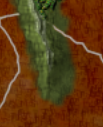
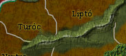 This one looks pretty good, a little tweaking and it'll be really good. But this one
  Notice the hard lines where the mountains meet the playable area? Get it looking more like the first example and I'll take another look
![]() by koontz1973 on Wed Aug 01, 2012 12:24 pm
by koontz1973 on Wed Aug 01, 2012 12:24 pm


![]() by isaiah40 on Wed Aug 01, 2012 1:26 pm
by isaiah40 on Wed Aug 01, 2012 1:26 pm
 ? Do all of them like this and IMHO they'll be just about perfect!
![]() by koontz1973 on Thu Aug 02, 2012 2:00 am
by koontz1973 on Thu Aug 02, 2012 2:00 am


Users browsing this forum: No registered users
|
|||||||
| Conquer Club is not associated with RISK online in any way. Copyright © 2006-2024 by Big Wham LLC | |||||||
