koontz1973 wrote:Done.
Enjoys cairns.
Thanks koontz.
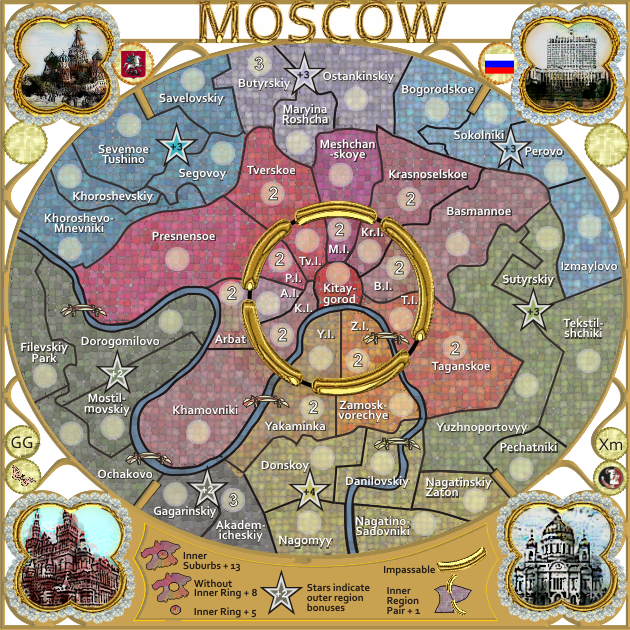
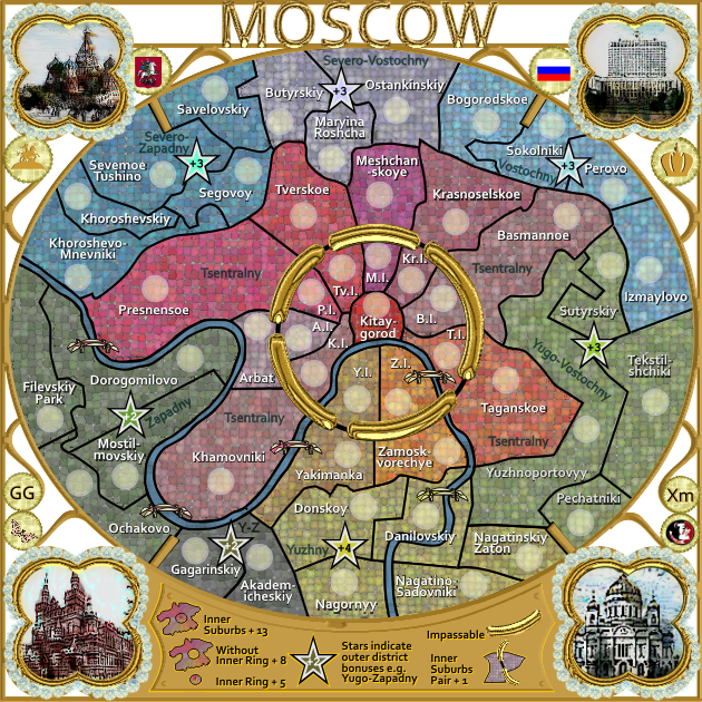
Version 17....couple of changes
* some borders have moved slightly to get the names in properly...
* some aspects of the legend have improved....
Moderator: Cartographers
![]() by cairnswk on Sun Nov 25, 2012 8:27 pm
by cairnswk on Sun Nov 25, 2012 8:27 pm
koontz1973 wrote:Done.
Enjoys cairns.


![]() by koontz1973 on Mon Nov 26, 2012 1:08 am
by koontz1973 on Mon Nov 26, 2012 1:08 am


![]() by cairnswk on Mon Nov 26, 2012 1:28 am
by cairnswk on Mon Nov 26, 2012 1:28 am
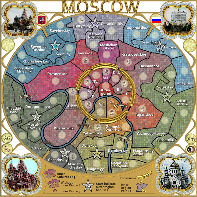
koontz1973 wrote:Yakaminka colour is heading into Akademicheskiy. Bottom left pic in frame- can you tone down the blue sky, it looks like it is a wonderful day but out of place.
![]() by cairnswk on Mon Nov 26, 2012 4:53 pm
by cairnswk on Mon Nov 26, 2012 4:53 pm
![]() by Nola_Lifer on Tue Nov 27, 2012 3:05 pm
by Nola_Lifer on Tue Nov 27, 2012 3:05 pm


![]() by cairnswk on Tue Nov 27, 2012 3:11 pm
by cairnswk on Tue Nov 27, 2012 3:11 pm
Nola_Lifer wrote:How does it look with a darker background instead of white?
![]() by koontz1973 on Tue Nov 27, 2012 11:39 pm
by koontz1973 on Tue Nov 27, 2012 11:39 pm
![]() by iancanton on Thu Nov 29, 2012 4:18 pm
by iancanton on Thu Nov 29, 2012 4:18 pm
iancanton wrote:on the yellow pages map to which u link, yellow district 10 is nagornyy, which is long and narrow from north to south.
iancanton wrote:yakaminka ought to be yakimanka.


![]() by cairnswk on Fri Nov 30, 2012 3:01 am
by cairnswk on Fri Nov 30, 2012 3:01 am
iancanton wrote:iancanton wrote:on the yellow pages map to which u link, yellow district 10 is nagornyy, which is long and narrow from north to south.
the correct spelling is nagornyy, not nagomyy.iancanton wrote:yakaminka ought to be yakimanka.
http://evans.com.ru/yakimanka/
Both of those now fixed.in the legend, instead of referring to outer region bonuses, i suggest outer district bonuses or outer suburb bonuses. this is not only more appropriate for a city map, but avoids confusion with other uses of the word region in cc. similarly, inner region pair can be replaced by inner suburb pair.
ian.
![]() by cairnswk on Fri Nov 30, 2012 3:09 am
by cairnswk on Fri Nov 30, 2012 3:09 am
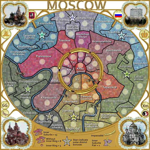
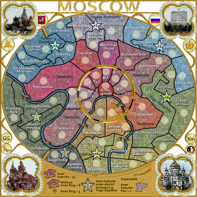
koontz1973 wrote:cairns, I only have one thing that I might change and this would be completely up to you as it really is aesthetics would be the gold circle in the middle. Could you make it the same thickness as the lettering in the title?
![]() by koontz1973 on Fri Nov 30, 2012 5:13 am
by koontz1973 on Fri Nov 30, 2012 5:13 am
cairnswk wrote:koontz1973 wrote:cairns, I only have one thing that I might change and this would be completely up to you as it really is aesthetics would be the gold circle in the middle. Could you make it the same thickness as the lettering in the title?
What is your purpose with this please....there is a lot of work in doing this, as i will have to re-do the whole gold lot
![]() by ManBungalow on Fri Nov 30, 2012 8:09 am
by ManBungalow on Fri Nov 30, 2012 8:09 am


![]() by cairnswk on Sat Dec 01, 2012 12:24 am
by cairnswk on Sat Dec 01, 2012 12:24 am
ManBungalow wrote:Are you going to put the names of the bonuses anywhere?
It's not a big issue, but if I were in a team game I might say "go for that green bonus over there, you know the one I mean".
![]() by Seamus76 on Sat Dec 01, 2012 12:34 am
by Seamus76 on Sat Dec 01, 2012 12:34 am


![]() by koontz1973 on Sat Dec 01, 2012 2:18 am
by koontz1973 on Sat Dec 01, 2012 2:18 am
![]() by cairnswk on Sat Dec 01, 2012 2:41 am
by cairnswk on Sat Dec 01, 2012 2:41 am
koontz1973 wrote:cairns, what where you going to call the bonuses anyway? I have to agree with Seamus, using the territ names instead of bonus names seems to be the norm for me in team games anyway.
![]() by koontz1973 on Sat Dec 01, 2012 2:50 am
by koontz1973 on Sat Dec 01, 2012 2:50 am
cairnswk wrote:koontz1973 wrote:cairns, what where you going to call the bonuses anyway? I have to agree with Seamus, using the territ names instead of bonus names seems to be the norm for me in team games anyway.
well some people also like or expect to see some continent names on maps also. you have it in Madrid, Seamus has it in "Ancient Israel" etc.etc.
so as i said i will think on what to do.
![]() by cairnswk on Sat Dec 01, 2012 2:51 am
by cairnswk on Sat Dec 01, 2012 2:51 am
koontz1973 wrote:cairnswk wrote:koontz1973 wrote:cairns, what where you going to call the bonuses anyway? I have to agree with Seamus, using the territ names instead of bonus names seems to be the norm for me in team games anyway.
well some people also like or expect to see some continent names on maps also. you have it in Madrid, Seamus has it in "Ancient Israel" etc.etc.
so as i said i will think on what to do.
The reason why I asked what you where going to call them is if you had the territ name for the bonus name as well, you could do the name on the map slightly different. Just an idea.
![]() by cairnswk on Sat Dec 01, 2012 4:14 am
by cairnswk on Sat Dec 01, 2012 4:14 am
![]() by cairnswk on Sat Dec 01, 2012 4:24 am
by cairnswk on Sat Dec 01, 2012 4:24 am
Seamus76 wrote:... I also like the stars indicating the bonuses, and don't think naming them does much but take up more space. Team games can always use tert names as indicators, etc., but I'm sure you're creative juices are flowing already.
Keep up the great work.
![]() by cairnswk on Sat Dec 01, 2012 11:24 pm
by cairnswk on Sat Dec 01, 2012 11:24 pm
koontz1973 wrote:cairns, I only have one thing that I might change and this would be completely up to you as it really is aesthetics would be the gold circle in the middle. Could you make it the same thickness as the lettering in the title?
Seamus76 wrote:Great looking map as always cairns, I really like the mosaic, which is pretty different but what I would expect from you. I have to agree with Koontz though, the inner gold ring is too thick, and a little distracting. Also, no offense, but with it being so big it looks a little cheesy and fake. Making it thinner will give you a little more room for the inner ring names, and god knows what magic you can do with an extra pixel or two...
![]() by isaiah40 on Sat Dec 01, 2012 11:29 pm
by isaiah40 on Sat Dec 01, 2012 11:29 pm


![]() by cairnswk on Sun Dec 02, 2012 3:47 pm
by cairnswk on Sun Dec 02, 2012 3:47 pm
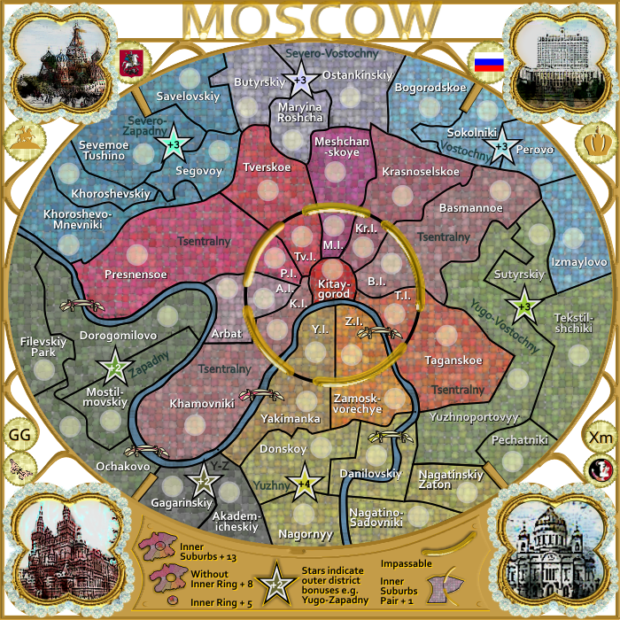
isaiah40 wrote:The title is perfect, and the ring looks much better.
![]() by iancanton on Wed Dec 05, 2012 4:16 pm
by iancanton on Wed Dec 05, 2012 4:16 pm
![]() by cairnswk on Wed Dec 05, 2012 4:24 pm
by cairnswk on Wed Dec 05, 2012 4:24 pm
iancanton wrote:must u have the dots in the abbreviations for the inner suburbs? they make the centre of the map a bit untidy.
ian.
Users browsing this forum: Fuchsia tude
|
|||||||
| Conquer Club is not associated with RISK online in any way. Copyright © 2006-2024 by Big Wham LLC | |||||||