What follows is an account of ManBungalow's opinion of the map, 'Classic Cities: Madrid'. Comments made by this author do not necessarily reflect the opinions of the community.
I'm not really sure where to start with this.
First, I suppose, the background. It just looks quite 'cheap' to me. And I've no idea what the theme of the map is supposed to be. The background is like some sort of crosshatch rug/papyrus texture with some Spanish cultural images pasted in; and then - for contrast - the grassy stuff in the playable area is like concrete with a green filter on.
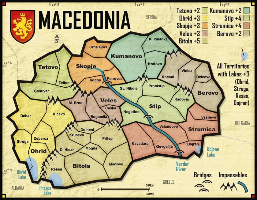
At first I thought the hulking black border around everything is unappetising, but I've realised that it's the contrast between the foreground and the background which makes it as such. Maybe the roads should look more like roads. Maybe not, if they serve their function regardless. So I went and looked at the Macedonia map (which I like) again, as it also has a fully fledged black border (Macedonia map image: http://maps.conquerclub.com/Macedonia.L.jpg). However, the outline of Macedonia only really serves to distinguish the playable area from the background, and overall it looks like a consistent image...rather than there being a line between two completely different images.
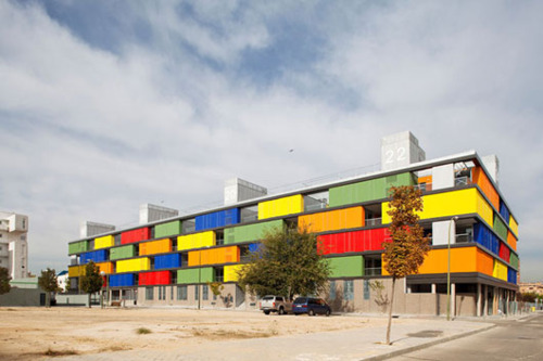
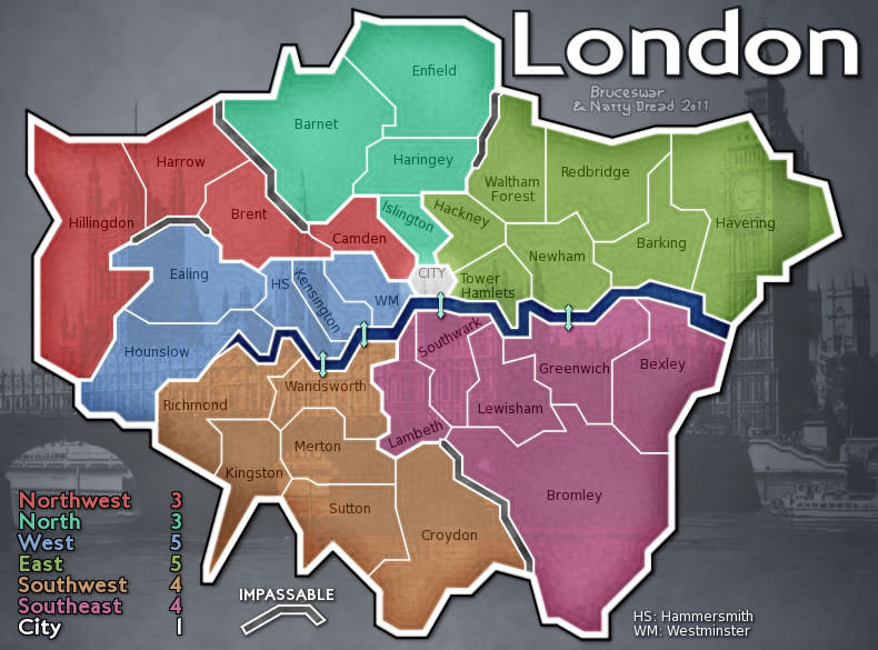
Even in the London map, which is a map outline slapped on top of a recognisable image of London, (London map image: http://maps.conquerclub.com/London2.L.jpg) it is all well integrated and complements the overall theme.
As a side note, you might argue here that not every map should be the same (in terms of graphics, gameplay or otherwise), and there are a few things to say in response to that. Sure, that's fine. We don't want 200 Doodle Whatevers (as has been established in this thread: viewtopic.php?f=127&t=78446#p1860557), but we have 200+ maps with (to use quite an extreme but still self-evident example) regions which can't attack some other regions - and there is no practical way of quantifying how many regions must contribute to _X_ or do not do _Y_ in order to make a map significantly different. And the same is true for graphics - probably to an even greater extent. Hence, the argument is reduced to banality. But on with the observations...
Ah, also on a related note, you'll notice that I'm using various existing maps for comparison. I think this is justified in arguing that the quality of a map is relative (and, hence, never quite objective - which is a prevailing problem with the foundry system with no evident/imposable solution). I guess it's quite like saying that we already have nice-looking maps, this should be too. Which isn't the same as saying that we already have nice-looking maps, we don't need to introduce any more; which is quite a distinct matter. I'm sure if you posted this on landgrab they'd be all over it. So to speak.
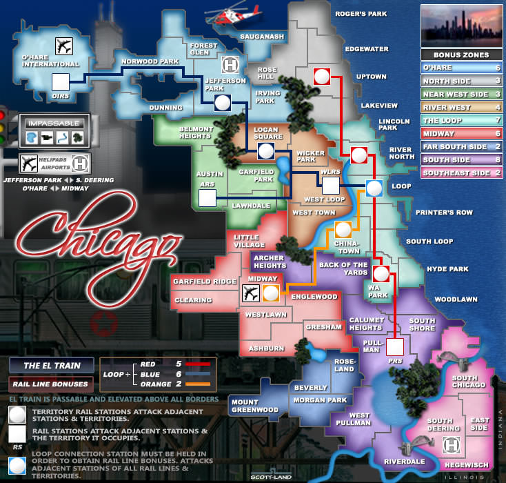
So, in addition to the papyrus/whatever texture, you have these funny high-contrast buildings and trees sticking out, and none of it looks quite right. Perhaps that is, in part, because you have this fabric-ish background (the papyrus bit, that is) with some images on top which look like they're from a colouring book. Similarly, the individual region borders/names are in high-contrast colours which don't look healthy. The Chicago map, for instance, (link: http://maps.conquerclub.com/Chicago.L.jpg) also has some fairly extreme colours. It even has a red area adjacent to a green area! Even so, the colours look right. And aren't distracting visually.
As a fairly irrelevant point of interest more than anything, I put the Madrid map into the Google search by image tool, and the 'similar' images suggested are predominantly drawn in what appears to be crayon.
Let me know what you think, koontz; I always look forward to reading your comments.
What follows is an account of ManBungalow's opinion of the map, 'Classic Cities: Madrid'. Comments made by this author do not necessarily reflect the opinions of the community.
Fixed this for you.
isaiah40 wrote:Darn you koontz!! You're making my job easy on this one! I liked this map from day one. I'll look at it a little close in the next couple of days.
ironsij0287 wrote:I think this looks great. Perhaps the best looking of the World City maps to come down the pipe recently.
Dukasaur wrote:It is beautiful... I think you've managed to capture the riot of bright colours that one associates with Iberia.
Opinion. I have no defence against an opinion as everyone has a right to theirs. Riotous colours of Madrid. In the following spoiler you will find some pictures from Madrid that shows the colour scheme at work. Madrid is unlike most European cities. It has a lot of colour. The background is just that, a background. As for the images, you have 4 pictures relevant to Spain and more closely Madrid. Flamenco dancer, the bull, red cloth for the bull, and the bear and tree.These are placed in opposite corners to reflect each other. The Bull and cloth. The figures, dancer and Bear. Saying the green for the board is concrete with a green filter on is laughable. I scoured google and tried to find a concrete image that even remotely looks like this and still have not found one. It is actually a Fallera pattern which comes from Spain.
Industrial Helix wrote:The background is beautiful, don't change a thing there.
This part of your premise is flawed. Their is no black border to my image. Macedonia has one and whilst I have my opinion of that map, this is not the place for it. The black lines in my image are roads, not a border. If I had the outside ones look different you could easily say what you did. Should they look more like roads, I tried that route and was asked to take it back a step as it made the crossings harder to see. But what the roads do have and this ties in with the rest of the map is a cartoon feel to them. A road but not quite a road. As for distinguishing between the the playable area and non playable area, the distinct change in colour from brown to green and the out lying road serves this purpose.
No it does not. The London map is absolutely rubbish IMO. All natty did was take a generic photo and reduce the opacity of the map to let it show through. Change the background image to this: change the names on the map and you have Classic Cities Madrid. Their is nothing about London on that map apart from the background image. At least my one has images associated to Spain and in particular to Madrid.
We do have thngs that you allude to in this part. They are called golden numbers. Something that this map has. As for saying that not every map should be the same, here we agree, but can you find another map that looks like this or plays like this? You cannot as their is not one yet on this site.
This is not the place to argue the faults of the foundry. But the one point you made clear is that you do not like this map in any way and hope to see it stopped. You made yourself clear when you said this map to you is ugly, where others have stated they love it. This is your opinion and you are entitled to it. Here is your opinion from throughout the thread.
MB wrote:This is still graphically overloaded.
Here cairnswk agreed with you and I redid a lot of the elements. The difference is, cairnswk came back, you did not.
MB wrote:What is even going on in this map ?
MB wrote:I have to be honest with you koontz...I have no idea how this passed the graphics stage.
If their was one or two elements that had a high contrast to them over all the rest, then your point would be valid. But as the overall image is like that and no one part of it is off, it works. It is all the same. The contrasting colours are their, as I stated before, Madrid and Spain are like this. It has a riot of colour all over the place. Big, bold, striking images that imprint into your mind. Again, you are trying to compare this to an older map. Whilst this may be an idea, again I say, you cannot really do this as we do not have another map made like this. If in the future, another map maker makes one, you can then compare the two because they will be alike. But you cannot compare this as it would be like comparing apples to oranges. Both nice, but today I want an orange, tomorrow I might like an apple.
Let me know what you think, koontz; I always look forward to reading your comments.
Done.
So far, MB, you have picked up on little details you do not like, anyone can do that, but what you failed to say was what was wrong with the map. You said the roads do not look like roads. You said the buildings have this funny look to them. You have said the colours are too bright. These individual elements may not work alone, but together they do. Easy of these elements may not work for London or Chicago or Cairo, but together for Madrid they do. As I said earlier, you do not like this map, even some of the players from Madrid do not like it, but others do. Halting a map because you do not like it or the map maker, is not sporting. You have your opinion and others have theirs. You are welcome to give your opinions in he map threads but if you do not comment, then you do not have a say. The one comment you gave that was graphically good and not opinion based:
MB wrote:This is still graphically overloaded.
was worked on and the map changed. It is not up to me to come looking for you to look at the map. In fact, you have been in the foundry a lot recently over the last months when this has been made and apart from the 3 I showed, you have not commented on the map. This leads me to believe you accepted the changes. But again, your opinion is wanted, and is also necessary to get a map made as all comments needs to be addressed. I hope this addresses your comments and we can now listen to others and play this one.
isaiah40 wrote:Darn you koontz!! You're making my job easy on this one! I liked this map from day one. I'll look at it a little close in the next couple of days.
ironsij0287 wrote:I think this looks great. Perhaps the best looking of the World City maps to come down the pipe recently.
Dukasaur wrote:It is beautiful... I think you've managed to capture the riot of bright colours that one associates with Iberia.
The background is beautiful, don't change a thing there.
As for the buildings, leave them as they are PLEASE!!!
The map has passed through rigorous gameplay and graphics examinations and all major concerns have been addressed. If you have any other concerns, please make your voice heard. If after a reasonable amount of time there has not been any objection or protest, the map will be stamped and submitted for the Beta period.
When images are shrunk to tiny sizes, you basically have two choices. If you try to be photorealistic, then yes it may look more professional but all the tiny details blend into a grey fuzz which really conveys nothing to the viewer, unless he's normally in the some area of forensics where blurry images are deconstructed for evidence. Or, you can go Impressionist route: isolate the most important idea and exaggerate it. That's what he's done here, and he's actually captured the feeling if Iberia very nicely.
If you don't like Manet, you won't like Koontz. And I'll be honest: hanging on a wall at the Met, I actually don't like Manet. But on this tiny screen, it works, and it works much better than a photorealistic treatment would.
“Life is a shipwreck, but we must not forget to sing in the lifeboats.” ― Voltaire
Dukasaur wrote:When images are shrunk to tiny sizes, you basically have two choices. If you try to be photorealistic, then yes it may look more professional but all the tiny details blend into a grey fuzz which really conveys nothing to the viewer, unless he's normally in the some area of forensics where blurry images are deconstructed for evidence. Or, you can go Impressionist route: isolate the most important idea and exaggerate it. That's what he's done here, and he's actually captured the feeling if Iberia very nicely.
If you don't like Manet, you won't like Koontz. And I'll be honest: hanging on a wall at the Met, I actually don't like Manet. But on this tiny screen, it works, and it works much better than a photorealistic treatment would.
Yes, I understand that the trees (for instance) in the image are not supposed to look exactly like real trees, and that they still look like trees in a tree sort of way.
The problem, for me, is...everything else, really. I hate to say it really, because I can see that effort has been put into this.
But apparently it's not worth me posting any more of my concerns here.
---The development period has concluded for the Classic Cities: Madrid Map. All objections have had their time. The Foundry and I hereby brand this map with the Foundry Beta Brand. Let it be known that this map is now ready for BETA Play. After an extended period of time in BETA and once all quirks and issues have been resolved, the map will be put into Full Play(barring any Admins or Foundry Foreman vetoes).
Conquer Club, enjoy!
While the map is in BETA Play, there are a couple of administrative tasks that are required of the mapmaker(s) in addition to the initial gameplay testing:
1. Please ensure that the first post of the thread contains all the necessary information to help future visitors to the development thread; it's particularly important to ensure the most recent images are there, along with any helpful guides (such as gameplay quirks/nuances or the location/size of any starting neutrals etc.) 2. It is the responsibility of the mapmaker(s) to ensure that they respond to further feedback in a timely and constructive manner. 3. Write a "creative" map description and send it to thenobodies80 via PM. You're encouraged to post it into the first post of the thread as well; the description will be used to populate the maps database.
This is playing not as I expected for 1v1 games. So far today in my games alone, I have dropped 3 bonuses, and even captured the whole of the centro region by taking one territ. In 1v1 games, players only have 6 regions and it is being decided by end of round 1.
Ideas to give a better game or is this what should be expected by a map of this size?
koontz1973 wrote:This is playing not as I expected for 1v1 games. So far today in my games alone, I have dropped 3 bonuses, and even captured the whole of the centro region by taking one territ. In 1v1 games, players only have 6 regions and it is being decided by end of round 1.
Ideas to give a better game or is this what should be expected by a map of this size?
I thought you addressed this specifically by the starting positions? Can you link some game numbers?
2 games with bonuses dropped. With the xml, 8 positions with a max of one given out and an underlying neutral of 2. This should of put the odds of a drop outside of the need to change range. But I have not played that many games today and it needs to change now. Only option I have to to code in neutrals which I hate so the question, ideas anyone?
Maps and xml. All bonuses are now 1 apart from the two large ones. They stay. Neutrals that underlined the starting positions have been raised to a 3. Background green now lighter to allow green to be seen better. Will look into these issues later again when new files uploaded.


