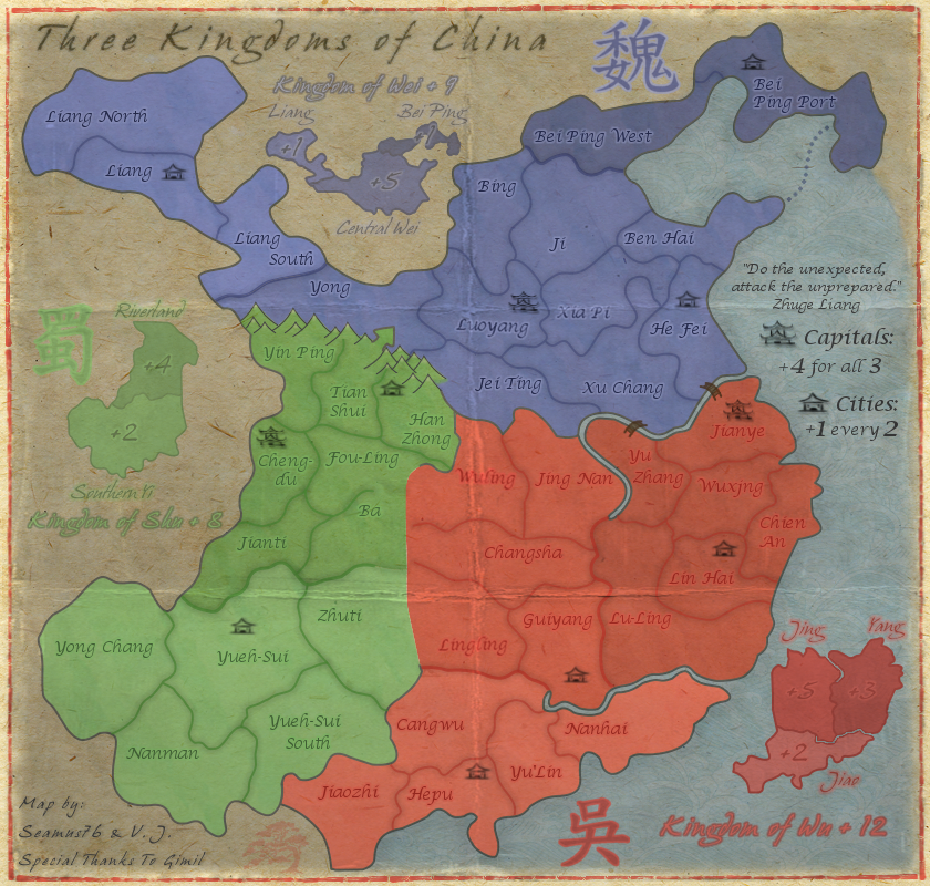
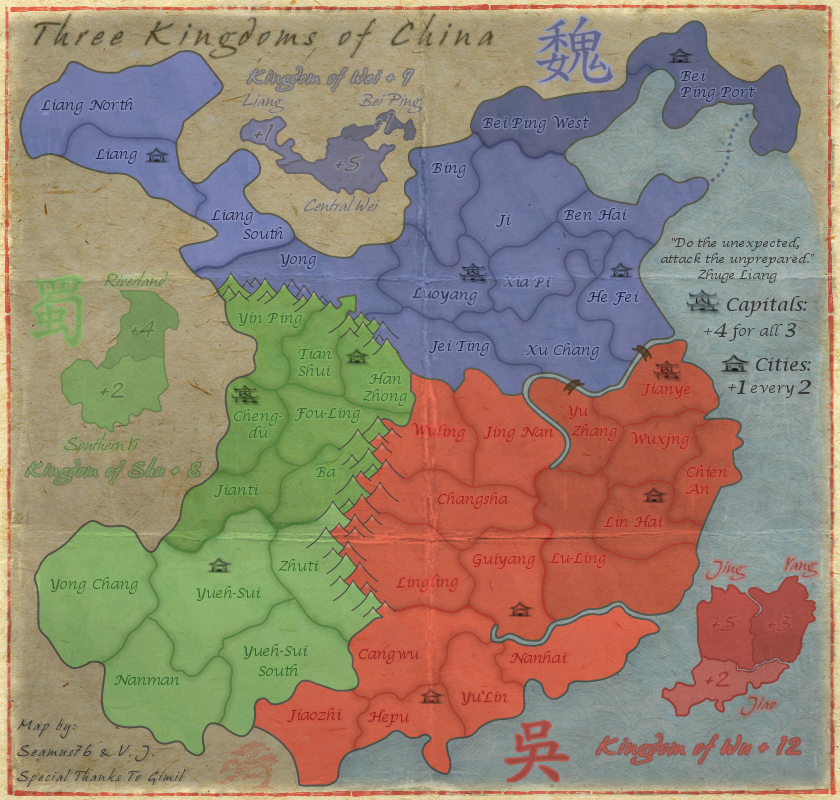
RedBaron0 wrote:I kinda agree about the straight line nature of the main mountain range in the center. Adding some girth (additional mountains) to the range as a whole would likely fix this.
I agree as well.
RB, what is your opinion on the creases?
Moderator: Cartographers
![]() by Seamus76 on Tue Feb 19, 2013 10:50 am
by Seamus76 on Tue Feb 19, 2013 10:50 am
RedBaron0 wrote:I kinda agree about the straight line nature of the main mountain range in the center. Adding some girth (additional mountains) to the range as a whole would likely fix this.


![]() by Oneyed on Tue Feb 19, 2013 11:13 am
by Oneyed on Tue Feb 19, 2013 11:13 am


![]() by Seamus76 on Tue Feb 19, 2013 12:04 pm
by Seamus76 on Tue Feb 19, 2013 12:04 pm
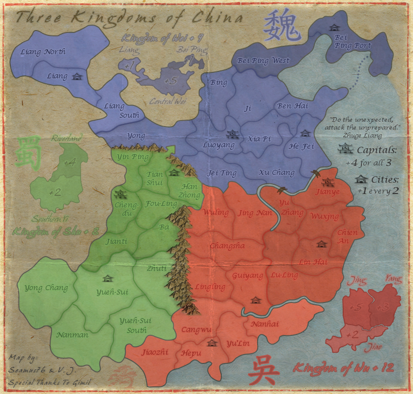
Oneyed wrote:why is one way attack from Tian shui to Yong? it is because geography reason or? I do not like it much.
the font of parts of kingdoms does sting my eyes.
![]() by Oneyed on Tue Feb 19, 2013 12:09 pm
by Oneyed on Tue Feb 19, 2013 12:09 pm
Seamus76 wrote:The reason for the one way is to represent the constant, and failed, historical attempts of the south to invade the north. It also adds more gameplay strategy to holding Central Wei.
Seamus76 wrote:Which font/text exactly are you referring to? Let me know some examples.
![]() by koontz1973 on Tue Feb 19, 2013 12:11 pm
by koontz1973 on Tue Feb 19, 2013 12:11 pm
Bei Ping, Central Wei, Riverland, Jing, Yang, Jiao, Southern Yi, Liang.


![]() by Seamus76 on Tue Feb 19, 2013 12:27 pm
by Seamus76 on Tue Feb 19, 2013 12:27 pm
koontz1973 wrote:Seamus, your title text looks blurred. Make it sharp like the rest of the text but change the colour to a brown on burn mode. Change the brown as needed so it looks part of the map.Bei Ping, Central Wei, Riverland, Jing, Yang, Jiao, Southern Yi, Liang.
Agree with Oneyed over these mini map names. The font is out of place.
![]() by Seamus76 on Fri Feb 22, 2013 1:25 pm
by Seamus76 on Fri Feb 22, 2013 1:25 pm
![]() by RedBaron0 on Sun Feb 24, 2013 12:02 pm
by RedBaron0 on Sun Feb 24, 2013 12:02 pm


![]() by Seamus76 on Mon Feb 25, 2013 11:42 am
by Seamus76 on Mon Feb 25, 2013 11:42 am

![]() by iancanton on Tue Feb 26, 2013 5:23 pm
by iancanton on Tue Feb 26, 2013 5:23 pm


![]() by RedBaron0 on Tue Feb 26, 2013 5:48 pm
by RedBaron0 on Tue Feb 26, 2013 5:48 pm
![]() by Seamus76 on Fri Mar 01, 2013 11:54 am
by Seamus76 on Fri Mar 01, 2013 11:54 am
iancanton wrote:i do like the crease effect, which immediately tells us that this is a paper map.
the course of the pearl river, which is one of two readily-recognisable features on the map, at nanhai is wrong. the river actually flows roughly south-east from where guiyang meets lu-ling, cutting nanhai in half; a bridge can be drawn between the two halves of nanhai to keep it as one region. mountains between nanhai and lu-ling form a natural impassable.
ian.
RedBaron0 wrote:While geographical accuracy is a good thing, it isn't always good for gameplay. I dislike the use of bridges within regions to keep them connected denoting that they are still "connected" it invites confusion.
Impassibles should be placed at the mapmakers discretion based on their judgement of the region, overall gameplay, and aesthetics of the image itself.
gimil wrote:iancanton wrote:Re: Post by iancanton on Sun Jul 06, 2008 8:40 am
cangwu and yulin need to be swapped round and the borders of the southern wu continent adjusted. the pearl river runs into the sea to the west of nanhai and does not go any further east. can u replace the eastern part of the river by mountains, as i have done in the mock-up below (thick brown line above nanhai)? i've also opened up an attack route between nanhai and guiyang to eliminate the nanhai dead-end, but i think the dead-end isn't a big issue if u don't like the gap between the mountains and the river.
my main source for the above changes is this map, which shows the position in ad 229, when hepu had been split into two commanderies for a short period.
http://www.anu.edu.au/asianstudies/decr ... _map16.gif
ian.
Cheers ian, appreciated as always. Unforuntaly adding the river in your mock up wouldnt change the gameplay. Because I used the pen tool to create my contients it would be alot of work with no gain. Reducing the other river will be a drastic change to gameplay. Im happy to live with this inaccuarcy for the sake of maintaining gameplay.
![]() by The Bison King on Mon Mar 04, 2013 12:41 am
by The Bison King on Mon Mar 04, 2013 12:41 am
I made the decision to go with gimils original design as it was the best for gameplay and only slightly off from geographical accuracy, which I too think is acceptable for the map. Unless there is a huge motion from the community I would like to keep the river and impassables as they are.


![]() by isaiah40 on Tue Mar 05, 2013 10:01 pm
by isaiah40 on Tue Mar 05, 2013 10:01 pm


![]() by Seamus76 on Tue Mar 05, 2013 11:22 pm
by Seamus76 on Tue Mar 05, 2013 11:22 pm
isaiah40 wrote:A few items. First of all this map is really turning out pretty darn good seamus!
1. The bonus amounts on the mini-map for Wu, especially on Yang is very hard to read. Maybe increase the outer glow a tad bit to make it stand out more. The same on Jing.
2. The bonus amount on Bei Ping is also hard to read, move it beside Bei Ping.
3. The Chinese character for Shu is hard to see as well, it needs to be darkened a bit.
4. Kingdom of Wu text is hard to tell exactly what it is. It looks like the "g" is an "s".
5. Kindom of Shu text is hard to read due to the light color you have. My suggestion is to use the same dark color you have for the bonus amounts.
6. I think that you will also need to adjust the kerning of the text for each "the Kingdom of ..." as the letters are very close together which also makes them hard to read. I can read them fine because I've been following the map, but first time players probably will have a hard time reading them.
Well these items should keep you busy for awhile. Looking forward to your next update!
7. I'm sorry, but those mountains do not go with the rest of the map. They stick out like a sore thumb, so they need to be changed. RjBeals did a quick tutorial on hand drawn mountains, take a look at it and see what you can do.
![]() by sannemanrobinson on Wed Mar 06, 2013 1:26 am
by sannemanrobinson on Wed Mar 06, 2013 1:26 am
Seamus76 wrote:7. I'm sorry, but those mountains do not go with the rest of the map. They stick out like a sore thumb, so they need to be changed. RjBeals did a quick tutorial on hand drawn mountains, take a look at it and see what you can do.
Ouch, this one does sting a bit. Of course Rj makes it look extremely easy, but I'm willing to give it another go. The current mountains are the 4th version, and one of those thorns in my side. I thought we had come up with a winner, but I will give it my best shot and see what I can produce.
Thank you for your time and feedback. I really appreciate it.


![]() by gimil on Wed Mar 13, 2013 10:47 am
by gimil on Wed Mar 13, 2013 10:47 am
natty_dread wrote:I was wrong


![]() by Seamus76 on Mon Mar 18, 2013 10:54 am
by Seamus76 on Mon Mar 18, 2013 10:54 am
![]() by koontz1973 on Mon Mar 18, 2013 12:00 pm
by koontz1973 on Mon Mar 18, 2013 12:00 pm
Seamus76 wrote:- Redid the Northern Shu mountains, and added a bit of "snow color" to the tops, but nothing else at the moment. Before I add more color to them, and more importantly before I do the Eastern mountains I want to get everyone's thoughts on these, especially isaiah40. I actually think they do look better and fit more with the style of the map, and if everyone agrees I'll go ahead and finish them up in this style.
![]() by RjBeals on Mon Mar 18, 2013 6:51 pm
by RjBeals on Mon Mar 18, 2013 6:51 pm


![]() by Seamus76 on Mon Mar 18, 2013 8:36 pm
by Seamus76 on Mon Mar 18, 2013 8:36 pm
RjBeals wrote:those look nice. I wouldn't do much more with the shading or more color, sometimes less is more.
![]() by isaiah40 on Mon Mar 18, 2013 11:01 pm
by isaiah40 on Mon Mar 18, 2013 11:01 pm
![]() by sannemanrobinson on Tue Mar 19, 2013 7:41 am
by sannemanrobinson on Tue Mar 19, 2013 7:41 am
![]() by RedBaron0 on Tue Mar 19, 2013 9:13 am
by RedBaron0 on Tue Mar 19, 2013 9:13 am
![]() by Seamus76 on Wed Mar 20, 2013 12:04 am
by Seamus76 on Wed Mar 20, 2013 12:04 am
Users browsing this forum: No registered users
|
|||||||
| Conquer Club is not associated with RISK online in any way. Copyright © 2006-2024 by Big Wham LLC | |||||||
