Page 8 of 17
Re: District of Alaska - v11.1 [2013-07-18] pg12

Posted:
Fri Jul 19, 2013 1:55 amby Industrial Helix
Hey, I really love this map and really think you pushed Alaska into an interesting gameplay instead of simple geography, so excellent work on that. I enjoy the graphics as well.
But I do have one criticism, I don't like that the small boats revert to neutral. I enjoy the trench setting for games and playing this map on trench would be a nightmare with the small boats reverting to neutral. So why not put a decay on it instead -3 sounds pretty good to me.
I'm not sure if this is the rule anymore but it used to be that maps had to be playable on all types of settings, but that might have changed since I left the carto mods.
Re: District of Alaska - v11.1 [2013-07-18] pg12
Posted:
Fri Jul 19, 2013 1:59 amby koontz1973
IH, trench does not come into play with killer neutrals. You are able to attack them and then out of them on the same turn.
As for the settings, still the same as before.
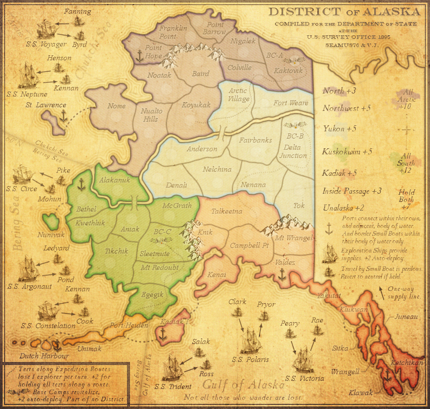
Re: District of Alaska - v11.2 [2013-07-22] pg13
Posted:
Mon Jul 22, 2013 12:09 pmby Seamus76
CURRENT UPDATE INFO - 2013-07-22:
- Got a little bored so I tried a couple of things to make the map look more antique.
CURRENT MAP VERSION v11.2 - Large (840x800) - Click image to enlarge.
Re: District of Alaska - v11.2 [2013-07-22] pg13
Posted:
Tue Jul 23, 2013 10:08 amby iAmCaffeine
I'm wondering how hard it will be for some people to read the region names? Ketchikan, Kadiak I for example.. At least I think that's what they say?

The faint look works for me but I'm young, I still have good eyes.

Re: District of Alaska - v11.2 [2013-07-22] pg13
Posted:
Tue Jul 23, 2013 10:20 amby Seamus76
iAmCaffeine wrote:I'm wondering how hard it will be for some people to read the region names? Ketchikan, Kadiak I for example.. At least I think that's what they say?
The faint look works for me but I'm young, I still have good eyes.
Yeah you're right, I can fix all of that, and saw those in particular as well. Thanks as always for the feedback. I think this will be a fun one.
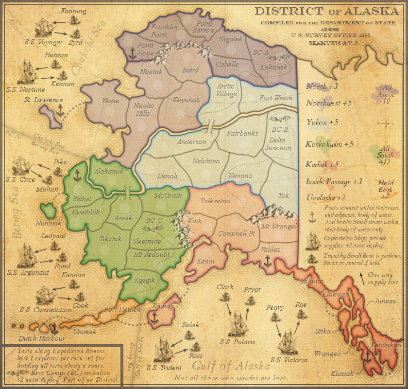
Re: District of Alaska - v11.3 [2013-07-23] pg13
Posted:
Tue Jul 23, 2013 12:17 pmby Seamus76
CURRENT UPDATE INFO - 2013-07-22:
- Fixed any names that might have been hard to read. i.e. Kadiak I.
CURRENT MAP VERSION v11.3 - Large (840x800) - Click image to enlarge.

Re: District of Alaska - v11.2 [2013-07-22] pg13
Posted:
Tue Jul 23, 2013 12:20 pmby isaiah40
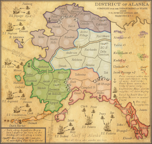
I have a few items that need to be addressed:
1. Along with making the region names darker, I would make the text in both legends darker and the lines from the region names to the regions themselves darker as well.
2. In the Expedition Route legend, the picture of the Base Camp needs some outer glow to bring it out from the background.
3. Put the abbreviation of base Camp in the legend as well, considering you have the abbreviation on the playable area. So it should read Base Camps (BC) revitilize ...
4. The Expedition routes need to be darker as well as there are a coupe of them I am having trouble seeing.
5. The bonus mini-maps need to be a tad darker, especially Yukon as that is a little hard to see.
6. Make the base camps on the map a tad darker as well.
Remember that this will be saved as a jpeg, and we know how that will turn out.
That's it from me for now!
Re: District of Alaska - v11.3 [2013-07-23] pg13
Posted:
Tue Jul 23, 2013 12:26 pmby cairnswk
Seamus, i just came into read what isaiah40 had written, and noticed immediately how "yellow" the map looks.
Maybe this has been requested, but not my favourite colour is "mustard".
Re: District of Alaska - v11.2 [2013-07-22] pg13
Posted:
Tue Jul 23, 2013 12:30 pmby Seamus76
isaiah40 wrote:I have a few items that need to be addressed:
1. Along with making the region names darker, I would make the text in both legends darker and the lines from the region names to the regions themselves darker as well.
2. In the Expedition Route legend, the picture of the Base Camp needs some outer glow to bring it out from the background.
3. Put the abbreviation of base Camp in the legend as well, considering you have the abbreviation on the playable area. So it should read Base Camps (BC) revitilize ...
4. The Expedition routes need to be darker as well as there are a coupe of them I am having trouble seeing.
5. The bonus mini-maps need to be a tad darker, especially Yukon as that is a little hard to see.
6. Make the base camps on the map a tad darker as well.
Remember that this will be saved as a jpeg, and we know how that will turn out.
That's it from me for now!
Thanks Isaiah. BC can be added easily.
The other stuff seems to be more from when I added the antique overlays, everything got a lot lighter and more yellow-ish. Do me a favor and take a look at version v11.1 in the OP, and let me know if you like that better. You'll see how much darker everything is.
Re: District of Alaska - v11.2 [2013-07-22] pg13
Posted:
Tue Jul 23, 2013 12:35 pmby isaiah40
Seamus76 wrote:isaiah40 wrote:I have a few items that need to be addressed:
1. Along with making the region names darker, I would make the text in both legends darker and the lines from the region names to the regions themselves darker as well.
2. In the Expedition Route legend, the picture of the Base Camp needs some outer glow to bring it out from the background.
3. Put the abbreviation of base Camp in the legend as well, considering you have the abbreviation on the playable area. So it should read Base Camps (BC) revitilize ...
4. The Expedition routes need to be darker as well as there are a coupe of them I am having trouble seeing.
5. The bonus mini-maps need to be a tad darker, especially Yukon as that is a little hard to see.
6. Make the base camps on the map a tad darker as well.
Remember that this will be saved as a jpeg, and we know how that will turn out.
That's it from me for now!
Thanks Isaiah. BC can be added easily.
The other stuff seems to be more from when I added the antique overlays, everything got a lot lighter and more yellow-ish. Do me a favor and take a look at version v11.1 in the OP, and let me know if you like that better. You'll see how much darker everything is.
Yes it looks better, maybe move the antique overlays under the text and mini-maps and see how it looks.
Re: District of Alaska - v11.2 [2013-07-22] pg13
Posted:
Tue Jul 23, 2013 12:36 pmby cairnswk
Seamus76 wrote:...
The other stuff seems to be more from when I added the antique overlays, everything got a lot lighter and more yellow-ish. Do me a favor and take a look at version v11.1 in the OP, and let me know if you like that better. You'll see how much darker everything is.
Maybe just my preference...but the older versions work better for me...i examined V7 and V8.

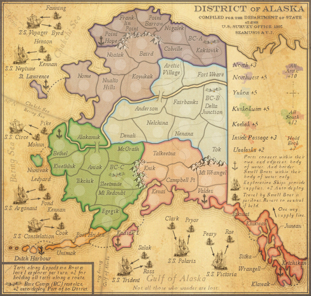
Re: District of Alaska - v11.4 [2013-07-23] pg13
Posted:
Tue Jul 23, 2013 1:06 pmby Seamus76
CURRENT UPDATE INFO - 2013-07-22:
- Removed one of the "antique" overlays and lowered the opacity of the remaining overlay, which made the map less yellow, and the gray objects much darker (i.e. text, sea routes, etc.). I think this works better. It still has the yellow antique feel I wanted, but not so much that it washes it out the map anymore. Thoughts?
- Also lowered the opacity of the white, snowy mountain color to make it a little lest bright, and take it back more to the v7 and v8 look (darker)
- Added the (BC) to the small legend
CURRENT MAP VERSION v11.4 - Large (840x800) - Click image to enlarge.
Re: District of Alaska - v11.4 [2013-07-23] pg13
Posted:
Tue Jul 23, 2013 1:23 pmby cairnswk
For me, this looks much better
Re: District of Alaska - v11.4 [2013-07-23] pg13
Posted:
Tue Jul 23, 2013 1:27 pmby Seamus76
cairnswk wrote:For me, this looks much better
Thanks, I agree. Now go get some sleep cairns.
Re: District of Alaska - v11.4 [2013-07-23] pg13
Posted:
Tue Jul 23, 2013 1:38 pmby isaiah40
cairnswk wrote:For me, this looks much better
+1
Now go and start getting the small, 888 test, and CB tests done!
Re: District of Alaska - v11.4 [2013-07-23] pg13
Posted:
Tue Jul 23, 2013 1:44 pmby Seamus76
isaiah40 wrote:cairnswk wrote:For me, this looks much better
+1
Now go and start getting the small, 888 test, and CB tests done!
Thank you sir. Will do!!
Re: District of Alaska - v11.4 [2013-07-23] pg13
Posted:
Thu Aug 08, 2013 3:59 pmby isaiah40
How are the updates coming along?

Re: District of Alaska - v11.4 [2013-07-23] pg13
Posted:
Thu Aug 08, 2013 4:10 pmby Seamus76
isaiah40 wrote:How are the updates coming along?
Slow.
Forgot how unmotivating the small map was to do. Finished redoing all of the text and a few of the tert borders. Only have one or two more and then the 888's. I would say in the next 2-3 days I should have the finished small with an 888 version, and CB versions of the large. The 888 version of the large has been posted for a bit.
Re: District of Alaska - v11.4 [2013-07-23] pg13
Posted:
Wed Aug 14, 2013 10:16 pmby Seamus76
CURRENT UPDATE INFO - 2013-08-15:- Added the regular Small version, and the 888 version(see OP). I will post the CB versions tomorrow.
CURRENT MAP VERSION v11.4 - Large (840x800) - Click image to enlarge.
- Click image to enlarge.
Re: District of Alaska - v11.4 [2013-08-15] pg14
Posted:
Thu Aug 22, 2013 10:57 pmby RedBaron0
You got a color blind test I can see seamus?
Re: District of Alaska - v11.4 [2013-08-15] pg14
Posted:
Sat Aug 24, 2013 11:06 pmby Seamus76
RedBaron0 wrote:You got a color blind test I can see seamus?
Sorry for the delay. They have been added to the OP. Enjoy.
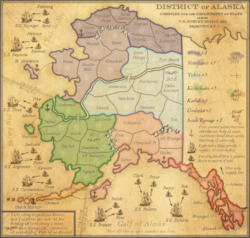
Re: District of Alaska - v11.4 [2013-08-25] pg14
Posted:
Sun Aug 25, 2013 1:23 amby koontz1973
Seamus, a very tiny thing from me, in the legend can you rearrange the inside and unalaska bonus symbol so the pink is below and to the right of the orange. Right now it looks like an inverted T and had me looking in the wrong place for it.

Re: District of Alaska - v11.4 [2013-08-25] pg14
Posted:
Mon Aug 26, 2013 10:57 amby iancanton
at the same time as u do this, change
dutch harbour to
dutch harbor, using the american spelling?
ian.
Re: District of Alaska - v11.4 [2013-08-25] pg14
Posted:
Mon Aug 26, 2013 12:53 pmby Seamus76
CURRENT UPDATE INFO - 2013-08-25:
- In the legend, per Koontz's suggestion, I swapped positions of the Inside Passage and Unalaska bonus info, and Super Bonus mini-maps. Personally I didn't think players would have a problem, and it looked a little better originally, but I can live with this.
- Changed Dutch Harbour to Dutch Harbor
CURRENT MAP VERSION v11.5 - Large (840x800) - Click image to enlarge.
- Click image to enlarge.
Re: District of Alaska - v11.5 [2013-08-26] pg14
Posted:
Tue Aug 27, 2013 12:43 amby koontz1973
Thanks Seamus. One tiny point from me now. Sea passages. The one from Bethel to Nunivak looks a little faded. Any chance of bringing it out like the others?