Page 5 of 7

Posted:
Mon Jun 19, 2006 4:38 pmby mrdexter
C....

Posted:
Mon Jun 19, 2006 4:39 pmby AndyDufresne
Well...
---I'd have to toss my vote out for a flip flop of Haydena's. C--->B--->A.
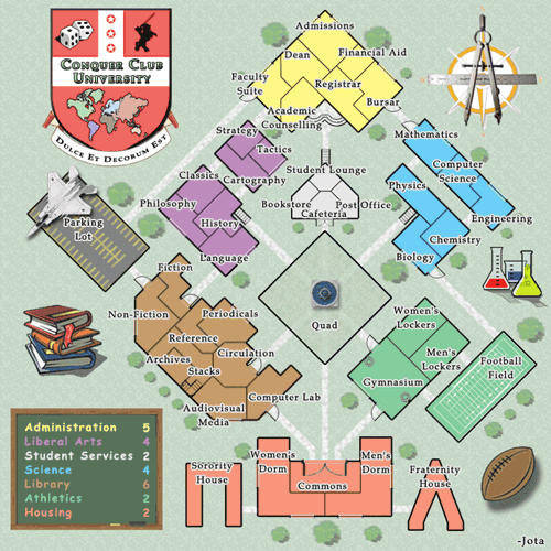
---I'm curious what if you add a little more military and war theme to the map? Maybe make the football a little bullet riddled and blackened from bombs...or perhaps a bomb near the chemistry facility....and the books? Maybe if possible look for more images to write 'The Art of War' on them, etc. Maybe a few throw pillows....landmines, you know...the works.
--Andy

Posted:
Mon Jun 19, 2006 5:09 pmby Jota
I think this map is hovering near the "Clutter Threshold", and adding "the works" would be quite likely to push it over the edge -- especially as one of my original goals was to have a map with a clean, simple visual style, and I'd really prefer not to stray too terribly far from that principle.

Posted:
Mon Jun 19, 2006 5:12 pmby AndyDufresne
Well perhaps not more addittions...but simply make the existing images more CC like.
--Andy

Posted:
Mon Jun 19, 2006 8:03 pmby Jota
I dunno. I'm reading this, and it's making me want to go back and rename the football field to what it was. This isn't really the direction I want to go in here. The concept of the map is that it's supposed to be a normal university. Putting a plane in the parking lot and describing football as a "combat simulation" are just jokes added as an afterthought, not the theme.

Posted:
Mon Jun 19, 2006 11:19 pmby rocksolid
C, or no plane or anything. Tank a cool idea but image not working.

Posted:
Tue Jun 20, 2006 7:17 amby qeee1
What Rock said.
Also no more clutter. Rename the football field if you want but leave the plane.

Posted:
Tue Jun 20, 2006 8:36 amby fluffybunnykins
maybe leave the tank in (it's a nice subtle touch) but get rid of the other ornaments (ball, flasks, books). I think this one is god enough to look at with the decorations that are more part of the map (doors, stairs, fountain, etc.)

Posted:
Tue Jun 20, 2006 1:16 pmby Machiavelli
They all look really good.
I like C the best too.

Posted:
Tue Jun 20, 2006 7:47 pmby Jota
If anyone wants to compare,
here's a version like what fluffy described.

Posted:
Tue Jun 20, 2006 7:57 pmby Evil Pope
I actually like that one better..
But the combat simulation grounds doesn't really work for me.. But I wouldn't be too bothered it it stayed..

Posted:
Wed Jun 21, 2006 2:45 amby gavin_sidhu
Wow. alot has been happening since i last posted.
I still hate the shapes of the sorority and faternity houses.
I also think that the pile of books should be replaced. Looks too clipart.

Posted:
Wed Jun 21, 2006 3:11 amby Jota
Anyone else want to add an opinion on the extra art/no extra art question before I make a final executive decision?

Posted:
Wed Jun 21, 2006 3:32 amby reverend_kyle
Hate it without the books and stuff.

Posted:
Wed Jun 21, 2006 6:36 amby fluffybunnykins
like it without the cheesy clip-art much better! I like the lighter tank, too, though... just my vote...
Maybe go back to football field, but put a few craters in it?

Posted:
Wed Jun 21, 2006 9:51 amby rocksolid
In favour of version with cheesy clip-art

Posted:
Wed Jun 21, 2006 5:21 pmby Jota
The time for minor aesthetic suggestions has finished. Unless any genuinely important issues arise, this is the version I'll be submitting to lack:
[url=http://grunk.org/risk/ccu18b-large.gif]

(Click for large version.)[/url]
Also, the XML is
here if anyone wanted to look at it.

Posted:
Sat Jun 24, 2006 12:46 amby AndyDufresne
The
Final Forge period has concluded for the
Conquer Club University Map. All objections have had their time. The Foundry
and I hereby brand this map with the
Foundry Brand. Let it be known that this map is now ready for live play
(barring any Lack vetoes).
Conquer Club, enjoy!
–Andy

Posted:
Sun Jun 25, 2006 1:03 pmby AndrewLC
Jota wrote:The time for minor aesthetic suggestions has finished. Unless any genuinely important issues arise, this is the version I'll be submitting to lack:
[url=http://grunk.org/risk/ccu18b-large.gif]

(Click for large version.)[/url]
Also, the XML is
here if anyone wanted to look at it.
Why is there a plane in the parking lot? I'm just curious...

Posted:
Sun Jun 25, 2006 1:26 pmby AndyDufresne
Because it's CC University....
--Andy

Posted:
Sun Jun 25, 2006 3:12 pmby Telvannia
one question after playing this map i was trying to remember where i had seen the latin quote before and after remember i realised it makes no sense:
"it is a wonderful thing"
in my opinion that makes no sense i think if it is possible to change it to fit the whole quote in
"Dulce et decorum est pro patria mori."
which makes a lot more sense
"it is a wonderful thing to die for ones country"

Posted:
Sun Jun 25, 2006 3:15 pmby AndrewLC
There should be snakes comming out of that plane

Just kidding!

Posted:
Sun Jun 25, 2006 3:28 pmby Haydena
Just a side note...
This map is bloody awesome!!!
Jota you've done it again! Everyone of your maps is simply unbelievable. I like the USApocalypse map also, had a good game on there, I don't know what it is, but I think the CCU is my favourite map about now!

Posted:
Sun Jun 25, 2006 3:32 pmby AndyDufresne
I think the idea of the quad...because you can get to anyone nearly from it....unless someone controls it.
--Andy

Posted:
Sun Jun 25, 2006 3:48 pmby Haydena
I'm incerdibly chuffed that I just got drawn athletics on the first turn... should make my game easier

