South America [Quenched]
Moderator: Cartographers
![]() by MR. Nate on Tue Sep 25, 2007 12:08 pm
by MR. Nate on Tue Sep 25, 2007 12:08 pm
I like the new colors more than any that I've seen so far. As for the font, they're classy as well. I agree with DiM on the sea routs and borders though. They feel a bit clunky for the map, and I think making them lighter will actually make the map feel a bit brighter.
AAFitz wrote:There will always be cheaters, abusive players, terrible players, and worse. But we have every right to crush them.
MeDeFe wrote:This is a forum on the internet, what do you expect?
End the Flame Wars.
-

 MR. Nate
- Posts: 951
- Joined: Tue Dec 19, 2006 10:59 am
- Location: Locked in the warehouse.


![]() by edbeard on Tue Sep 25, 2007 2:44 pm
by edbeard on Tue Sep 25, 2007 2:44 pm
Marvaddin wrote:1. Pampas is like a Grassland, while the Caatinga is a dry, semi arid vegetation.
2. The legend is not readable. Looks like this font is not to use with dark colours. Gran Chaco and Patagonia are terrible to read.
3. I dont think I would create any bridge in the Paraná river, the little "bottleneck" there is not a problem.
4. What I would suggest instead would be a bridge connecting Amapá to Xingu,
5. instead of Japurá to Rondônia.
6. I keep my opinion that we could split Santiago, having Andes as 7 territories and 4 borders to bonus of 4
7. And you still need to move Tierra del Fuego name nearer to it
1. I will switch their colours
2. Are you talking about the version on page 11 or 12? Because, I think 12 is very readable.
3. I think this bridge is a good idea. If you're stuck in that area you have such a long way to go up to the northwest point of the map.
4. Maybe.
5. Do you mean Japura to Roraima? This would make the Amapa/Xingu connection make more sense. The only possible problem with removing Japura/Roraima is that you can take over bogota and cut down 1 border. Is this a good idea or not?
6. Well. I really don't like the idea of 45 territories. As I have said, for 1v1 and 3 player games it is a bad number
7. I guess I'll switch to dashed lines instead of dots for the ocean routes, so this move will be easier. I don't see any problem with these borders, and I like bigger borders than this. I don't want thin tiny lines.
The title to me screams outdoors and wildlife which is a big thing anywhere I guess, but with the Amazon it's even bigger to me. I think it fits quite well.
I think a picture of Simon Bolivar would work. I don't know how Marv feels about this though. He doesn't represent all of South America, but he did lead I think five revolutionary wars?
I was reading and there is also this guy Jose de San Martin who I think is a national hero for Argentina? Maybe we can find all of the big revolutionaries for South America and place pictures on them on the map.
I'm not sure how many there are, but I think there's space for a few.
edit: I guess there's at least 7
-

edbeard
- Posts: 2501
- Joined: Thu Mar 29, 2007 12:41 am


![]() by edbeard on Tue Sep 25, 2007 4:16 pm
by edbeard on Tue Sep 25, 2007 4:16 pm
Only thing I've done here is to put up new fonts for the title, legend, and also the territories so we can get more options.
I realize that a lot of the text doesn't line up properly and some of the text needs to be resized a point or two and moved around a bit.
A.

title matches up with Pernambuco and Guyanan Highlands
B.

title matches up with Bahia and Brazilian Highlands.
C.

title matches up with Minas Gerais and Patagonia
D.

title matches up with Sao Paolo and Gran Chaco
E.

this is the one we had before. title matches up with almost everything
I realize that a lot of the text doesn't line up properly and some of the text needs to be resized a point or two and moved around a bit.
A.
title matches up with Pernambuco and Guyanan Highlands
B.
title matches up with Bahia and Brazilian Highlands.
C.
title matches up with Minas Gerais and Patagonia
D.
title matches up with Sao Paolo and Gran Chaco
E.
this is the one we had before. title matches up with almost everything
-
edbeard
- Posts: 2501
- Joined: Thu Mar 29, 2007 12:41 am

![]() by I GOT SERVED on Tue Sep 25, 2007 7:15 pm
by I GOT SERVED on Tue Sep 25, 2007 7:15 pm
I like the stencil effect, but save it for the legend. I personally like (C) as the title font.

Highest score: 2512
Highest rank: 424
-

I GOT SERVED
- Posts: 1532
- Joined: Fri Jan 26, 2007 9:42 pm
- Location: Good 'ol New England


![]() by ParadiceCity9 on Tue Sep 25, 2007 7:25 pm
by ParadiceCity9 on Tue Sep 25, 2007 7:25 pm
sorry if this has been stated...but you don't plan on keeping the legend with different fonts, do you?
and btw i like E..and the map!
and btw i like E..and the map!
-
ParadiceCity9
- Posts: 4239
- Joined: Thu Feb 15, 2007 4:10 pm


![]() by jako on Tue Sep 25, 2007 7:43 pm
by jako on Tue Sep 25, 2007 7:43 pm
i like D the most, E's font reminds me of war, more specifically the 60's era and the vietnam war, not very south american to me.

Time to retire this much loved sig of mine with a new clan.
-
jako
- Posts: 1022
- Joined: Sun Jun 03, 2007 4:50 am
- Location: A lost soul with no-one to stalk.


![]() by gimil on Tue Sep 25, 2007 11:45 pm
by gimil on Tue Sep 25, 2007 11:45 pm
D's a winner to me. i think it wouldnt hurt to make the army circles a little more transparent. Also i thik the outer gloes on your terr names it a tad to strong. but maybe its jsut me im tierd and its late.
What do you know about map making, bitch?
Top Score:2403
natty_dread wrote:I was wrong
Top Score:2403
-

gimil
- Posts: 8599
- Joined: Sat Mar 03, 2007 12:42 pm
- Location: United Kingdom (Scotland)


![]() by edbeard on Wed Sep 26, 2007 1:18 am
by edbeard on Wed Sep 26, 2007 1:18 am
Alright enough dillydallying. Lets get a vote going. I picked the three favourites from the last five. (by favourites I mean the three that at least one person said they liked haha)
A.

B.

C.

So let your votes do the talking. I guess you could let your words do some talking too, but I don't see how discussion will get anything done........(that's a joke in case you couldn't tell)
Not only did I mess around with fonts, I also made some updates.
Changes:
1. Switch colours of Caatinga and Pampas per information by Marvaddin
2. Ocean Routes. Dashed lines instead of dots. I liked the dots, but I put this up when a couple people said they were too thick. If you prefer the dots, then speak up.
3. Ocean Colour and Texture. I lightened the colour to go with this alternate texture. If you prefer the old ocean, then speak up.
4. Added art. It's a statue of Simón Bolívar and José de San Martín. They are both Liberators. They are credited with leading revolutions for eight current nations in South America.
5. I like the territory font. I think it's easily readable. I'm not sure if anyone has a dislike for it, so I think it'll stay no matter which title/legend font is chosen.
A.
B.
C.
So let your votes do the talking. I guess you could let your words do some talking too, but I don't see how discussion will get anything done........(that's a joke in case you couldn't tell)
Not only did I mess around with fonts, I also made some updates.
Changes:
1. Switch colours of Caatinga and Pampas per information by Marvaddin
2. Ocean Routes. Dashed lines instead of dots. I liked the dots, but I put this up when a couple people said they were too thick. If you prefer the dots, then speak up.
3. Ocean Colour and Texture. I lightened the colour to go with this alternate texture. If you prefer the old ocean, then speak up.
4. Added art. It's a statue of Simón Bolívar and José de San Martín. They are both Liberators. They are credited with leading revolutions for eight current nations in South America.
5. I like the territory font. I think it's easily readable. I'm not sure if anyone has a dislike for it, so I think it'll stay no matter which title/legend font is chosen.
Last edited by edbeard on Wed Sep 26, 2007 3:08 am, edited 1 time in total.
-
edbeard
- Posts: 2501
- Joined: Thu Mar 29, 2007 12:41 am
![]() by reverend_kyle on Wed Sep 26, 2007 1:30 am
by reverend_kyle on Wed Sep 26, 2007 1:30 am
A is definitely the best.
DANCING MUSTARD FOR POOP IN '08!
-

reverend_kyle
- Posts: 9250
- Joined: Tue Mar 21, 2006 4:08 pm
- Location: 1000 post club


![]() by edbeard on Wed Sep 26, 2007 1:58 am
by edbeard on Wed Sep 26, 2007 1:58 am
something a friend suggested was to group the legend by colour instead of by location
eg: the order would be something like
Pampas
Amazon
Guyanan Highlands
Gran Chaco
Andes
Caatinga
Brazilian Highlands
Patagonia
so the greens and browns are separated and they both are in order of increasing darkness
I'll put this in the next update
edit: And, Kyle likes A yet doesn't vote! ......
eg: the order would be something like
Pampas
Amazon
Guyanan Highlands
Gran Chaco
Andes
Caatinga
Brazilian Highlands
Patagonia
so the greens and browns are separated and they both are in order of increasing darkness
I'll put this in the next update
edit: And, Kyle likes A yet doesn't vote! ......
-
edbeard
- Posts: 2501
- Joined: Thu Mar 29, 2007 12:41 am
![]() by Marvaddin on Wed Sep 26, 2007 2:13 am
by Marvaddin on Wed Sep 26, 2007 2:13 am
I really like the most old option C (now A) to the title, but would like to see the old A in the legend.
The bright ocean is even worse than the previous one,
Want to use the liberators? Try something like this:
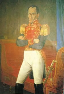
Because this statue even the south american history students in the 5th grade cant tell who they are, lol
Oh, this one is Simon Bolivar, say hello to him
The bright ocean is even worse than the previous one,
Want to use the liberators? Try something like this:
Because this statue even the south american history students in the 5th grade cant tell who they are, lol
Oh, this one is Simon Bolivar, say hello to him
-

Marvaddin
- Posts: 2545
- Joined: Thu Feb 09, 2006 5:06 pm
- Location: Belo Horizonte, Brazil

![]() by DiM on Wed Sep 26, 2007 11:19 am
by DiM on Wed Sep 26, 2007 11:19 am
A is the best.
now on to other things.
the dashes are a definite improvement. but same problem as the borders they are too think.
look at the borders of the rivers that thin nice line should be used as the internal borders and the current internal borders as the outer borders.
the new ocean is also an improvement not by much but still better. one thing that bugs me is that the legend has the same texture but on a different scale. the waves are much smaller. it looks odd.
another problem is that i only see simon bolivar i can't see san martin

anyway i like that you added him but i don't like how you added him. the image you used and the way you cut it looks bad. maybe think of an image of bolivar with his sword pointing at the legend and the legend is written on a nice scroll like this:
it might require making the image a bit wider but you have plenty of space to do that. your map is 576px wide and you can go all the way to 630.
and if you do that you could also add a nice frame to the title like the one marvaddin presented a page back.
now on to other things.
the dashes are a definite improvement. but same problem as the borders they are too think.
look at the borders of the rivers that thin nice line should be used as the internal borders and the current internal borders as the outer borders.
the new ocean is also an improvement not by much but still better. one thing that bugs me is that the legend has the same texture but on a different scale. the waves are much smaller. it looks odd.
another problem is that i only see simon bolivar i can't see san martin
anyway i like that you added him but i don't like how you added him. the image you used and the way you cut it looks bad. maybe think of an image of bolivar with his sword pointing at the legend and the legend is written on a nice scroll like this:
it might require making the image a bit wider but you have plenty of space to do that. your map is 576px wide and you can go all the way to 630.
and if you do that you could also add a nice frame to the title like the one marvaddin presented a page back.
“In the beginning God said, the four-dimensional divergence of an antisymmetric, second rank tensor equals zero, and there was light, and it was good. And on the seventh day he rested.”- Michio Kaku
-

DiM
- Posts: 10415
- Joined: Wed Feb 14, 2007 6:20 pm
- Location: making maps for scooby snacks


-

Optimus Prime
- Posts: 9665
- Joined: Mon Mar 12, 2007 9:33 pm


![]() by edbeard on Wed Sep 26, 2007 2:08 pm
by edbeard on Wed Sep 26, 2007 2:08 pm


not sure if people think these are better or worse. Maybe a Spanish speaker can tell me if they are free for use or not.
But, so far only DIM has disliked the picture, so we'll see.
Btw, I am doing a thinner borders version so there can be a vote.
As for the title...I'll post it up too. I'm not a fan of that though.
Not sure when though. Could be tonight, tomorrow, or next week.
-
edbeard
- Posts: 2501
- Joined: Thu Mar 29, 2007 12:41 am
![]() by Serbia on Wed Sep 26, 2007 4:10 pm
by Serbia on Wed Sep 26, 2007 4:10 pm
I think version B is the simplest to read, with version A second.
CONFUSED? YOU'LL KNOW WHEN YOU'RE RIPE
saxitoxin wrote:Serbia is a RUDE DUDE
may not be a PRUDE, but he's gotta 'TUDE
might not be LEWD, but he's gonna get BOOED
RUDE
-

Serbia
- Posts: 12251
- Joined: Sun Jan 14, 2007 10:10 pm
- Location: Detroit


![]() by Solus on Tue Oct 02, 2007 11:26 am
by Solus on Tue Oct 02, 2007 11:26 am
It's been awhile since I looked at this post but, seeing it now ... It's... BEAUTIFUL.
You don't have an income like mine, plus you've never even ridden in my amazing rocket car... Maybe if I get bored I'll bench press it for you.
Click here to get turned into a monster http://s3.bitefight.org/c.php?uid=76785
Click here to get turned into a monster http://s3.bitefight.org/c.php?uid=76785
-

Solus
- Posts: 75
- Joined: Sat Jun 02, 2007 6:20 pm
- Location: Pennsylvania
![]() by Coleman on Sun Oct 14, 2007 2:26 pm
by Coleman on Sun Oct 14, 2007 2:26 pm
Time for the is anything happening here comment. 
Is Anything Happening Here?
It looks like the poll has run its course and option A has won. Are we ready to move on?
Is Anything Happening Here?
It looks like the poll has run its course and option A has won. Are we ready to move on?
Warning: You may be reading a really old topic.
-

Coleman
- Posts: 5402
- Joined: Tue Jan 02, 2007 10:36 pm
- Location: Midwest


![]() by edbeard on Sun Oct 14, 2007 5:23 pm
by edbeard on Sun Oct 14, 2007 5:23 pm
yea you can remove the poll. I will be showing the legend option that Marvaddin requested. If there's a large group who like that (or if we just feel that one is better) then we'll switch over, but it looks like A is the winner.
I've been very busy lately so I've been unable to dedicate any time at all to this. I hoped this weekend was the one, but I will try again next weekend.
I've been very busy lately so I've been unable to dedicate any time at all to this. I hoped this weekend was the one, but I will try again next weekend.
-
edbeard
- Posts: 2501
- Joined: Thu Mar 29, 2007 12:41 am
![]() by cairnswk on Mon Oct 15, 2007 6:37 am
by cairnswk on Mon Oct 15, 2007 6:37 am
Poll Results
Which Fonts for Legend and Title?
Option A 55% [ 16 ]
Option B 10% [ 3 ]
Option C 24% [ 7 ]
None 10% [ 3 ]
Total Votes : 29
Which Fonts for Legend and Title?
Option A 55% [ 16 ]
Option B 10% [ 3 ]
Option C 24% [ 7 ]
None 10% [ 3 ]
Total Votes : 29

* Pearl Harbour * Waterloo * Forbidden City * Jamaica * Pot Mosbi
-

cairnswk
- Posts: 11510
- Joined: Sat Feb 03, 2007 8:32 pm
- Location: Australia

Who is online
Users browsing this forum: nwilson
|
|||||||
| Conquer Club is not associated with RISK online in any way. Copyright © 2006-2024 by Big Wham LLC | |||||||