I like the top 2


Moderator: Cartographers
![]() by WidowMakers on Mon Aug 20, 2007 5:55 am
by WidowMakers on Mon Aug 20, 2007 5:55 am


![]() by DiM on Mon Aug 20, 2007 6:19 am
by DiM on Mon Aug 20, 2007 6:19 am
cairnswk wrote:WM....I'm sorry to be negative, but they do nothing for me. Others may see it differently though.


![]() by cairnswk on Mon Aug 20, 2007 7:11 am
by cairnswk on Mon Aug 20, 2007 7:11 am
KEYOGI wrote:So apart from mibi, is there actually anyone who wants a different background?


![]() by mibi on Mon Aug 20, 2007 8:51 am
by mibi on Mon Aug 20, 2007 8:51 am


![]() by jako on Mon Aug 20, 2007 8:19 pm
by jako on Mon Aug 20, 2007 8:19 pm
mibi wrote:casper wrote:pixels are so unrealistic...
I was under the impression, from the art deco style of the title that a rail map like this would appeal to people in the glory days of train travel, when these trains and routes had history, when the locomotives were iconic and train travel was something to experience. when pixel schedule boards didn't exist.
I am probably wrong tho, this map is probably is probably for the player who liked to invoke the standard lackluster, overpriced, Amtrak style train travel of modern day. my apologies.
you have a modern schedule board and a subway background, so i suppose i am way off base.
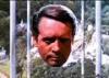
Here is the best image so far, from my off base point of view
Such a evocative locomotive blazing away under the full moon with nothing but a head light and a steady cloud of smoke. It had emotion and character, what the current versions lacked.


![]() by Coleman on Mon Aug 20, 2007 8:21 pm
by Coleman on Mon Aug 20, 2007 8:21 pm


![]() by WidowMakers on Mon Aug 20, 2007 9:05 pm
by WidowMakers on Mon Aug 20, 2007 9:05 pm
![]() by steve monkey on Tue Aug 21, 2007 2:53 am
by steve monkey on Tue Aug 21, 2007 2:53 am


![]() by WidowMakers on Tue Aug 21, 2007 5:49 am
by WidowMakers on Tue Aug 21, 2007 5:49 am


![]() by cena-rules on Tue Aug 21, 2007 6:07 am
by cena-rules on Tue Aug 21, 2007 6:07 am


![]() by WidowMakers on Tue Aug 21, 2007 6:13 am
by WidowMakers on Tue Aug 21, 2007 6:13 am
It needs to overlap a little. If it doesn't, the train will get covered more than it does now. Believe me I tried. I had to balance the graphics and I felt that was a trade-off I had to make.cena-rules wrote:I love this map.
1 thing.
the seattle station is on the legend. It is worse on the small map but not to bad on the big map.
If this can be fixed thank because it bugs me.
![]() by cena-rules on Tue Aug 21, 2007 6:41 am
by cena-rules on Tue Aug 21, 2007 6:41 am
WidowMakers wrote:It needs to overlap a little. If it doesn't, the train will get covered more than it does now. Believe me I tried. I had to balance the graphics and I felt that was a trade-off I had to make.cena-rules wrote:I love this map.
1 thing.
the seattle station is on the legend. It is worse on the small map but not to bad on the big map.
If this can be fixed thank because it bugs me.
WM
![]() by jako on Tue Aug 21, 2007 11:41 am
by jako on Tue Aug 21, 2007 11:41 am
WidowMakers wrote:OK. How is this?
I took out the little station icons because there was not a lot of room on the small map.
![]() by Coleman on Tue Aug 21, 2007 12:30 pm
by Coleman on Tue Aug 21, 2007 12:30 pm
![]() by MR. Nate on Tue Aug 21, 2007 12:39 pm
by MR. Nate on Tue Aug 21, 2007 12:39 pm
AAFitz wrote:There will always be cheaters, abusive players, terrible players, and worse. But we have every right to crush them.
MeDeFe wrote:This is a forum on the internet, what do you expect?

![]() by cairnswk on Tue Aug 21, 2007 2:35 pm
by cairnswk on Tue Aug 21, 2007 2:35 pm
![]() by Coleman on Tue Aug 21, 2007 3:35 pm
by Coleman on Tue Aug 21, 2007 3:35 pm
cairnswk wrote:But please ask yourselves: is it really bothering you, or are you just nit-picking, afterall, there is no bonus text in that area where the clock tower overhangs.
![]() by cairnswk on Tue Aug 21, 2007 3:57 pm
by cairnswk on Tue Aug 21, 2007 3:57 pm
Coleman wrote:cairnswk wrote:But please ask yourselves: is it really bothering you, or are you just nit-picking, afterall, there is no bonus text in that area where the clock tower overhangs.
Well what is bothering me is that the times on the clock towers are either inconsistent or wrong based on the other clock towers around them in the same time zone and in others.
It also bothers me that the small map clock towers are more detailed then the large map clock towers.
Users browsing this forum: No registered users
|
|||||||
| Conquer Club is not associated with RISK online in any way. Copyright © 2006-2024 by Big Wham LLC | |||||||