you want to have a killer whale (orca) that mayby fits the map?

shrink one of the 2 largest ones and i think they'll fit
P.S
i love killer whales
shrink one of the 2 largest ones and i think they'll fit
P.S
i love killer whales
Conquer Club, a free online multiplayer variation of a popular world domination board game.
https://www.conquerclub.com/forum/
https://www.conquerclub.com/forum/viewtopic.php?f=358&t=25537
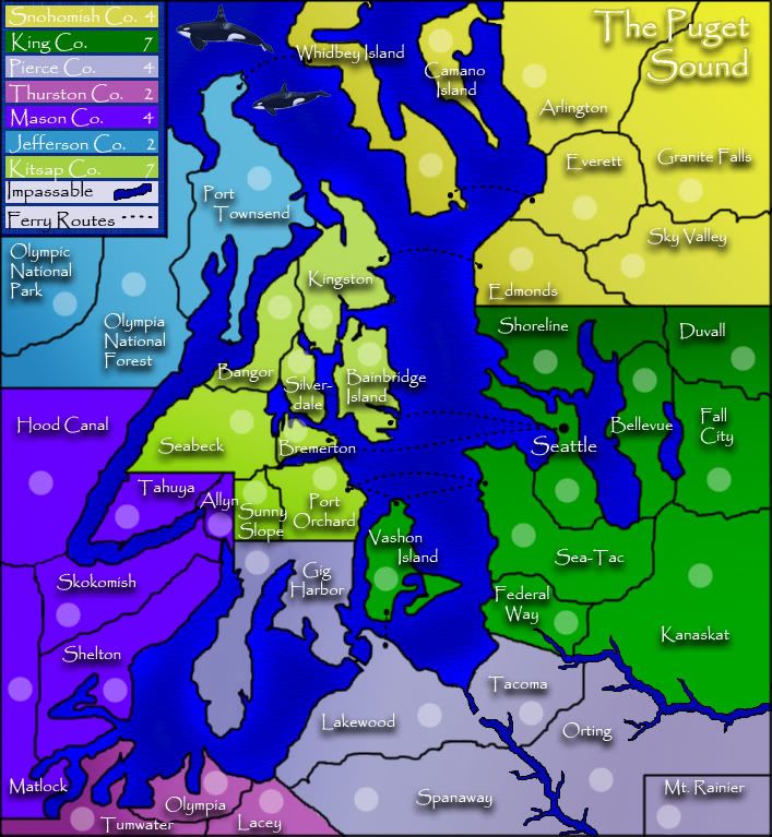
Gnome wrote:jako wrote:Gnome wrote:I like your map...but there are some things that I don't like that much...
-some borders are to straight...as for edmonds and shoreline its ok...but the border between Mason co. and Kitsap Co. looks so unnatural...Can't you just make it like the rest? I think that would look way better...
-You also forgot to draw some black borders, the border between lakewood and Tacoma, you have a river there....you started a border at lakewood but you didn't finished it...maybe it's better to stop it at the river mouth...
-And I don't agree with some bonuses, how did you calculate them?
King Co has 7 borders and has a bonus of 7 (agree)
Snohomish has 3 borders but has a bonus of 4 (disagree)
Pierce Co has 4 borders and has a bonus of 4 (agree)
Thurston CO has 2 borders and has a bonus of 2 (agree)
Mason CO has 4 borders and has a bonus of 4 (agree, although its hard to hold explanation at Kitsap Co)
Jefferson CO has 2 borders and a bonus of 2 (agree)
Kitsap Co has 6 borders and has a bonus of 7 (disagree much...When you hold Kitsap Co you get a bonus of 7 which is a lot because you can defend Kitsap with only 5 borders...
When you take Allyn and Seattle you can easely prevent some1 to take Masson co because Tahuya can only be fortified along Allyn...and you can afford to put your defense from Bremerton and Bainbridge into 1 territory (Seattle)
I think this makes the gameplay really hard...
actually i disagree with ur bonus comments, i think her bonus values are fine, u have to also take into account how many terrs it contains that u have to control in order to get the bonus, and in this case, the amount of terrs to entry points suits the bonus values.
Ok maybe your right about the bonuses...but I still think that the way you can make it some1 really really hard to keep Mason Co and you only make it yourself easier to hold Kitsap is unfair...
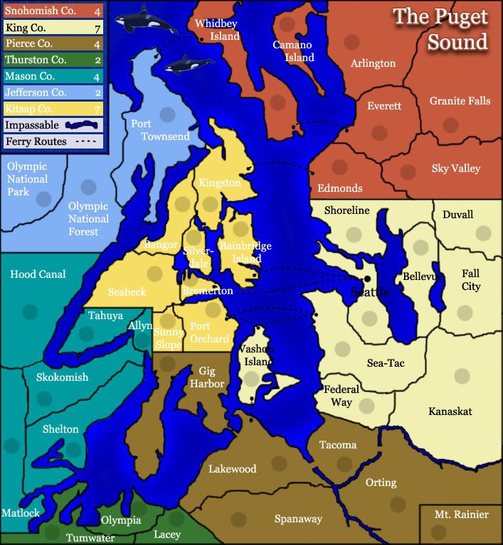
oaktown wrote:good start so far. You've found a region that lends itself to a CC map.
The color palette doesn't work for me... seems a bit bright for the Pacific Northwest.
oaktown wrote:good start so far. You've found a region that lends itself to a CC map.
The color palette doesn't work for me... seems a bit bright for the Pacific Northwest.
jako wrote:lol that was my next comment, yeah the colours arent what i would picture for this area, and its hard on the eyes, that up north its all bright, almost a glare like feel to it, and then down south its all dark.

oaktown wrote:good start so far. You've found a region that lends itself to a CC map.
The color palette doesn't work for me... seems a bit bright for the Pacific Northwest.

Tisha wrote:better? The river in the south is actually Carbon River and the river in the north is White River...White River actually flows into Carbon River on the REAL maps... should I lie, and continue it to the sound?
Xyl wrote:Tisha wrote:better? The river in the south is actually Carbon River and the river in the north is White River...White River actually flows into Carbon River on the REAL maps... should I lie, and continue it to the sound?
Well, you can either lie and continue it to the sound, or you can have it actually drain into the carbon river and use it as the Tacoma/Orting border. But having it just disappear randomly doesn't seem like a good option. It makes it look like it's flowing east.
Of course, that's not the only reason it looks like it's going east. The other reason is that your tributaries are pointing in the wrong direction on both rivers...
Keredrex wrote:try using all white text for the names and a black Drop shadow....
Tisha wrote:jako, is there anything u actually like about the map at all?
I actually loved the totem pole.. great for the North West. I found a picture of it complete.
The colors do look nice on the map, I'm just not sure where to fit a totem pole..
and is this font better reverend_kyle? (please say yes) there aren't many that I like. I know it does need shadow or something to the font...would just like reverend_kyle's approval before working on that more..
jako wrote:i guess this is my last comment on this map since tisha told me on the chat to stay away, EDITED.
to answer ur above post tisha, i would play it, at least once anyways. hell i played DiM's AoM map, and i thought that map was away worse than urs.
by font i meant font colour, sorry i was rushing and forgot to type in colour. but u fixed it so forget what i just said(u probably dont need since ur gonna ignore my comments anyways.)
i guess u can keep the borders, but there is a fine line between accuracy, and playability. so plz keep that in mind.
i never said i didnt like ur map, i just stated that it wouldnt be one of my first picks to play. and i do like some things in ur map. let me get back to u when i can think of some.
i dont need glasses, but if u feel the sea is good enough, i cant change ur mind. it could be just me i guess.
so the map u looked at drew mt rainier as a square? hm....like i said above, there is a very fine line between accuracy and playability, its up to u which side u stay on.
okay thats it for me then. i'l stop anymore comments tisha, but i'l look in from time to time. i know u will probably not be happy i made this one final comment in ur thread.
remember i'l be watching in the background, adn i really do hope ur map turns out for the best and goes to live play.... eventually