American Civil War [Quenched]
Moderator: Cartographers
![]() by happy2seeyou on Thu Nov 29, 2007 3:04 pm
by happy2seeyou on Thu Nov 29, 2007 3:04 pm
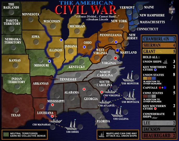
I have not read anyone elses comments and I am looked at the map on page one... Is the river supposed to be that bright?

-

 happy2seeyou
- Posts: 4021
- Joined: Mon Jan 22, 2007 2:59 pm
- Location: A state that is in the shape of a mitten!


![]() by yamahafazer on Fri Nov 30, 2007 3:00 am
by yamahafazer on Fri Nov 30, 2007 3:00 am
oaktown wrote:In addition to bringing down the color, what if the land beveled off at the river's edges, just as it does at the shoreline?
Me thinks oaktown has a good idea here... It mabe just what the river needs to get everyone to like it.

-

yamahafazer
- Posts: 211
- Joined: Fri Aug 24, 2007 9:56 am
![]() by Elijah S on Sat Dec 01, 2007 12:33 am
by Elijah S on Sat Dec 01, 2007 12:33 am
reverend_kyle wrote:I was just trying to figure out a way to resolve the Blue/Grey with the sepia feel and I realized...
Why not do both. I noticed your greys are mostly the same, but the blue colors have changed. Is there a way you could bring back the old colors with a sepia tint to it.
I'm working on putting together a variation of the current map to reintroduce the blue-gray colors.
When the two maps are worked a little more I'll put them up in a poll and see which one most prefer.
I've also noted other recent input and will make the changes I think will benefit the map.
-
Elijah S
- Posts: 672
- Joined: Wed May 09, 2007 6:24 pm


![]() by Elijah S on Sat Dec 01, 2007 6:58 pm
by Elijah S on Sat Dec 01, 2007 6:58 pm
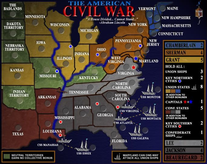
Notable Changes:
- Main legend fonts have been realigned and the brown changed to more closely match Beauregard's states.
-The guide line that was onder "Hold All:" has been taken out.
-The CSS Manassas has been moved slightly away from the mouth of the river.
-The rivers have been recolored and a bevel placed around them.
-The texture in the ocean has been dulled some and made to gradually fade.
-The overall tone has been lightened some.
-Vicksburg has replaced Memphis as one of the south's key cities.
-Some more borders have been thinned a little and pixelation worked on.
Just to address some of the recently suggestions...
The bevel around the river I think improves it but I'm going to try to make the rivers a little thinner. The color of the river, I like.
Lee and Jackson's colors are sufficiently different and clear to tell what's what.
The ship's names are slightly smaller than the state names, and appropriate.
Note- The 3 Confederate ships DO touch land and I'm not changing this. It was a way to attribute southern "ownership" of these ships without placing attack lines, which would have confederate ships attacking confederate states. They DO still attack each other, but it's more understated.
Again, when this map has reached a point where all valid issues have been addressed, I'll be making one which will use a blue instead of the current color of Sherman's states. -This will go to a poll later.
My "to do" list:
-Work on river width and try different bevels.
-Continue border work.
-
Elijah S
- Posts: 672
- Joined: Wed May 09, 2007 6:24 pm
![]() by Bad Speler on Sat Dec 01, 2007 7:06 pm
by Bad Speler on Sat Dec 01, 2007 7:06 pm
wow, this map certainly looks much better than the previous draft I saw...I have but two complaints.
Borders look a bit too thick, and the white names stand out too much from the dark background of the map.
Borders look a bit too thick, and the white names stand out too much from the dark background of the map.
Highest Score: 2532
Highest Position: 69 (a long time ago)
Highest Position: 69 (a long time ago)
-

Bad Speler
- Posts: 1027
- Joined: Fri Jun 02, 2006 8:16 pm
- Location: Ottawa


![]() by Coleman on Wed Dec 05, 2007 12:09 am
by Coleman on Wed Dec 05, 2007 12:09 am
A lot of programmers use white on black for readability.
A lot of programmers also wear glasses...
I'm not sure if graying the lettering would be a good idea or not, we probably would need to see it. I don't feel there is a problem though.
A lot of programmers also wear glasses...
I'm not sure if graying the lettering would be a good idea or not, we probably would need to see it. I don't feel there is a problem though.
-

Coleman
- Posts: 5402
- Joined: Tue Jan 02, 2007 10:36 pm
- Location: Midwest


![]() by Elijah S on Wed Dec 05, 2007 1:39 pm
by Elijah S on Wed Dec 05, 2007 1:39 pm
oaktown wrote:Tisha wrote:i like the white territory names.. easy to read
I agree... it keeps the map clean.
I third that...
After messing with dulling the white down I found it added nothing to the map, so the font will remain white.
I am still playing with the borders, and where there's obvious thickness differences I'm trying to make them more uniform.
Planning to put the sepia version and the blue-gray version up to a vote, possibly as soon as tonight.
Thanks for the recent input...
-
Elijah S
- Posts: 672
- Joined: Wed May 09, 2007 6:24 pm


![]() by oaktown on Fri Dec 07, 2007 12:03 am
by oaktown on Fri Dec 07, 2007 12:03 am
the blue and grey version still has the flags in the great lakes, and I hadn't noticed this before but Lake Michigan look like a 4th of July neck tie. 
You're still working on some edges, right? Because it's funny that in both maps the lakes cast a shadow.
You're still working on some edges, right? Because it's funny that in both maps the lakes cast a shadow.

-

oaktown
- Posts: 4451
- Joined: Sun Dec 03, 2006 9:24 pm
- Location: majorcommand


New changes...
![]() by Elijah S on Fri Dec 07, 2007 12:05 am
by Elijah S on Fri Dec 07, 2007 12:05 am
Map A - Earthtones
Map B - Blue/Gray
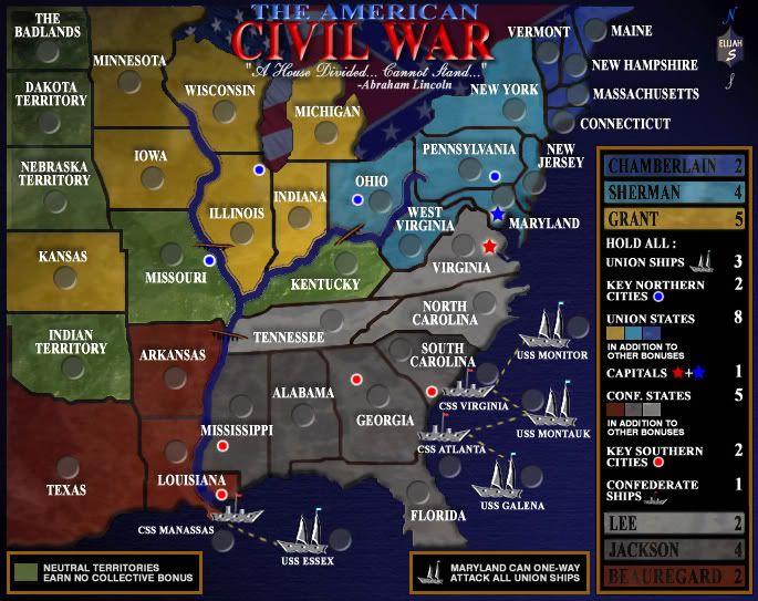
Notable differences:
-The color schemes
-The river's now match the ocean color
-Flags have been put in the blue-gray version
-A new texture in the blue-gray
-Gettysburg has replaced Philadelphia as a key northern city
The two maps are now in a poll which will determine what color scheme gets quenched.
When the poll has been decided some additional fine-tuning will be done to only the map which is selected by the CC Community.
Map B - Blue/Gray
Notable differences:
-The color schemes
-The river's now match the ocean color
-Flags have been put in the blue-gray version
-A new texture in the blue-gray
-Gettysburg has replaced Philadelphia as a key northern city
The two maps are now in a poll which will determine what color scheme gets quenched.
When the poll has been decided some additional fine-tuning will be done to only the map which is selected by the CC Community.
-
Elijah S
- Posts: 672
- Joined: Wed May 09, 2007 6:24 pm
..
![]() by Suzy1 on Fri Dec 07, 2007 12:09 am
by Suzy1 on Fri Dec 07, 2007 12:09 am
Oaktown, I think the shadow you are referring to is a bevel. I love these maps. My only problem is deciding which one to vote for. However, I have always been parital to the blue and the gray with the flags. You have done a fantastic job combining the colors. Looks like a quencher to me.
Last edited by Suzy1 on Fri Dec 07, 2007 1:11 am, edited 1 time in total.
-
Suzy1
- Posts: 269
- Joined: Sat May 12, 2007 3:25 am


![]() by DukeToshiro on Fri Dec 07, 2007 12:48 am
by DukeToshiro on Fri Dec 07, 2007 12:48 am
Elijah S wrote:-Vicksburg has replaced Memphis as one of the south's key cities.
Cool, a suggestion of mine made it into a CC map! This map looks like a ton of fun and I can't wait to play it. Great job!
-

DukeToshiro
- Posts: 103
- Joined: Wed Sep 12, 2007 5:17 pm
- Location: Oklahoma


![]() by reverend_kyle on Fri Dec 07, 2007 1:29 am
by reverend_kyle on Fri Dec 07, 2007 1:29 am

this map has come a long way.
DANCING MUSTARD FOR POOP IN '08!
-

reverend_kyle
- Posts: 9250
- Joined: Tue Mar 21, 2006 4:08 pm
- Location: 1000 post club

![]() by AndyDufresne on Fri Dec 07, 2007 3:47 pm
by AndyDufresne on Fri Dec 07, 2007 3:47 pm
Indeed it has, Reverend Kyle! Some of my favorite maps are those that truly develop and evolve...and this map certainly fits that case!
I voted for the blue/gray...it seems to reflect a mood the map should have.
It's looking good Elijah!
--Andy
I voted for the blue/gray...it seems to reflect a mood the map should have.
It's looking good Elijah!
--Andy
-

AndyDufresne
- Posts: 24919
- Joined: Fri Mar 03, 2006 8:22 pm
- Location: A Banana Palm in Zihuatanejo

![]() by Unit_2 on Fri Dec 07, 2007 4:04 pm
by Unit_2 on Fri Dec 07, 2007 4:04 pm
i see around the name "Louisiana" there is bright blue its really sticking out to me.
though for the maps i like A better but you need to add the flags and stuff like you did to B without the blue/grey.
also i like the blue better in the B map, how about you try to change the blue in A to that color(the Sherman area blue).
though for the maps i like A better but you need to add the flags and stuff like you did to B without the blue/grey.
also i like the blue better in the B map, how about you try to change the blue in A to that color(the Sherman area blue).

-

Unit_2
- Posts: 1834
- Joined: Sun Jan 14, 2007 12:59 pm
- Location: Pennsylvania, U.S.A, North America, Earth, Milky Way, Universe.


![]() by Elijah S on Fri Dec 07, 2007 4:52 pm
by Elijah S on Fri Dec 07, 2007 4:52 pm
Unit_2 wrote:i see around the name "Louisiana" there is bright blue its really sticking out to me.
though for the maps i like A better but you need to add the flags and stuff like you did to B without the blue/grey.
also i like the blue better in the B map, how about you try to change the blue in A to that color(the Sherman area blue).
I don't see what you mean about the blue around Louisiana...
As for your other comments, these are the choices and I'm not planning to do anything further to the color schemes.
The flags in the blue-gray version clashed with the color scheme in the earthtone version and that's why they were left out.
-
Elijah S
- Posts: 672
- Joined: Wed May 09, 2007 6:24 pm
![]() by Elijah S on Fri Dec 07, 2007 4:56 pm
by Elijah S on Fri Dec 07, 2007 4:56 pm
AndyDufresne wrote:Indeed it has, Reverend Kyle! Some of my favorite maps are those that truly develop and evolve...and this map certainly fits that case!
I voted for the blue/gray...it seems to reflect a mood the map should have.
It's looking good Elijah!
--Andy
Thanks Andy... this has been a real learning experience for me, and while some of the input during this project really got to me, I have to admit that they made me even more determined to make this a great map.
-
Elijah S
- Posts: 672
- Joined: Wed May 09, 2007 6:24 pm
![]() by AndyDufresne on Fri Dec 07, 2007 7:48 pm
by AndyDufresne on Fri Dec 07, 2007 7:48 pm
Glad to hear it and glad that you stuck through. I hope you've got some other ideas to work on after this map!
--Andy
--Andy
-
AndyDufresne
- Posts: 24919
- Joined: Fri Mar 03, 2006 8:22 pm
- Location: A Banana Palm in Zihuatanejo
![]() by Lord Zod on Sat Dec 08, 2007 5:47 am
by Lord Zod on Sat Dec 08, 2007 5:47 am
I think you should get rid of the cities as some of the ones chosen were not that major during the civil war plus you would be getting a bonus simply for having a territory which some would have with the drop. Also the capitals should be separate territories if the are going to have a bonus.
This map does look interesting though and I hope you can work it out soon.
This map does look interesting though and I hope you can work it out soon.
All kneel before ZOD!!!
-

Lord Zod
- Posts: 40
- Joined: Sat Nov 03, 2007 10:17 am
![]() by spiesr on Sat Dec 08, 2007 9:22 am
by spiesr on Sat Dec 08, 2007 9:22 am
Lord Zod wrote:I think you should get rid of the cities as some of the ones chosen were not that major during the civil war plus you would be getting a bonus simply for having a territory which some would have with the drop. Also the capitals should be separate territories if the are going to have a bonus.
This map does look interesting though and I hope you can work it out soon.
You could be dropped on any continent, I don't see how these would be any worse.
They are separate territories...
-

spiesr
- Posts: 2809
- Joined: Mon May 08, 2006 10:52 am
- Location: South Dakota


Who is online
Users browsing this forum: No registered users
|
|||||||
| Conquer Club is not associated with RISK online in any way. Copyright © 2006-2024 by Big Wham LLC | |||||||