Page 1 of 12

Dungeon of Draknor - Halls of Testing [Quenched]

PostPosted: Sun Oct 07, 2007 12:32 pm
by WidowMakers
ImageImageImageImageImageImage
XML:
http://www.fileden.com/files/2007/6/15/ ... 0fixed.xml
Large:
http://img212.imageshack.us/img212/9821/dodl115lhq5.jpg
Small:
http://img297.imageshack.us/img297/7932/dodl115sel8.jpg

Image
Image
==================================================
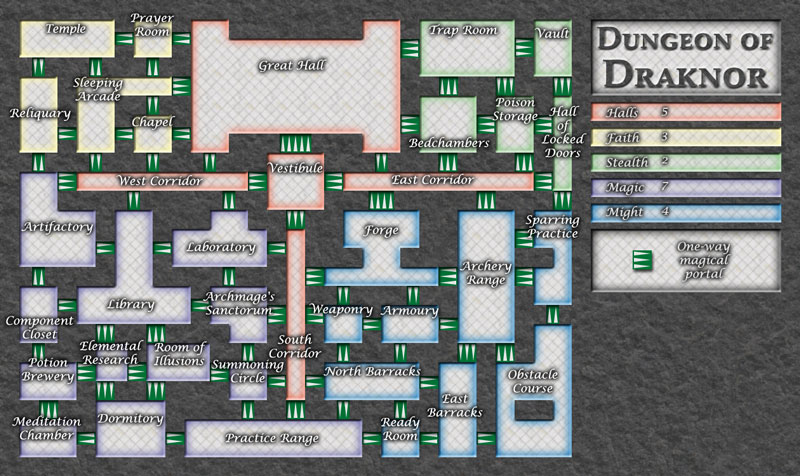
Map Information Page

Dungeon of Draknor - The Halls of Testing Concept by Jota / Design & XML by WidowMakers
Map Creation Thread: http://www.conquerclub.com/forum/viewtopic.php?t=29184
Number of Territories: 37
Number of Continents: 5
Gameplay Features: One Way Borders

Accompanying Story:
    Your sword has had quite a workout today, mowing down the undead minions summoned by the evil sorcerer Draknor to guard his fortress. According to Belegruin, your closest friend and an expert spellcaster, this is the last room before you reach Draknor's lair. While little Garrick -- hired against your better judgement for his quick reflexes and nimble fingers -- checks the final door for traps, you sit back to rest and let the party's healer tend to your wounds.

    "Hold it!" shouts Garrick, "It's a trap!"

    "Then disable it and pick the lock," you answer wearily. "That's what you're here for."

    "No, it's not on the door. It's the whole room. Look at the floor!"

    All of you look down. The floor tiles are covered with strange sigils. They mean nothing to you, but Belegruin clearly recognizes them.

    "The munchkin is right," he says. "This is a teleportation circle with glyphs of warding around the edges... we're trapped here. This enchantment is too powerful for me to break."

    Just then, a deep, maniacal laughter echoes through the chamber. "You thought you might defeat me, adventurers? I am Draknor, the greatest wizard who ever lived! Now you will go where all the others who sought to infiltrate my fortress were sent: into my dungeon maze, a labyrinth of 1-way doors from which there is no escape!

    Can you prove yourself worthy by conquering the entire dungeon and making it safely to the next level alive?
Recommended Gameplay Settings:
    Any
Gameplay Feature Associations:
    1) One Way Borders-All territories are connected with one way doors.
Map Description:
    The Dungeon of Draknor-The Halls of Testing is the first level of three, for this map series. Due to the fact that every door is a one way border, the way a player defends and attacks neighboring bonus areas is much trickier than on a standard two way border map.
=========================================
Feel free to post suggestions for the Map info Page


The story portion was from the original thread started by Jota. It will stay like that for to most part (theme wise) but additions and tweaks can be made to the sentences.


===============================================================
FIRST POST

I have also been asked to revisit this map that Jota had previously been working on. The original thread can be seen here.

http://www.conquerclub.com/forum/viewto ... ht=draknor

Most of the map is the same, I added the Main Gate territory to show the entrance for the map.

While I was in contact with Jota to discuss the development and ideas I came up with some suggestions to alter gameplay. He liked the ideas but did not want the basic gameplay (1-way borders) to be changed. I then proposed an idea to him.

What if I make a 3 level dungeon and each level get more and more XML features and gameplay aspects. He agreed to that.

Level 1- Dungeon of Draknor: Halls of Testing
Level 2- Dungeon of Draknor: Crypts and Catacombs
Level 3- Dungeon of Draknor: Secret of Draknor

So this is level 1. It is a revamp of his original idea. The other 2 levels will be started once the graphical elements are worked out in this one. I wish to keep the three maps as similar in style as possible (doors, textures, title style, etc).

So basically right now the comments I need are Bonus suggestions, colors and door direction.

This is the small map.
Image
Original Map
Image

PostPosted: Sun Oct 07, 2007 1:04 pm
by Unit_2
i realy don't think that this map is a good one becuase, its too confusing :?

PostPosted: Sun Oct 07, 2007 1:48 pm
by Wisse
i love confusing map (as long as they aren't as confusing as AoM) continue!

PostPosted: Fri Oct 12, 2007 8:43 pm
by WidowMakers
OK.. I need suggestion on this map. Bonuses and directions of the one-way doors.

Or is it done?

I still plan on adding little artifacts things through out the map. Making the floors dirty and grungy. Just like an self respecting dungeon would have.

WM

PostPosted: Fri Oct 12, 2007 10:34 pm
by cairnswk
WM...are there any copyright issues to be handled here? For the title, concept etc.

PostPosted: Sat Oct 13, 2007 4:40 am
by cena-rules
maybe make magic and might more contrasting

PostPosted: Sat Oct 13, 2007 5:39 am
by spinwizard
I remember making 1 like this

PostPosted: Sat Oct 13, 2007 5:42 am
by spinwizard

PostPosted: Sat Oct 13, 2007 6:21 am
by Iliad
I like this map the only problem is seeing which borders in a continent can be attacked or not

PostPosted: Sat Oct 13, 2007 8:36 am
by WidowMakers
Iliad wrote:I like this map the only problem is seeing which borders in a continent can be attacked or not
I guess I don't know what you mean. The top right corner of the new map has the instruction for attacking. The green arrows are the attack routes.

WM

map

PostPosted: Sat Oct 13, 2007 8:51 am
by WL_southerner
nice concept map if i have any ideas i come back and post them

PostPosted: Sat Oct 13, 2007 8:59 am
by WidowMakers
cairnswk wrote:WM...are there any copyright issues to be handled here? For the title, concept etc.
1) I will contact Jota and look into the name of the map. We can always make up another if there are any issues.
There does not seem to be anything on wikipedia and there are several other websites and unrelated pages that use the name.

2) As far as the concept goes, Jota gave the project to me to complete (ask Andy). I only needed to keep the basic layout and attacking concept. I could redo the graphics and make minor gameplay changes as the community desired (switching 1-way doors or adding/subtracting them).

PostPosted: Sat Oct 13, 2007 9:04 am
by yamahafazer
WidowMakers wrote:OK.. I need suggestion on this map. Bonuses and directions of the one-way doors.


Maybe if you just instead of having 3 arrows for the directions just make the border the same with just a kink in it in the direction that movement is allowed so that the map doesn't look so crowded.

I think that you also might need to make the colures of "magic" and "might" a little more distinguishable.

Re: Dungeon of Draknor - Reborn

PostPosted: Sat Oct 13, 2007 3:13 pm
by mibi
WidowMakers wrote:I have also been asked to revisit this map that Jota had previously been working on. The original thread can be seen here.

http://www.conquerclub.com/forum/viewto ... ht=draknor

Most of the map is the same, I added the Main Gate territory to show the entrance for the map.

While I was in contact with Jota to discuss the development and ideas I came up with some suggestions to alter gameplay. He liked the ideas but did not want the basic gameplay (1-way borders) to be changed. I then proposed an idea to him.

What if I make a 3 level dungeon and each level get more and more XML features and gameplay aspects. He agreed to that.

Level 1- Dungeon of Draknor: Halls of Testing
Level 2- Dungeon of Draknor: Crypts and Catacombs
Level 3- Dungeon of Draknor: Secret of Draknor

So this is level 1. It is a revamp of his original idea. The other 2 levels will be started once the graphical elements are worked out in this one. I wish to keep the three maps as similar in style as possible (doors, textures, title style, etc).

So basically right now the comments I need are Bonus suggestions, colors and door direction.

This is the small map.
Image
Original Map
Image


I love the initial idea of this map with all the one way borders and confusing trapped-in-a-dungeon aspect but there is a serious issue with the graphics as far as im concerned.

First off, the title treatment is really great, it fits the mood and style perfectly. Unfortunately the rest of the map looks like some neon electrical diagram. The map part in no ways conveys a dungeon, and taking the dungeon feel out of this map is wrong.

My main issues are two. First, the colors are rediculous and totally unnessasry. Please find a more creative way to convey a separation of territory, try patterns, texture, lighting, but don't overlay the skittles rainbow.

second the 'magic portals' are just dumb. why are they there instead of regular connected one way borders. Since when is a dungeon a serious of seperate chambers connected with bright green magical arrows. This also ruins the style and dungeon aspect. As yamahafazer said above, a regular connecting hallway with a kink or subtle arrow is the proper way to bring this map from the grasp of the rainbow faeries.

I was actually considering revisting this map myself but im glad you took it on.

Re: Dungeon of Draknor - Reborn

PostPosted: Sun Oct 14, 2007 7:22 am
by WidowMakers
mibi wrote:I love the initial idea of this map with all the one way borders and confusing trapped-in-a-dungeon aspect but there is a serious issue with the graphics as far as im concerned.

First off, the title treatment is really great, it fits the mood and style perfectly. Unfortunately the rest of the map looks like some neon electrical diagram. The map part in no ways conveys a dungeon, and taking the dungeon feel out of this map is wrong.

My main issues are two. First, the colors are rediculous and totally unnessasry. Please find a more creative way to convey a separation of territory, try patterns, texture, lighting, but don't overlay the skittles rainbow.

second the 'magic portals' are just dumb. why are they there instead of regular connected one way borders. Since when is a dungeon a serious of seperate chambers connected with bright green magical arrows. This also ruins the style and dungeon aspect. As yamahafazer said above, a regular connecting hallway with a kink or subtle arrow is the proper way to bring this map from the grasp of the rainbow faeries.

I was actually considering revisting this map myself but im glad you took it on.


OK
-I will eliminate the colors (rainbow) but will probably use some browns and grays to help distinguish areas.
-The floors have different texture now, I will try to make that stand out more.

-Change the doors. I guess I kept it the same idea as Jota's because others felt it was OK then. Apparently not now. I will look into several designs and post the m for everyone to evaluate.

Thanks for the advice everyone. These are the things I wanted to get worked out before the other two maps got started. As mentioned above I want as many of the graphical aspect to be agreed upon and standardize for first map so the other 2 levels will look similar an dfeel a part of the whole.

WM

PostPosted: Sun Oct 14, 2007 10:10 am
by cairnswk
WidowMakers wrote:
cairnswk wrote:WM...are there any copyright issues to be handled here? For the title, concept etc.
1) I will contact Jota and look into the name of the map. We can always make up another if there are any issues.
There does not seem to be anything on wikipedia and there are several other websites and unrelated pages that use the name.

2) As far as the concept goes, Jota gave the project to me to complete (ask Andy). I only needed to keep the basic layout and attacking concept. I could redo the graphics and make minor gameplay changes as the community desired (switching 1-way doors or adding/subtracting them).


Thanks WM

PostPosted: Mon Oct 15, 2007 11:32 am
by Gnome
maybe you can inplant some 'traps' like a chamber that gives you -1 witout telling so in the legend...maybe same for 'chest rooms' that give you +1 (but that would need new xml...so the bonus gets only given once...)

PostPosted: Mon Oct 15, 2007 5:42 pm
by WidowMakers
Gnome wrote:maybe you can inplant some 'traps' like a chamber that gives you -1 witout telling so in the legend...maybe same for 'chest rooms' that give you +1 (but that would need new xml...so the bonus gets only given once...)
This XML cannot be done (as of yet) plus Jota requested that I keep his vision alive in the first level of the dungeon. I have several other ideas for the lower 2 levels once this gets done.

PostPosted: Mon Oct 15, 2007 5:47 pm
by WidowMakers
Version 2

OK here is the next revision
Changes:
Colors/textures-I made the territories more texture and differentiated them with out TONS of color. some of the texture have their own natural color anyway.
Arrows-I took out the green arrows (forgot to in the legend) and added some plain gradated ones.
When trying to make doors look good, the issue comes up that a door would allow movement both ways. I think an opening and an arrow is the best.
So is this arrow good or show some other ones?


Image

After the texture and arrows are in place and agreed upon, we can start discussing the direction of the arrows and thus bonuses.
Plus I will begin to add character to each of the rooms based on the purpose of the room and the artifacts that may be in them.

PostPosted: Mon Oct 15, 2007 5:50 pm
by Coleman
I'm not sure about that arrow, hard to see for me.

PostPosted: Mon Oct 15, 2007 6:43 pm
by Aerial Attack
I liked the graduated colors of your Version 1 arrows. I think they may have been a bit too tall and not wide enough.

Your Version 2 arrows don't have enough pizazz. They aren't tall enough, but I think the width is right. They need a bit more color/gradation.

EDIT: My comments apply to arrows configured left to right or vice versa (i.e. >>>).

PostPosted: Tue Oct 16, 2007 7:53 am
by yamahafazer
I think the new arrows are MUCH better than the ones before. I can see why some might find them hard to read, so maybe if you make several that you are happy with and then put it to a poll?

Less colure is definatly better but I think that they might still be a bit bright for a dongeon. Could you make it a bit darker?

I like the texture in the top right. I think that's spot on.

All in all a definate improvment :wink:

PostPosted: Tue Oct 16, 2007 6:32 pm
by WidowMakers
Here is a quick stab at the arrows. I want to see what everyone thinks. I am not going to do a poll. They take too long.

I want suggestions and choices. Once I get some feedback i will adjust accordingly.

I still like #1 maybe with a little color of blue or green. Or maybe varying colors based on the rooms it is connecting?

Image


WM

PostPosted: Tue Oct 16, 2007 6:49 pm
by unriggable
To me either 1 or 3 is most appealing.

PostPosted: Tue Oct 16, 2007 7:37 pm
by mibi
I think you should lose the arrows and add actual hallways or breaks in the walls. You know something people can actually walkthrough, otherwise its still a series of seperate rooms. And then add arrows on top or something.

Also, this dungeon looks like a palace, it needs to be dirtied up and shadows and such. Kind of like the wards in Siege :wink: