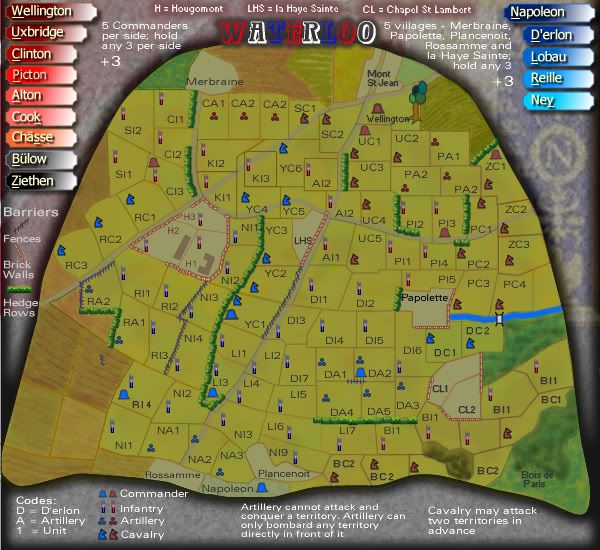
Cairns - the shape of napolean's hat in the picture above is nice, but i must say the stretched transformation seems more like a safari hat. The concept is good, but keep the shape of the original, maybe rotate it 35-40o (degres) so that the point is down on the left a little and going across the page (if some of the corners get chopped off i wouldn't say that's a problem - so long as the shape, i.e. what the image is, can be discerned - the present transformation truly is a little misleading) - ultimately, at the same time as providing the space for the field of battle, it would be really nice if it could be only so slightly discernable as a transparency {if you could get it to not interfere with the practical bits of the map}, this would also help the case for not needing to see the whole hat.
P.S. - the battle took place on a hill didn't it? - If it's at all within your sights, i'd love to see a bit of a foreground/background setting, i.e a little more three dimensional (though not necc. 3D), i think the setting of this battle certainly urges it.
My thought is, that, Wellington's troops, placed a little to the north west of the map (i.e. within the hat that run's the opposite direction as mentioned above) would be presented as the highest point in your graphical representation, moving down to Napolean's army to the south east. (it seems the diagonal/slant would be a good way of representing slope)
Ahh, if this is the case, then the landscape, of the hill, could take up your whole map, though the playing area could still reamain within the hat, which now, is more of an outline - though still inclusionary(of the playing field)/exclusionary(of the bonus info and left over land etc). Here, the landscape outside of the hat could be shadded/dimmed/whatever's appropriate. This would also give you the chance of keeping some of the original hat's graphics around the unused verges.
Battle of Waterloo [Quenched]
Moderator: Cartographers

![]() by cairnswk on Fri Nov 09, 2007 11:07 am
by cairnswk on Fri Nov 09, 2007 11:07 am
yeti_c....too much...i've already tried all those figurines etc...and they simply just don't fit the curent size restrictions of the small map. Sorry. 

* Pearl Harbour * Waterloo * Forbidden City * Jamaica * Pot Mosbi
-

 cairnswk
- Posts: 11510
- Joined: Sat Feb 03, 2007 8:32 pm
- Location: Australia


![]() by Coleman on Fri Nov 09, 2007 11:11 am
by Coleman on Fri Nov 09, 2007 11:11 am
Mind if I try to build symbols closer to those that fit? I could give you a set later of a few attempts. I just don't like that the calvary is flags.
The infantry and artillery are actually probably as good as possible. Couldn't you try something like a knight chess piece instead of a flag?
The infantry and artillery are actually probably as good as possible. Couldn't you try something like a knight chess piece instead of a flag?
Warning: You may be reading a really old topic.
-

Coleman
- Posts: 5402
- Joined: Tue Jan 02, 2007 10:36 pm
- Location: Midwest


![]() by cairnswk on Fri Nov 09, 2007 11:25 am
by cairnswk on Fri Nov 09, 2007 11:25 am
asl80 wrote:Cairns - the shape of napolean's hat in the picture above is nice, but i must say the stretched transformation seems more like a safari hat. The concept is good, but keep the shape of the original, maybe rotate it 35-40o (degres) so that the point is down on the left a little and going across the page (if some of the corners get chopped off i wouldn't say that's a problem - so long as the shape, i.e. what the image is, can be discerned - the present transformation truly is a little misleading) - ultimately, at the same time as providing the space for the field of battle, it would be really nice if it could be only so slightly discernable as a transparency {if you could get it to not interfere with the practical bits of the map}, this would also help the case for not needing to see the whole hat.
P.S. - the battle took place on a hill didn't it? - If it's at all within your sights, i'd love to see a bit of a foreground/background setting, i.e a little more three dimensional (though not necc. 3D), i think the setting of this battle certainly urges it.
My thought is, that, Wellington's troops, placed a little to the north west of the map (i.e. within the hat that run's the opposite direction as mentioned above) would be presented as the highest point in your graphical representation, moving down to Napolean's army to the south east. (it seems the diagonal/slant would be a good way of representing slope)
Ahh, if this is the case, then the landscape, of the hill, could take up your whole map, though the playing area could still reamain within the hat, which now, is more of an outline - though still inclusionary(of the playing field)/exclusionary(of the bonus info and left over land etc). Here, the landscape outside of the hat could be shadded/dimmed/whatever's appropriate. This would also give you the chance of keeping some of the original hat's graphics around the unused verges.
asl80...this is now the 10th time i have tried to get this map into some form of a map for CC....and it is for all intense purposes working to a degree. I also probably don't have the skill you speak of to present the things you need.
I appreciate the length you proposed above, but at this time i don't want to change it from where it is at present, its is simply too much work.
As it is now the next stage is to put it into continents that are spearated somewwhat bny fences and hedge rows.
Yes the battle did take place on a hill, but that is vey hard to convey on a 2 dimensional map, especially if you want to have all the abilities of artillery and cavalry.
The shape of Napoleon's hat is also goping to remain unchanged as this allows the map with plenty of room for the bonus information around the outside. Sorry
* Pearl Harbour * Waterloo * Forbidden City * Jamaica * Pot Mosbi
-
cairnswk
- Posts: 11510
- Joined: Sat Feb 03, 2007 8:32 pm
- Location: Australia
![]() by asl80 on Fri Nov 09, 2007 11:57 am
by asl80 on Fri Nov 09, 2007 11:57 am
Haha - no worries, cheers for the words. But "tell him he's dreaming" would have sufficed.
(I trust you get the reference)
Anyway, good luck, i look forward to seeing it move along in any case.
Reakon you could maybe take coleman up on his offer with the symbols though, see what he comes up with.
(I trust you get the reference)
Anyway, good luck, i look forward to seeing it move along in any case.
Reakon you could maybe take coleman up on his offer with the symbols though, see what he comes up with.
-
asl80
- Posts: 208
- Joined: Wed Jun 27, 2007 10:07 am


![]() by cairnswk on Fri Nov 09, 2007 12:08 pm
by cairnswk on Fri Nov 09, 2007 12:08 pm
Coleman wrote:Mind if I try to build symbols closer to those that fit? I could give you a set later of a few attempts. I just don't like that the calvary is flags.
The infantry and artillery are actually probably as good as possible. Couldn't you try something like a knight chess piece instead of a flag?
Yes, i can cope with that if that's what you really want. A full horse is simply too broad, and i have made adjustments in the next version to turn the cannon into cannon balls although that isnopt so advanced yet.
As to the terits, i have come up with the idea of using fences and hedge rows to separate some of the continent lines out so that this is not another Actium.
Appreciate your offers.
* Pearl Harbour * Waterloo * Forbidden City * Jamaica * Pot Mosbi
-
cairnswk
- Posts: 11510
- Joined: Sat Feb 03, 2007 8:32 pm
- Location: Australia
![]() by cairnswk on Fri Nov 09, 2007 12:11 pm
by cairnswk on Fri Nov 09, 2007 12:11 pm
asl80 wrote:Haha - no worries, cheers for the words. But "tell him he's dreaming" would have sufficed.
(I trust you get the reference)
Anyway, good luck, i look forward to seeing it move along in any case.
Reakon you could maybe take coleman up on his offer with the symbols though, see what he comes up with.
Yes asl80...i get the reference LOL, but that is an insufficient answer and justification for not wanting to change it. That sort of reply can get a rebuttal in certain quarters, if you know what i mean. I would prefer to be a little verbose and give good justification but done in a polite manner.
* Pearl Harbour * Waterloo * Forbidden City * Jamaica * Pot Mosbi
-
cairnswk
- Posts: 11510
- Joined: Sat Feb 03, 2007 8:32 pm
- Location: Australia
![]() by RjBeals on Fri Nov 09, 2007 9:13 pm
by RjBeals on Fri Nov 09, 2007 9:13 pm
I'm one of them who do not like the hat outline. I used my brain and still didn't figure it out. Sorry. I think because there is no depth to it. And I also was looking for 4 vertical bands, and only found them (horizontally) when I looked at an earlier version that wasn't so busy. You do say "across it" but I think the prominent diagonal running up and down got my focus first. You sure do think outside the box though. This is almost too much for me to take. Sorry - you do hold the title of creating my favorite map though (Bamboo Jack). That is pure beauty.

-

RjBeals
- Posts: 2506
- Joined: Mon Nov 20, 2006 5:17 pm
- Location: South Carolina, USA

![]() by Herakilla on Fri Nov 09, 2007 10:34 pm
by Herakilla on Fri Nov 09, 2007 10:34 pm
i found the bands immediately but maybe my mind works different lol!
Come join us in Live Chat!
-
Herakilla
- Posts: 4283
- Joined: Fri Jun 09, 2006 8:33 pm
- Location: Wandering the world, spreading Conquerism


![]() by cairnswk on Mon Nov 12, 2007 9:13 am
by cairnswk on Mon Nov 12, 2007 9:13 am
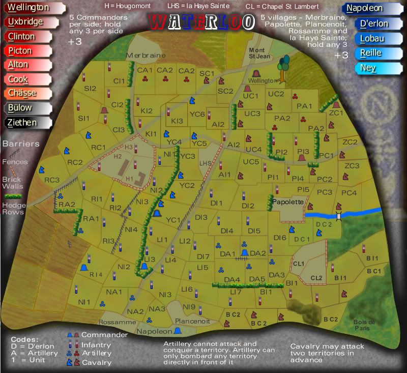
Version 5 Update.
Here's what i've done.
I wokred on the Napoleon side only and
1. condensed a few terts
2. changed the icons to horse chess pieces for cavalry and cannon balls for artillery.
3. changed the font to a 1 px larger size and something clearer
4. added hedgerows and fences as dividers for continents
Does this work for you?
Small

Large

Here's what i've done.
I wokred on the Napoleon side only and
1. condensed a few terts
2. changed the icons to horse chess pieces for cavalry and cannon balls for artillery.
3. changed the font to a 1 px larger size and something clearer
4. added hedgerows and fences as dividers for continents
Does this work for you?
Small
Large
* Pearl Harbour * Waterloo * Forbidden City * Jamaica * Pot Mosbi
-
cairnswk
- Posts: 11510
- Joined: Sat Feb 03, 2007 8:32 pm
- Location: Australia
![]() by cairnswk on Mon Nov 12, 2007 9:22 am
by cairnswk on Mon Nov 12, 2007 9:22 am
yeti_c wrote:Your army number on the large are too big!!!
C.
yes...that's coz they're simply upsized from the small map...nothing to concern at this stage i don't think. Thanks, Yeti_c
* Pearl Harbour * Waterloo * Forbidden City * Jamaica * Pot Mosbi
-
cairnswk
- Posts: 11510
- Joined: Sat Feb 03, 2007 8:32 pm
- Location: Australia
![]() by yeti_c on Mon Nov 12, 2007 9:26 am
by yeti_c on Mon Nov 12, 2007 9:26 am
Artillery wording...
Why not something like...
"Artillery can bombard any enemy position"
That way you don't need to mention bands and so forth...
Also it should mention that Artillery shouldn't be able to attack anyone (just bombard)
C.
Why not something like...
"Artillery can bombard any enemy position"
That way you don't need to mention bands and so forth...
Also it should mention that Artillery shouldn't be able to attack anyone (just bombard)
C.

Highest score : 2297
-

yeti_c
- Posts: 9624
- Joined: Thu Jan 04, 2007 9:02 am


![]() by cairnswk on Mon Nov 12, 2007 9:33 am
by cairnswk on Mon Nov 12, 2007 9:33 am
yeti_c wrote:Artillery wording...
Why not something like...
"Artillery can bombard any enemy position"
That way you don't need to mention bands and so forth...
Also it should mention that Artillery shouldn't be able to attack anyone (just bombard)
C.
OK...i guess it is feasible for this to occur... iwas thinking of keeping it within ranges, but as you pointed out this might alleviate the band idea....which in itself woudl be good.
and will add the bit about bombard also in next version.
Should the artillery only be able to bombard directly in front of its position? Given that Ajax is working and brings up the terts that one can attack to, would this work?
* Pearl Harbour * Waterloo * Forbidden City * Jamaica * Pot Mosbi
-
cairnswk
- Posts: 11510
- Joined: Sat Feb 03, 2007 8:32 pm
- Location: Australia
![]() by yeti_c on Mon Nov 12, 2007 9:44 am
by yeti_c on Mon Nov 12, 2007 9:44 am
cairnswk wrote:yeti_c wrote:Artillery wording...
Why not something like...
"Artillery can bombard any enemy position"
That way you don't need to mention bands and so forth...
Also it should mention that Artillery shouldn't be able to attack anyone (just bombard)
C.
OK...i guess it is feasible for this to occur... iwas thinking of keeping it within ranges, but as you pointed out this might alleviate the band idea....which in itself woudl be good.
and will add the bit about bombard also in next version.
Should the artillery only be able to bombard directly in front of its position? Given that Ajax is working and brings up the terts that one can attack to, would this work?
Whereas I like the idea... I dislike that BOB has to pick up the burden of working out what is going on in a map...
I think that a map should be understandable without BOB...
If you can find a way of describing this in the instructions then yes... otherwise no!
C.
C.
Highest score : 2297
-
yeti_c
- Posts: 9624
- Joined: Thu Jan 04, 2007 9:02 am
Version 6 Update
![]() by cairnswk on Tue Nov 13, 2007 6:46 pm
by cairnswk on Tue Nov 13, 2007 6:46 pm
Version 6 Update
Bonuses not yet evalutation!
Changes:
1. resize done on overall design to increase amount for map and individual terts.
2. All terts fits 3 digit armies
3. basic colour given as background to terts for easy reading army numbers
4. some gameplay options added.
Small
Large
Bonuses not yet evalutation!
Changes:
1. resize done on overall design to increase amount for map and individual terts.
2. All terts fits 3 digit armies
3. basic colour given as background to terts for easy reading army numbers
4. some gameplay options added.
Small
Large
* Pearl Harbour * Waterloo * Forbidden City * Jamaica * Pot Mosbi
-
cairnswk
- Posts: 11510
- Joined: Sat Feb 03, 2007 8:32 pm
- Location: Australia
![]() by Coleman on Tue Nov 13, 2007 7:55 pm
by Coleman on Tue Nov 13, 2007 7:55 pm
I'm confused for once.
The nameplates help explain how the places are named right?
Why is D'erlon in codes and in a name plate. What is codes even about? (EDIT: Nevermind, it's an example of how places are named... It's going to need improving)
There are 2 CA2 territories.
A place down by BI1 and BC1 with an infantry inside doesn't even have a name.
BC2 is a really confusing territory, but I'm not sure how to improve it.
NI1's 1 is poorly placed, nudge left?
The tree in wellington is hideous (sorry) does it have some sort of historical significance? Why is it there?
-
Coleman
- Posts: 5402
- Joined: Tue Jan 02, 2007 10:36 pm
- Location: Midwest
V 7 Update
![]() by cairnswk on Tue Nov 13, 2007 8:44 pm
by cairnswk on Tue Nov 13, 2007 8:44 pm
Coleman wrote:I'm confused for once.
The nameplates help explain how the places are named right?
Why is D'erlon in codes and in a name plate. What is codes even about? (EDIT: Nevermind, it's an example of how places are named... It's going to need improving)
Improved in V7 below i hope.
There are 2 CA2 territories.
Fixed.
A place down by BI1 and BC1 with an infantry inside doesn't even have a name.
Fixed
BC2 is a really confusing territory, but I'm not sure how to improve it.
Improved but still needs more work i think.
NI1's 1 is poorly placed, nudge left?
All Napoleon's terts renamed.
The tree in wellington is hideous (sorry) does it have some sort of historical significance? Why is it there?
Yes, Addy (Wellington, in the movie and in print was near a tree when it was struck by artillery fire, so it does have historical reference. Mind you it was probably one of the only trees around in that area that day.
But yes it does need fixing and will be attended to later.
Version 7 Update
Small

Large

* Pearl Harbour * Waterloo * Forbidden City * Jamaica * Pot Mosbi
-
cairnswk
- Posts: 11510
- Joined: Sat Feb 03, 2007 8:32 pm
- Location: Australia
![]() by unriggable on Tue Nov 13, 2007 9:09 pm
by unriggable on Tue Nov 13, 2007 9:09 pm
Artillery is useless in this, i suggest you fix it's role.

-

unriggable
- Posts: 8037
- Joined: Thu Feb 08, 2007 9:49 pm

![]() by Herakilla on Tue Nov 13, 2007 9:40 pm
by Herakilla on Tue Nov 13, 2007 9:40 pm
whats the differnce from YC1's commander and the others? its signifacantly different visually
Come join us in Live Chat!
-
Herakilla
- Posts: 4283
- Joined: Fri Jun 09, 2006 8:33 pm
- Location: Wandering the world, spreading Conquerism
![]() by cairnswk on Tue Nov 13, 2007 9:41 pm
by cairnswk on Tue Nov 13, 2007 9:41 pm
unriggable wrote:Artillery is useless in this, i suggest you fix it's role.
...and i suggest you suggest less arrogantly about what to do with the artillery, unriggable.
If you can't offer anything of decent value than to criticise in this commenting role, then please don't bother to comment at all on my maps.
I won't bother to fix anything unless you can come up with a decent suggestion.
* Pearl Harbour * Waterloo * Forbidden City * Jamaica * Pot Mosbi
-
cairnswk
- Posts: 11510
- Joined: Sat Feb 03, 2007 8:32 pm
- Location: Australia
![]() by edbeard on Tue Nov 13, 2007 9:49 pm
by edbeard on Tue Nov 13, 2007 9:49 pm
is there a difference between "directly in front of it" and "any surrounding territory?"
Also same question for two territories in advance. (Also, I suggest you change that to "up to two")
I think you just mean these can bombard any territory it is directly connected to, and any territory up to two moves away (respectively), but the way you worded it might confuse people when they play the map for the first time.
Are there going to be bonuses for holding all of a commander's section?
Are there going to be bonuses for holding H, LHS, and CL (whether separate or combined)?
Any reason that Wellington and Ney's commander icons have bolder edges?
-

edbeard
- Posts: 2501
- Joined: Thu Mar 29, 2007 12:41 am


![]() by Herakilla on Tue Nov 13, 2007 10:02 pm
by Herakilla on Tue Nov 13, 2007 10:02 pm
edbeard wrote:Any reason that Wellington and Ney's commander icons have bolder edges?
thats exactly what i meant
and i think he means for the calvary to be real attacks, not bombard and i believe when he says ahead he means into the other armies territories and not behind to its own army
Come join us in Live Chat!
-
Herakilla
- Posts: 4283
- Joined: Fri Jun 09, 2006 8:33 pm
- Location: Wandering the world, spreading Conquerism
![]() by edbeard on Tue Nov 13, 2007 10:07 pm
by edbeard on Tue Nov 13, 2007 10:07 pm
if that's the case those are the words he should use.
Also, I know it's not a bombard. You just read what I wrote incorrectly. I was talking about both the artillery and calvary at the same time. So, the wording was quite confusing.
Also, I know it's not a bombard. You just read what I wrote incorrectly. I was talking about both the artillery and calvary at the same time. So, the wording was quite confusing.
-
edbeard
- Posts: 2501
- Joined: Thu Mar 29, 2007 12:41 am
Who is online
Users browsing this forum: No registered users
|
|||||||
| Conquer Club is not associated with RISK online in any way. Copyright © 2006-2024 by Big Wham LLC | |||||||