Hi SM,
I was wondering how you're doing with the updates. The thread has fallen quiet, so I wanted to check in. I don't think there's much to comment on until you get the new graphics throughout. Is there anything specific you'd like feedback on before then?
* What is the round white thing in "Counter" in the new graphics?
:I'm a girl face:
Best,
LMR
Operation Drug War [Quenched]
Moderator: Cartographers
Re: Operation Drug War v11 pg7
![]() by laci_mae on Sun Apr 13, 2008 8:17 pm
by laci_mae on Sun Apr 13, 2008 8:17 pm
-

 laci_mae
- Posts: 404
- Joined: Tue Jan 08, 2008 6:08 pm
- Location: Arkansas


Re: Operation Drug War v12 pg8
![]() by edbeard on Tue Apr 15, 2008 5:04 pm
by edbeard on Tue Apr 15, 2008 5:04 pm
- Click image to enlarge.

- Click image to enlarge.

v11
v10
v9
v8
v7
v6
v5
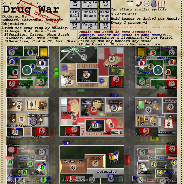
What you need to know
1. This is an objective map. Four different ones that all include holding the main stash.
2. There are 24 starting territories. Everything starts neutral except the 8 patrol cars, the 4 corner bosses, the 4 runners, the 4 corner junkies, the 4 counters.
That's 4*4 + 8 = 16 + 8 = 24
3. There are 35 other territories that start out as neutral
4. Number of neutrals on those territories has yet to be determined. Proposed 2 on all with the exceptions of 4 on objective territories and 6 on Main Stash
Just done:
1. graphics done! Lets give Telvannia a round of applause for the great job he's done on this.
2. corner graphics finished
3. added phone bonus back to legend that got taken off accidentally
4. Large map added!
5. Legend tinkering
To do:
1. finish gameplay talk
2. finalize neutral values
3. fix stash borders in south corners
Points of Discussion:
1. Laci I believe that is a water fountain
-

edbeard
- Posts: 2501
- Joined: Thu Mar 29, 2007 12:41 am


Re: Operation Drug War v12 pg8
![]() by oaktown on Tue Apr 15, 2008 9:22 pm
by oaktown on Tue Apr 15, 2008 9:22 pm
Legend thought: What if you start with the title where it is, but put the mini-map below it. This would allow you to have one or two columns of legend data to the right of the title/mini map in an unbroken block. And while I don't love the choice of font, I recognize the look you're going for... but maybe lose the italics on it? I'm cool with the look of the map itself, but the legend still seems clunky.

-

oaktown
- Posts: 4451
- Joined: Sun Dec 03, 2006 9:24 pm
- Location: majorcommand


Re: Operation Drug War v12 pg8
![]() by edbeard on Tue Apr 15, 2008 10:38 pm
by edbeard on Tue Apr 15, 2008 10:38 pm
oaktown wrote:Legend thought: What if you start with the title where it is, but put the mini-map below it. This would allow you to have one or two columns of legend data to the right of the title/mini map in an unbroken block. And while I don't love the choice of font, I recognize the look you're going for... but maybe lose the italics on it? I'm cool with the look of the map itself, but the legend still seems clunky.
I passed this along to Telvannia
Since you're the gameplay stamp dude, how about your thoughts on that? Here's how the starting territories and neutrals look
- Click image to enlarge.
-
edbeard
- Posts: 2501
- Joined: Thu Mar 29, 2007 12:41 am
Re: Operation Drug War v12 pg8
![]() by oaktown on Tue Apr 15, 2008 10:45 pm
by oaktown on Tue Apr 15, 2008 10:45 pm
edbeard wrote:Since you're the gameplay stamp dude, how about your thoughts on that? Here's how the starting territories and neutrals look
For starters, I consider the user-friendliness of the legend a pretty key part of the map's gameplay. If your map is hard to figure out, it's going to impact the play and, ultimately, the popularity of the map.
As for the starting counts, I'll try to take a closer look at them at some point, but my general feeling is that you know the map best, ed, so unless something looks way out of whack I'll leave that up to you. You may end up doing little tweaks here and there, but as long as the starting values don't put one player at an early advantage/disadvantage I suspect the starting values are fine.
-
oaktown
- Posts: 4451
- Joined: Sun Dec 03, 2006 9:24 pm
- Location: majorcommand
Re: Operation Drug War v12 pg8
![]() by edbeard on Tue Apr 15, 2008 10:51 pm
by edbeard on Tue Apr 15, 2008 10:51 pm
sounds good.
one thing I'd like your thoughts on though is the patrols bonus. since players start with them, that bonus might be something they go after early on. Do you think increasing it to 6 patrols for the +4 or decreasing the bonus to +3 would be beneficial?
one thing I'd like your thoughts on though is the patrols bonus. since players start with them, that bonus might be something they go after early on. Do you think increasing it to 6 patrols for the +4 or decreasing the bonus to +3 would be beneficial?
-
edbeard
- Posts: 2501
- Joined: Thu Mar 29, 2007 12:41 am
Re: Operation Drug War v12 pg8
![]() by AndyDufresne on Tue Apr 15, 2008 10:59 pm
by AndyDufresne on Tue Apr 15, 2008 10:59 pm
Regarding patrols, **scratches his chin, eats a banana** you could bump the number up to 6. I think I like that more than bumping the value down to 3....hm
--Andy
--Andy
-

AndyDufresne
- Posts: 24919
- Joined: Fri Mar 03, 2006 8:22 pm
- Location: A Banana Palm in Zihuatanejo


Re: Operation Drug War v12 pg8
![]() by oaktown on Wed Apr 16, 2008 12:16 am
by oaktown on Wed Apr 16, 2008 12:16 am
AndyDufresne wrote:Regarding patrols, **scratches his chin, eats a banana** you could bump the number up to 6. I think I like that more than bumping the value down to 3....hm
I would go the other way. I'd like to see a map in which players actually go after the objective rather than just pummel each other. I'd be in favor of giving less value to the territories/regions on which everybody starts, and make it more advantageous to expand into new turf/go after the victory objectives.
But then,it's late and I'm tired, so I should look more closely at the bonuses when I have fresher eyes.
-
oaktown
- Posts: 4451
- Joined: Sun Dec 03, 2006 9:24 pm
- Location: majorcommand
Re: Operation Drug War v12 pg8
![]() by edbeard on Wed Apr 16, 2008 12:47 am
by edbeard on Wed Apr 16, 2008 12:47 am
A.
I think I'll go with needing 6 patrols AND making it +3
I don't want patrols to be the focus in 1v1 games (even though this map is more of a 4 player game. at least I think anyway).
B.
Another thought/question is the bonuses in the Hideout Sector. Do you think there's enough incentive to go there?
1. You get +2 per muscle if you hold either leader or 2nd. It's fairly easy to get muscle though because all muscle start with 2 neutrals.
2. Only connection is the phone and the attorney (via DA).
C.
What do you think of the bonuses for the sectors? (the mini-map bonuses)
-
edbeard
- Posts: 2501
- Joined: Thu Mar 29, 2007 12:41 am
Re: Operation Drug War v12 pg8
![]() by gimil on Wed Apr 16, 2008 7:35 am
by gimil on Wed Apr 16, 2008 7:35 am
I havent really got any major concerns but can I see a small image without the starting numbers on it please?
What do you know about map making, bitch?
Top Score:2403
natty_dread wrote:I was wrong
Top Score:2403
-

gimil
- Posts: 8599
- Joined: Sat Mar 03, 2007 12:42 pm
- Location: United Kingdom (Scotland)


Re: Operation Drug War v13 pg8
![]() by edbeard on Wed Apr 16, 2008 4:40 pm
by edbeard on Wed Apr 16, 2008 4:40 pm
- Click image to enlarge.

v12small
v12large
v11
v10
v9
v8
v7
v6
v5
What you need to know
1. This is an objective map. Four different ones that all include holding the main stash.
2. There are 24 starting territories. Everything starts neutral except the 8 patrol cars, the 4 corner bosses, the 4 runners, the 4 corner junkies, the 4 counters.
That's 4*4 + 8 = 16 + 8 = 24
3. There are 35 other territories that start out as neutral
4. Number of neutrals on those territories has yet to be determined. Proposed 2 on all with the exceptions of 4 on objective territories and 6 on Main Stash
Just done:
1. graphical change. The map 'image' is changed into a photo on top of the report. the legend is now at the bottom and I think redone to quite a high level. I think clarity and spacing concerns have been met.
This was all Telvannia's doing. I have to say it is quite good.
2. Patrol bonus now +3 for holding 6
To do:
1. finish gameplay talk
2. finalize neutral values
Points of Discussion:
-
edbeard
- Posts: 2501
- Joined: Thu Mar 29, 2007 12:41 am
Re: Operation Drug War v13 pg8
![]() by Incandenza on Thu Apr 17, 2008 1:05 am
by Incandenza on Thu Apr 17, 2008 1:05 am
As someone playing on a smallish (12" laptop) screen, I would prefer that the legend be at the top unless there's a compelling reason for it not to be. Even the small map will require scrolling for attacks, and I'd rather see the whole map and have to scroll up for the legend than see the legend long after I've learned the gameplay and bonuses and have to scroll up to see the top of the actual physical game area.
THOTA: dingdingdingdingdingdingBOOM
Te Occidere Possunt Sed Te Edere Non Possunt Nefas Est
Te Occidere Possunt Sed Te Edere Non Possunt Nefas Est
-

Incandenza
- Posts: 4949
- Joined: Thu Oct 19, 2006 5:34 pm
- Location: Playing Eschaton with a bucket of old tennis balls


Re: Operation Drug War v13 pg8
![]() by TaCktiX on Thu Apr 17, 2008 3:22 pm
by TaCktiX on Thu Apr 17, 2008 3:22 pm
The alternate colors on Stash and Junkie CI make it harder to read, FYI.
My impression of the map is one that will be fun. Bonuses are small but widespread, and getting around the map is a breeze (5 groups that connect to each other). Should be interesting to see as people bring in several pieces of their objective and start fighting over the Main Stash.
My impression of the map is one that will be fun. Bonuses are small but widespread, and getting around the map is a breeze (5 groups that connect to each other). Should be interesting to see as people bring in several pieces of their objective and start fighting over the Main Stash.
-

TaCktiX
- Posts: 2392
- Joined: Mon Dec 17, 2007 8:24 pm
- Location: Rapid City, SD


Re: Operation Drug War v13 pg8
![]() by graulenst on Fri Apr 18, 2008 7:44 pm
by graulenst on Fri Apr 18, 2008 7:44 pm
The game play on this map will be very interesting indeed. I am looking forward to playing this one.
I am having trouble reading some of the pink muscle terr. names especially in the NW and SE. I think the pink muscle in the NE has some sort of black outline (could just be my eyes) that makes it a little easier to read.
I am having trouble reading some of the pink muscle terr. names especially in the NW and SE. I think the pink muscle in the NE has some sort of black outline (could just be my eyes) that makes it a little easier to read.
-

graulenst
- Posts: 273
- Joined: Sat Nov 17, 2007 2:53 am
- Location: Salem, MA

Re: Operation Drug War v13 pg8
![]() by laci_mae on Fri Apr 18, 2008 8:12 pm
by laci_mae on Fri Apr 18, 2008 8:12 pm
Incandenza wrote:As someone playing on a smallish (12" laptop) screen, I would prefer that the legend be at the top unless there's a compelling reason for it not to be. Even the small map will require scrolling for attacks, and I'd rather see the whole map and have to scroll up for the legend than see the legend long after I've learned the gameplay and bonuses and have to scroll up to see the top of the actual physical game area.
BOB will solve all your troubles!
LMR
-
laci_mae
- Posts: 404
- Joined: Tue Jan 08, 2008 6:08 pm
- Location: Arkansas
Re: Operation Drug War v13 pg8
![]() by Incandenza on Sun Apr 20, 2008 4:35 am
by Incandenza on Sun Apr 20, 2008 4:35 am
Thanks ed.
BOB can't make my laptop bigger, otherwise I'd be getting junk emails with titles like "fr33 b0b 4 ur c0mput3r"
laci_mae wrote:BOB will solve all your troubles!
BOB can't make my laptop bigger, otherwise I'd be getting junk emails with titles like "fr33 b0b 4 ur c0mput3r"
THOTA: dingdingdingdingdingdingBOOM
Te Occidere Possunt Sed Te Edere Non Possunt Nefas Est
Te Occidere Possunt Sed Te Edere Non Possunt Nefas Est
-
Incandenza
- Posts: 4949
- Joined: Thu Oct 19, 2006 5:34 pm
- Location: Playing Eschaton with a bucket of old tennis balls
Re: Operation Drug War v13 pg8
![]() by laci_mae on Sun Apr 20, 2008 8:51 pm
by laci_mae on Sun Apr 20, 2008 8:51 pm
I have a similar sized laptop, and the HUD menu makes it where I rarely have to scroll. I do think sometimes that BOB is a super-hero. He could totally have his own comic book.
LMR
LMR
-
laci_mae
- Posts: 404
- Joined: Tue Jan 08, 2008 6:08 pm
- Location: Arkansas
Re: Operation Drug War v13 pg8
![]() by gimil on Sun Apr 20, 2008 9:38 pm
by gimil on Sun Apr 20, 2008 9:38 pm
After looking at the small i have no real graphics issues. Ill hold off te stamping until oaktown has another say here. Make sure he has no large gameplay complaints that could tamper with graphics.
What do you know about map making, bitch?
Top Score:2403
natty_dread wrote:I was wrong
Top Score:2403
-
gimil
- Posts: 8599
- Joined: Sat Mar 03, 2007 12:42 pm
- Location: United Kingdom (Scotland)
Re: Operation Drug War v13 pg8
![]() by MrBenn on Mon Apr 21, 2008 7:09 am
by MrBenn on Mon Apr 21, 2008 7:09 am
Nothing major from me - just a couple of observations:
1 - I agree with comments about the legend being at the top of the map - I think it would be better there.
2 - I like the style of the photograph attached to the document. Will the 'diagonal' text look slightly out of place with the army numbers, which won't be rotated/tilted??
3 - Gameplay looks reasonably sound; you might decided to tweak things around as you see fit, but nothing jumps out and grabs me as being unfairly balanced.
-

MrBenn
- Posts: 6880
- Joined: Wed Nov 21, 2007 9:32 am
- Location: Off Duty


Re: Operation Drug War v13 pg8
![]() by yeti_c on Tue Apr 22, 2008 8:04 am
by yeti_c on Tue Apr 22, 2008 8:04 am
Incandenza wrote:Thanks ed.laci_mae wrote:BOB will solve all your troubles!
BOB can't make my laptop bigger, otherwise I'd be getting junk emails with titles like "fr33 b0b 4 ur c0mput3r"
That could be arranged!!!!
C.

Highest score : 2297
-

yeti_c
- Posts: 9624
- Joined: Thu Jan 04, 2007 9:02 am


Re: Operation Drug War v13 pg8
![]() by oaktown on Tue Apr 22, 2008 10:05 pm
by oaktown on Tue Apr 22, 2008 10:05 pm
Maybe it's just me, but the legend makes so much more sense this way. Everything is as it should be. I suspect there will be more little tweaks to the gameplay - and this might be one of those maps in which you play it a few times before you realize how you could make it better - but overall I am satisfied.

The one thing that bothers me a bit about the graphics right now is the way the image of the map is skewed on the table - it is off just enough to be obvious, but not enough to look intentional. Either skew it more so it looks like you meant it, or don't skew it at all.
The one thing that bothers me a bit about the graphics right now is the way the image of the map is skewed on the table - it is off just enough to be obvious, but not enough to look intentional. Either skew it more so it looks like you meant it, or don't skew it at all.
-
oaktown
- Posts: 4451
- Joined: Sun Dec 03, 2006 9:24 pm
- Location: majorcommand
Re: Operation Drug War v13 pg8
![]() by edbeard on Tue Apr 22, 2008 10:16 pm
by edbeard on Tue Apr 22, 2008 10:16 pm
well it's intentional in that Tel did that on purpose, but not intentional in that the person that put it there meant to have his file be straight.
But, as anyone who works in an office knows, paper-clipped stuff doesn't always stay neat.
thanks for the stamp!
But, as anyone who works in an office knows, paper-clipped stuff doesn't always stay neat.
thanks for the stamp!
-
edbeard
- Posts: 2501
- Joined: Thu Mar 29, 2007 12:41 am
Re: Operation Drug War v13 pg8
![]() by laci_mae on Tue Apr 22, 2008 10:32 pm
by laci_mae on Tue Apr 22, 2008 10:32 pm
I would like to see a candy-coated paperclip, maybe in the pretty red color that shows up in other parts of the map. If it stood out more, it would be obvious why the picture is crooked. Right now, I think "The picture is croooked. Why? Oh, there's a paperclip."
Just a thought,
LMR
Just a thought,
LMR
-
laci_mae
- Posts: 404
- Joined: Tue Jan 08, 2008 6:08 pm
- Location: Arkansas
Re: Operation Drug War v13 pg8
![]() by edbeard on Tue Apr 22, 2008 10:55 pm
by edbeard on Tue Apr 22, 2008 10:55 pm
laci_mae wrote:I would like to see a candy-coated paperclip, maybe in the pretty red color that shows up in other parts of the map. If it stood out more, it would be obvious why the picture is crooked. Right now, I think "The picture is croooked. Why? Oh, there's a paperclip."
Just a thought,
LMR
an interesting thought laci
I'll pass it along to Tel. Though, I'm quite surprised at how much this paperclip looks like a real one.
-
edbeard
- Posts: 2501
- Joined: Thu Mar 29, 2007 12:41 am
Who is online
Users browsing this forum: No registered users
|
|||||||
| Conquer Club is not associated with RISK online in any way. Copyright © 2006-2024 by Big Wham LLC | |||||||