TaCKtix, thanks for contacting me via PM. i've read through the thread and I have a few observations, and i am going to be blunt about your map. Please forgive, but i have to be for you to benefit.
As to why not a lot of people are commenting, I have the same problem, with commenting in general being quite slow at the moment....we've lost some controversial figureheads who don't comment so much anymore and i think this has caused some downturn. Plus the number of maps in progress now means so much more for people to comment on, and not every map made is going to be for everyone.
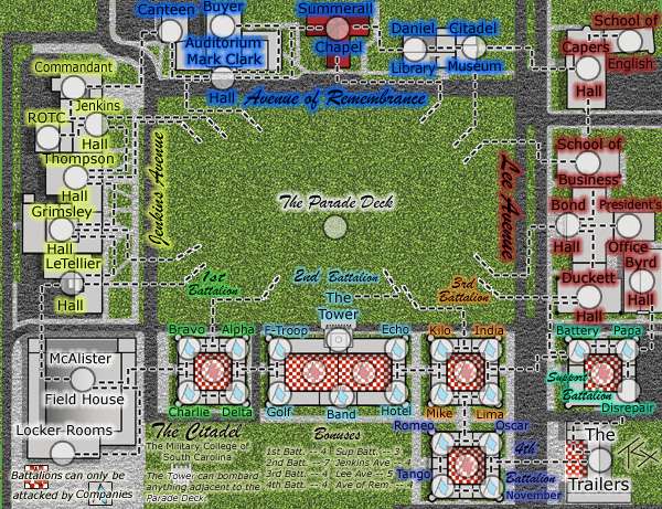
TaCktiX wrote:Version 5
Things that are NOT changing, so don't ask:
I would be very careful making statements like this with your first map. You obviously have some skills in graphics but don't be so arrogant as to think you won't have to change things because if a lot of commentors want the change, and you aren't prepared to make those changes it will hold your map up. Also it may give people the impression of "why should i comment because this guy is not going to take any notice of my requests". Keep a little humility about your replies, you need people to help progress your map, not push them away.
- Attack line look (simple, easy to understand as is)
- The continent names being on the map instead of in a secluded section
Discussion Points:
- Aren't the bonuses nice and easy to understand now? Are the values good?
- Are territory names now clear?
- Good color changes to Avenue of Remembrance and Lee Avenue?
For me, your version 5 hurts my eyes completely...there is so much going on on the map that i find it very difficult to take in and decipher upon initial viewing.
1. i find that while the
texture of the grass is good, its too glaring and contrasting with everything else, and for me conflicts with attack lines. can you reduce the opacity to tone it down?
2. you have a lot of black everything - font, outlines, ashphalt, and everything has a glow. can you not use the colours on the buildings like in regular maps with continents to distinguish them
3. the checker pattern - everytime i see this map i expect Mel Brooks and Madelaine Kahn to break out in the Hitler Rap and wait on the "tables" serving Bratwurst, bread and beer. It really does remind me of a Bavarian outdoor Cafe, with Heidi in her short skirt serving tables and the Oompah Band boys playing in the corner.....in short it doesn't look like a "plan" of buildings with that pattern. best advice there....change it.
4. why have you got the blue flags in the background of the army shadows? you won't see them when there are numbers sitting over the top of them when gameplay is underway. you need to come up with something alternative to that....maybe keep the flags but place them outside the army circles, or move the army circles.
5. i appreciate what you've tried to do with the attack lines, with the white edging around the black dashes. because a lot of the map is light gray, this doesn't work well for me coz there are such a lot of other black lines separating terts...it is very confusing. Perhaps follow the example of CCU map and have the paths between buildings as attack/connection lines. Field House doesn't look too bad, but the rest with attack lines, grey buildings and grey side path areas...my nightmare! Sorry.
6. the title and bonus areas need severe work. not only can i hardly read it on that grass background, but it's also too small. look as some of already quenched maps and see that legend and titles need to be very distinguishable from the rest of the map. give the legend a defined area of its own with the flavour of the map.
I hope this helps. While it may feel like an attack on your work, it will help to better the map and design, and might create more interest for you. I'll return later to see what you've come up with.