A random newbie's two cents:
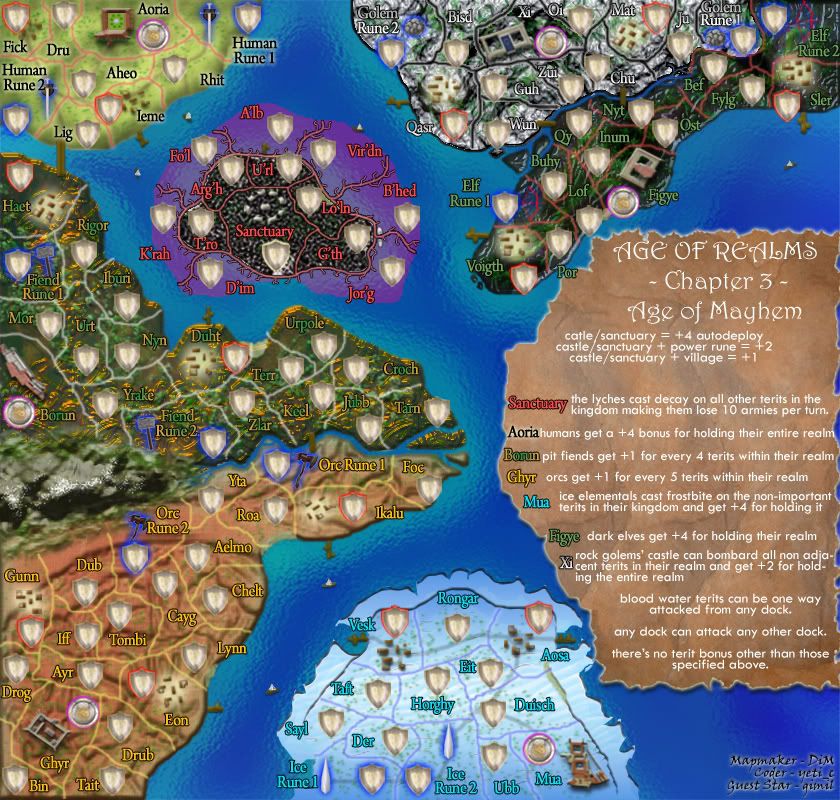
The Elven lands' dark green jars with the neon yellow for the borders which also jars with the blue for the glows of the runes. Similarly, with the rock golems, you have this grey, stonelike texture with these weird fluorescent green lines running across it. Things get lost among this swirling medley of bright glowing things - the runes of both are easy to miss, the river is missable, even the villages and castles are missable.
The dwarves, also, are quite strange. The random orange dashes don't look much like anything, the different shades of green seem to float on top of each other (as does the orange) for no real reason, and, tbh, I don't associate green and orange with dwarves.
The purple, black and white is OK for the sanctuary, but the purple across the ocean is fairly ugly and not really very smooth. Maybe sort of evil tendrils instead? I'm not sure what the sanctuary is meant to look like either, maybe make it more bonelike? The borders too?
These continents also clash with the other three: the human lands, the orcs and the ice golems: these are more sedate, more relaxed, with less going on. The random green specklings on the orcs don't look quite right, but the ice is very pretty and the green specks work well there as well as on the human continent. The water is also very nice, as are the little boats - it occurs to me, though, that if you're going for a chaotic battle feel, maybe some of the boats should be attacking each other? Maybe distinct styles for each species' boat? Actually, that stands for many of the buildings, too: you could make each species look distinct by making their buildings more unique, giving them more of a "dwarf" feel, or an "orc" feel.
Other than that, I'm sure it's awesome